
Aleph Design System
Overview
Company: Aleph
Timeframe: 2024–2025
Role: Product Design Director (contract)
Note: Published with client’s consent.
Background
Aleph is the largest ad reseller partner in the world, operating in over 150 countries. They rely on several owned and operated software systems, which were designed and developed in isolation despite a common stack, back-end services, and infrastructure.
After we rebuilt Wise.blue, our team standardized all UI components into a formal library. We then pitched the initiative and implemented its expansion to serve multiple development teams under a global company holding.
Results
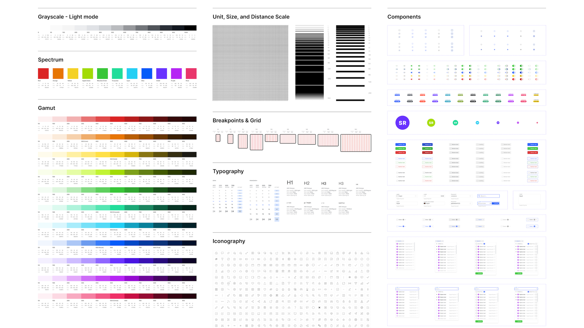
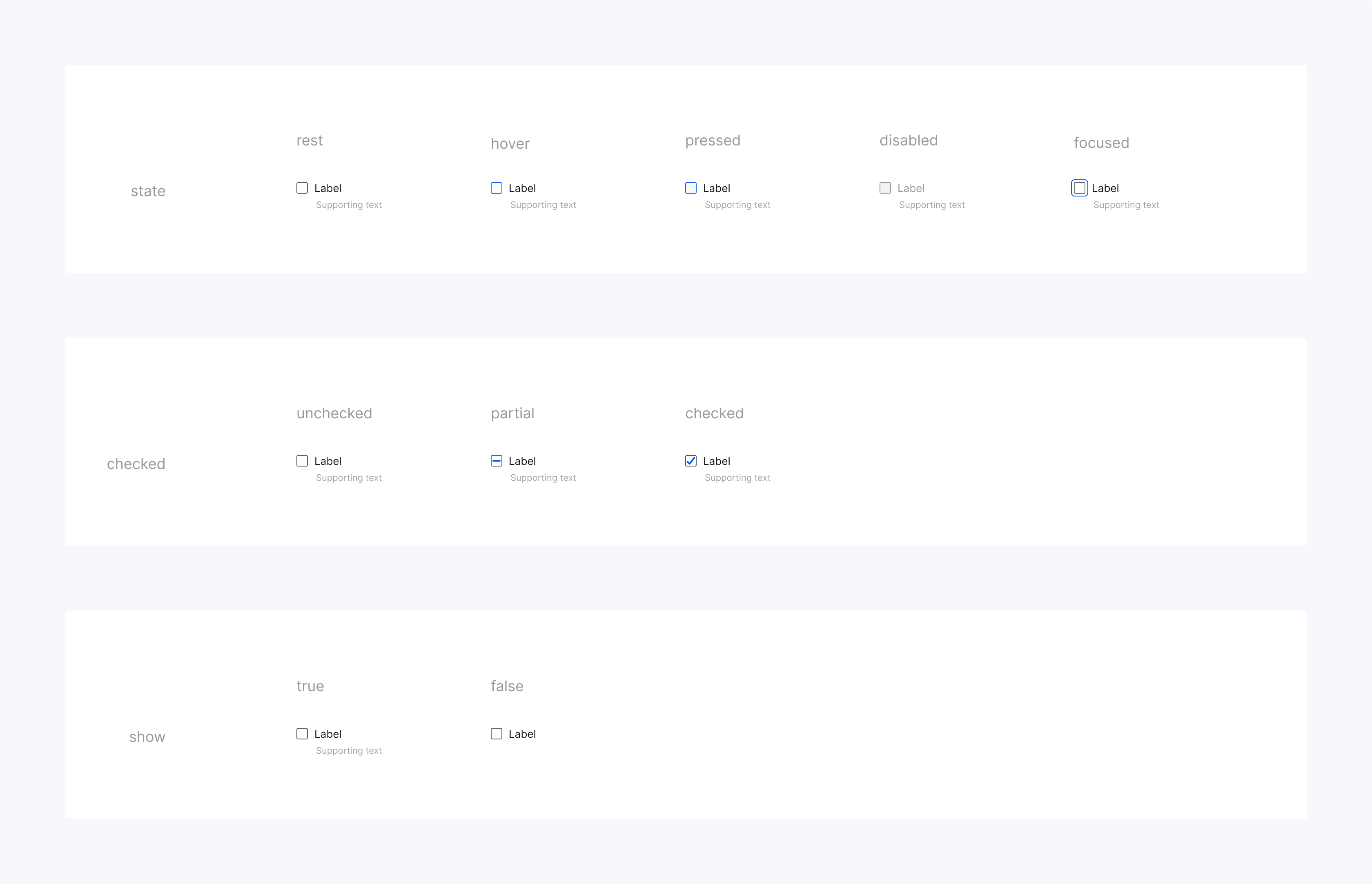
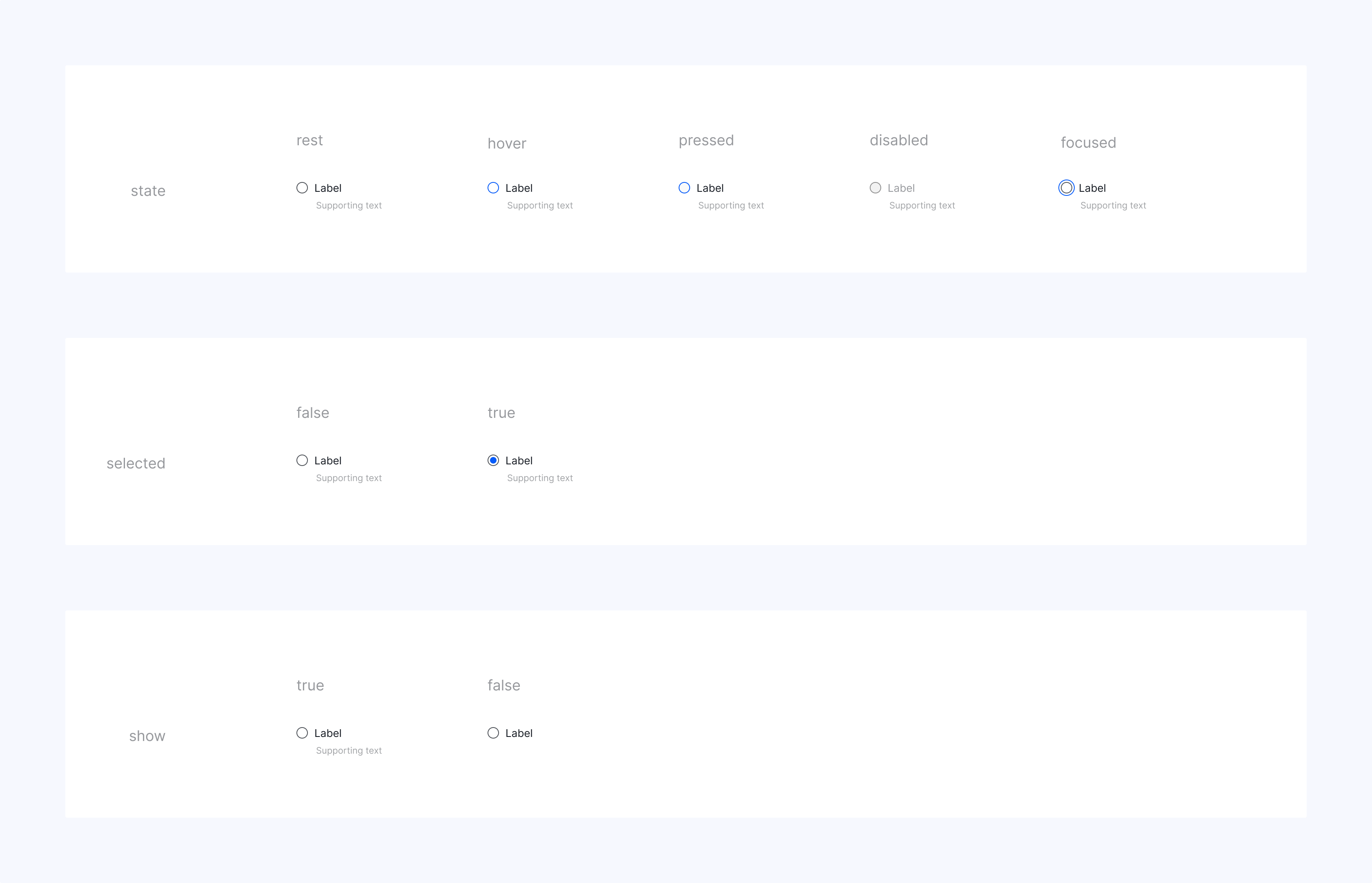
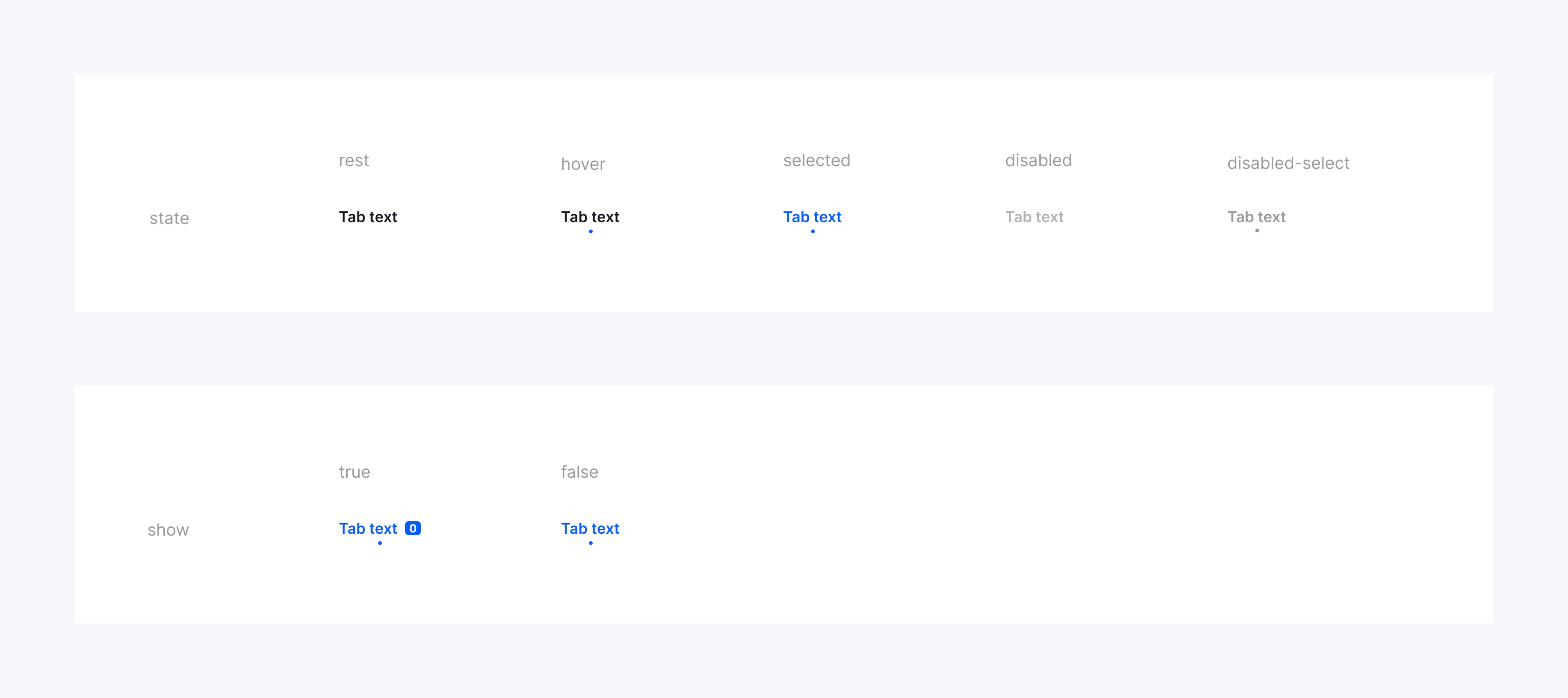
- Scope: 32 components totaling 95 variants
- Scale: Adopted as a global standard powering multiple products
Ownership
I was responsible for driving the design system from inception to global adoption in a hands-on player/coach role.
Show individual contributions
- Designed the foundational set of UI components as part of the Wise.blue Next redesign
- Designed the v2 extended scope and improved v1 implementation
- Implemented the rebranding to Aleph’s corporate visual identity
- Designed and wrote the design system manual
- Wrote technical specifications for all components
- Documented every product instance of every component with required fixes for the front-end clean-up
The role included leading a team of two UX+UI designers through the v1 implementation and later working with the VP of Product Management and the Engineering Manager on securing executive buy-in for global adoption and helping onboard other development teams.
Highlights
Requirements
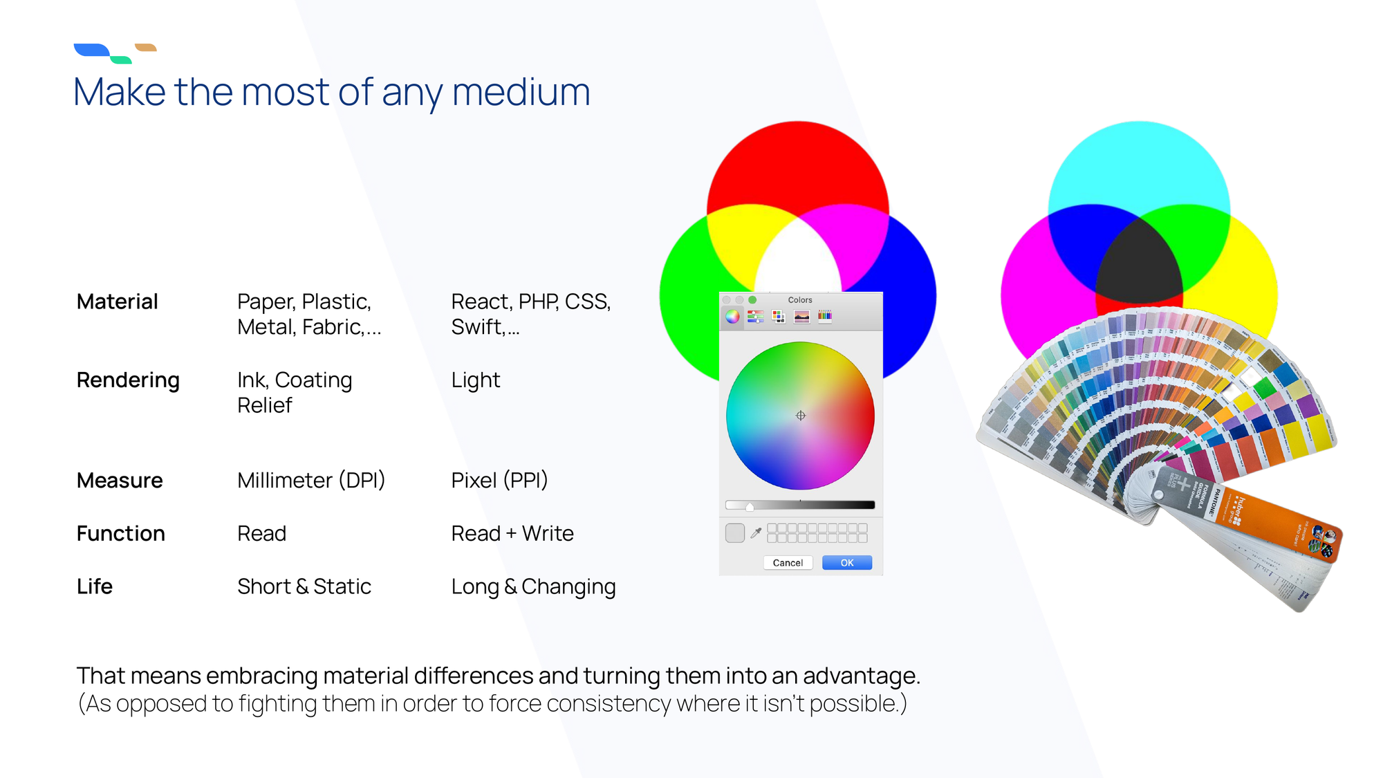
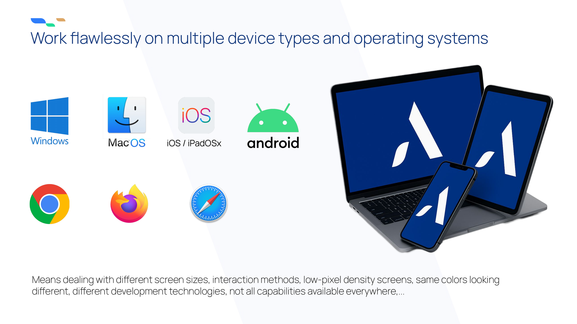
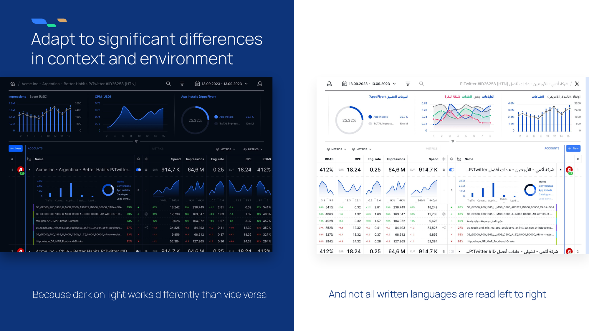
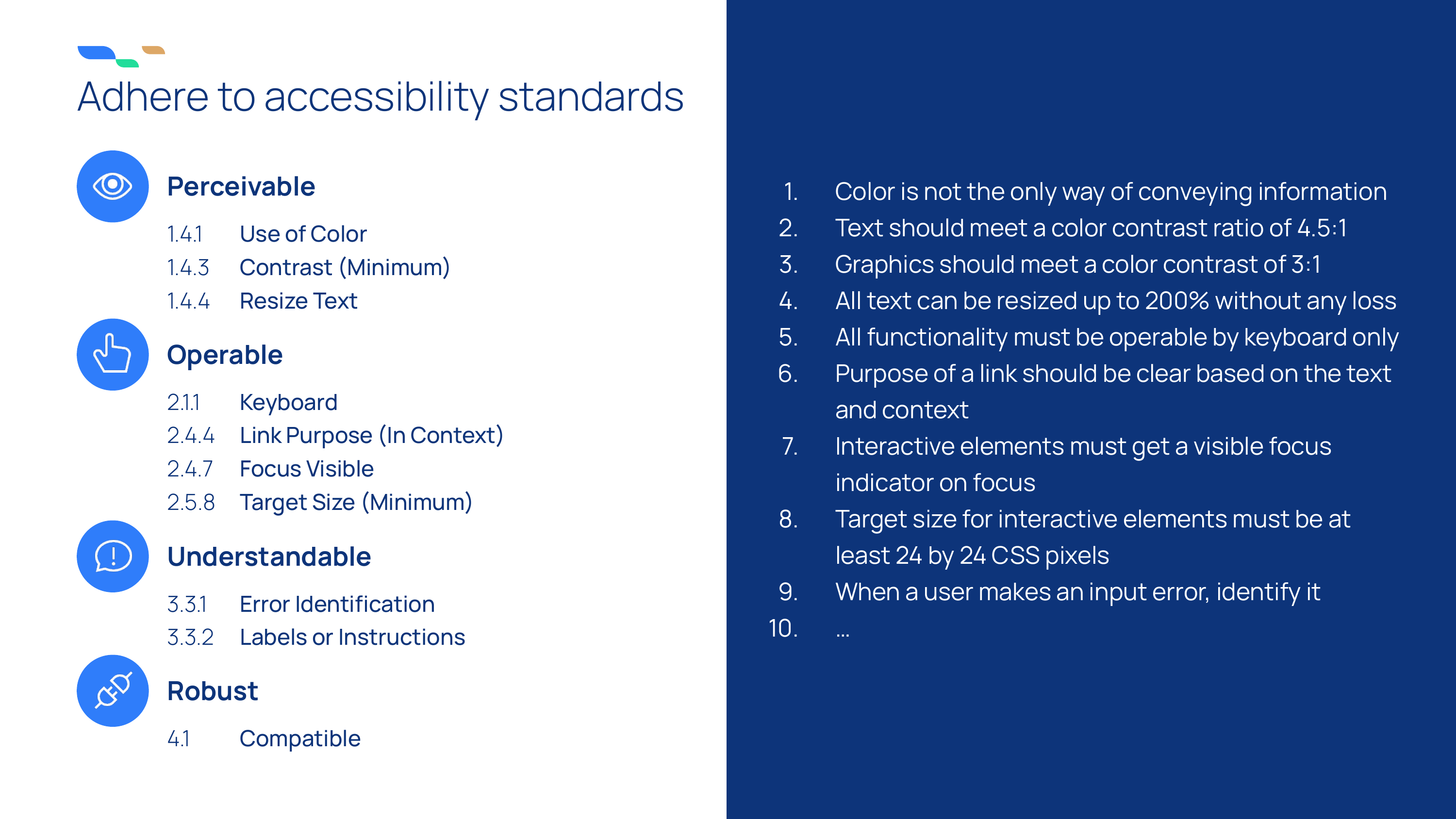
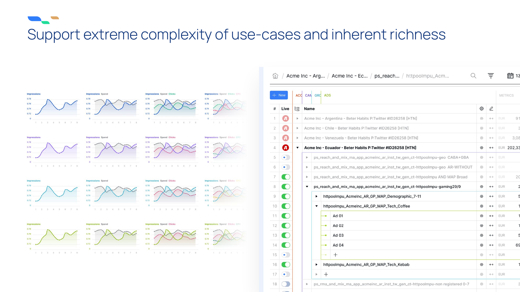
Slides from the Design System Manual
Rebranding a design system
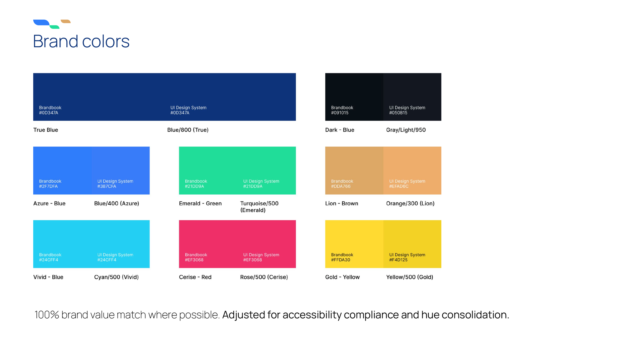
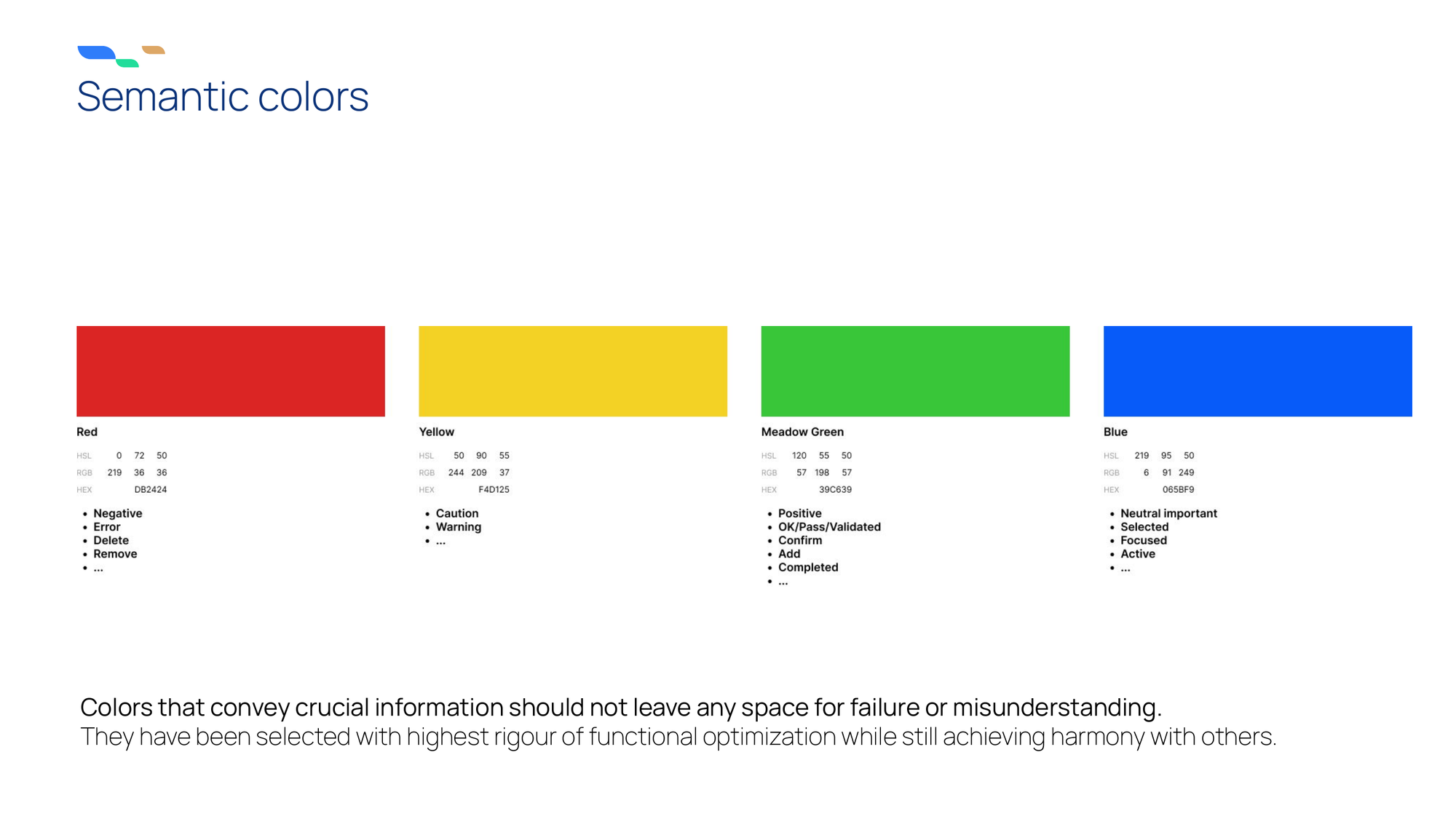
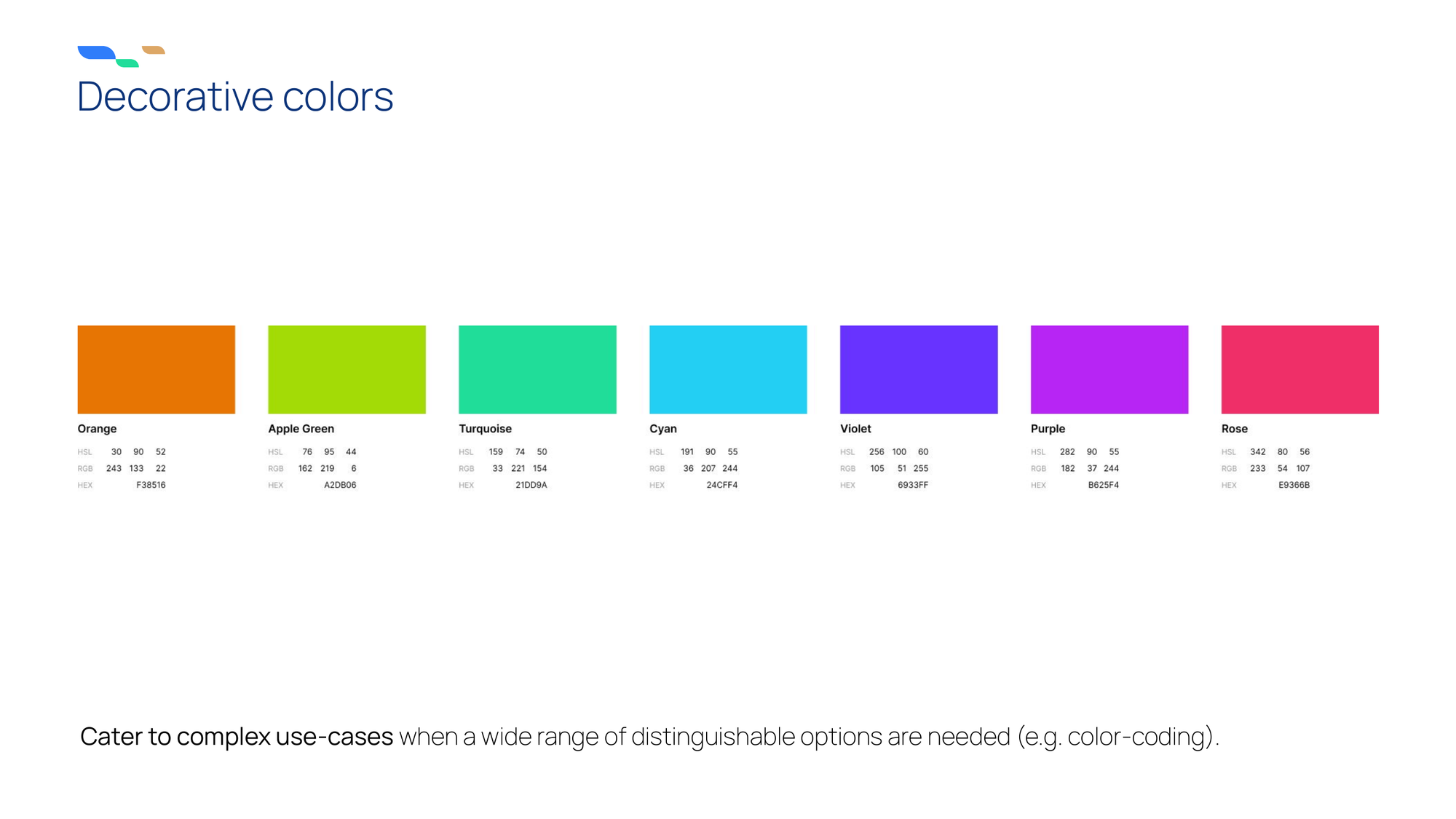
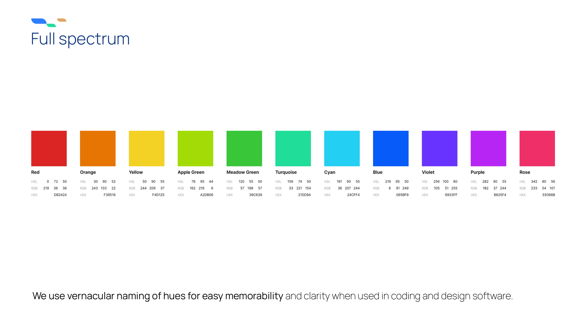
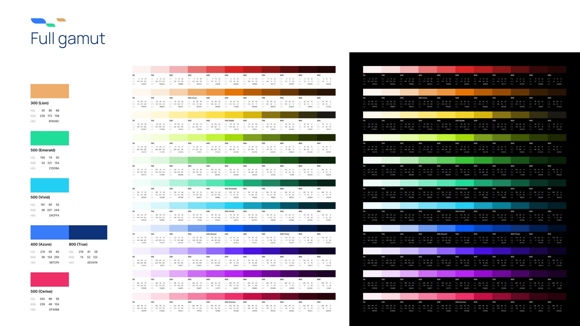
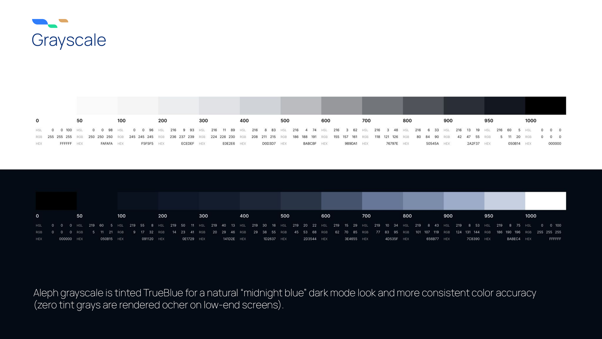
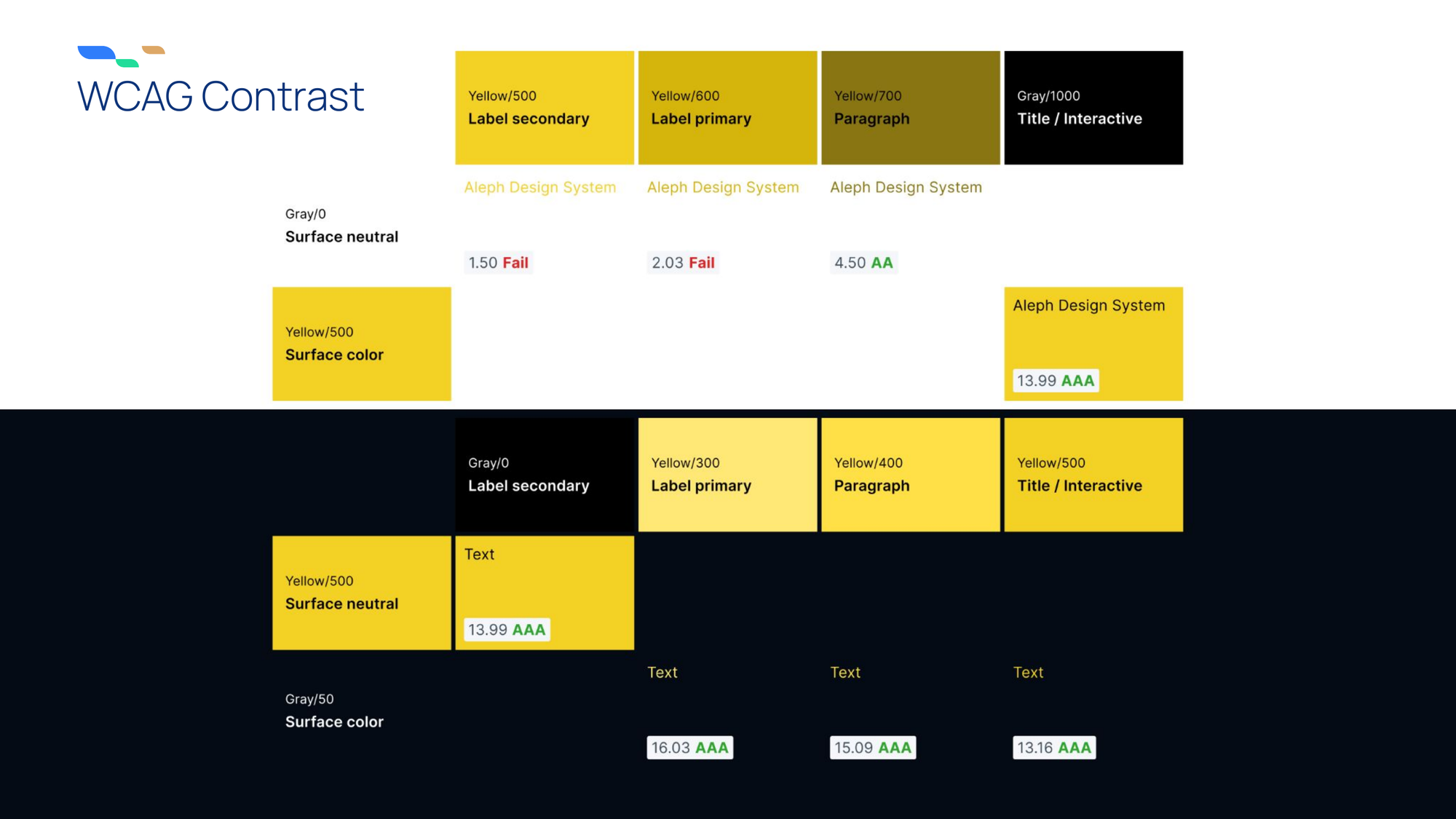
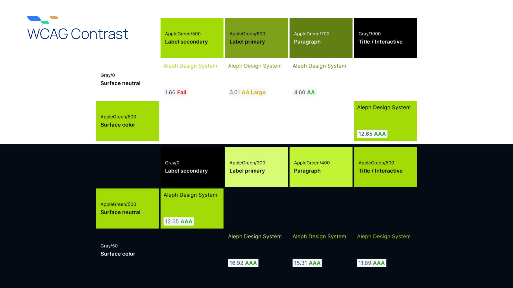
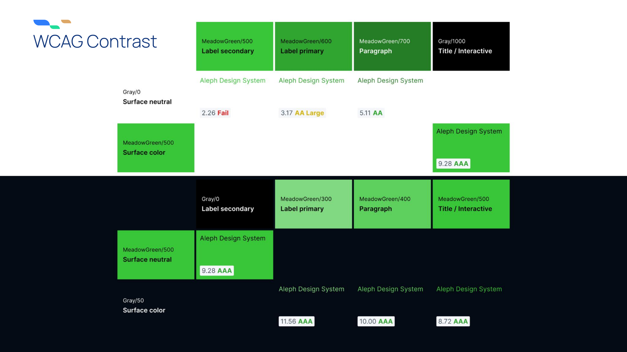
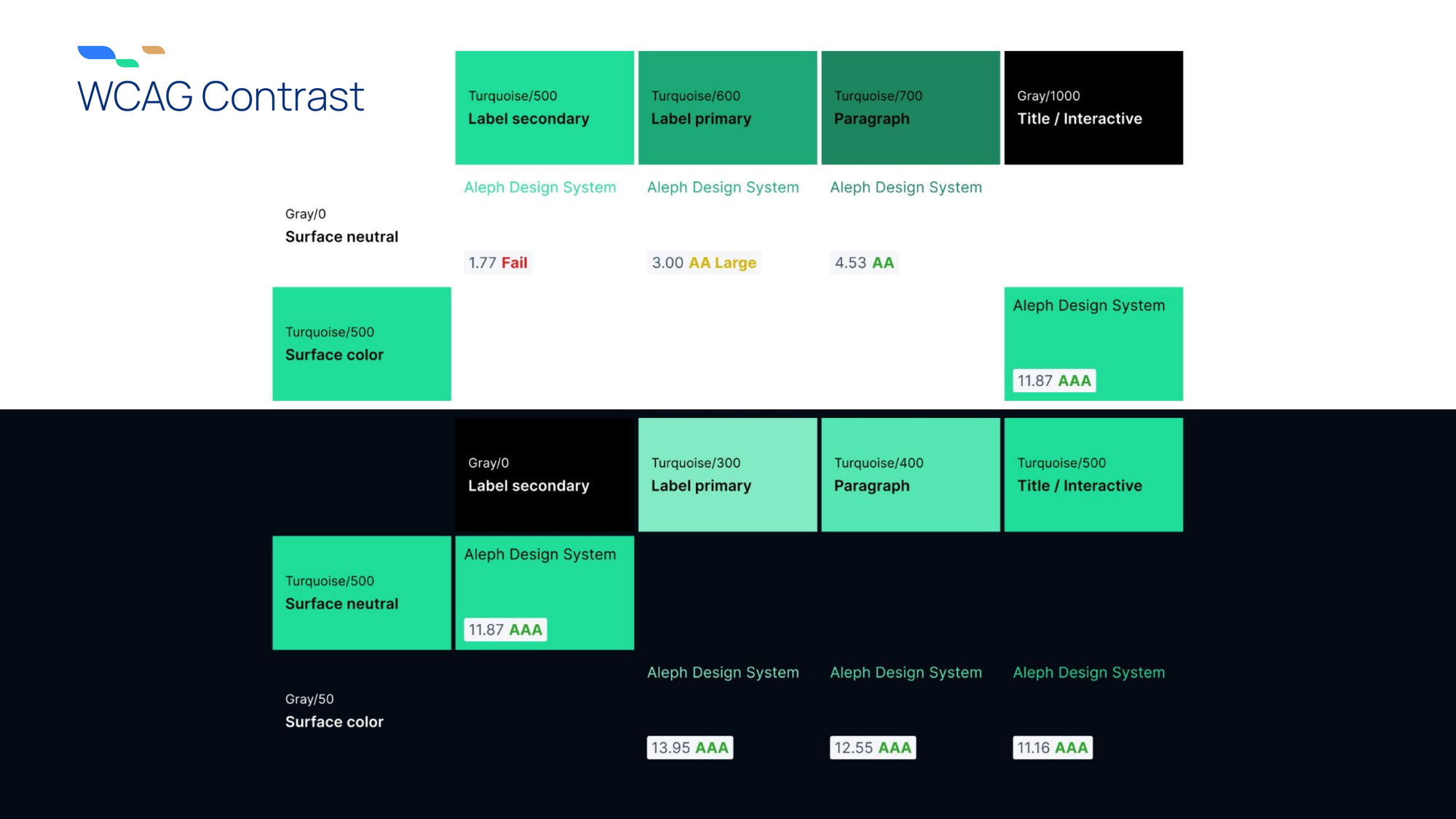
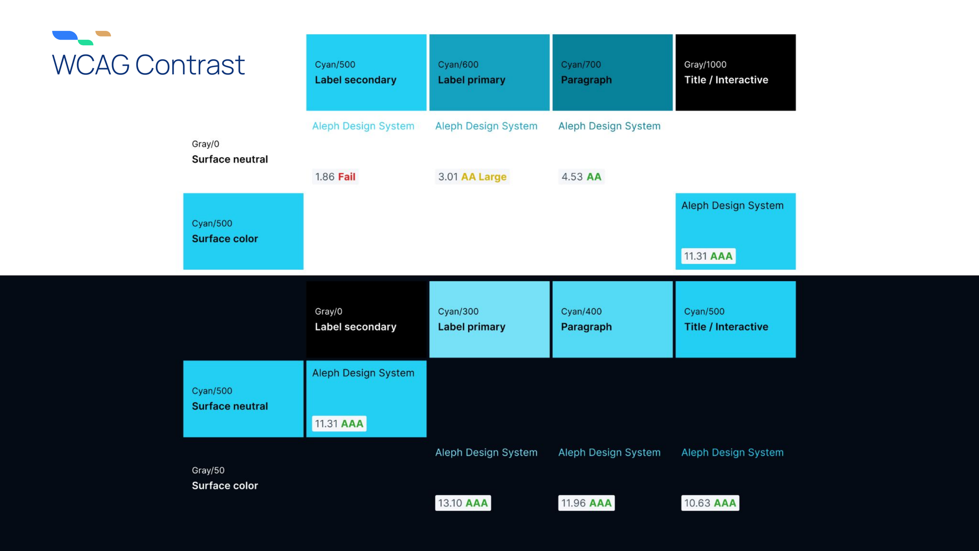
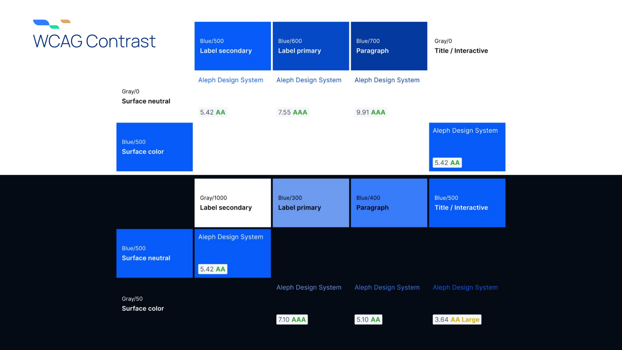
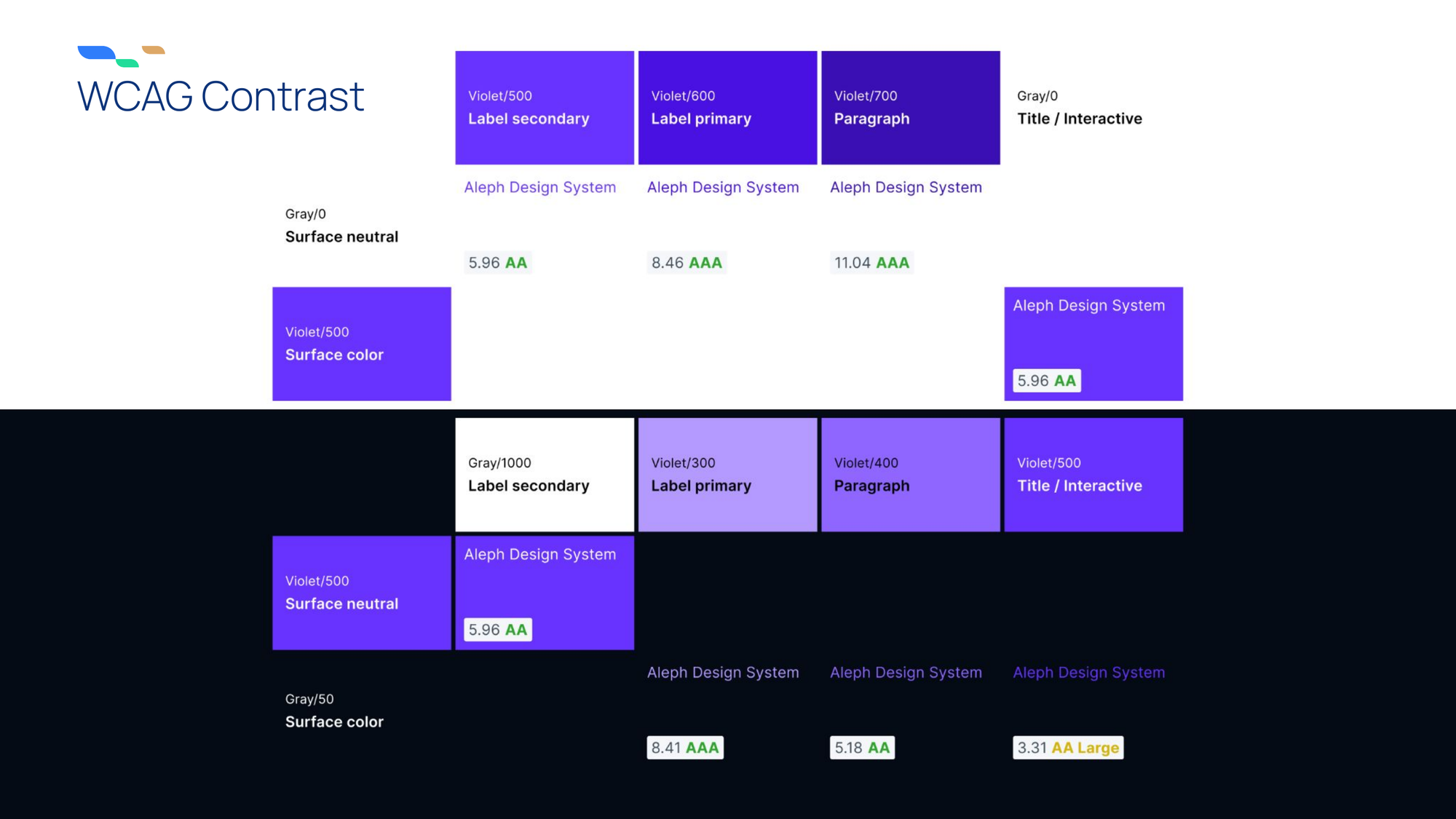
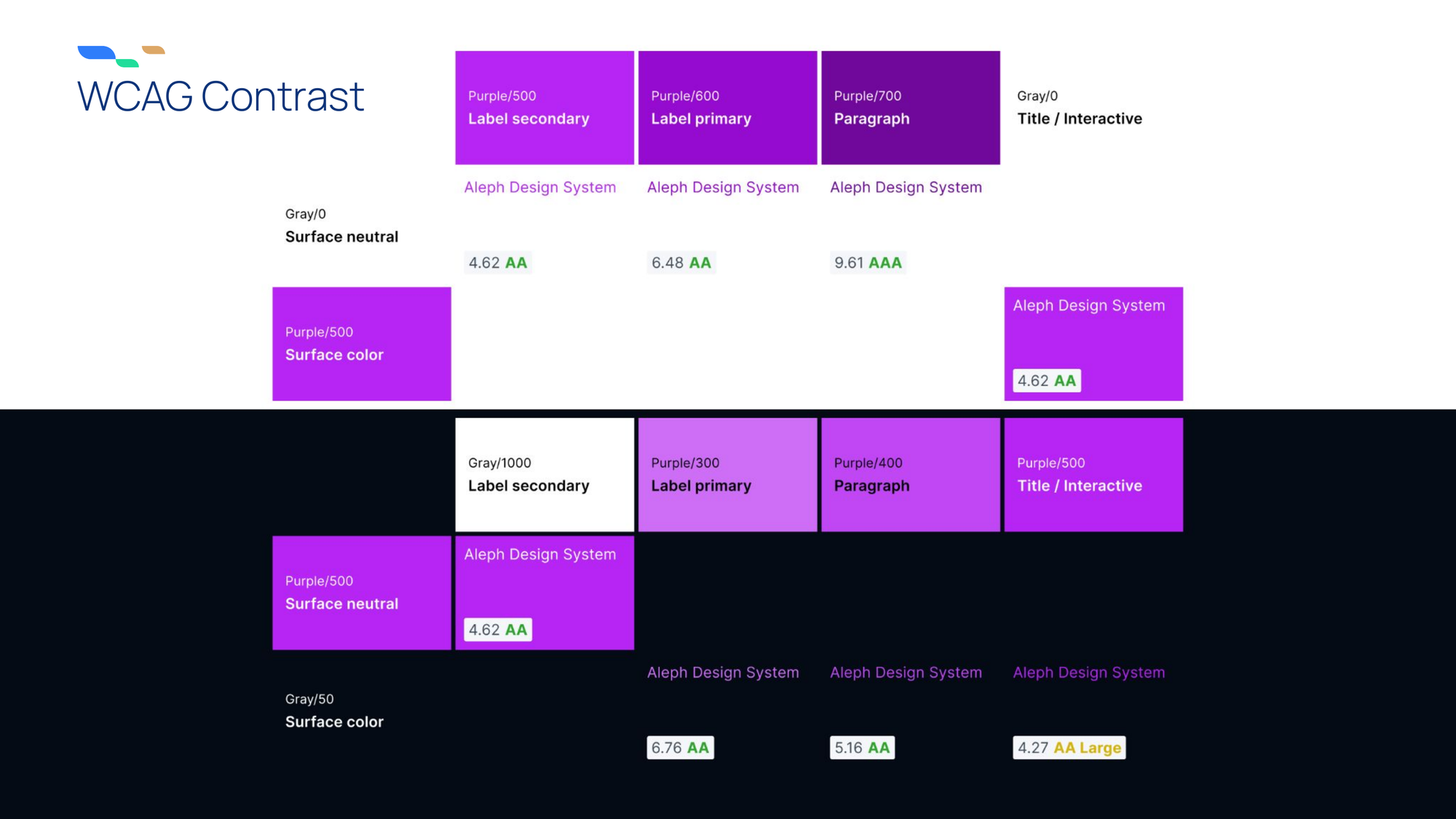
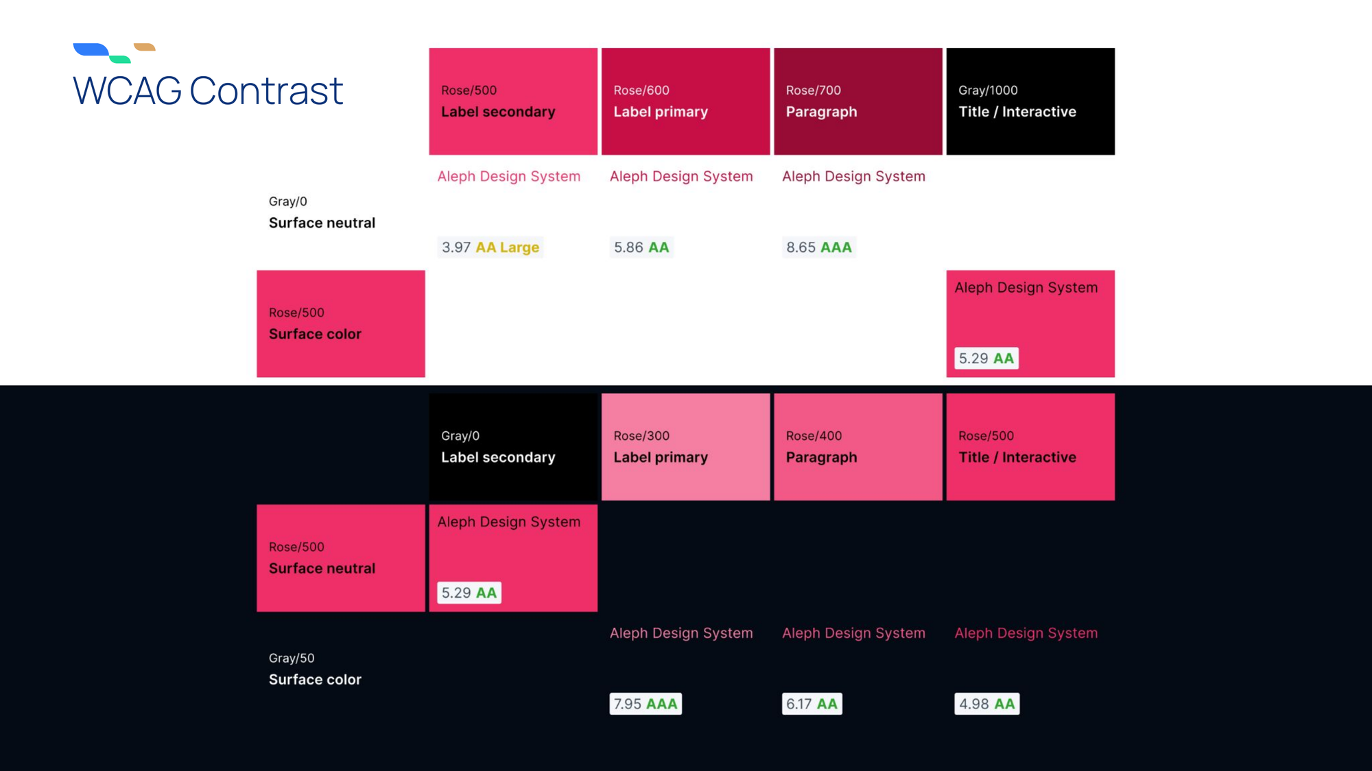
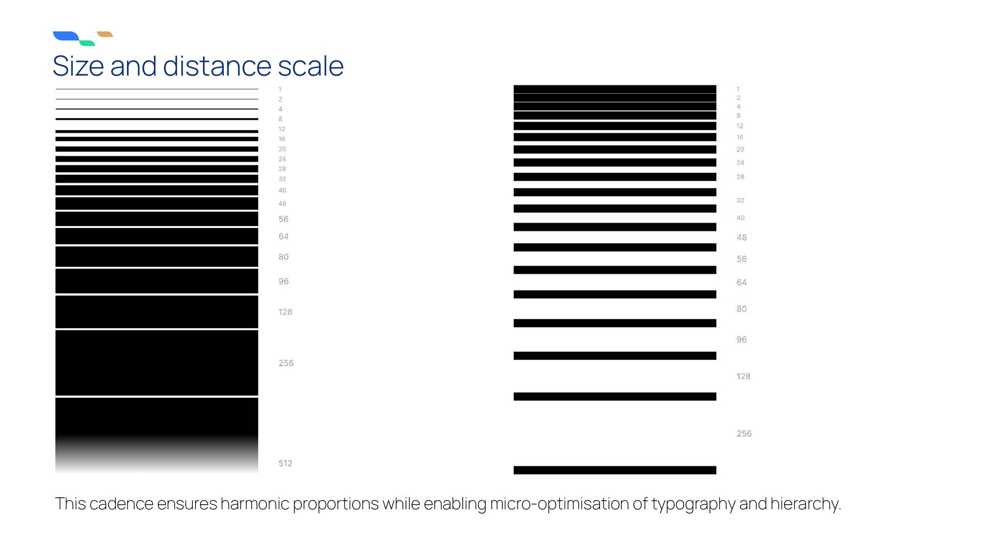
Changing the foundational tokens used in production was new territory. While the typography and scale needed only expanding the set, the color system had to be retrofitted to Aleph’s brand guidelines without breaking Wise.blue’s implementation.
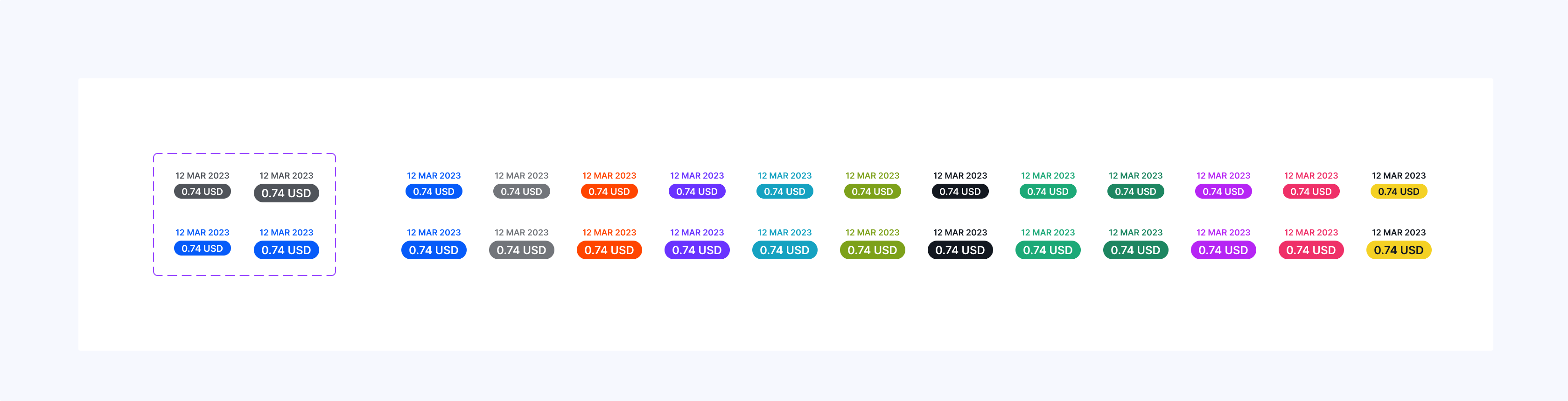
The solution was to align each existing hue with its brand counterpart, optimize adjacent hues for contrast, and tune individual tones to match the brand colors while keeping the optical gradation consistent.
Accessibility
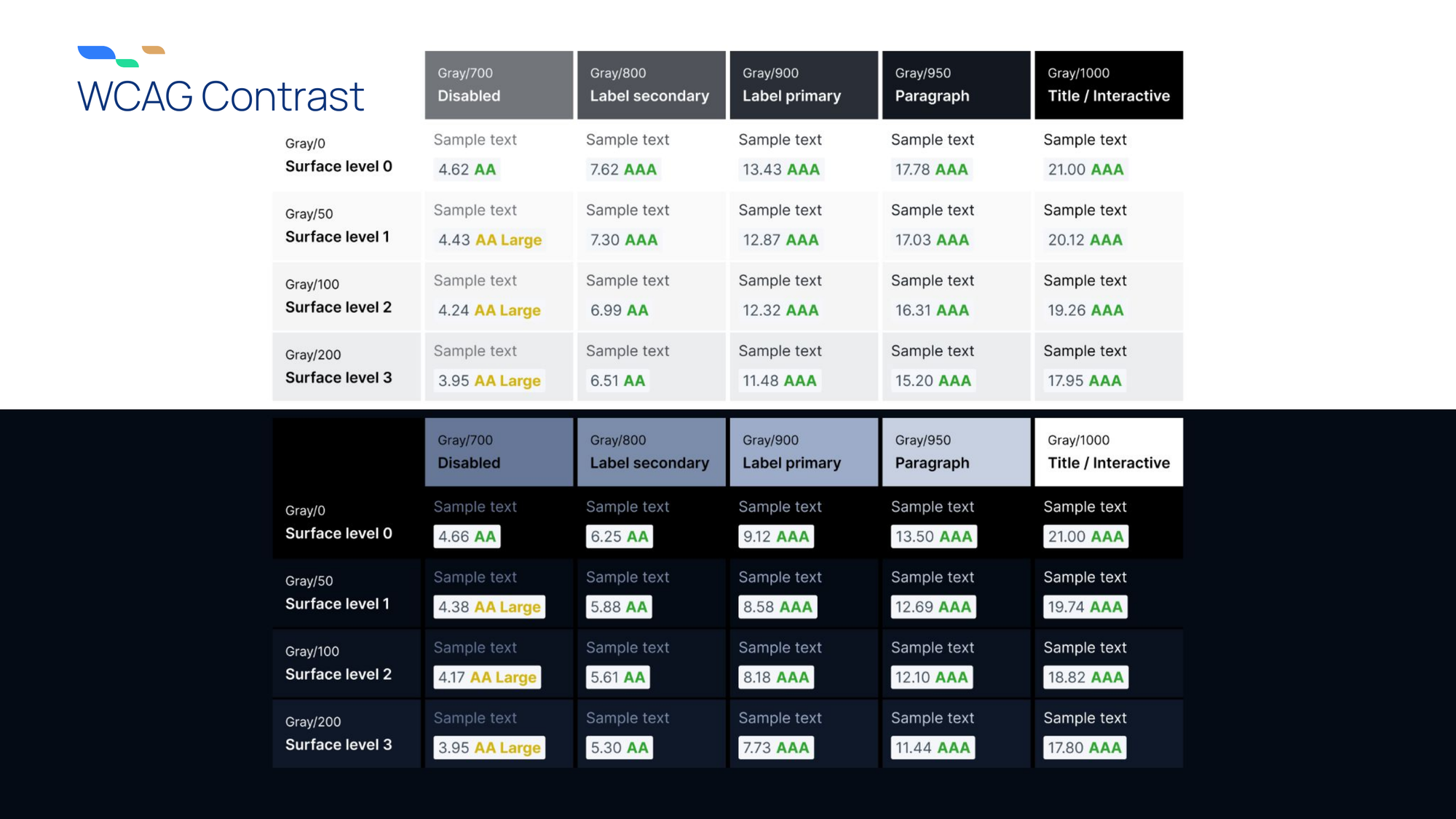
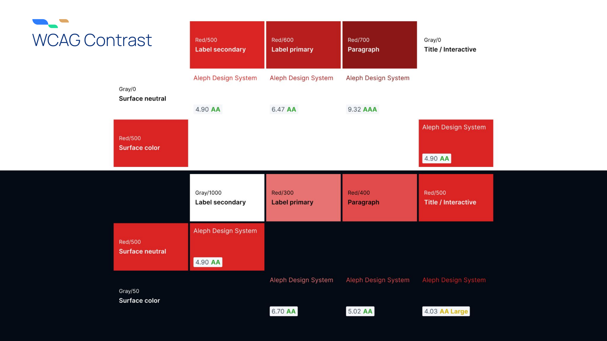
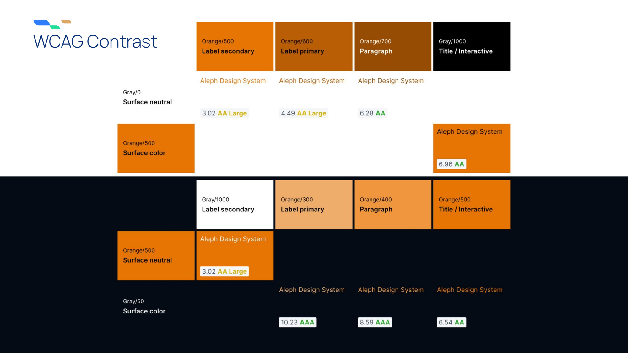
In addition to achieving Web Content Accessibility Guidelines (WCAG) AAA contrast compliance for most colors, with AA as the ensured minimum, we optimized the components’ design for all other crucial accessibility standards.
Typography
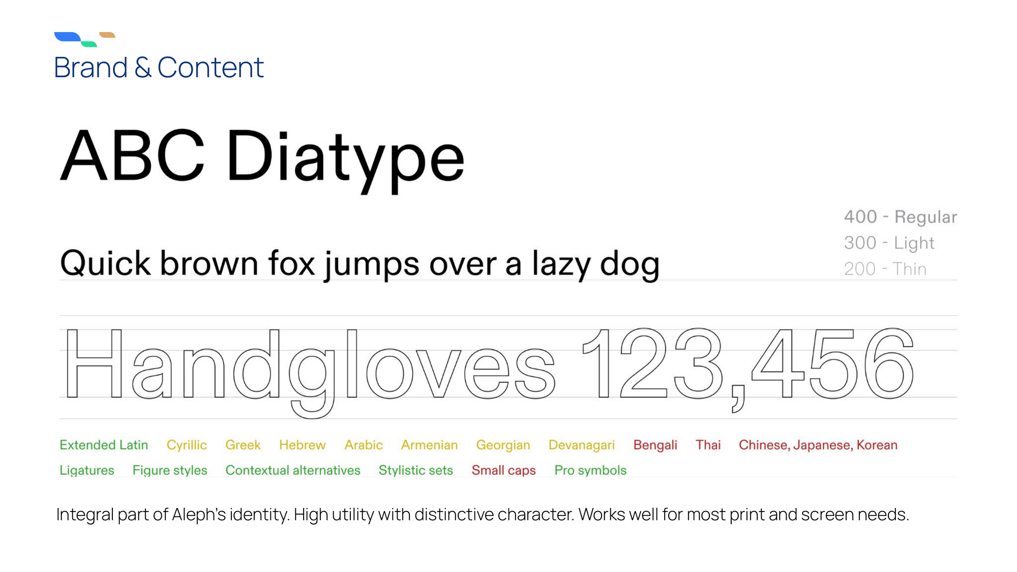
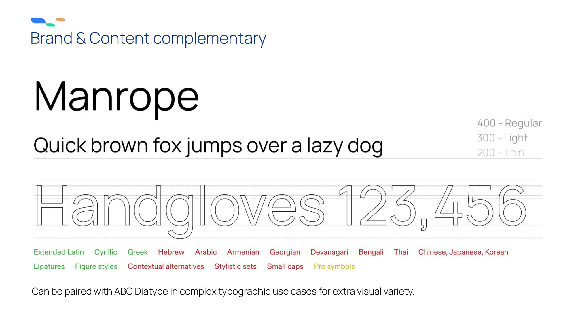
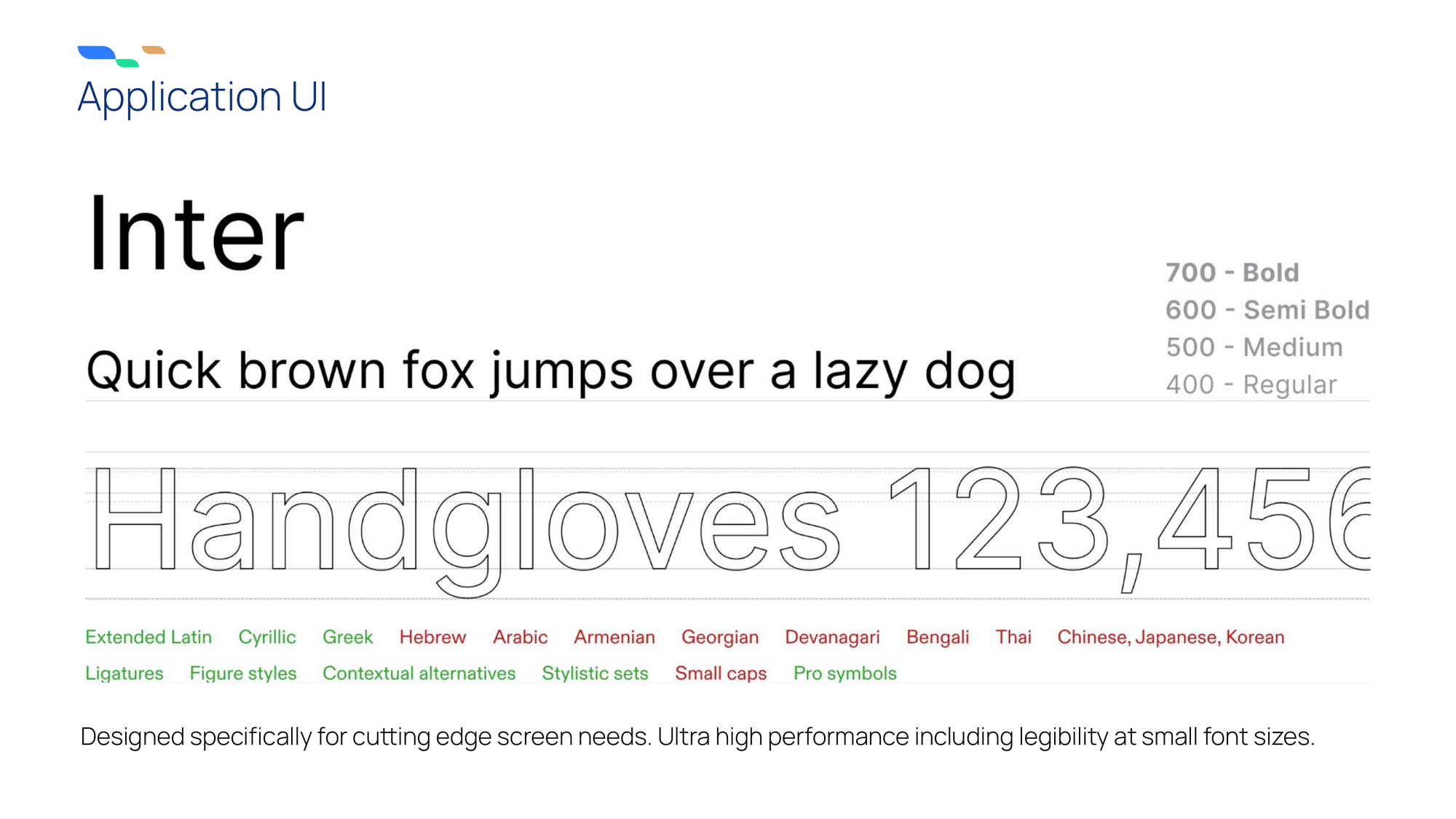
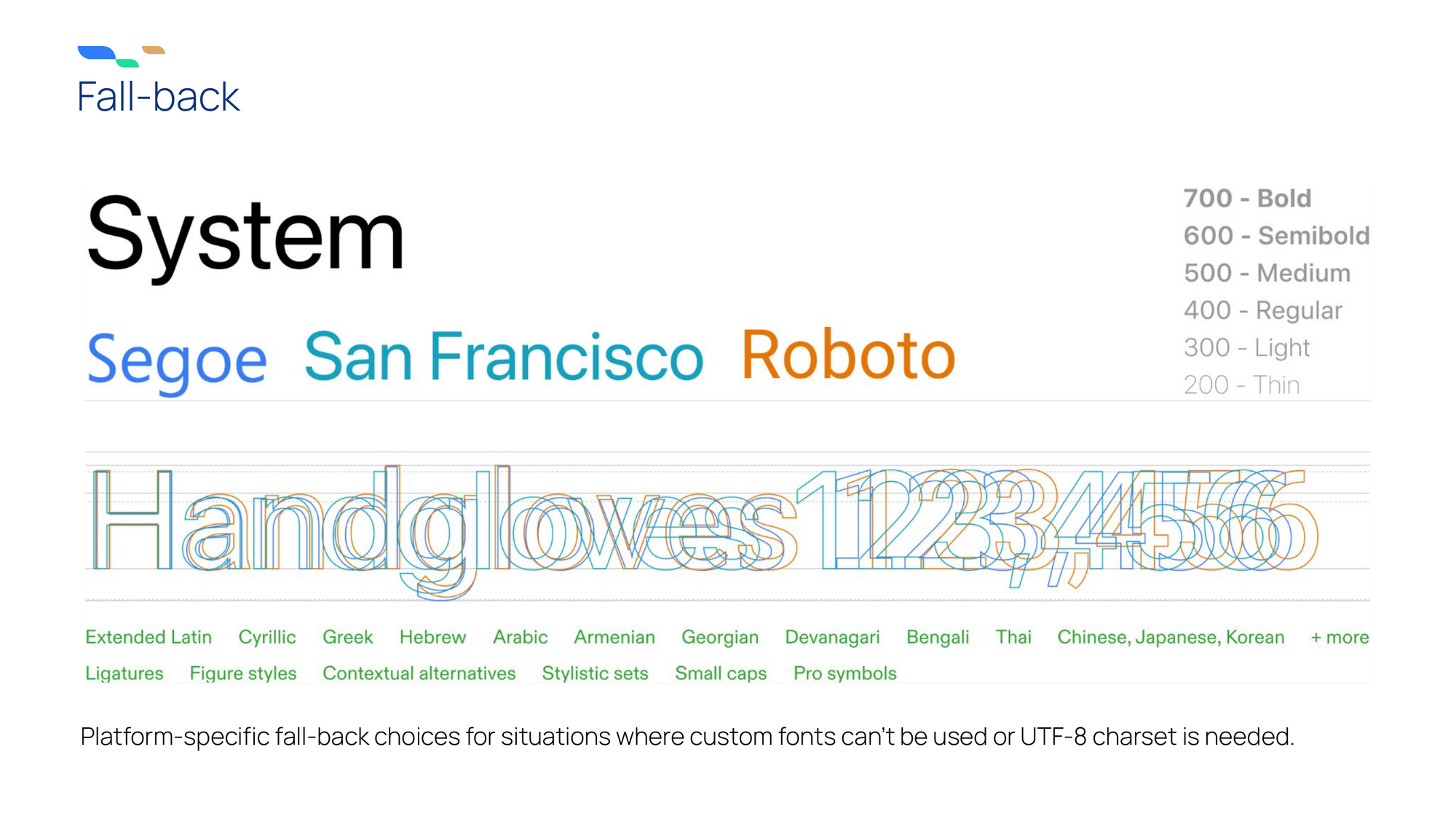
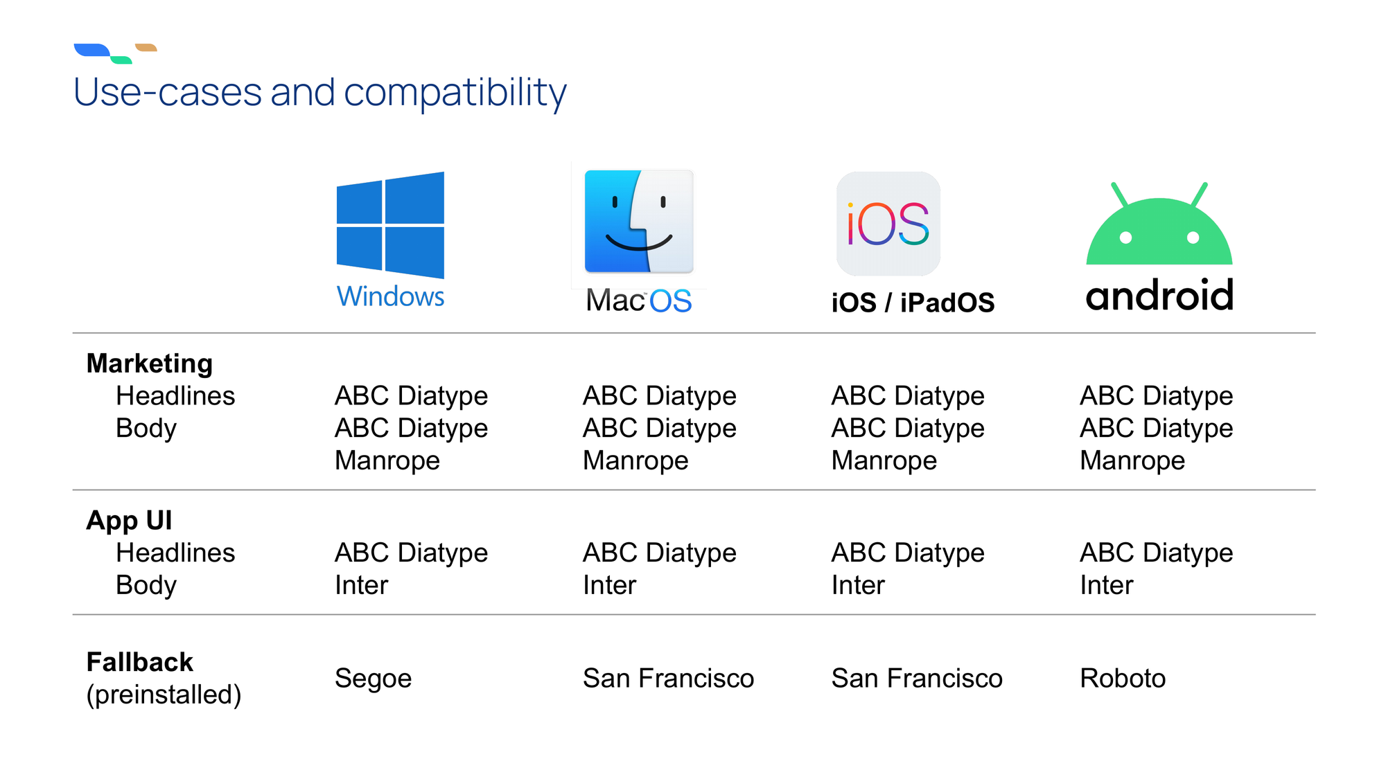
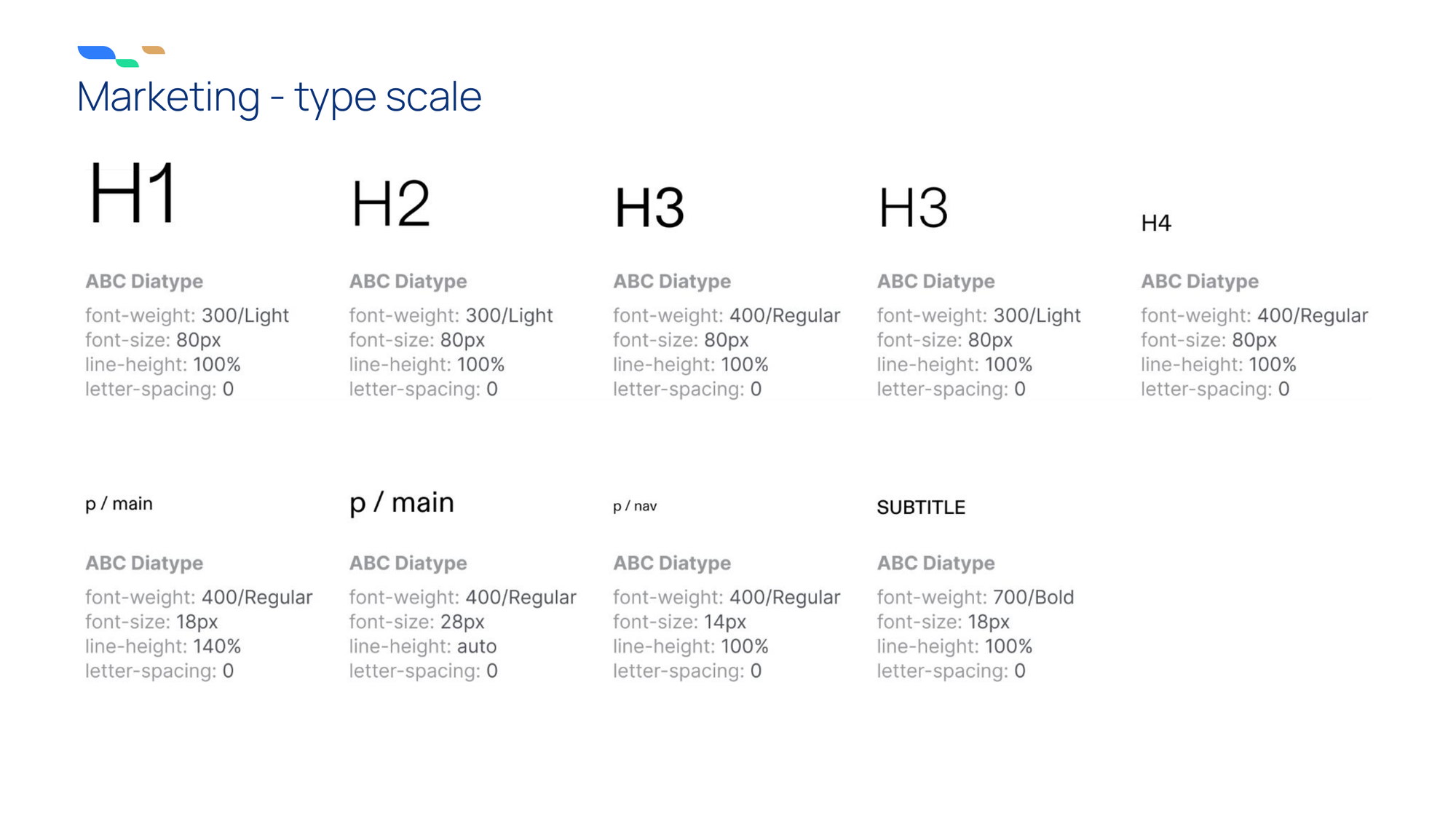
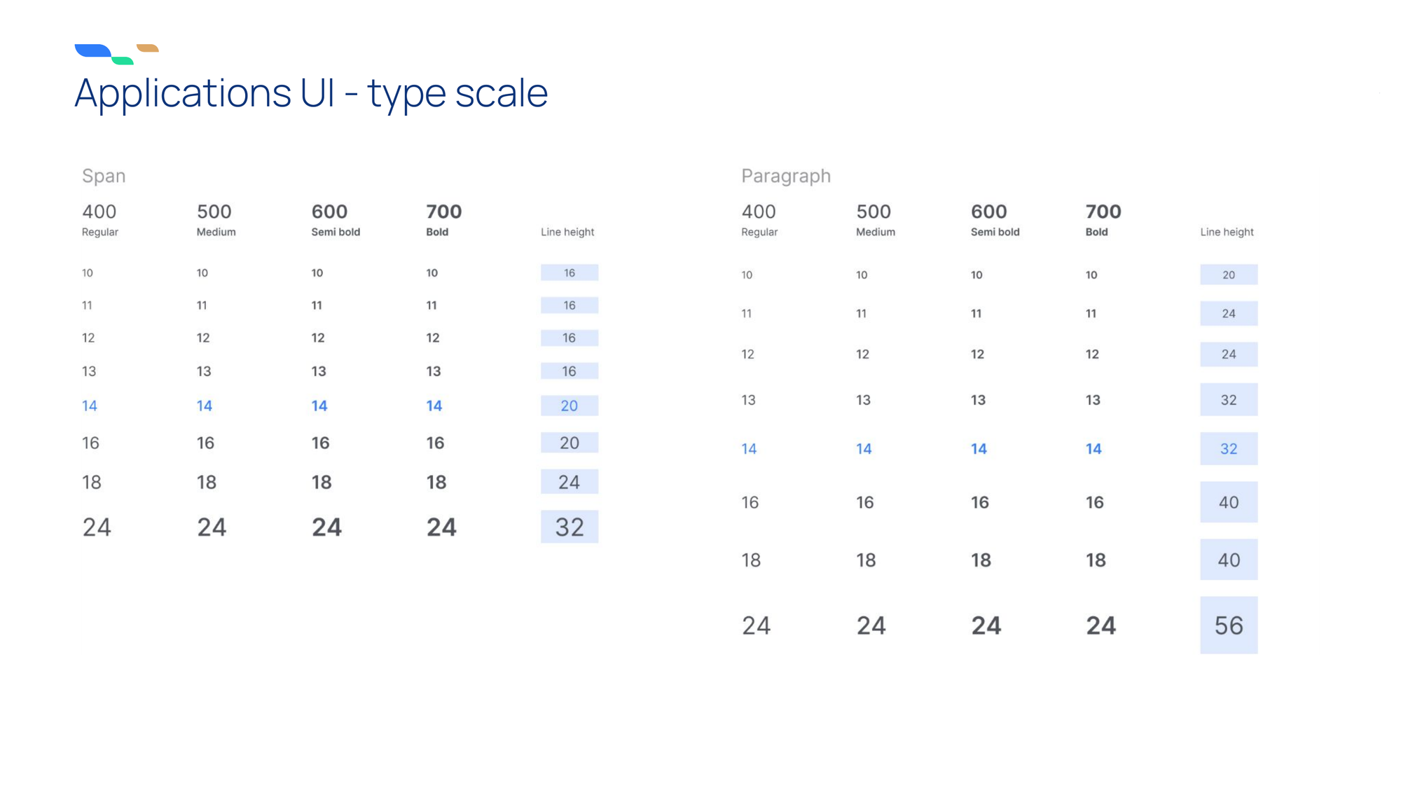
Neither of the brand typefaces were suitable for high-information-density apps, and the change would require a refactor of font sizes, container heights, and spacing due to a significant difference in fonts’ vertical metrics. Therefore, Inter joined the type mix, and the marketing type scale gained a styles matrix for software.
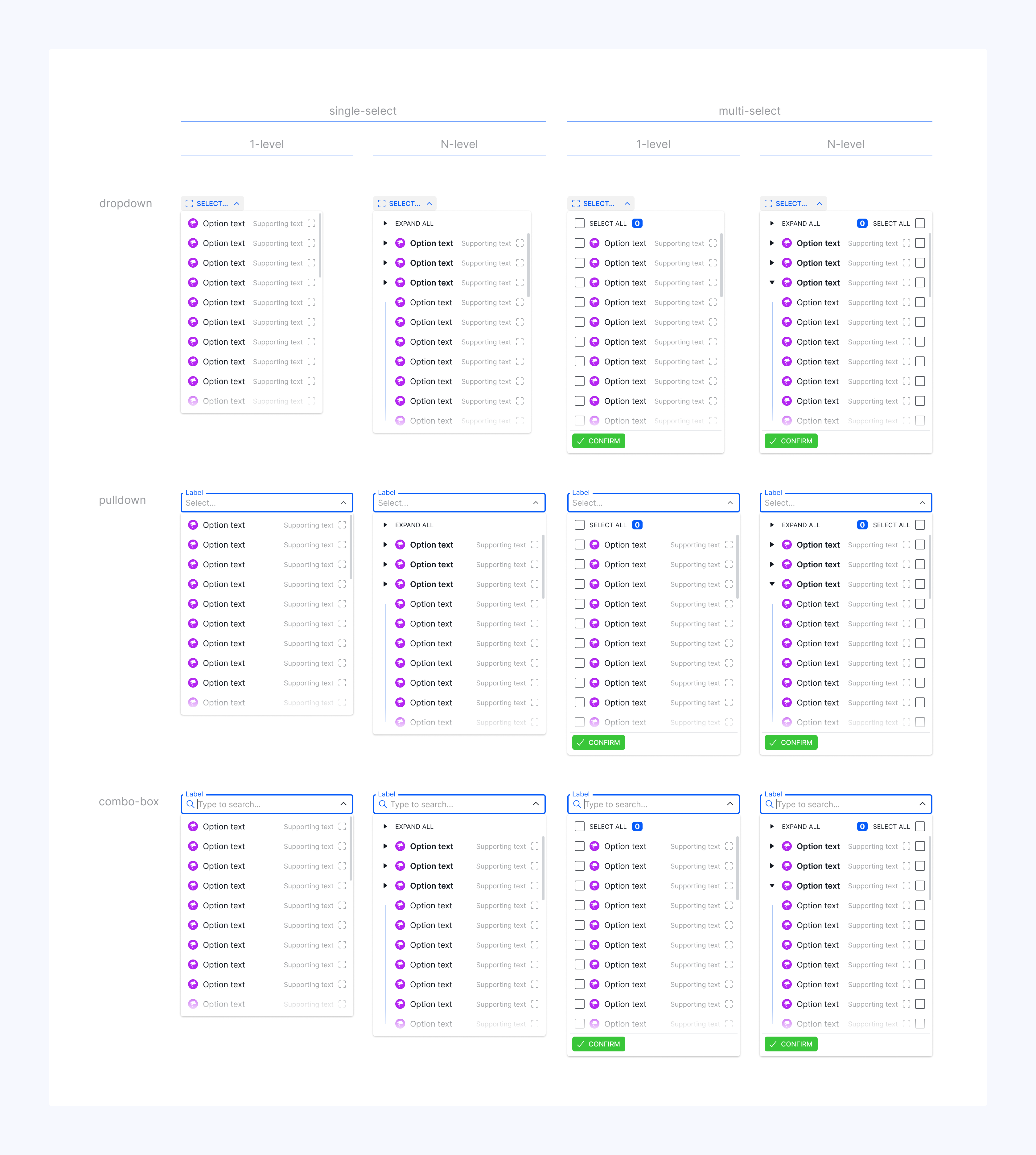
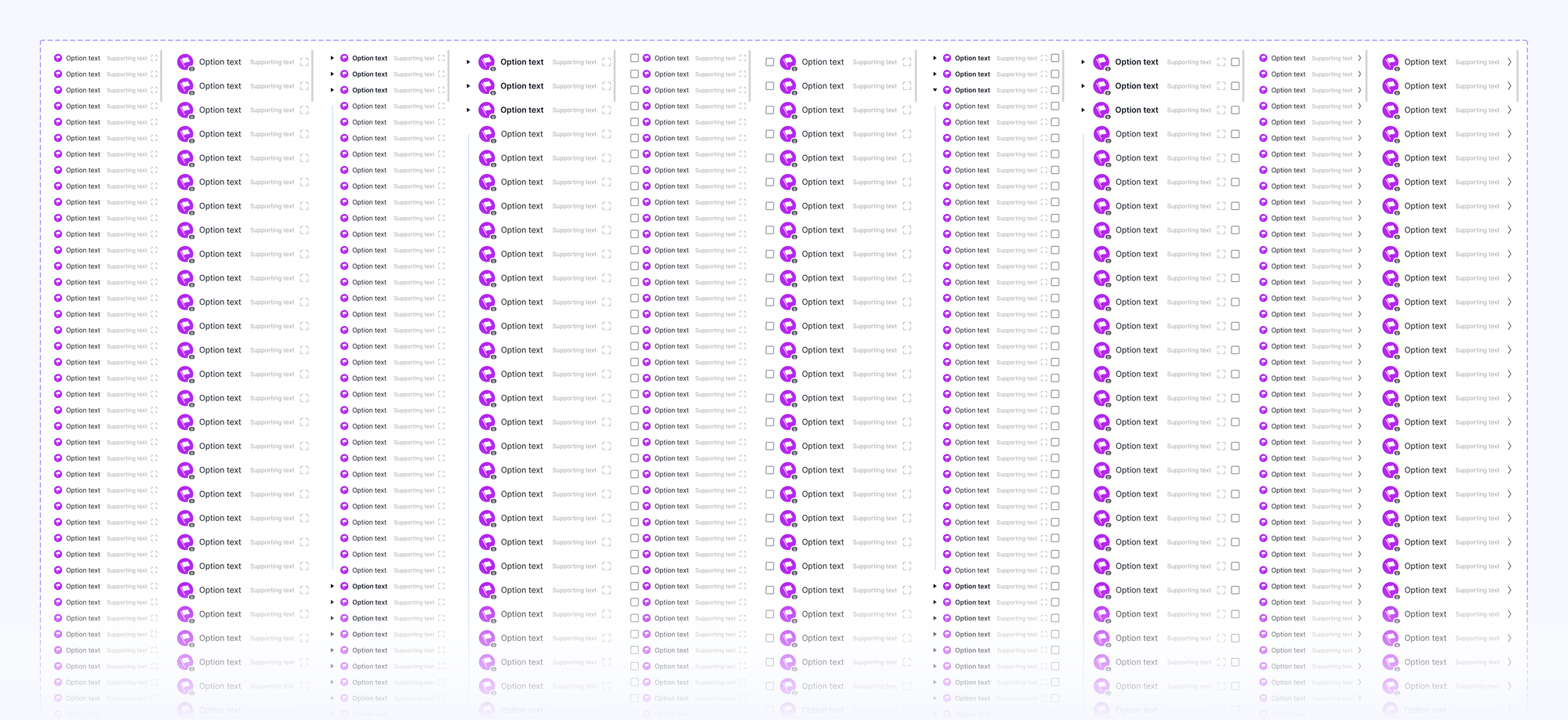
Lists and menus
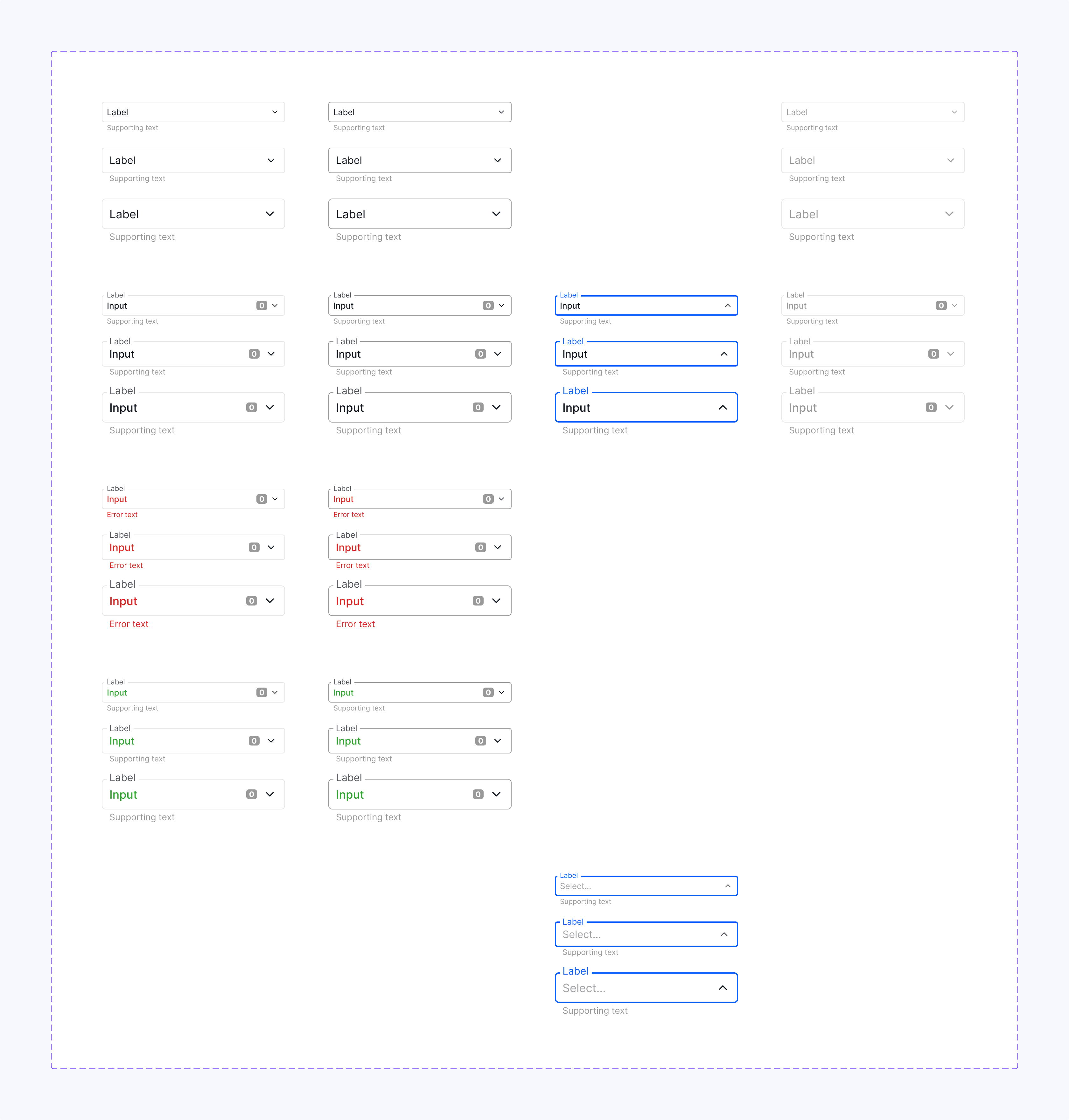
The Menu component family pushed Figma’s library system and our sanity to the edge. With the initial implementation, every time a designer needed to switch auto-layout from fill to hug or vice versa, they had to change the sizing of multiple nested layers. Instead of staying in the flow working on a feature, you could waste hours wrangling the component’s construction and relearning how to achieve desired behavior.
The component now has a control for making the menu overflow or resize with its select box; the select box stays in the layout flow while the menu overlays the content below, and the list remains a standalone subcomponent.
Date picker
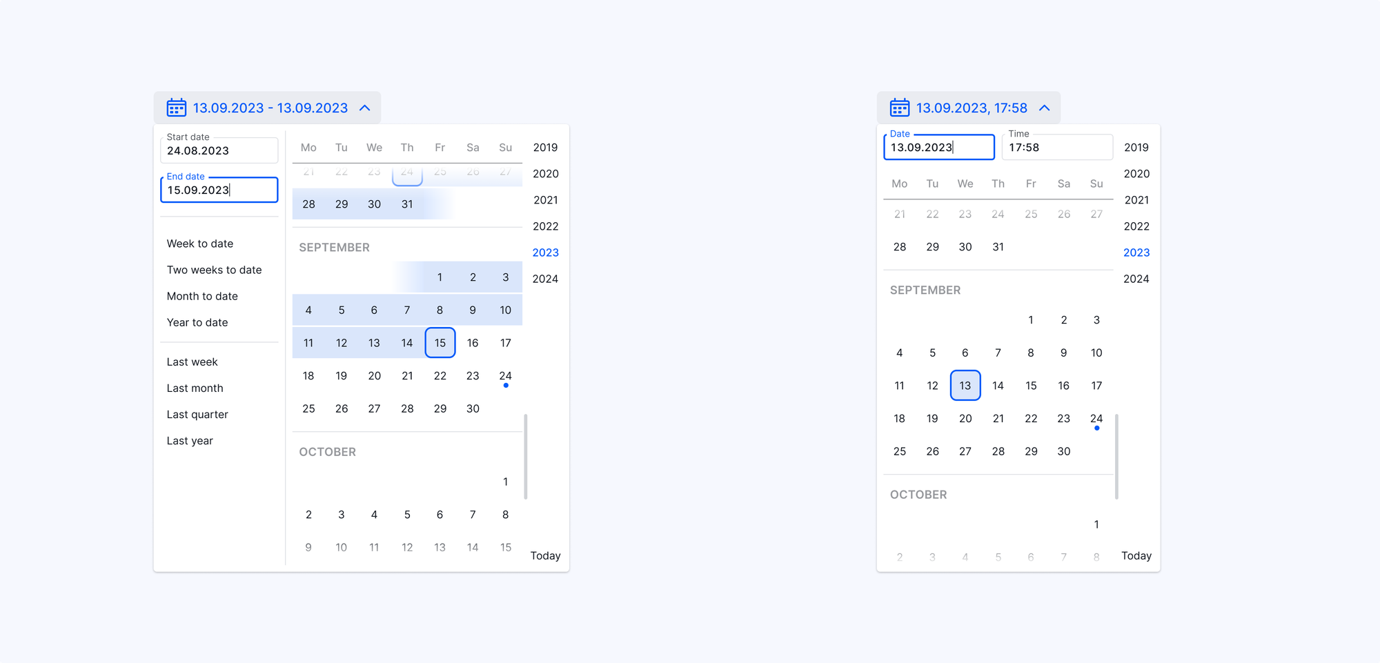
The standard UI pattern requires tens of arrow clicks to select a date a couple of years in the past. We improved it by changing the UI into a scrollable timeline with years as anchor links for point-and-click and keyboard value input methods supported in parallel.
More from the project
Credits
VP Product Management: M. Pangerc
Engineering Manager: S. Križanič
UX+UI Design: S. Rotter, A. Gjorsheska
Design Engineering: N. Ilievski, R. Aminov, A. Fajfar
Quality Assurance: H. Genas