Wise.blue
Context
Company: Aleph
Timeframe: 2022-2025
Role: Product Design Director (consultant)
Note: Published with client’s consent
Aleph is the largest ad reseller partner in the world, operating in over 150 countries. They enable brands in developing markets to advertise on TikTok, X, Microsoft, Amazon, Pinterest, Reddit, Spotify, Google, et al.
Wise.blue is their owned and operated campaign management platform. The original product was built in 2018 for Twitter and ran thousands of campaigns for hundreds of clients.
Objective
The development team discovered that some campaign managers:
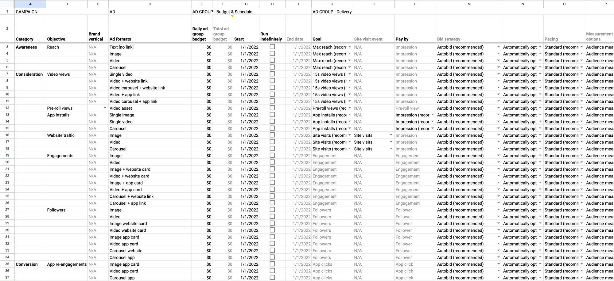
- Download all campaign data from a Twitter's Ad Manager account as an Excel file
- Add new spreadsheet rows with new campaign data
- Upload the file back to batch-create complex campaigns/groups/ads structures based on spreadsheet data input
This hack became the foundational idea for the new generation of the product: live campaign management with a spreadsheet UI.
The leadership bundled the new product strategy with a long-overdue front-end overhaul engineering project.
Output
I was recruited to help the team with product discovery. After we delivered a PoC and validated it with user testing, my contract was extended to direct MVP development and manage the UX team in a design/product-manager hybrid role.
After the MVP delivery, product management was brought back in-house, and my role focused on extending the design system for all Aleph apps while continuing to support the Wise.blue development team.
I reported to the global CTO, product's GM, and VP of Product Management.
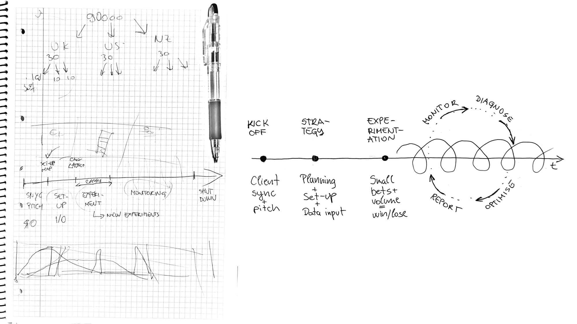
Project timeline
- Migration planning and development strategy
- Supergrid product discovery & user testing
- Wise.blue Next MVP development for Reddit
- Design System v1 Figma implementation and UI components code refactoring clean-up
- Wise.blue Next development for Spotify
- Design System rebrand and v2 upgrade
Individual contributions
- Managed two UX designers direct reports;
- Directed product discovery and PoC validation with UX research, rapid prototyping, IA data model, and user testing;
- Directed a full-stack development team through the MVP development;
- Designed the core scope of Supergrid campaign management, reporting, and integrated back-office admin UX+UI;
- Designed the Next platform data model architecture of entities, roles, and permissions;
- Wrote a value prop matrix and worked with the marketing on the roll-out;
- Supported the engineering and product management team through the process of integrating the Next platform with Reddit and Spotify;
- Directed Wise.blue Design System v1 efforts
- Hands-on executed components scope upgrade to v2 and Aleph Design System rebranding.
Results
Wise.blue Next for Twitter internal teaser — I wrote the script and provided creative direction
“Natan’s methodical approach to design surfaced invaluable user-research insights, addressed the complexities of an innovative GUI, and successfully led the entire team through a 0-1 marathon by creating a clear roadmap and specifications. He was crucial in helping me align executive stakeholders and bring the product idea to life. I look forward to the opportunity to work with him again in the future.”
— Davor Strehar, former Aleph Global CTO
Highlights
TABLE OF CONTENTS
— Migration planning
— Supergrid rapid prototyping
— User research, usability testing, and participatory design
— Campaign management Supergrid
— Engineering feat
— Platform architecture & admin UI
— Reporting
— Notification center
— Design system
Migration planning
When I joined, the engineering team had already developed a basic spreadsheet UI system using AG Grid. The infrastructure and services were already in place powering the legacy version.
Our job was to redesign the legacy app client.
Supergrid rapid prototyping
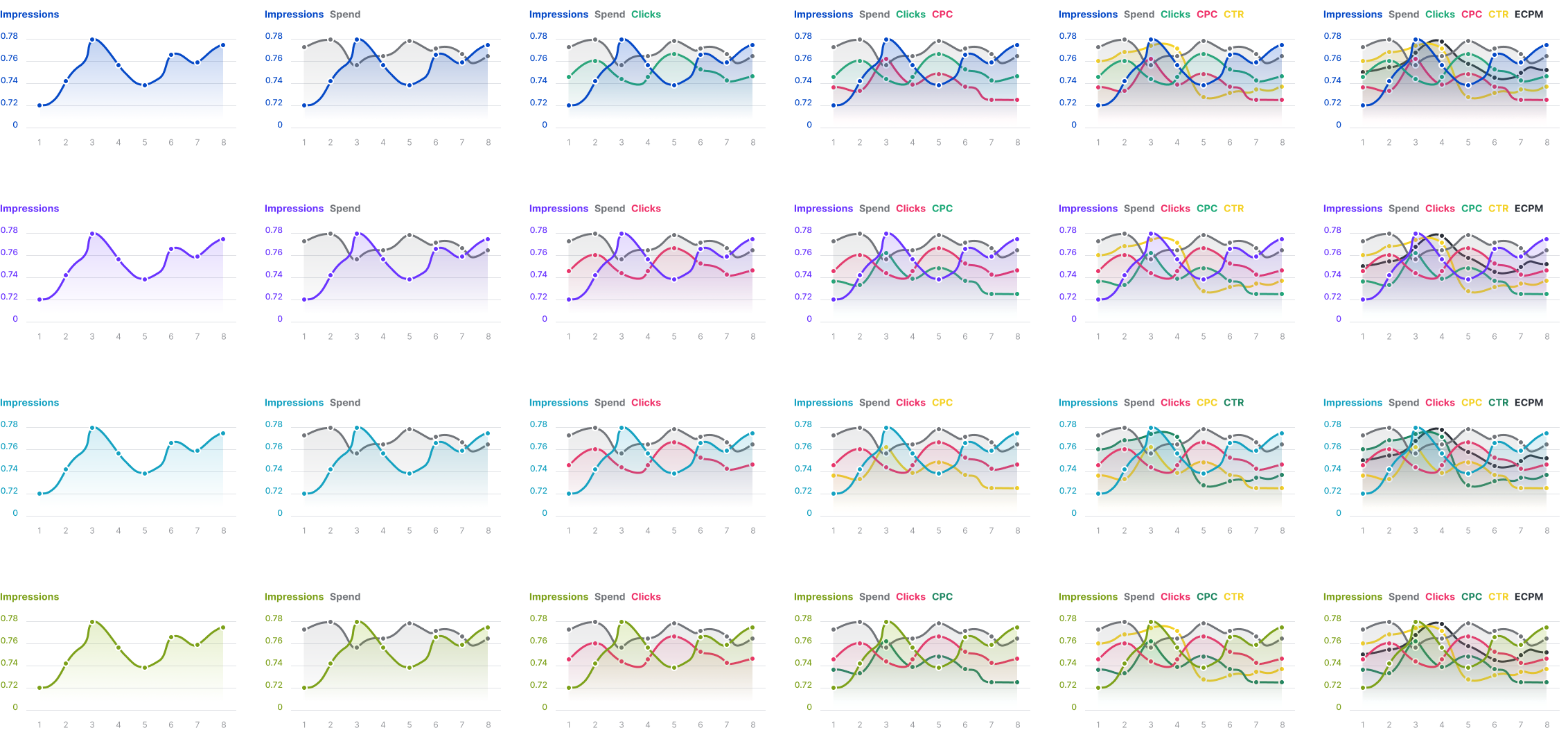
Our main worry was Supergrid's total width. We needed to get a sense of the horizontal scroll experience and assess how much we could compress it with label abbreviations and other UI design methods before development.
The UX team used Google Sheets to import a platform data dump and create a Supergrid proof of concept with realistic data.
Once we got a grip on the edges, we took on the challenge of creating an inventory of all the data columns, their properties, and dependencies.
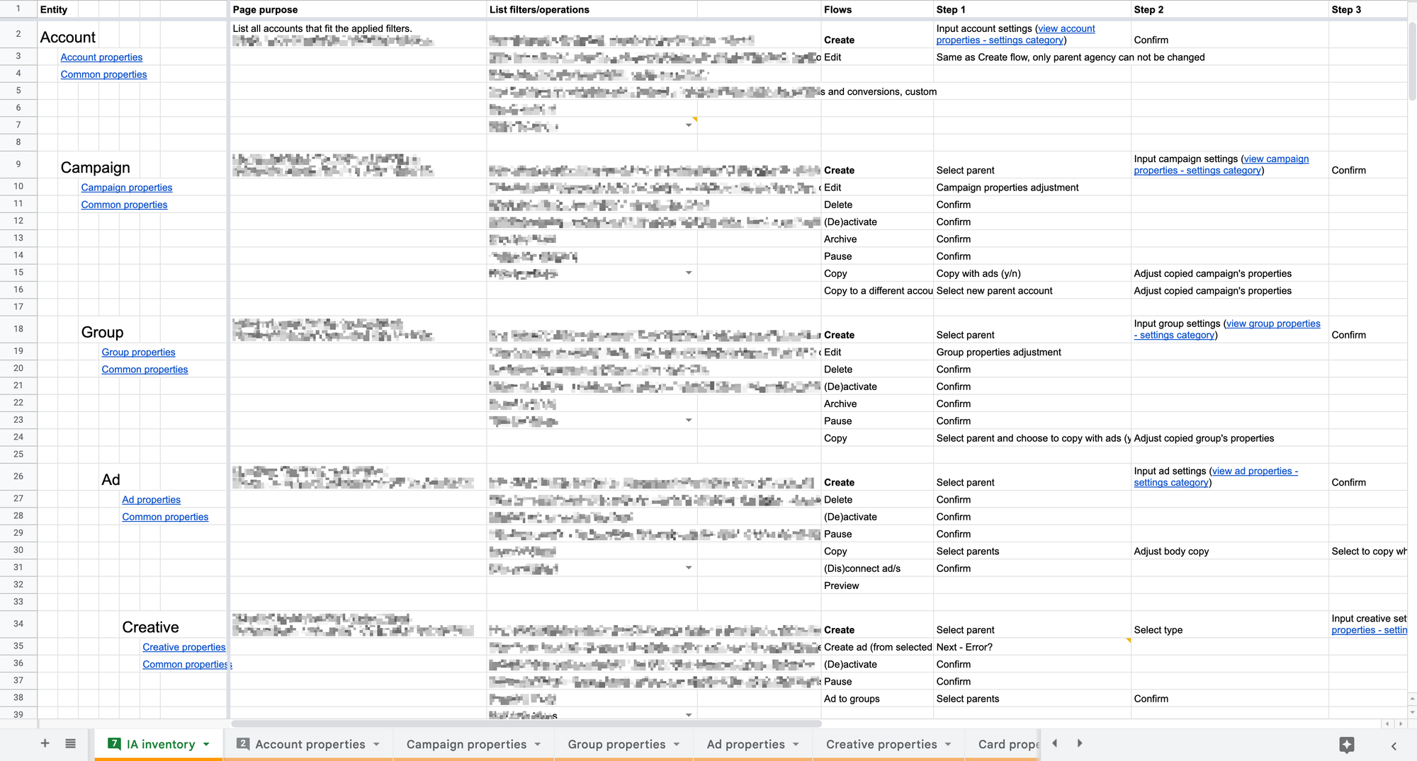
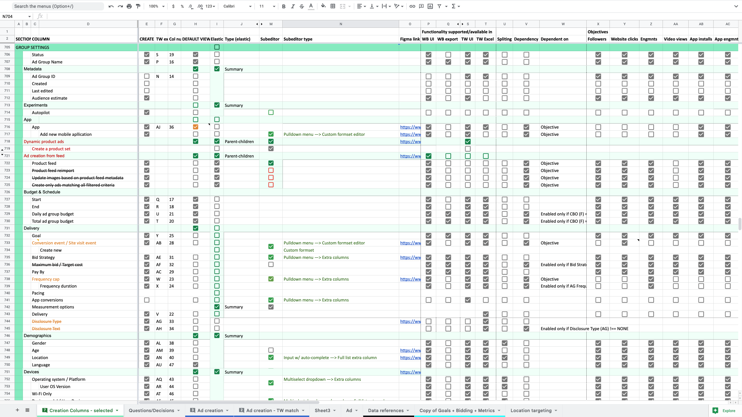
The next milestone was rendering the entire data model as a read-only Supergrid, and determining optimal views and UI micro-interactions needed to display, navigate, and make sense of enormous amounts of data.
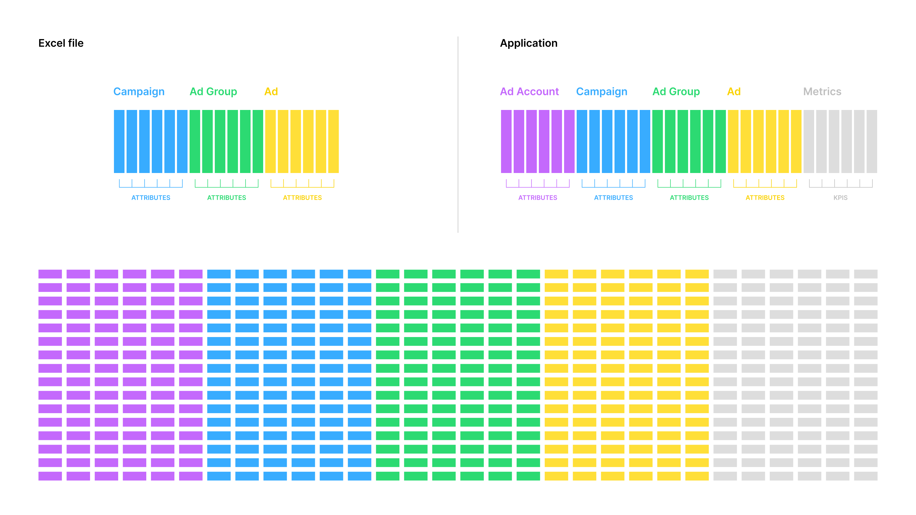
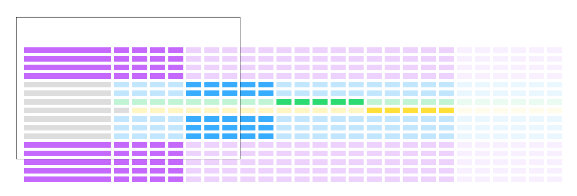
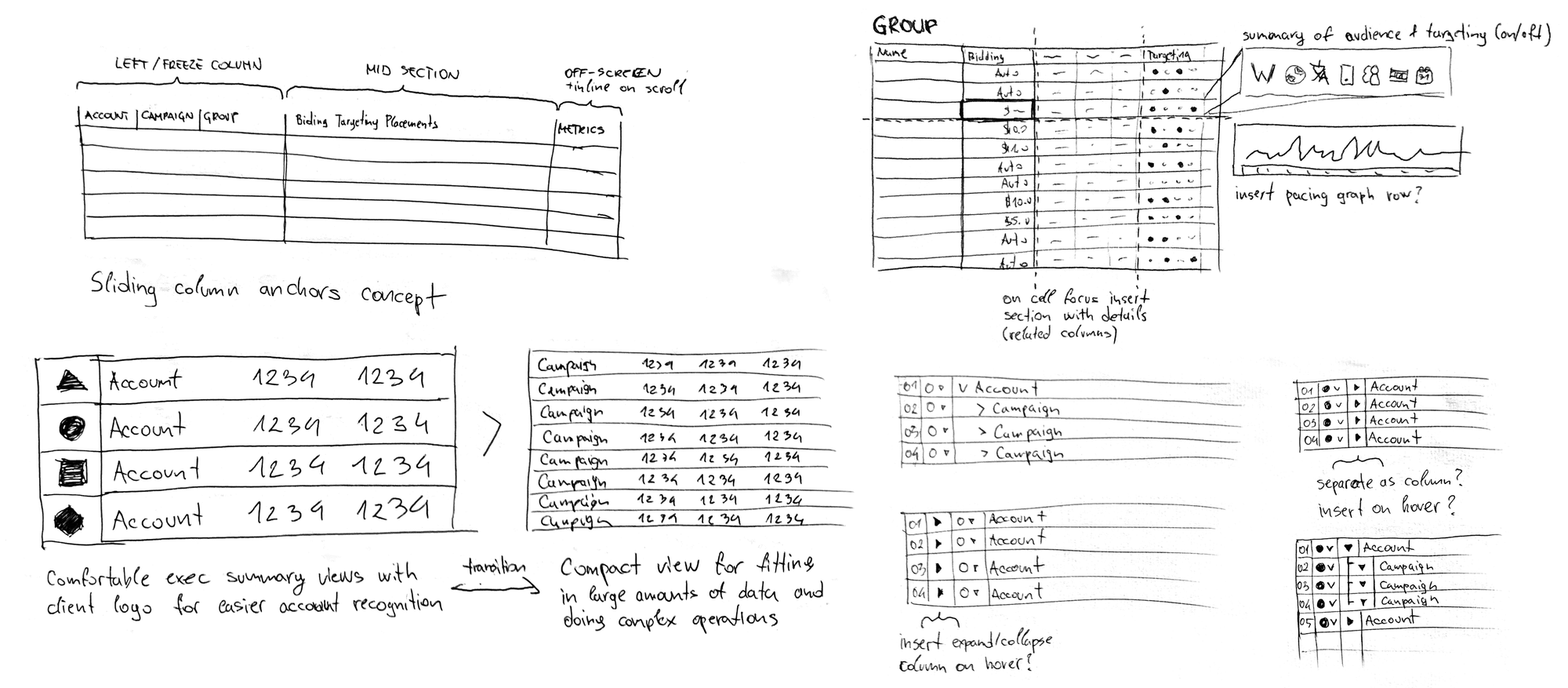
Supergrid structure drill-down schematics
The lead dev and I designed the core of Supergrid UI by rapid prototyping with code over the course of the next month. We iterated with hourly mockup to code cycles, together scrutinizing ideas, assessing UX of implementation experiments, and weighing trade-offs until we solved all key usability areas.
Rapid prototyping timelapse
Now we had a fully functional prototype. The app front-end was there; it just had no back-end to store data. However, we could simulate the UX of all key campaign management functionality with it. It was time to expose our assumptions to real users.
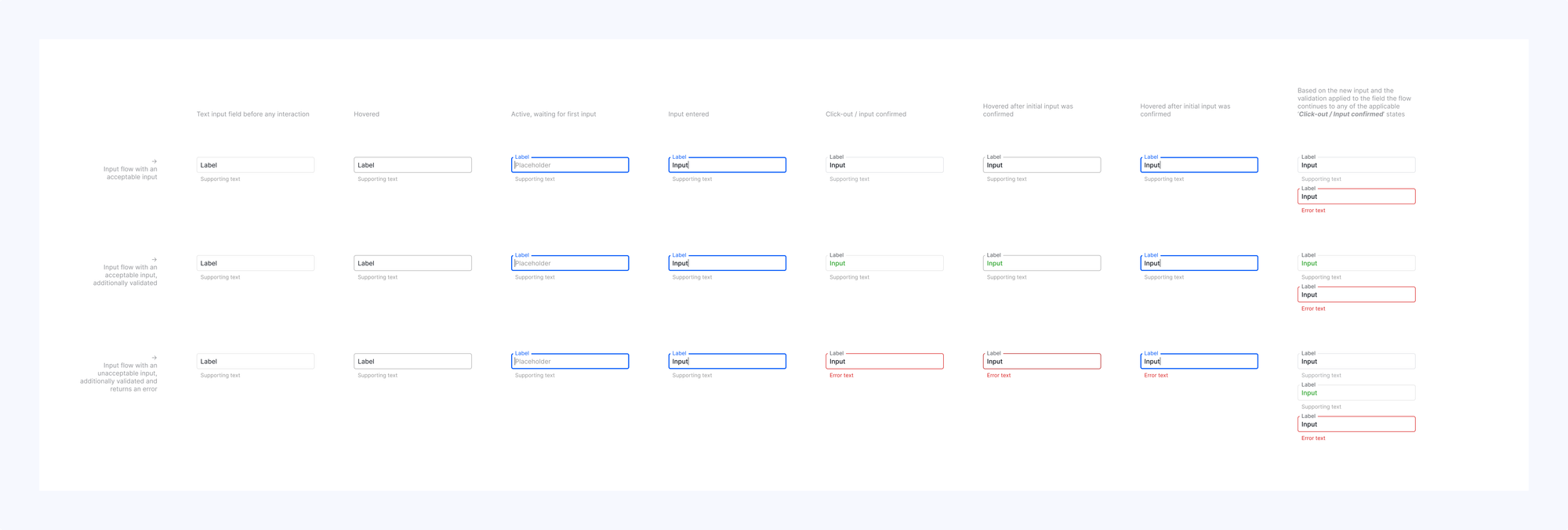
User research, usability testing, and participatory design
Commitment to allocating resources for months-long MVP development was conditional on product validation.
Would the spreadsheet UI be too abstract for users who are used to wizard-based campaign creation and classic app UI with record lists and entity detail pages?
How intuitive is the Supergrid UI? Where do our solutions break? Where does input data come from, and in what form?
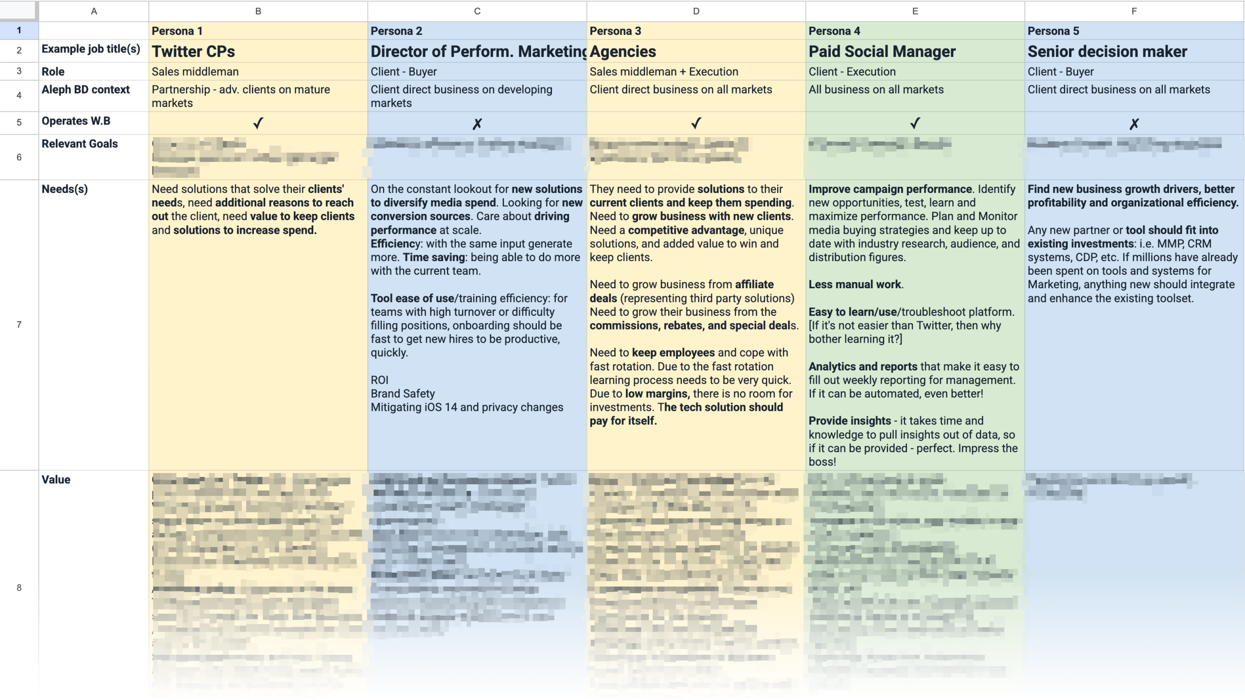
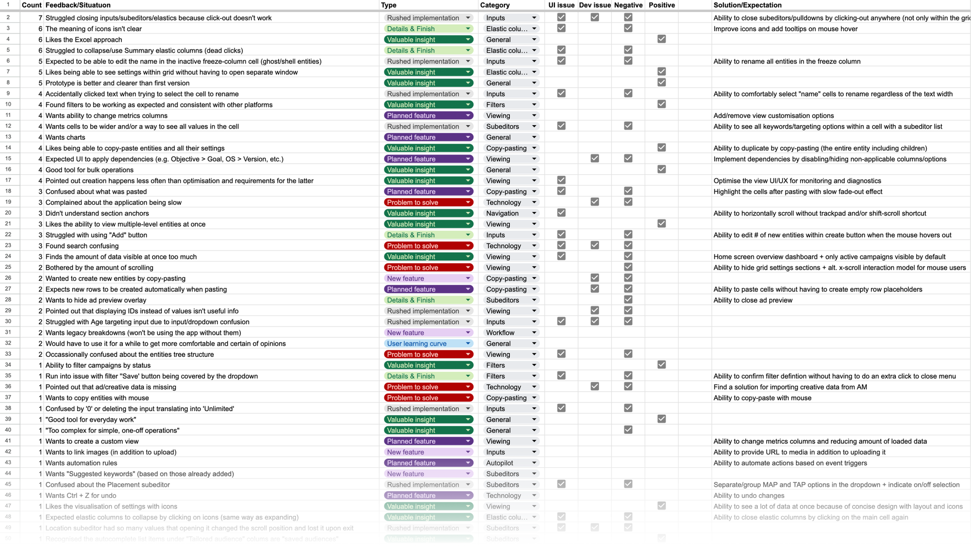
Core insights:
- Social media native ad managers with "1-2-3-launch" wizards are a design compromise needed to cater to both SMEs and in-house ad operations run by international brands.
- Native ad managers leave a lot to be desired for sophisticated agency power users who run orders of magnitude more complex operations that involve operating hundreds of ad accounts and thousands of campaigns.
- Campaign managers spend most of their time monitoring and optimizing campaigns on a daily and weekly basis.
- Creating campaigns and onboarding new clients happen less frequently but takes a lot of manual work inputting data and navigating app menus.
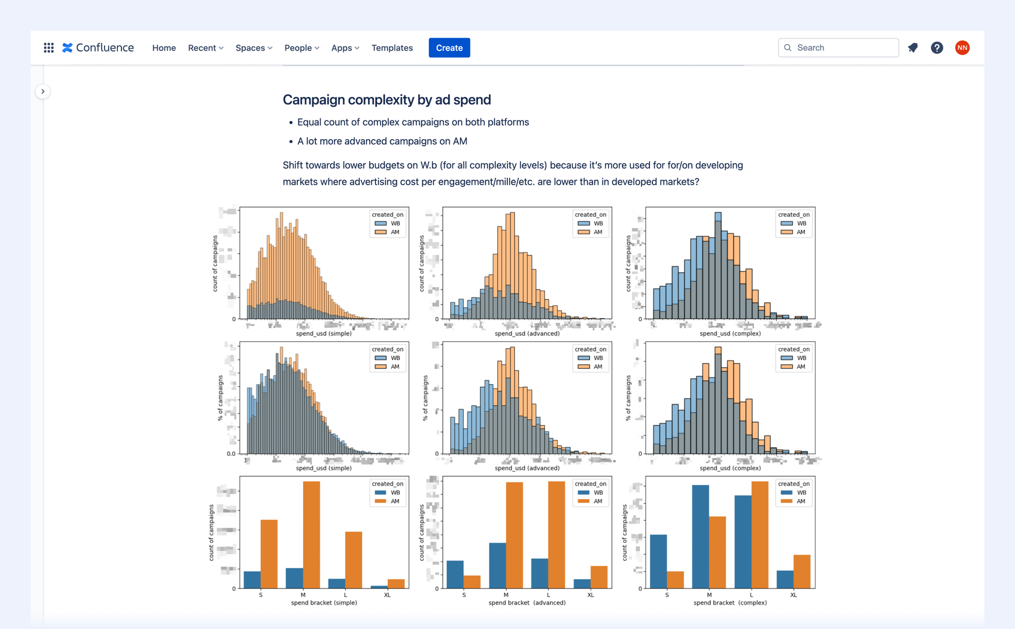
- Campaign managers use standardized "campaign map" spreadsheets, which contain campaign metadata, audiences, targeting settings, etc., to align with client advertisers, obtain approval, and prepare data for copy-pasting into ad management platforms.
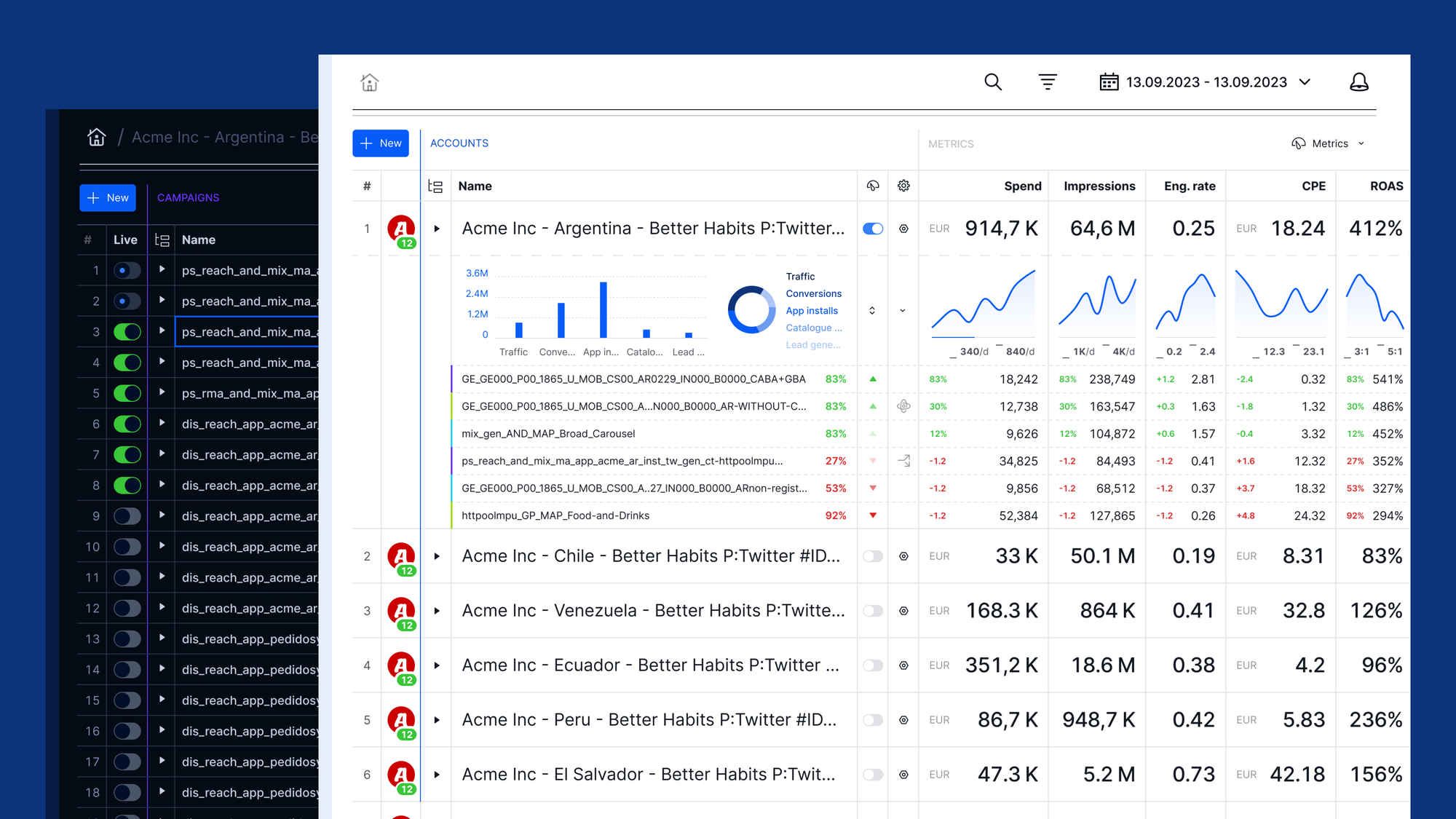
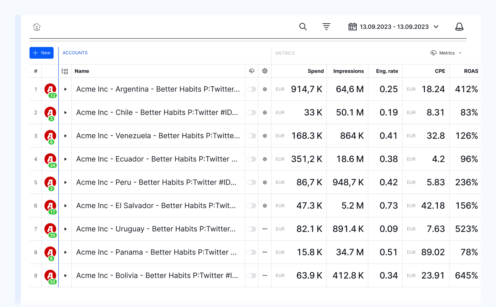
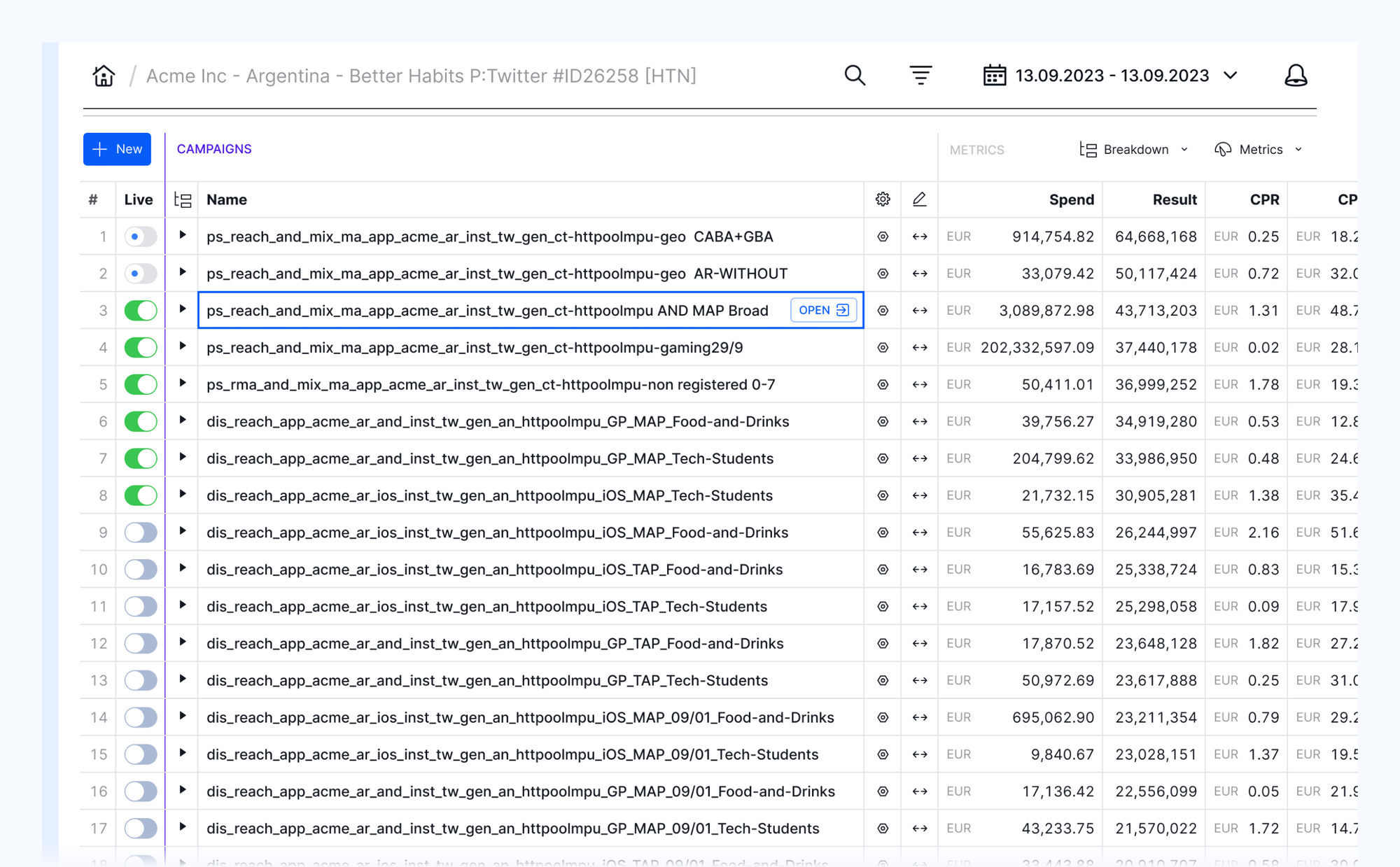
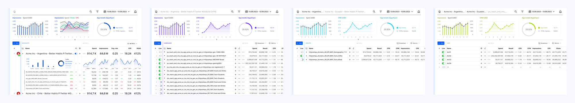
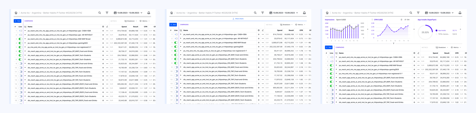
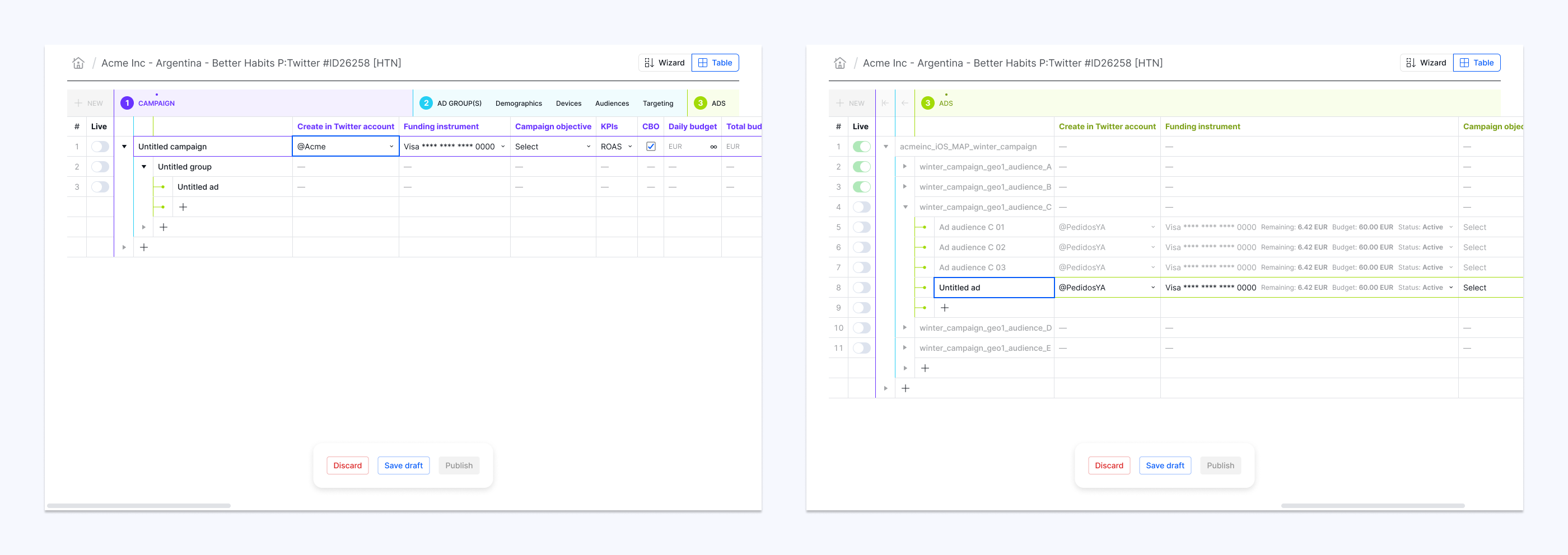
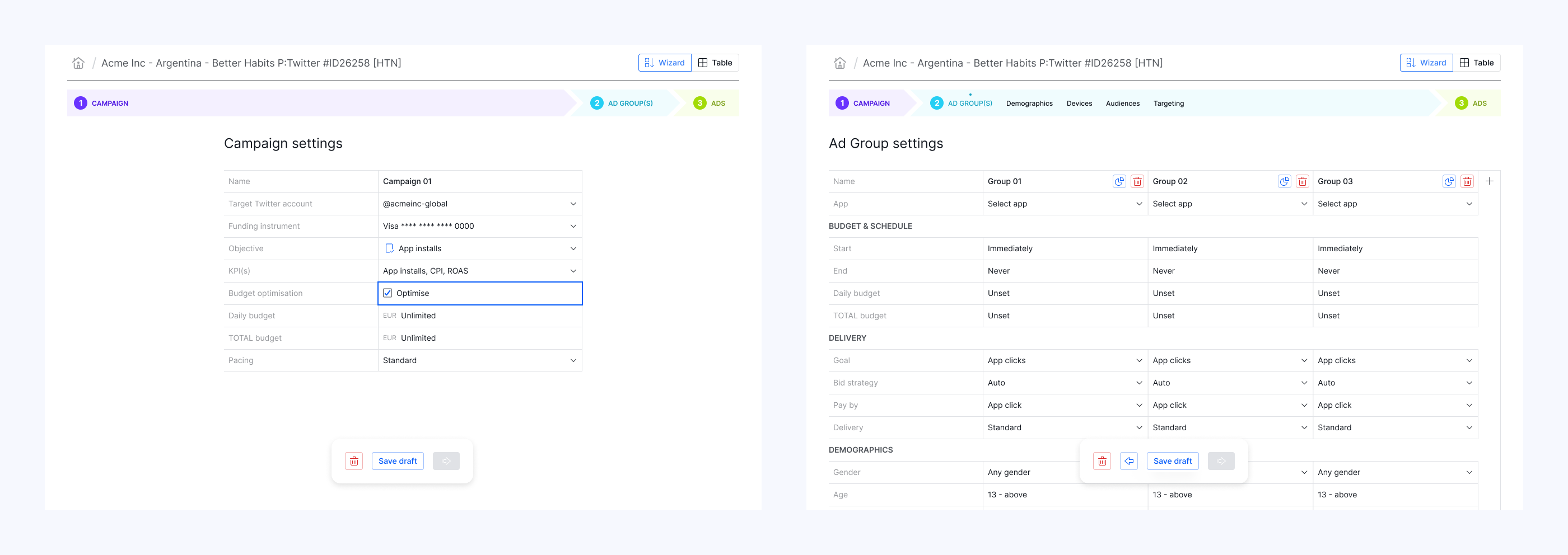
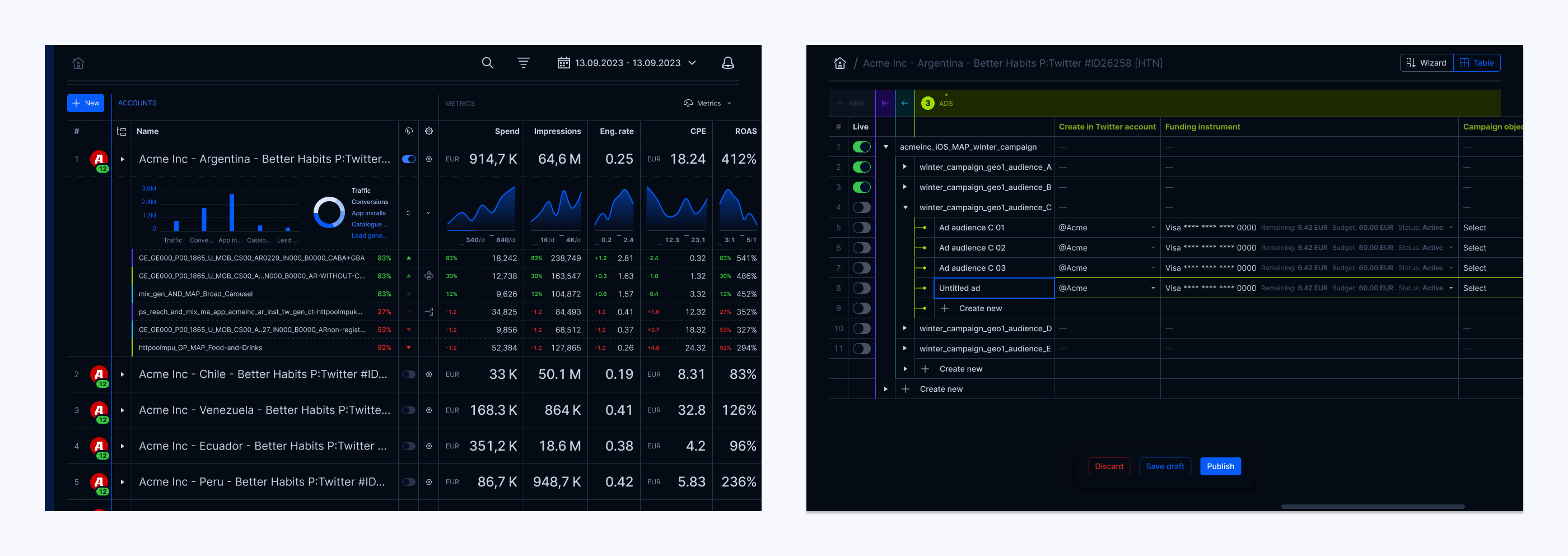
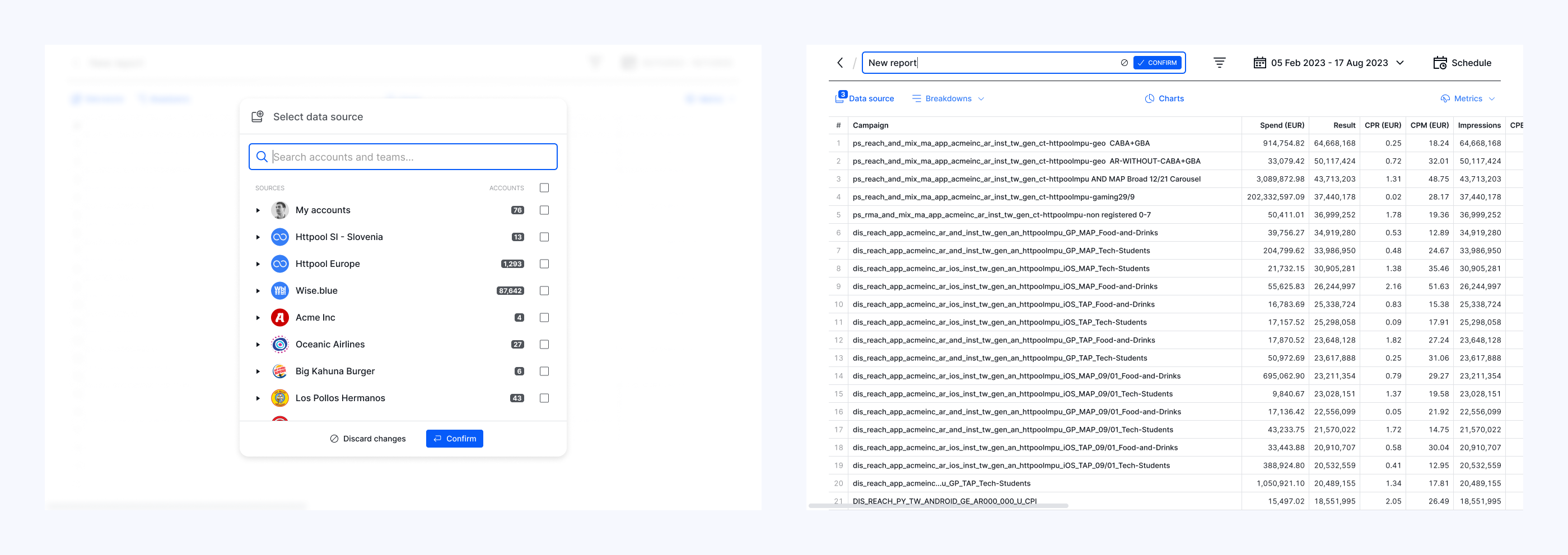
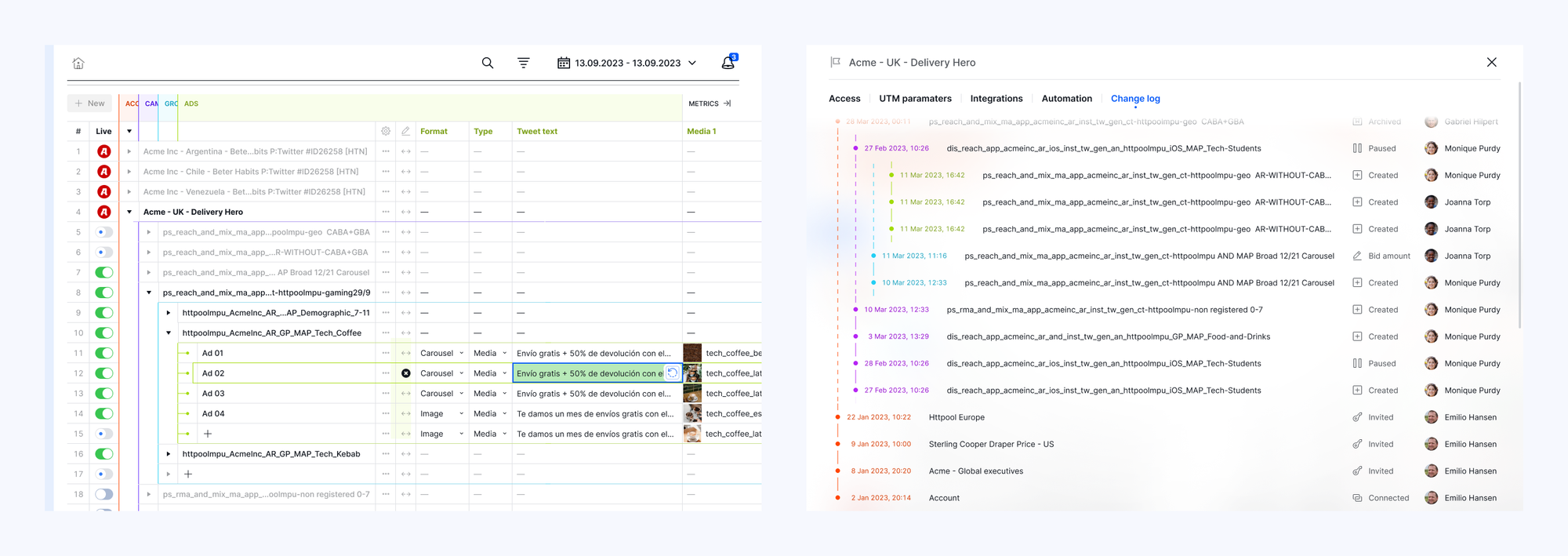
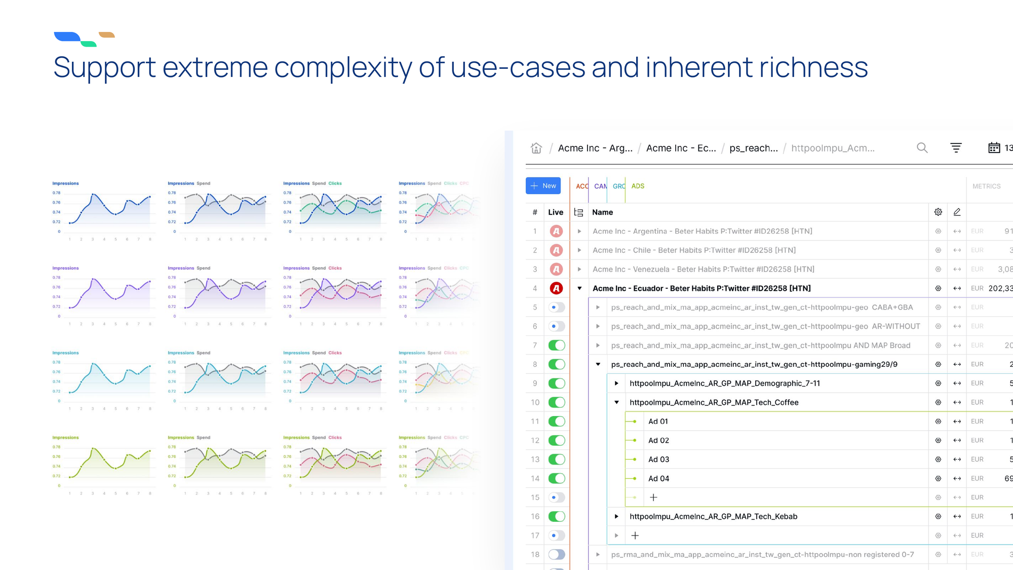
Campaign management Supergrid
With product validation and a fully functional prototype of the Supergrid in place, it was time to deliver the MVP capable of supporting E2E campaign management, reporting, and back-office platform administration.
The engineering team attacked the back end, refactoring the Supergrid code to production-ready standards, and developing the rest of the front-end functionality.
Equipped with in-depth understanding of users and workflows, the design team deep-dived into UX+UI design, streamlining of workflows, and addressing feature requests where applicable.
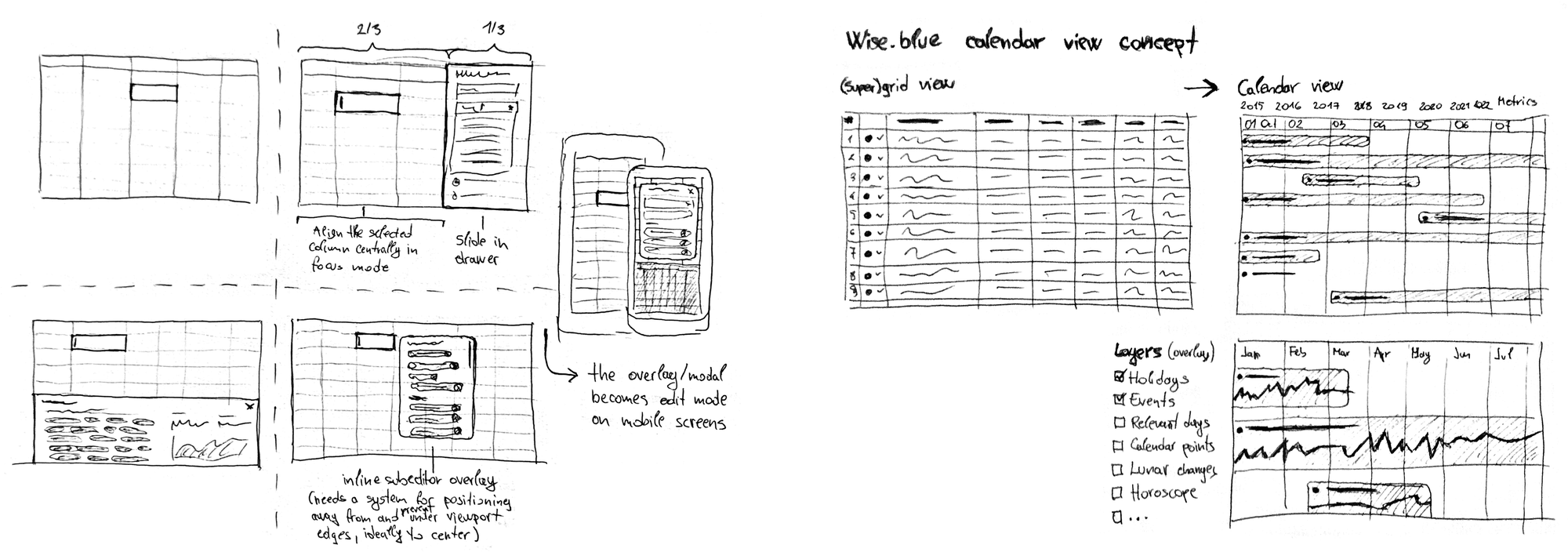
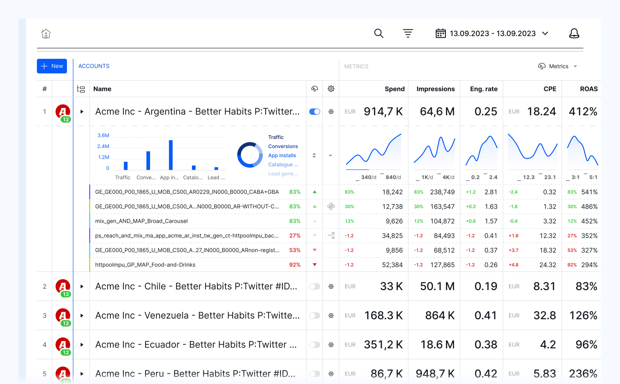
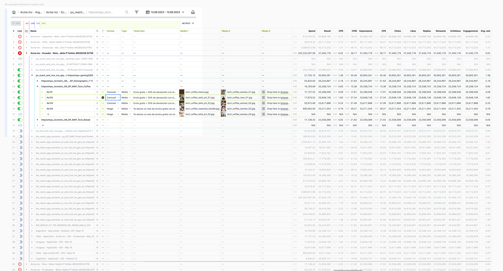
Entity anchor links for easier 2D orientation and navigation support for 2nd screen use-case with external mouse and no horizontal scrolling
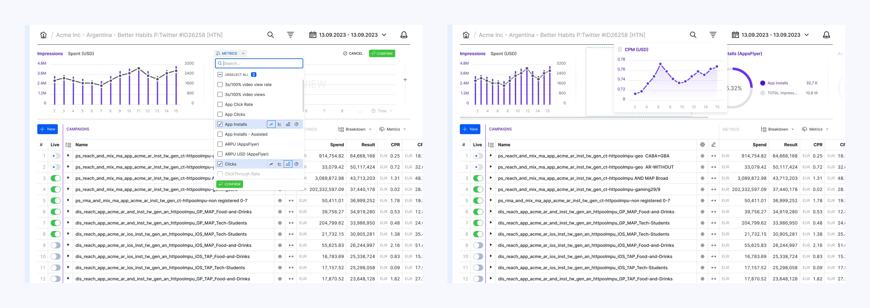
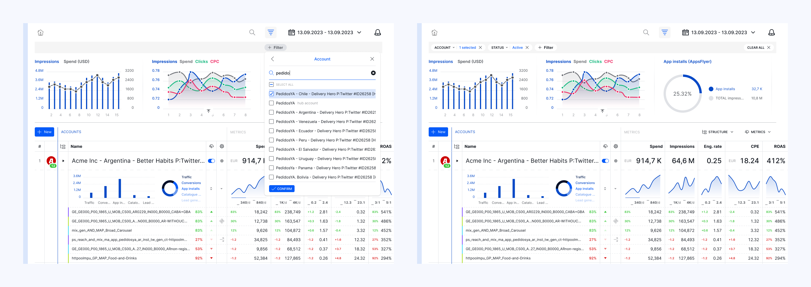
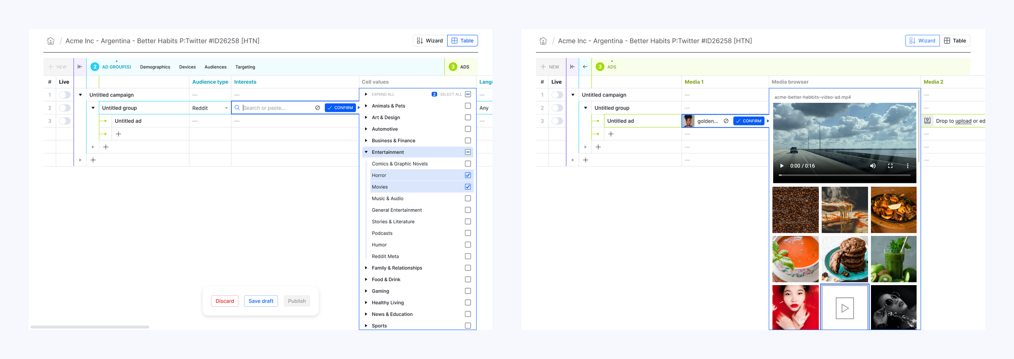
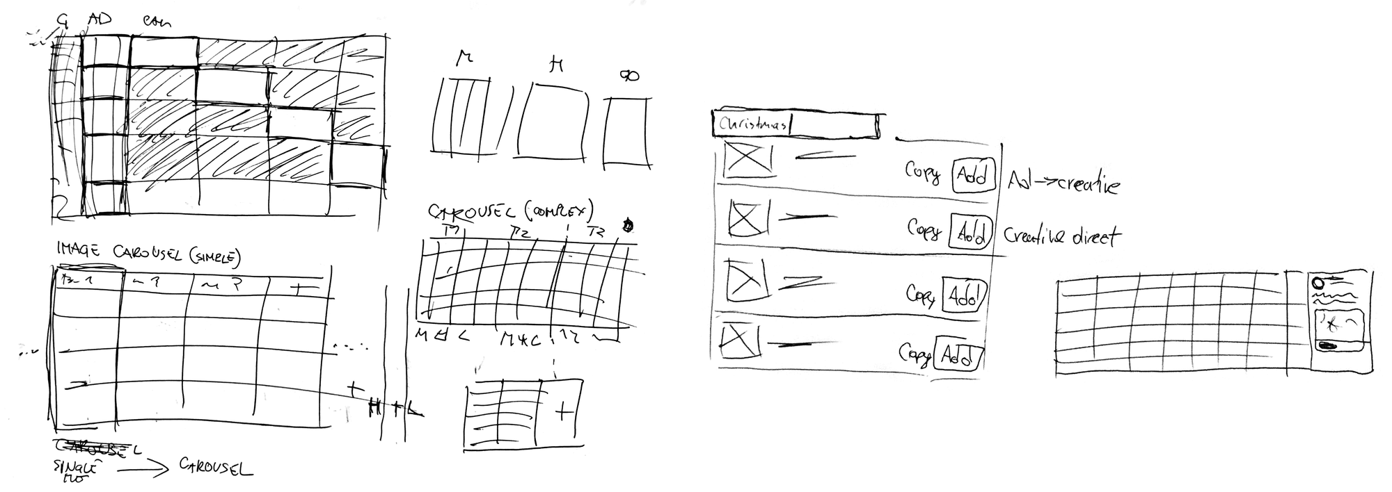
Smart copy-paste with structured-data formatting and API matching
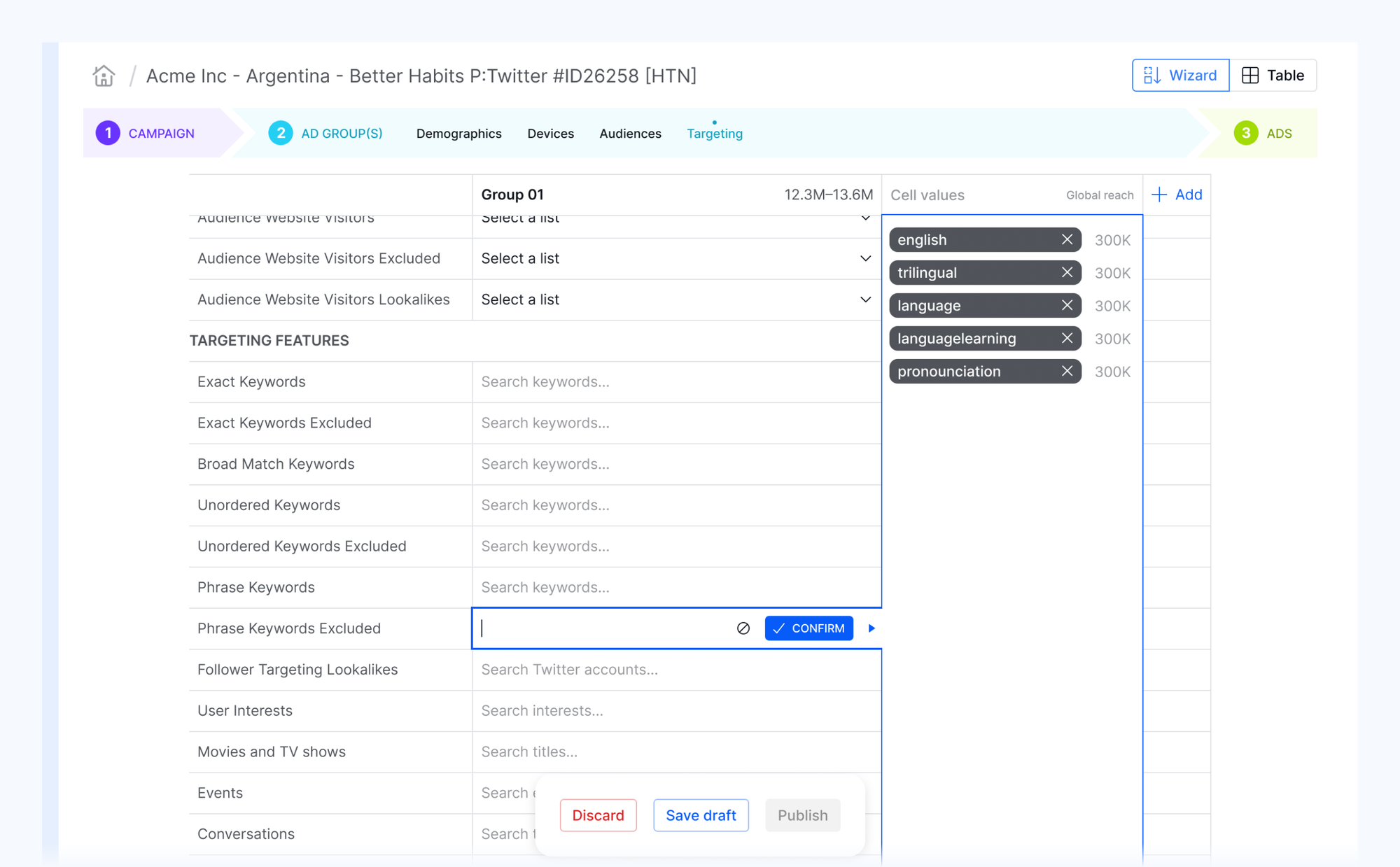
Flash Fill: to provide essential powers of Excel in the app, we reimplemented the famous feature for the most common pattern operations.
To make monitoring of complex campaign structures easier, and make sense of reporting data across multiple systems, campaign managers developed a practice of naming entities by their key settings and values (e.g. targeting). A universal peculiarity of the AdOps world. They often prepare text in advance of campaign creation by copy-pasting the variable parts and using spreadsheets Flash Fill to achieve all permutations.
Naming macros: enables users to generate names by using "$variables" in the name column in combination with the Flash Fill feature to automate the above procedure.
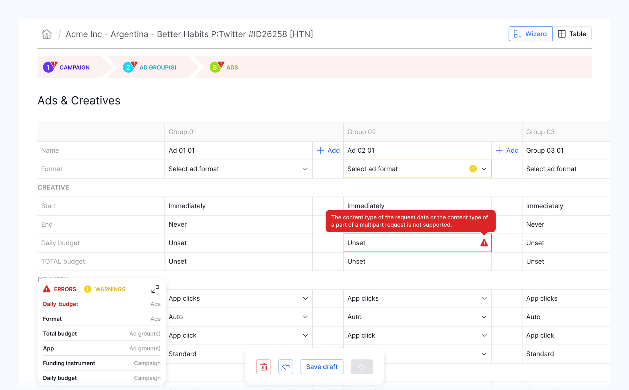
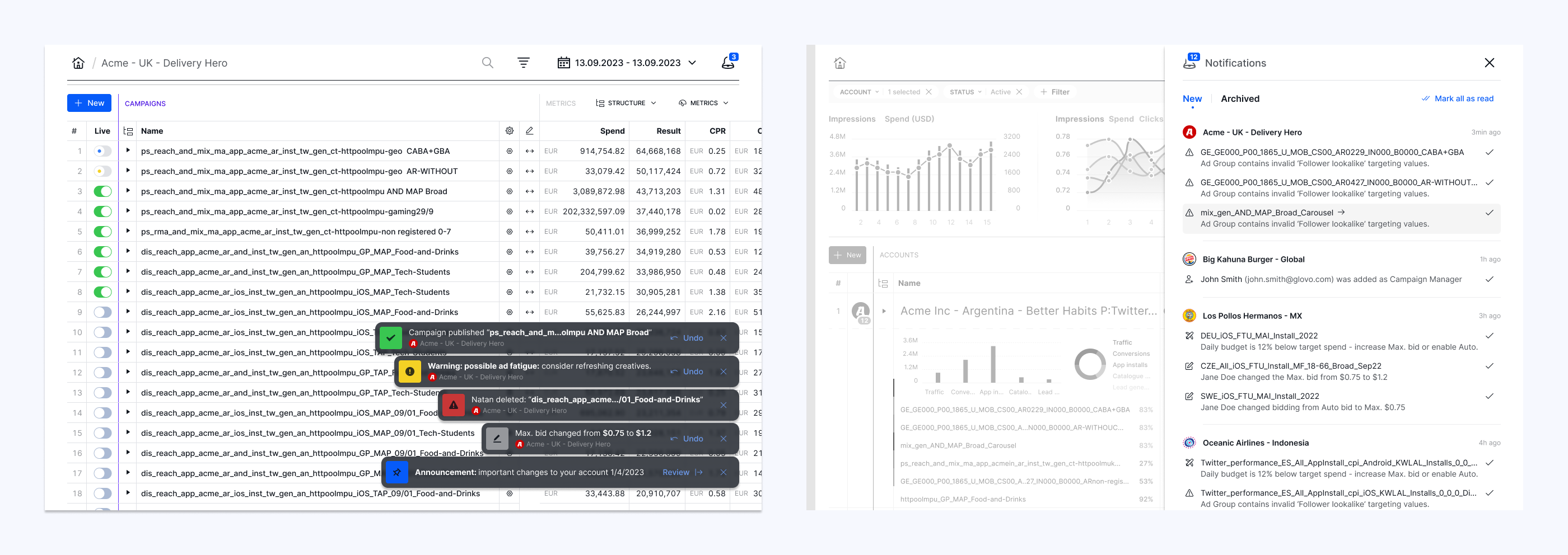
Engineering feat
When we implemented functionality that enables each user to customize their Supergrid view in any kind of configuration, the app became sluggish. Having to load hundreds of rows from three databases, merge them, and then correctly sort data became a computational overhead that drastically increased rendering time which called for a feature scale-back.
Instead, the engineering team reduced seconds to milliseconds by developing a backend pre-processor middleware that optimizes SQL queries. An invisible but crucial piece for a smooth, uninterrupted UX that enables users to stay in the flow with sub-second data/view changes.
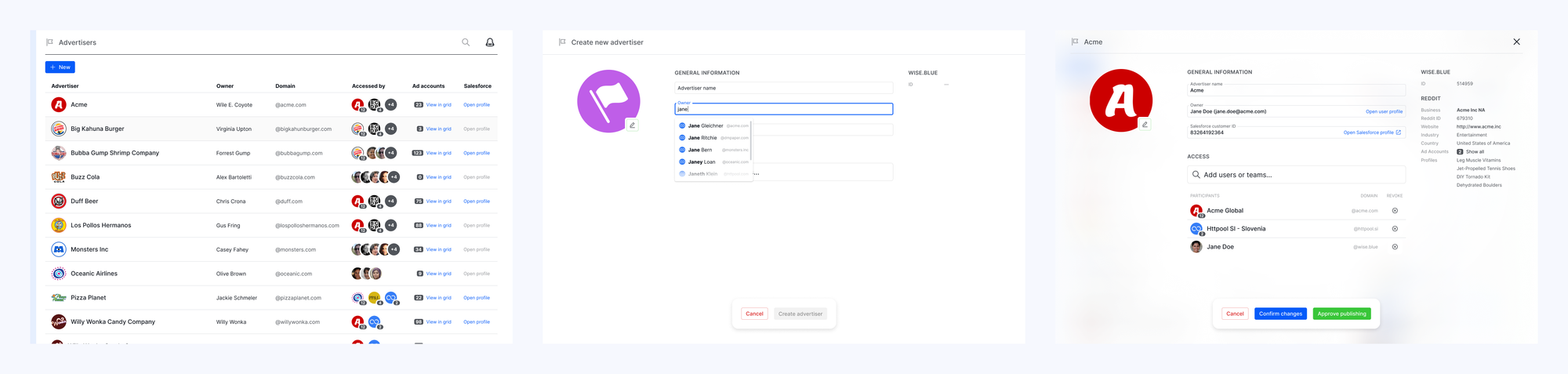
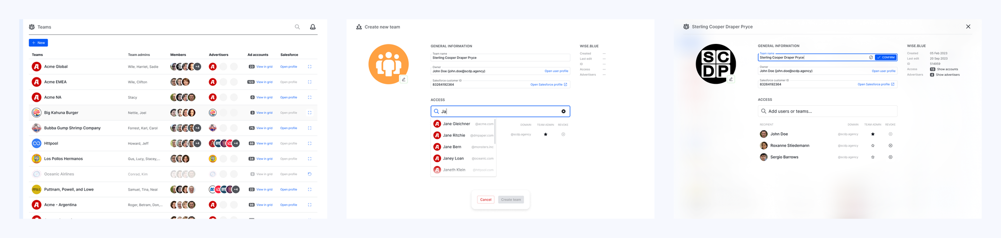
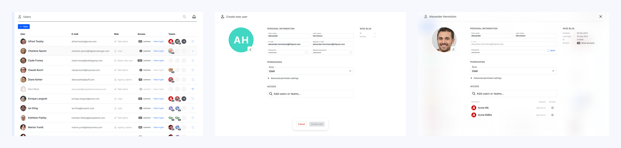
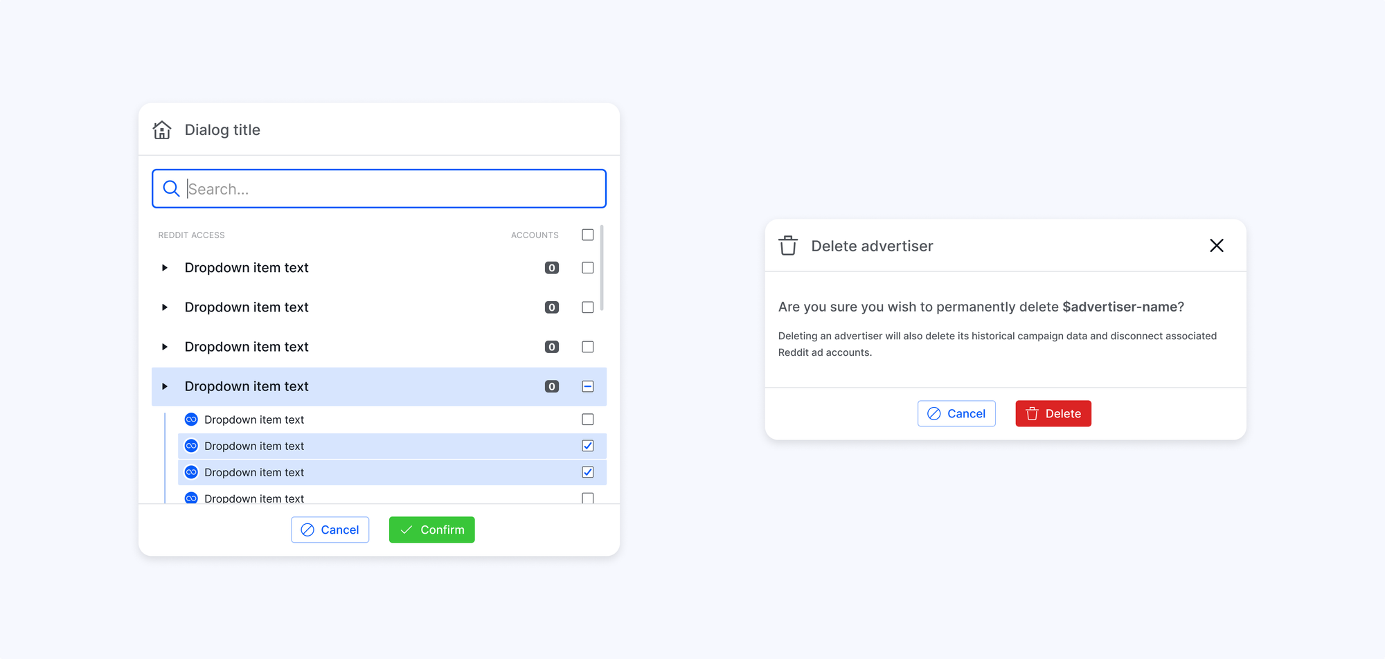
Platform architecture & admin UI
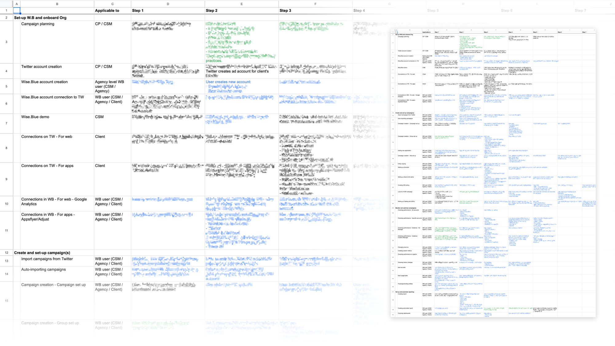
During the discovery phase, we identified several deficiencies and use cases that needed foundational changes concerning data entities, roles, and permissions.
The legacy platform allowed multiple external ad accounts to be connected to one Wise.blue ad account, which resulted in asymmetrical campaign structures and frequent user confusion. Also, the existing architecture did not entirely support workflows involving external agencies as clients and aggregating reporting data from multiple advertisers and ad accounts.
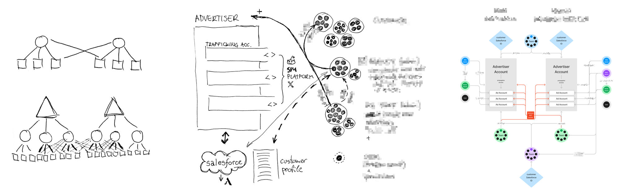
We redesigned the back-end architecture to achieve data symmetry, and introduced Agency Admin and Advertiser Admin roles to support business processes regardless of the organizational setup complexity. A new Team entity was introduced for bulk access management and cross-entity reporting based on the access graph.
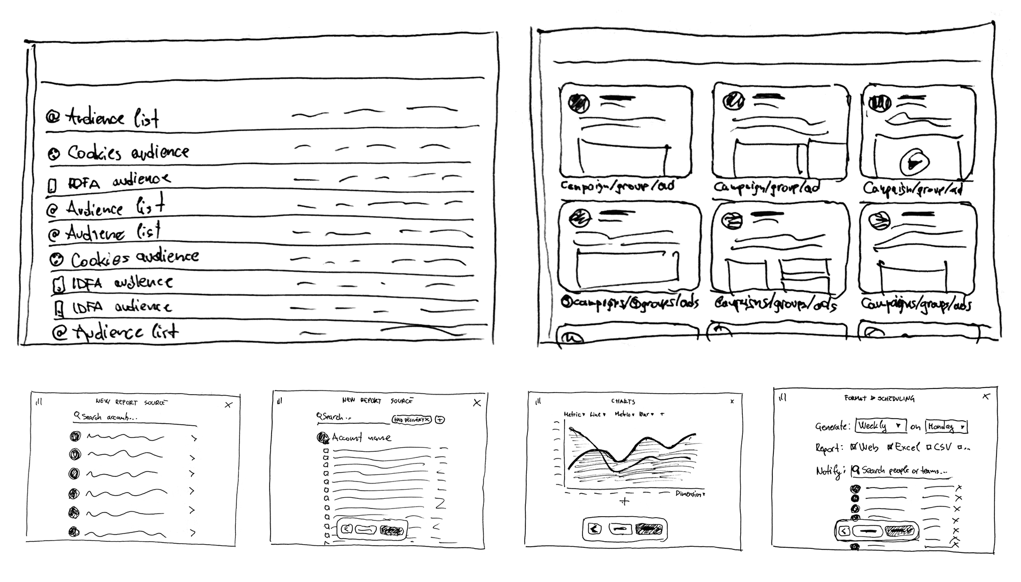
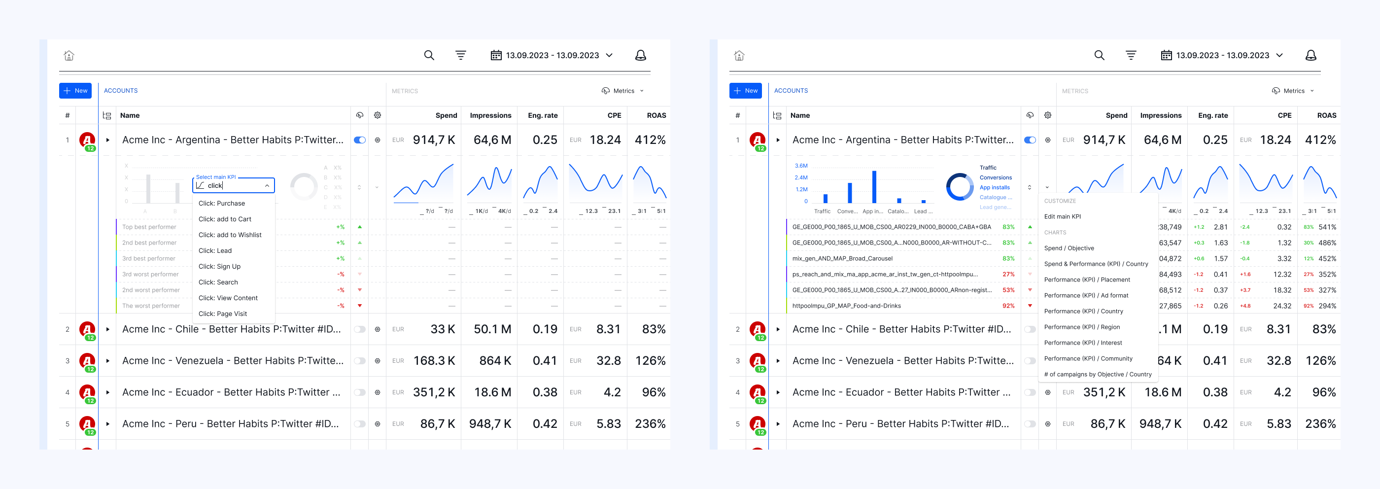
Reporting
In addition to the in-app report builder, which enables users to pull raw data, we created a Google Sheets add-on. It enables campaign managers to merge Wise.blue data with 3rd-party conversion trackers, create pivot tables, generate charts, link them within Google Slides reports for clients, and automate all steps for periodic updates with a refresh button.
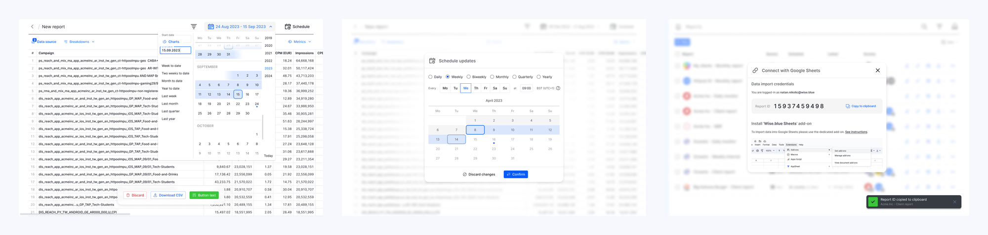
Notification center
We worked on a notification delivery system that decides whether a notification should be displayed as a toast in real time, added to the sidebar backlog in the background, or sent via email when the user is offline. Including user settings for more control over relevancy and allowed interruptions.
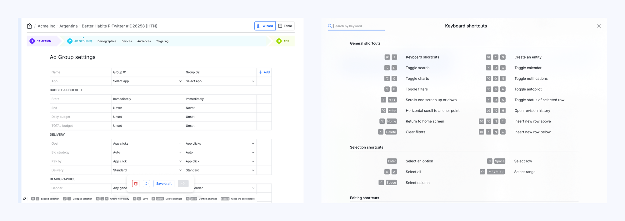
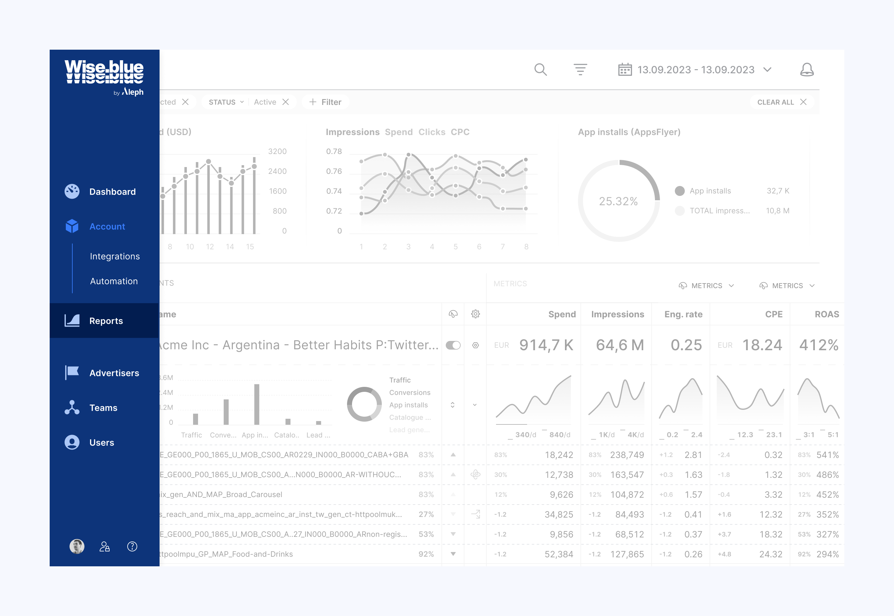
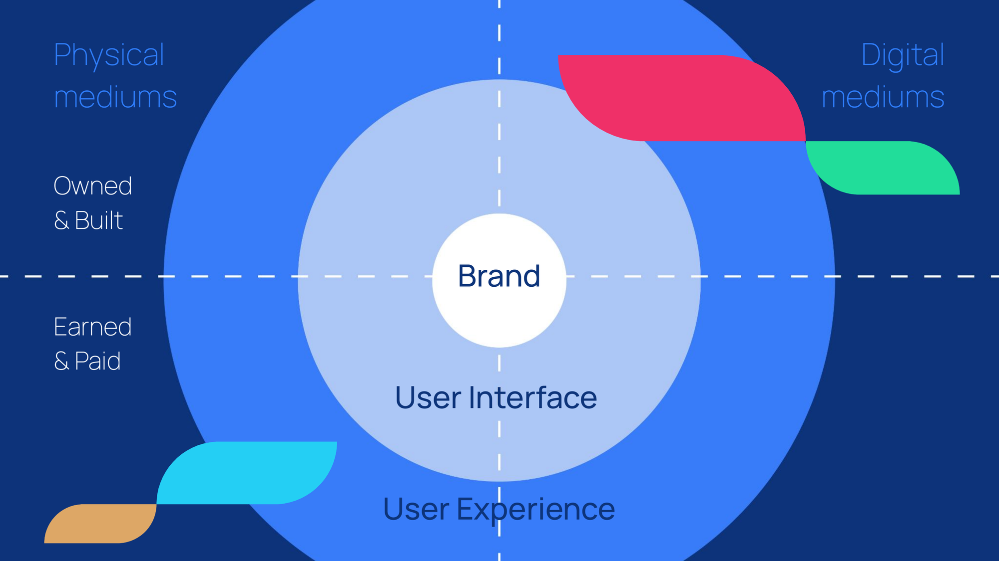
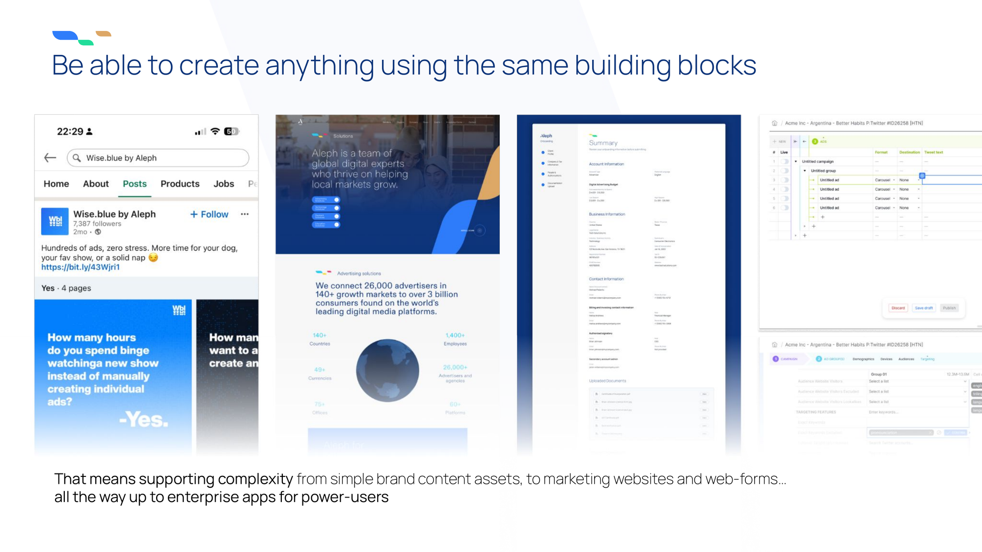
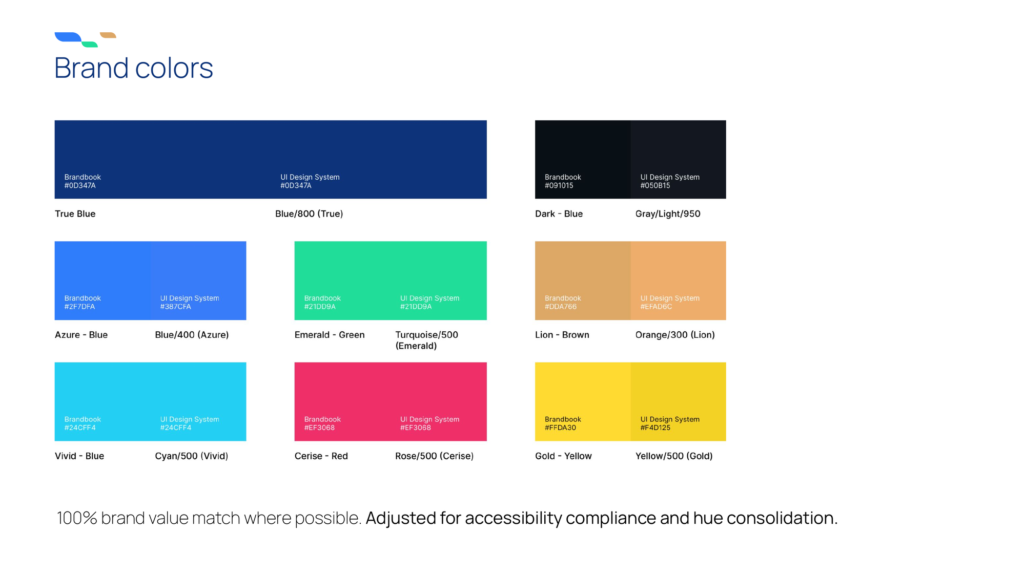
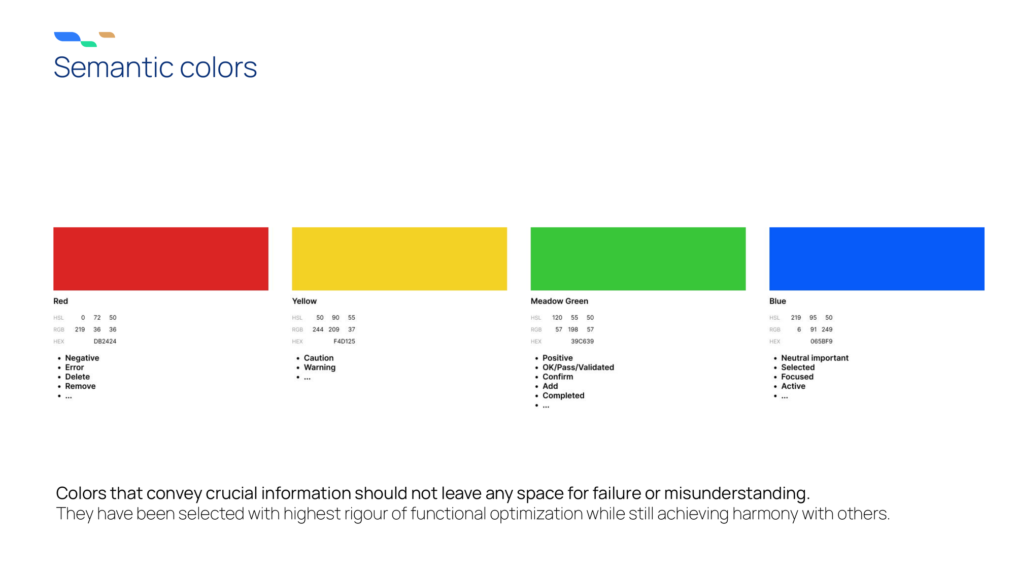
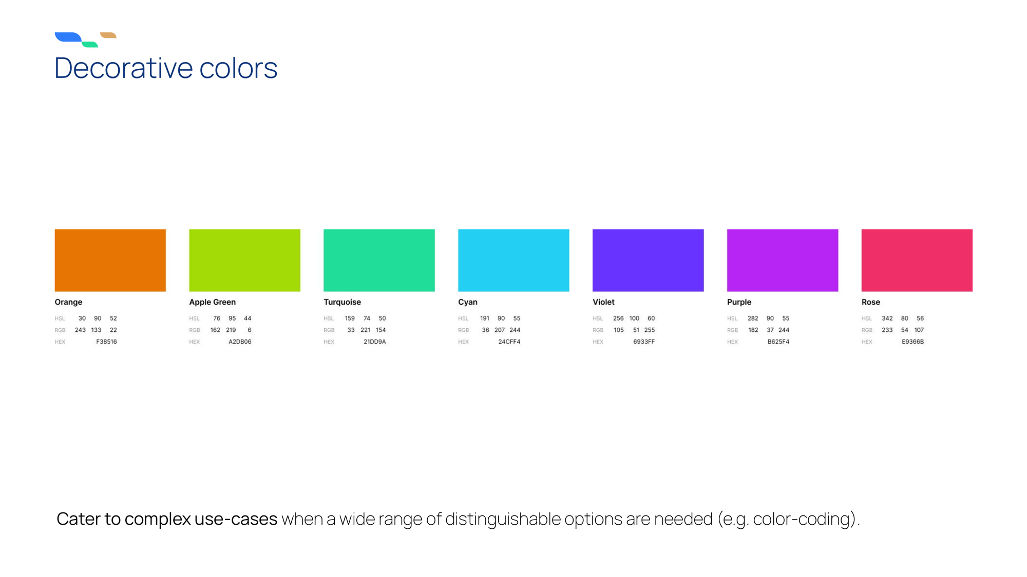
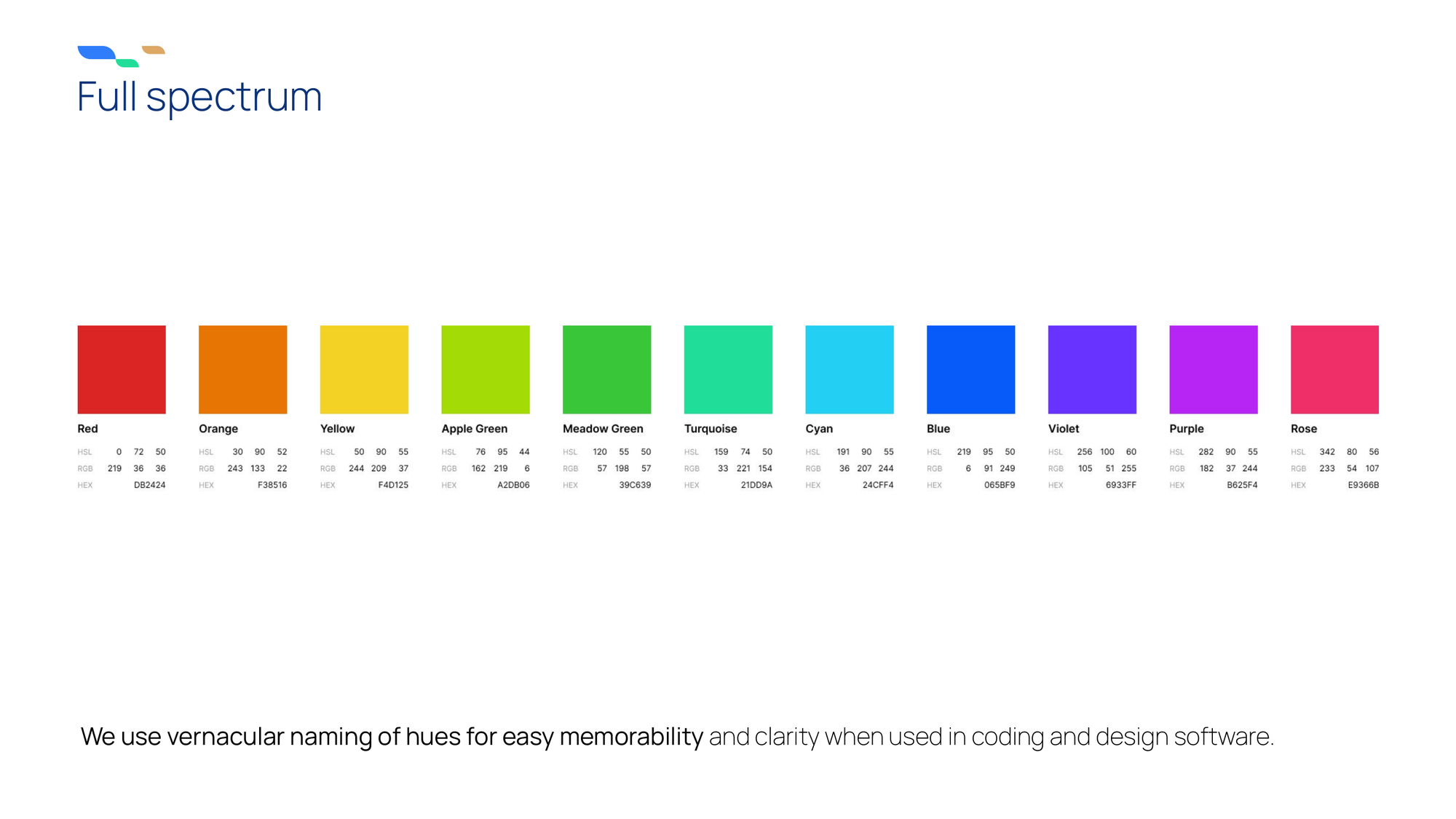
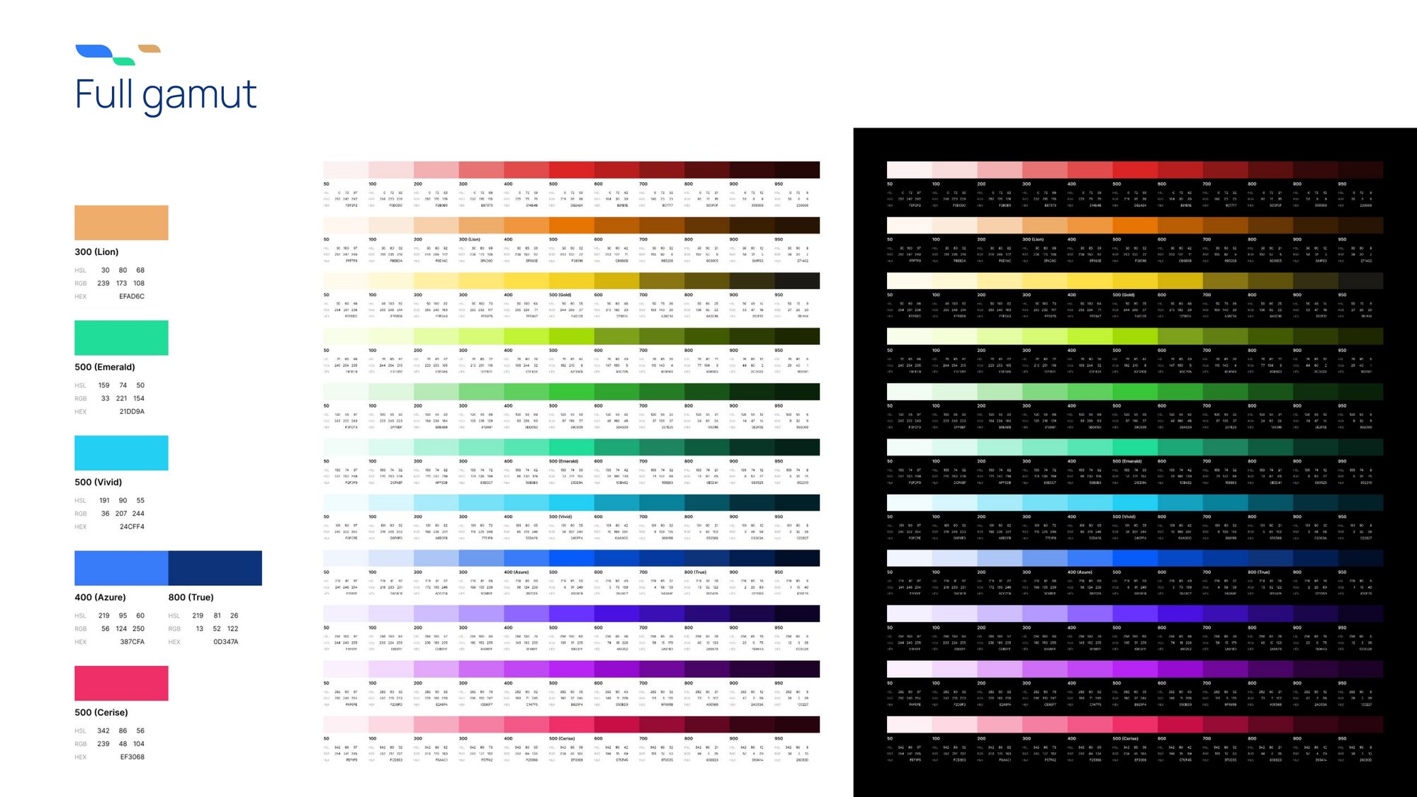
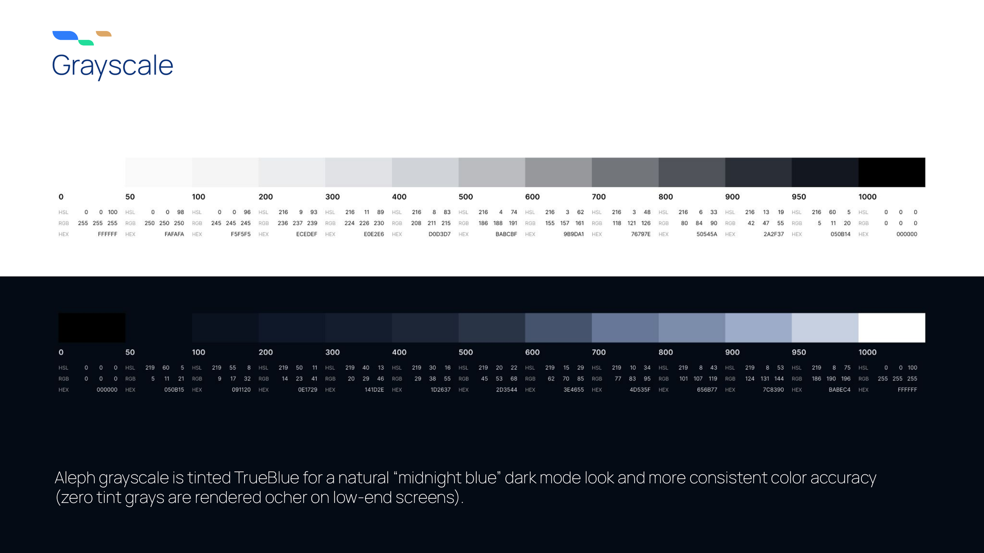
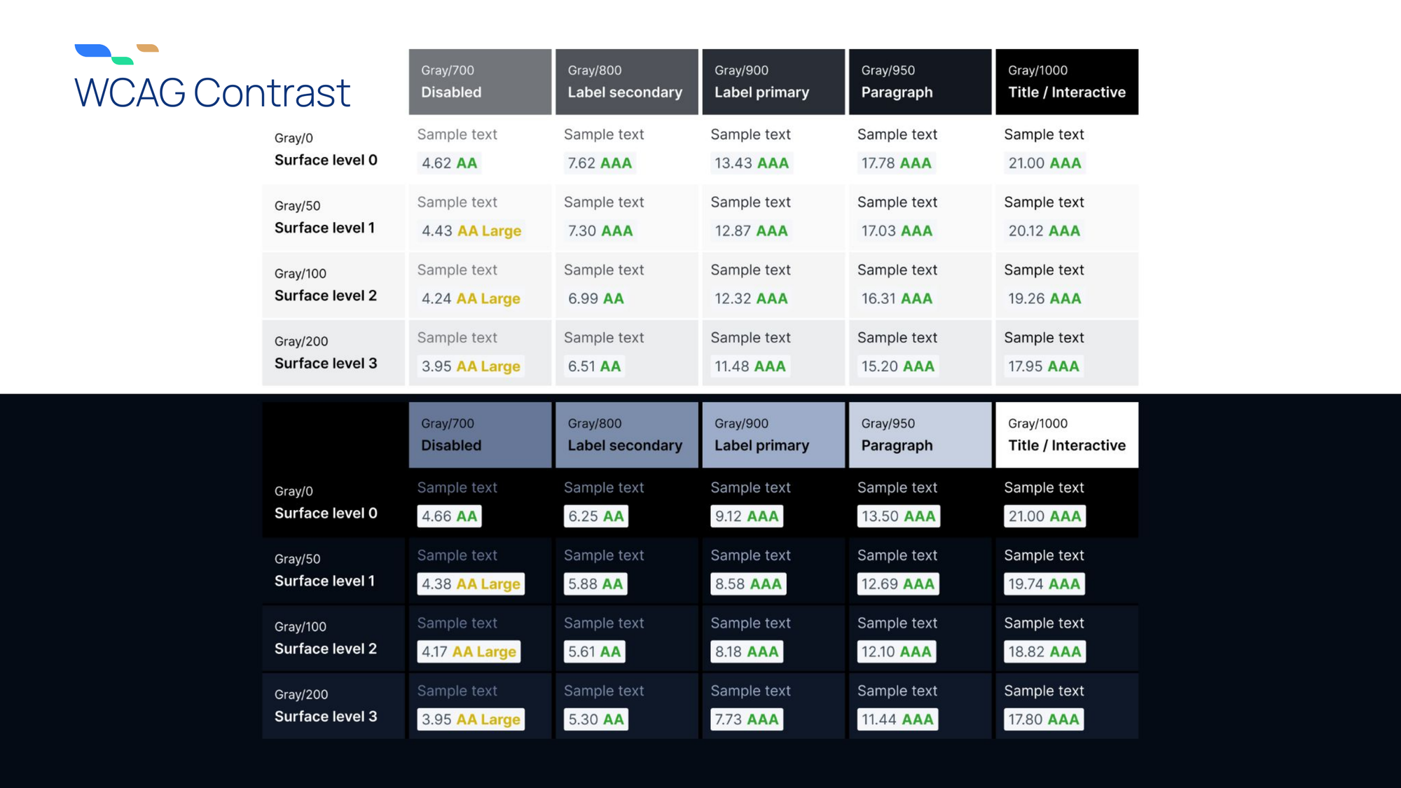
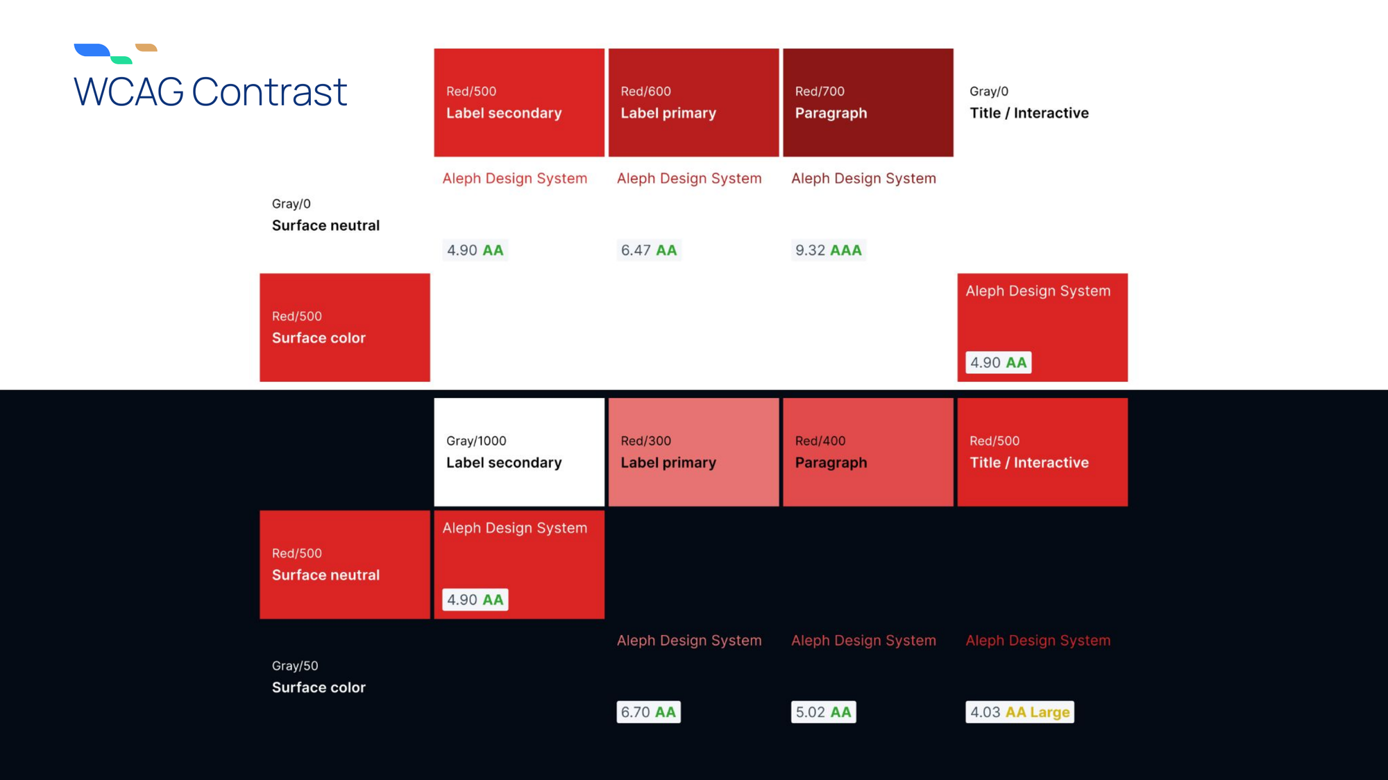
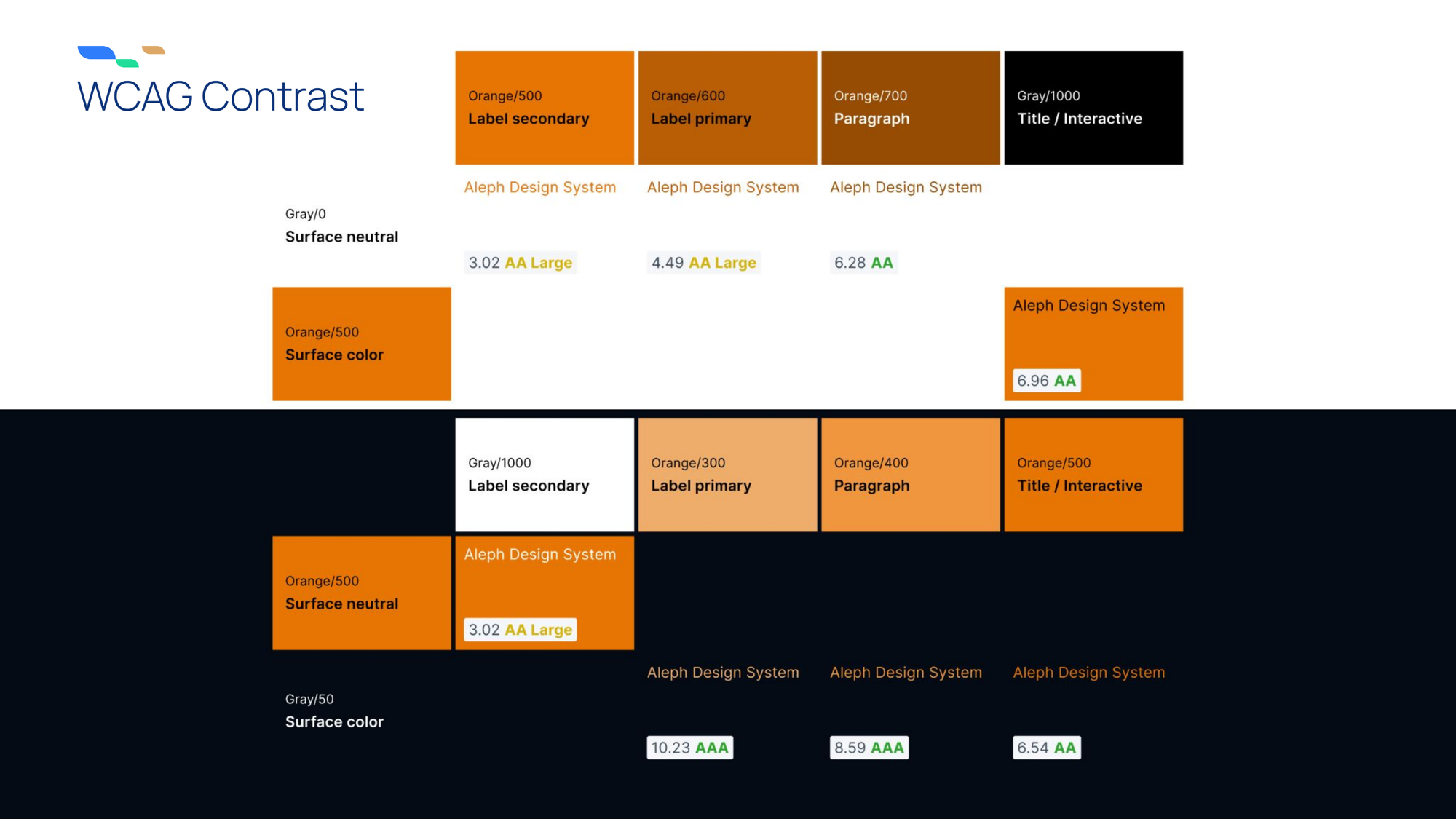
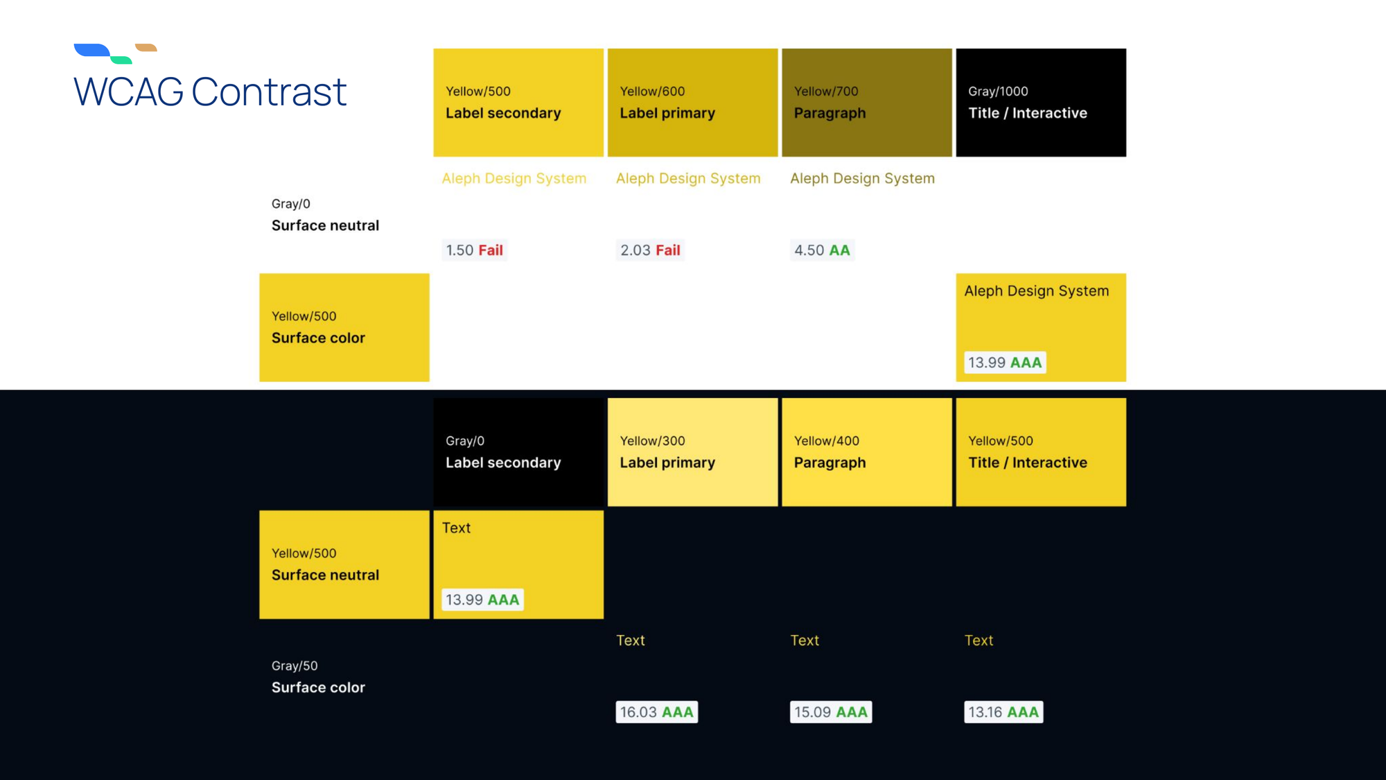
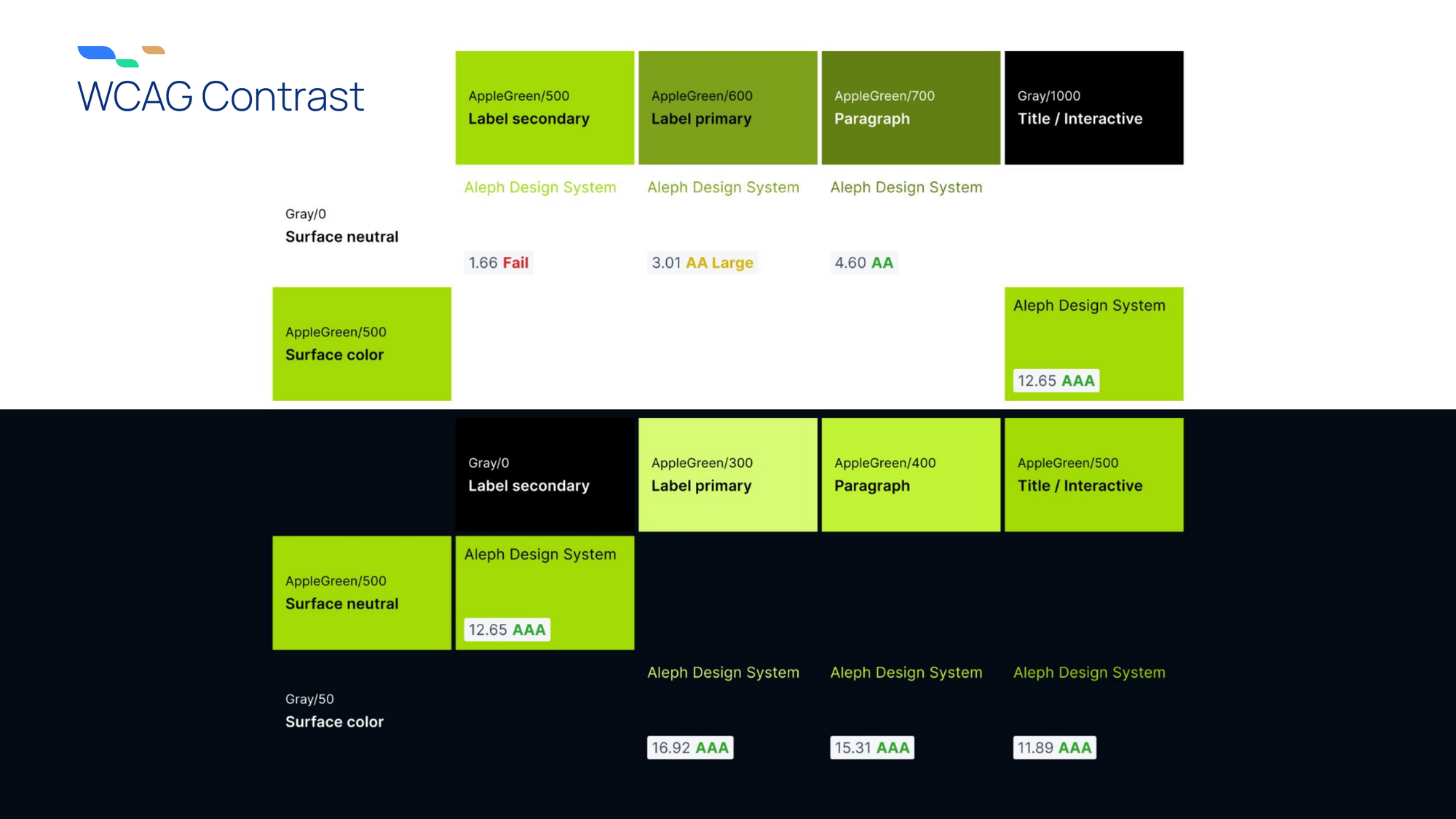
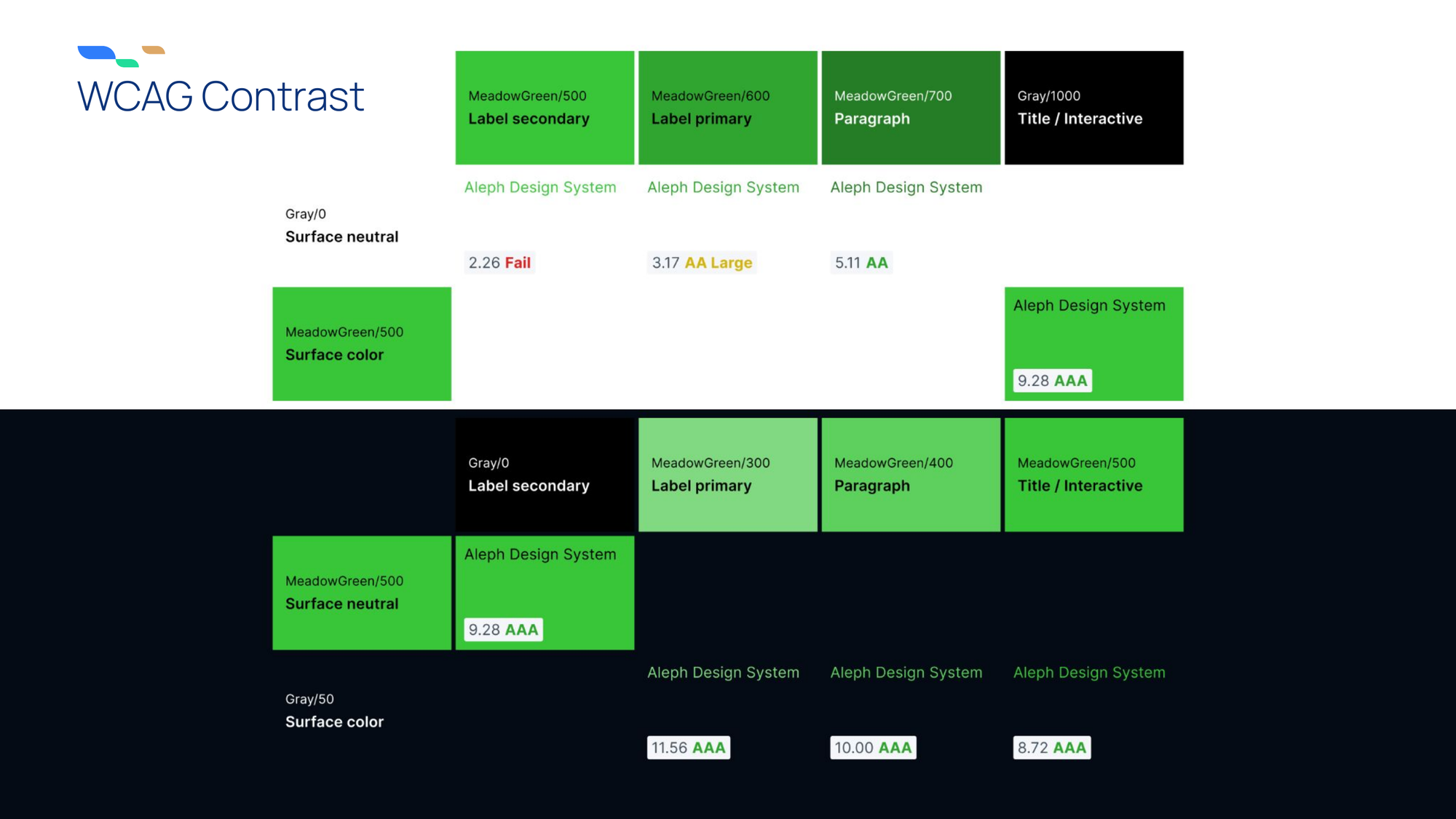
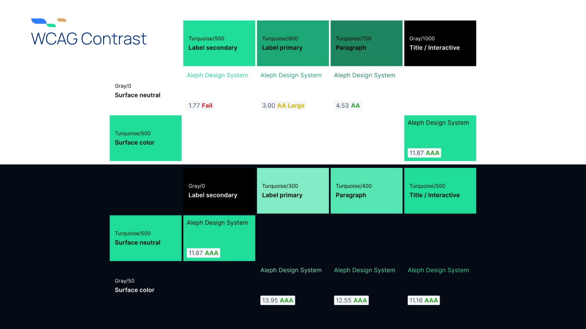
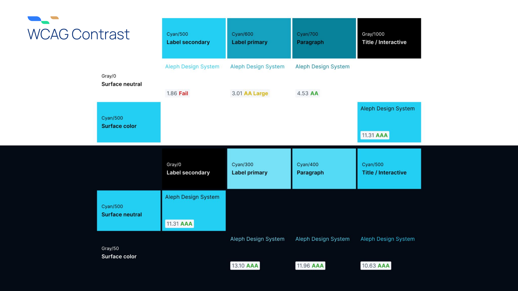
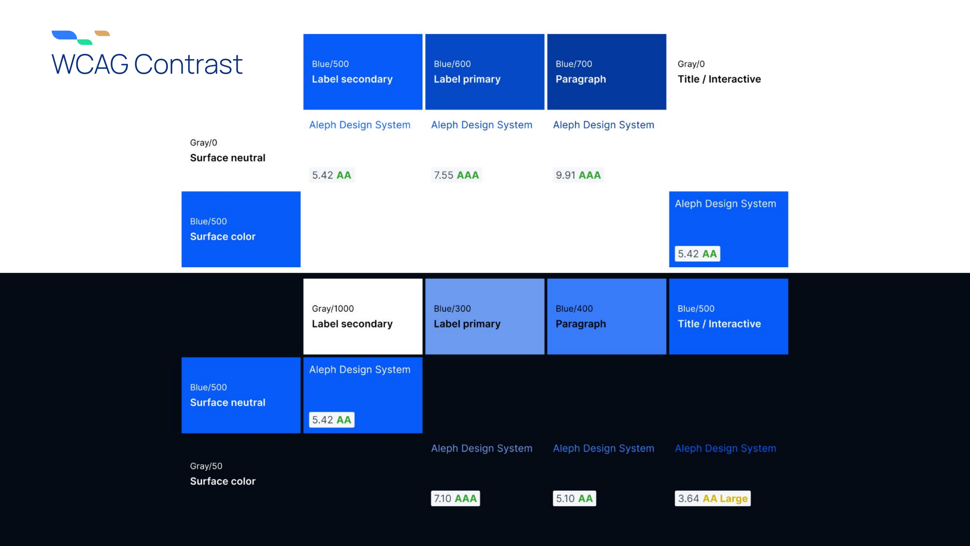
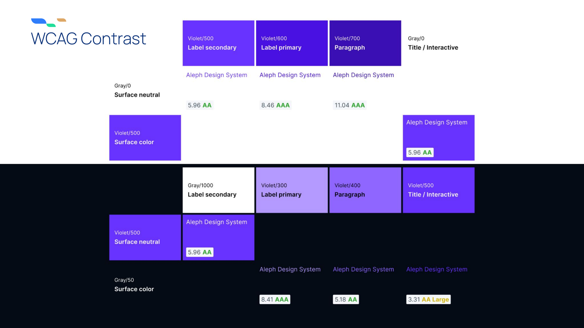
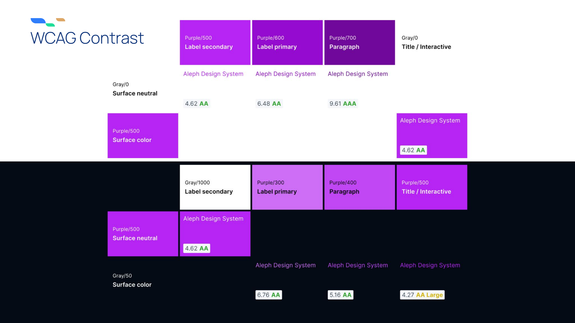
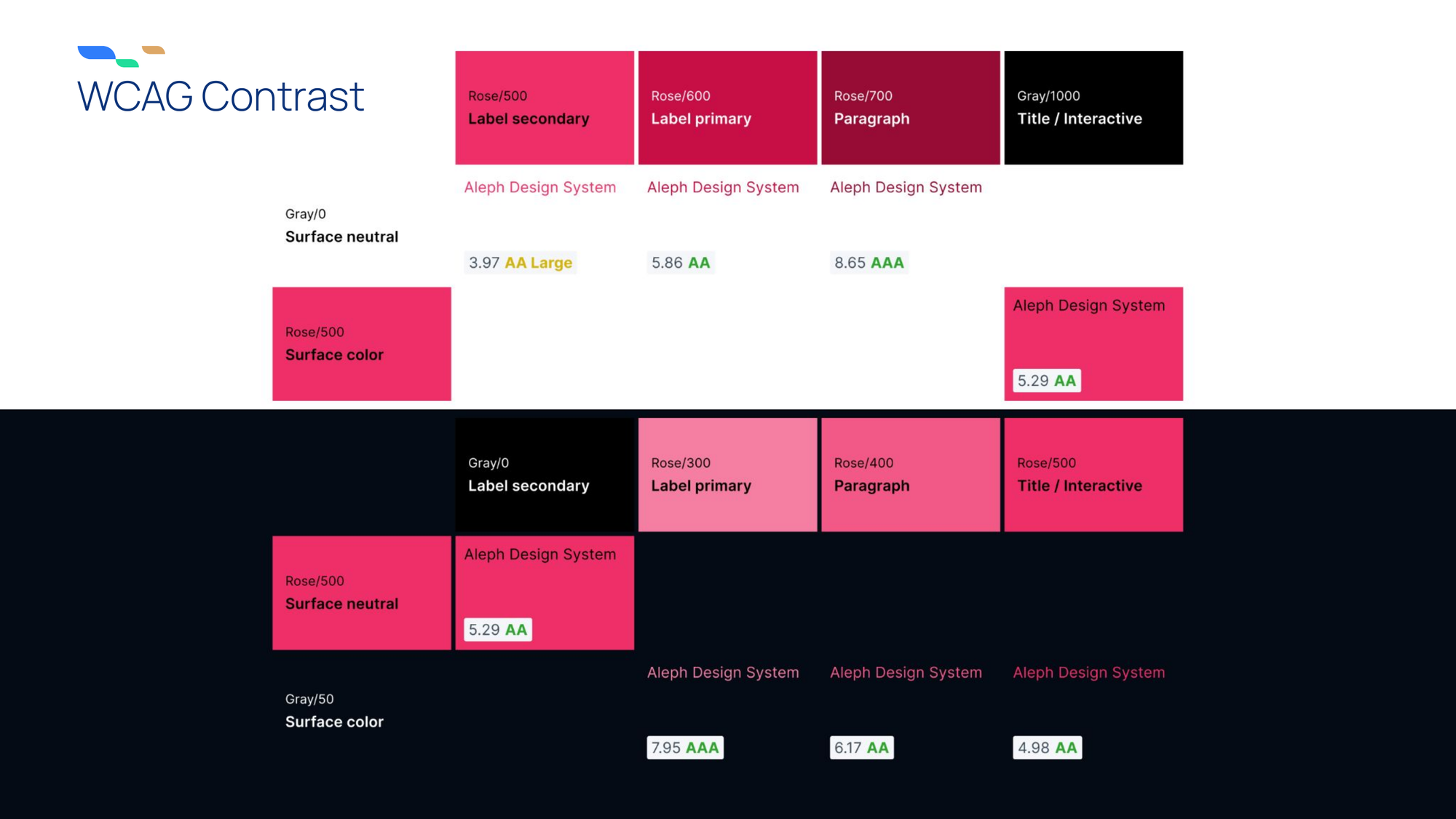
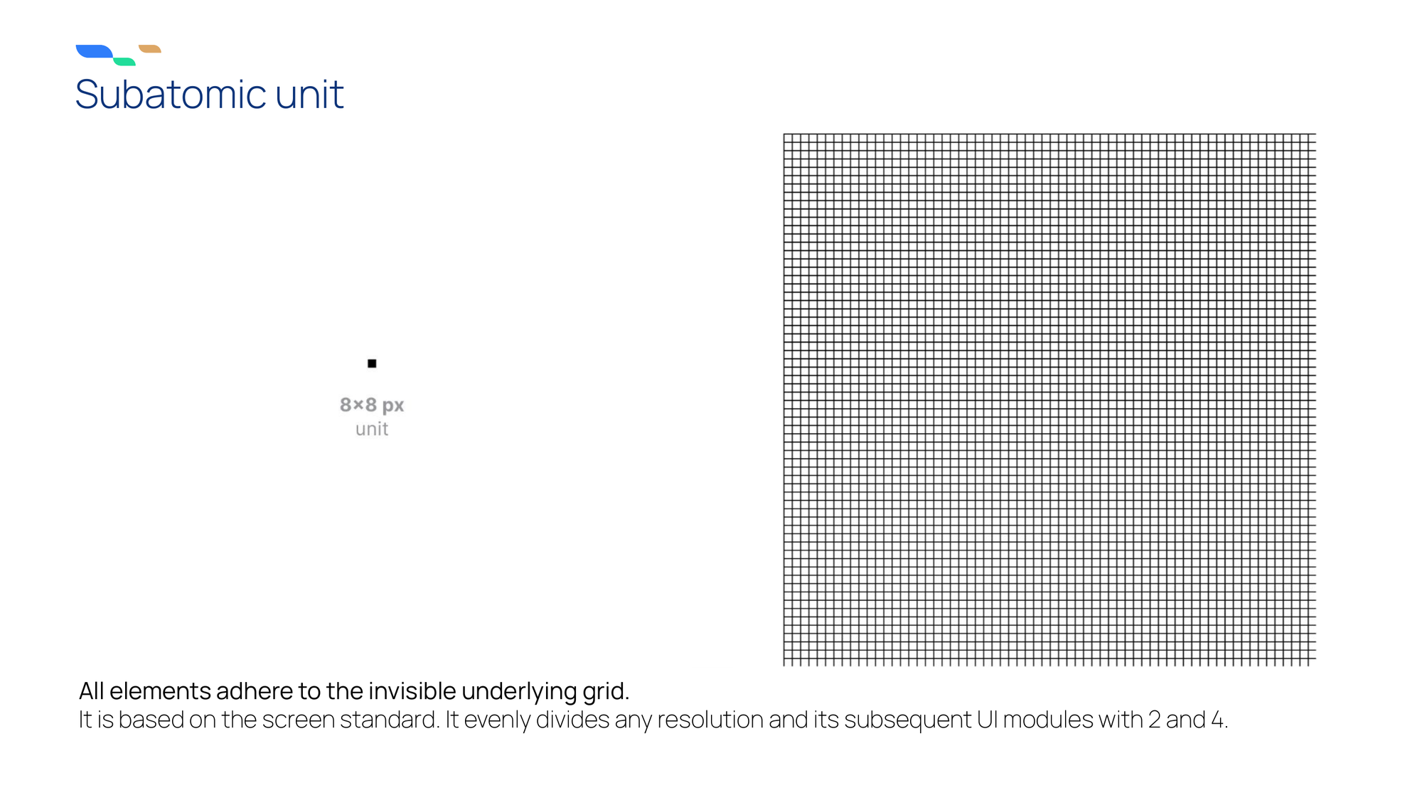
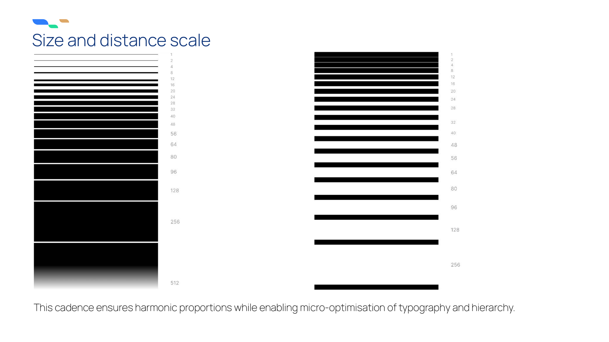
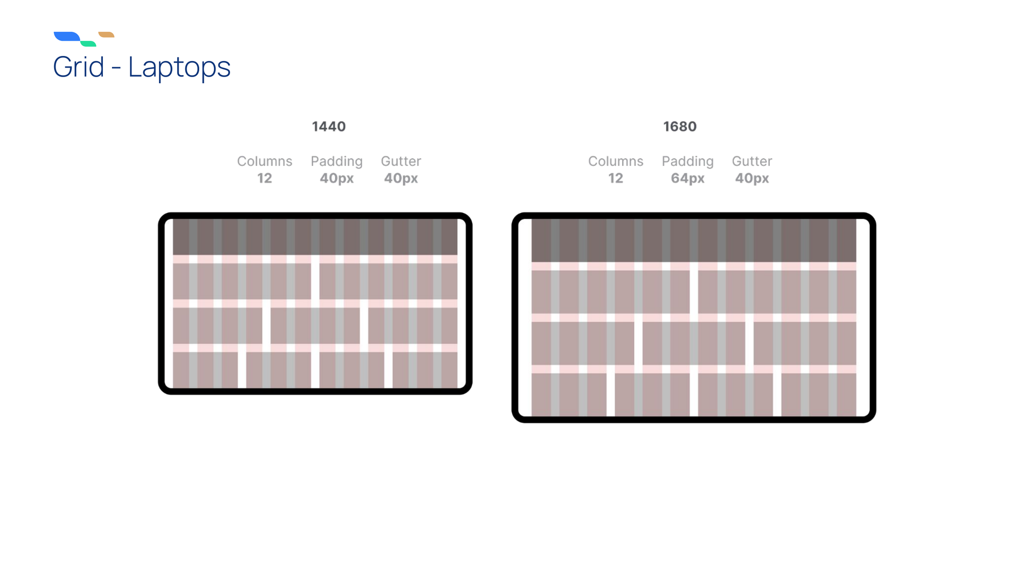
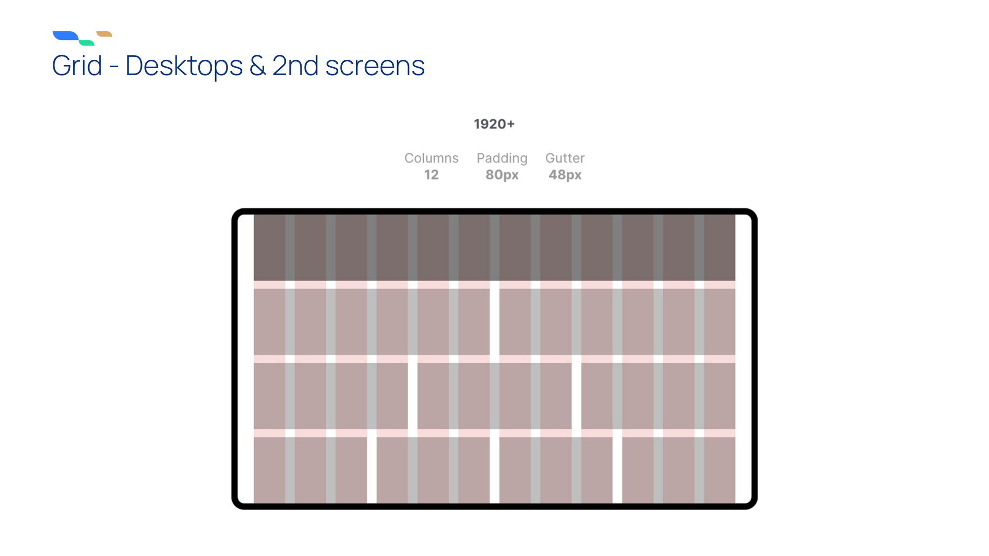
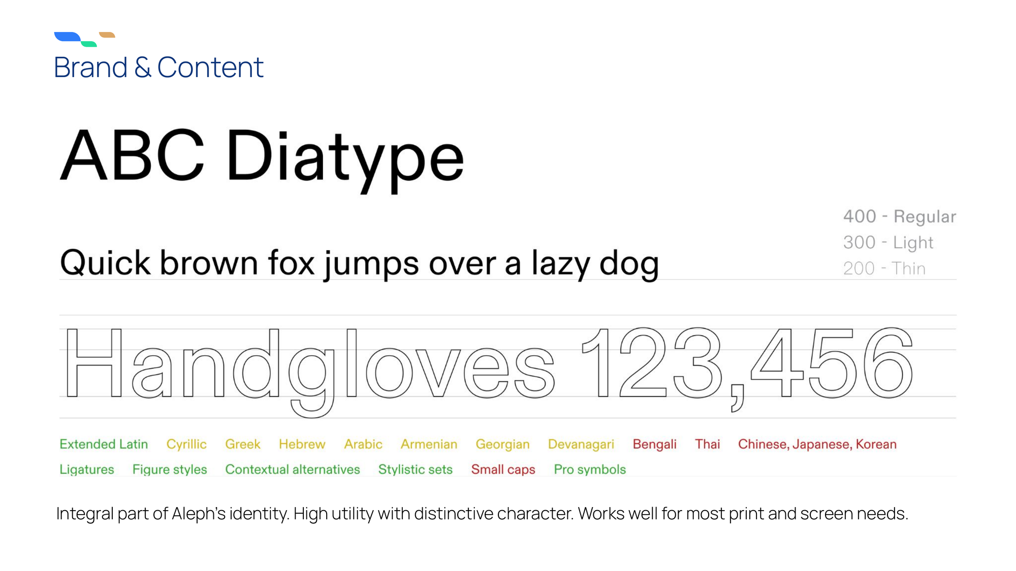
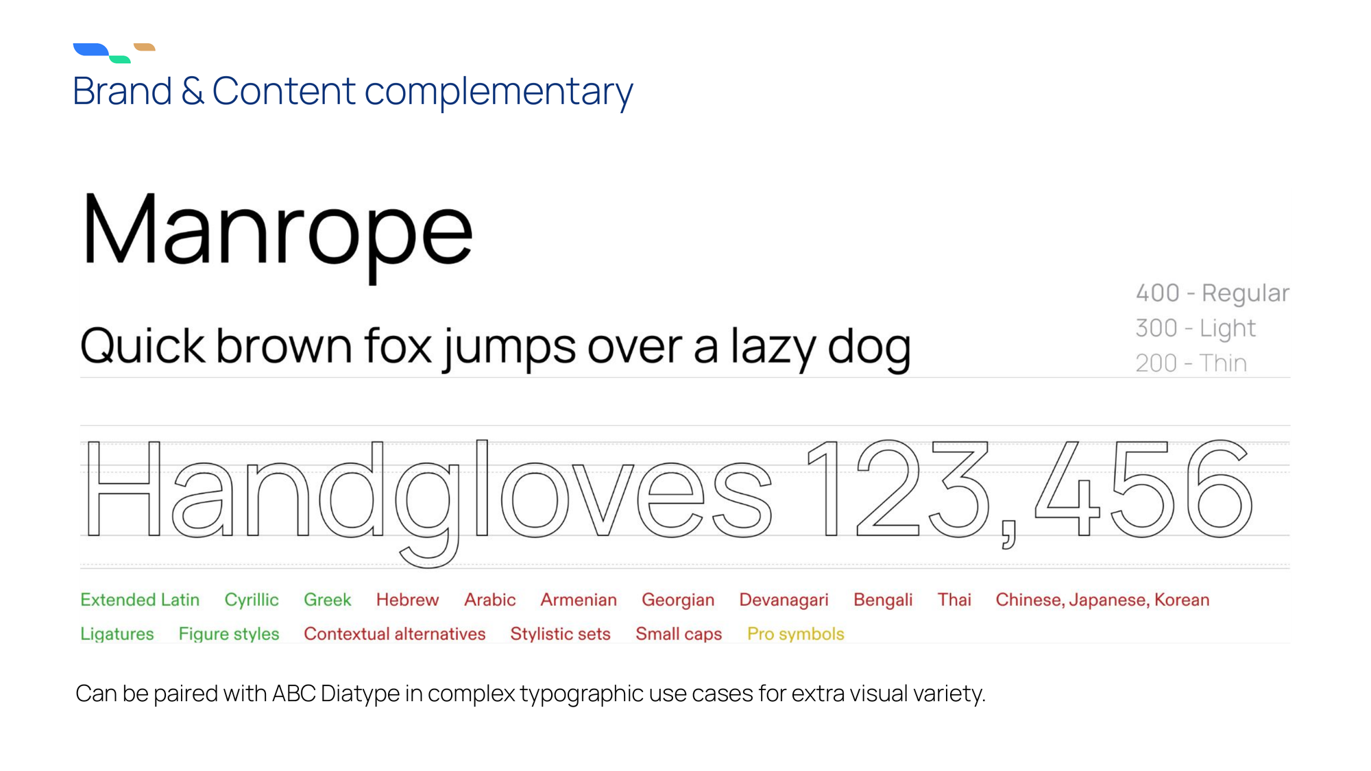
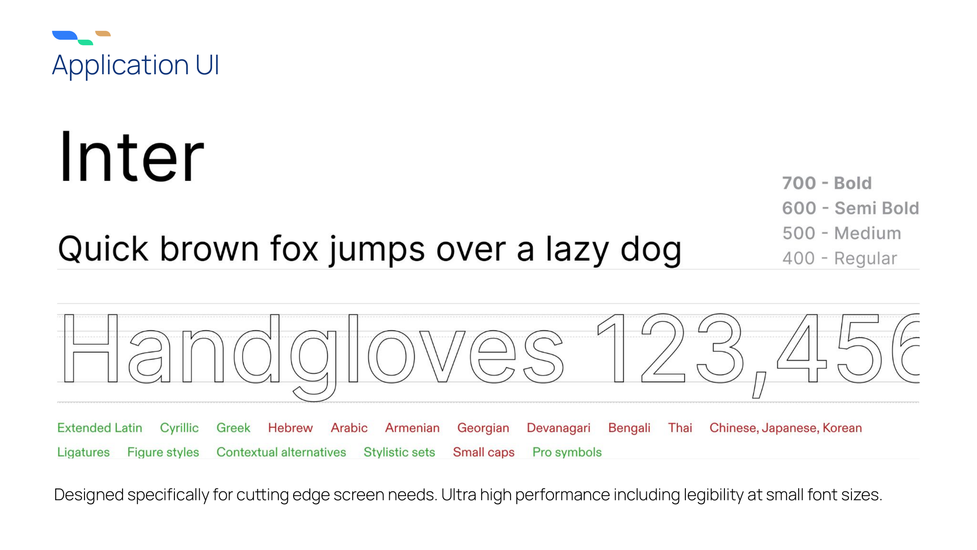
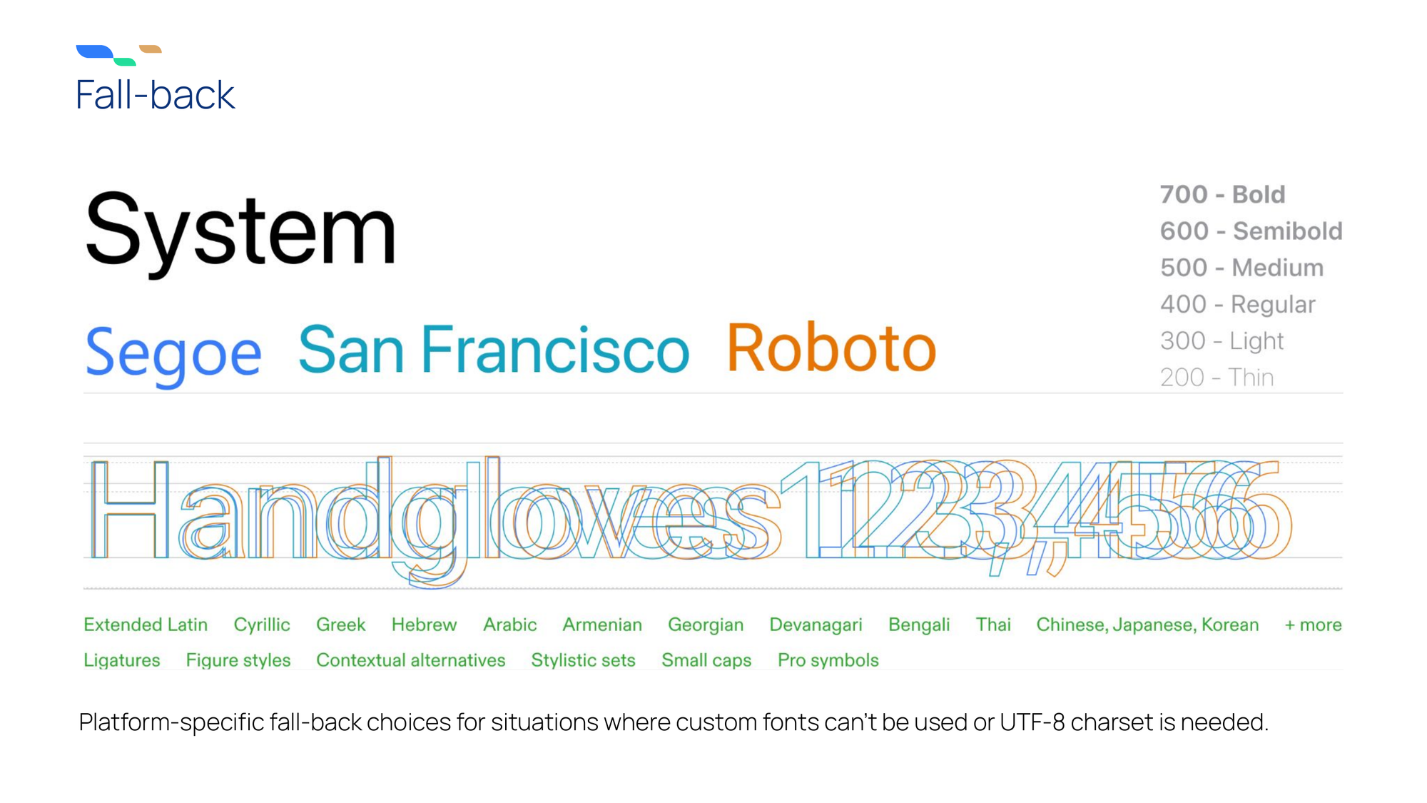
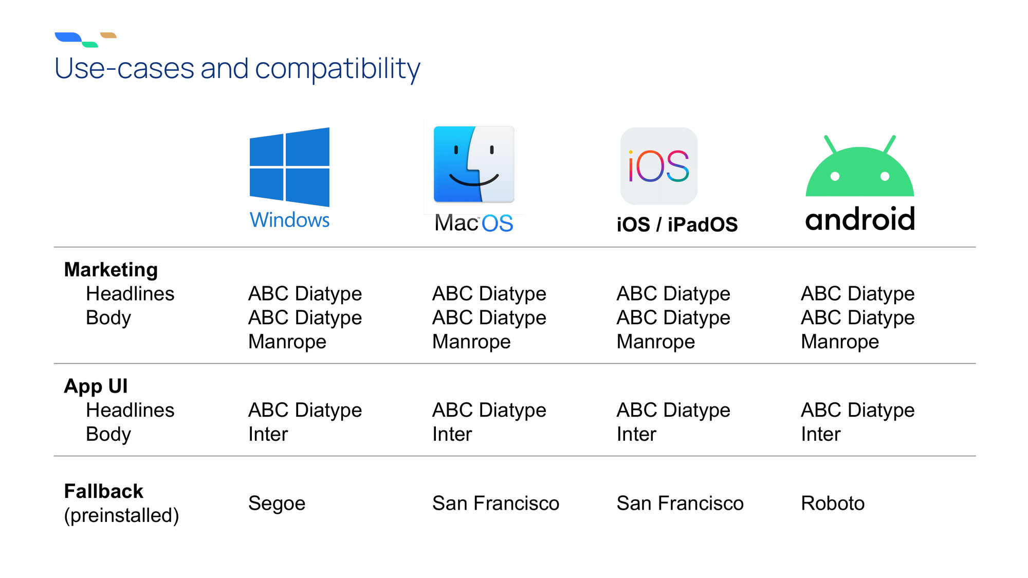
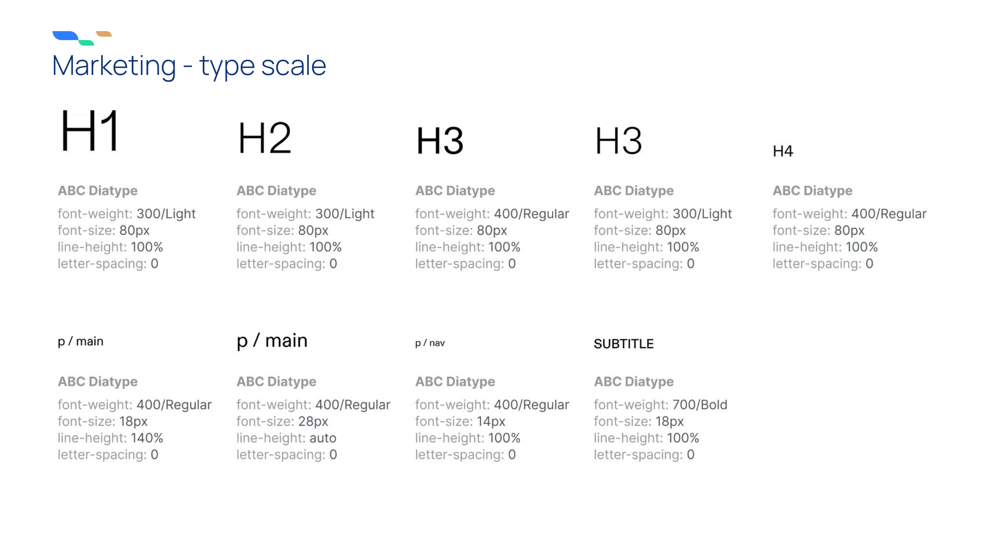
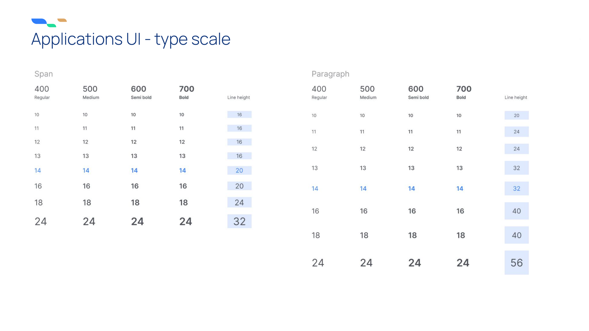
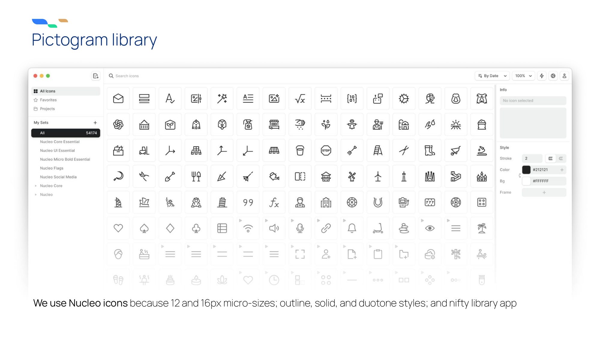
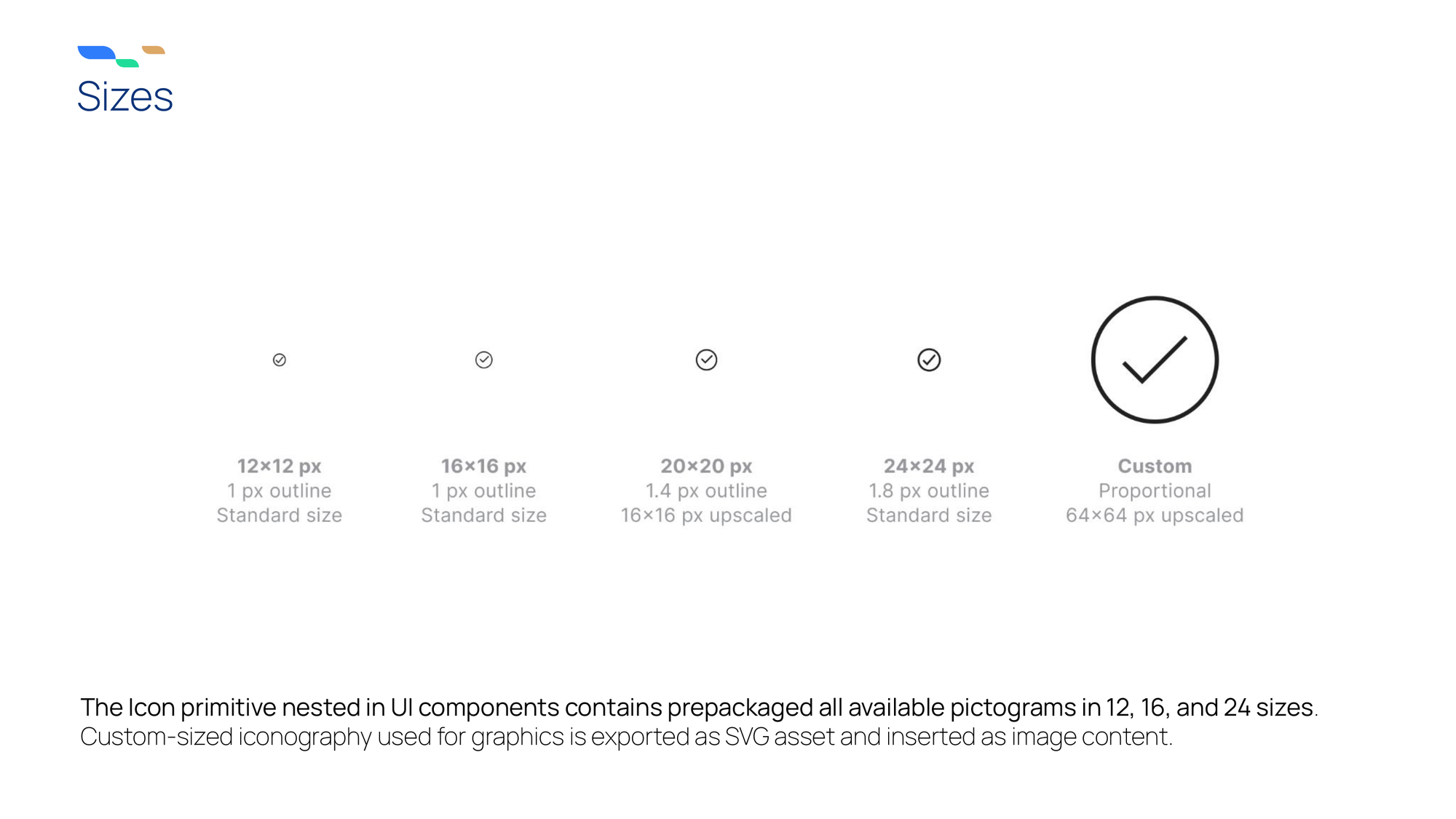
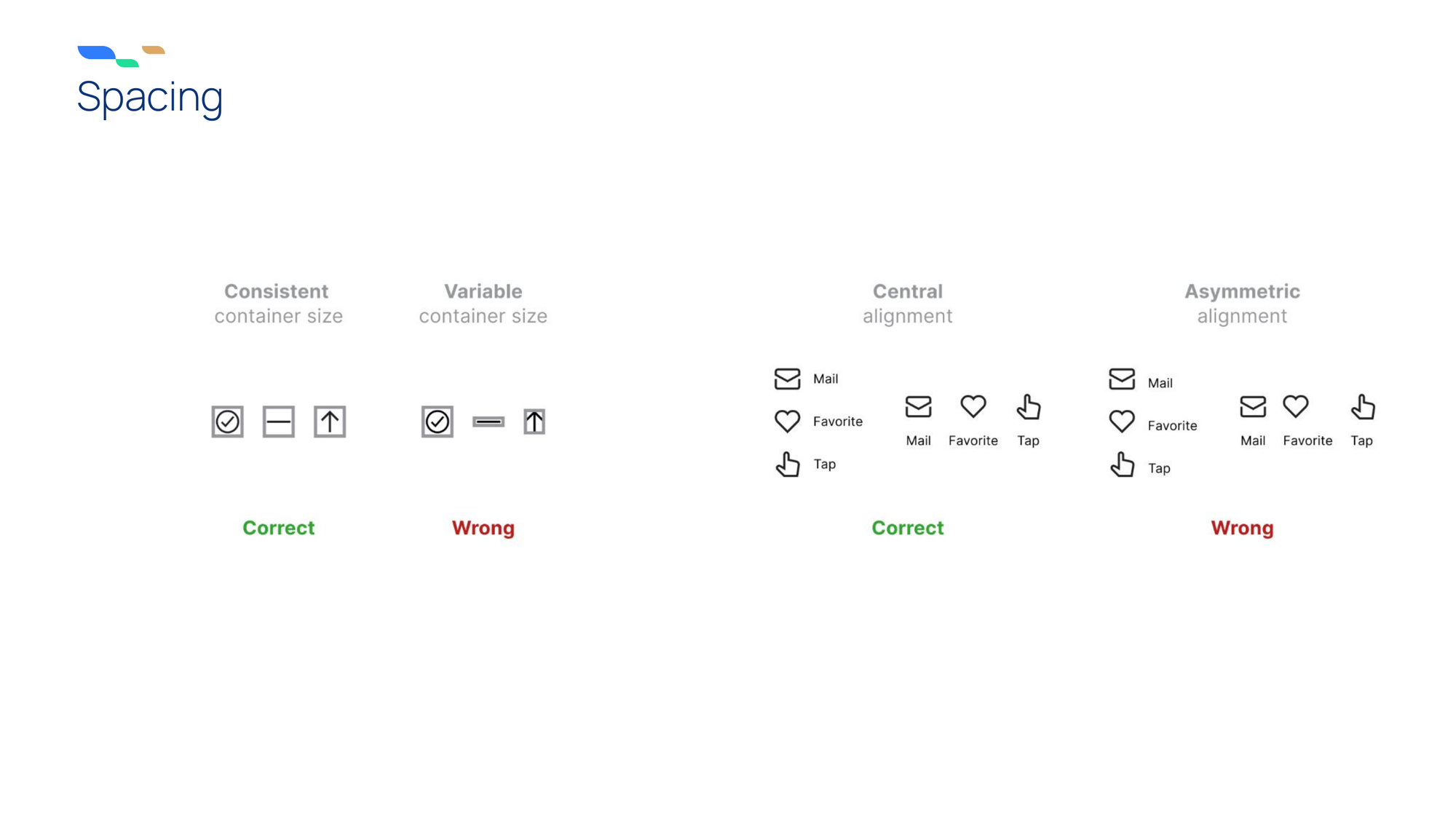
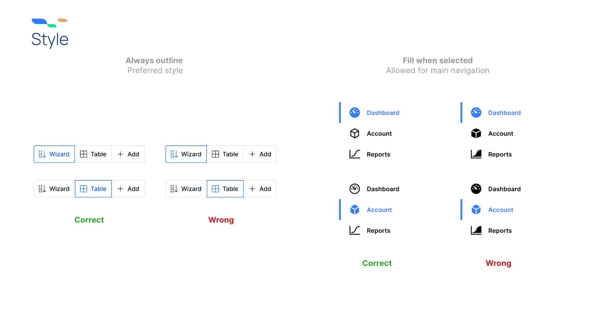
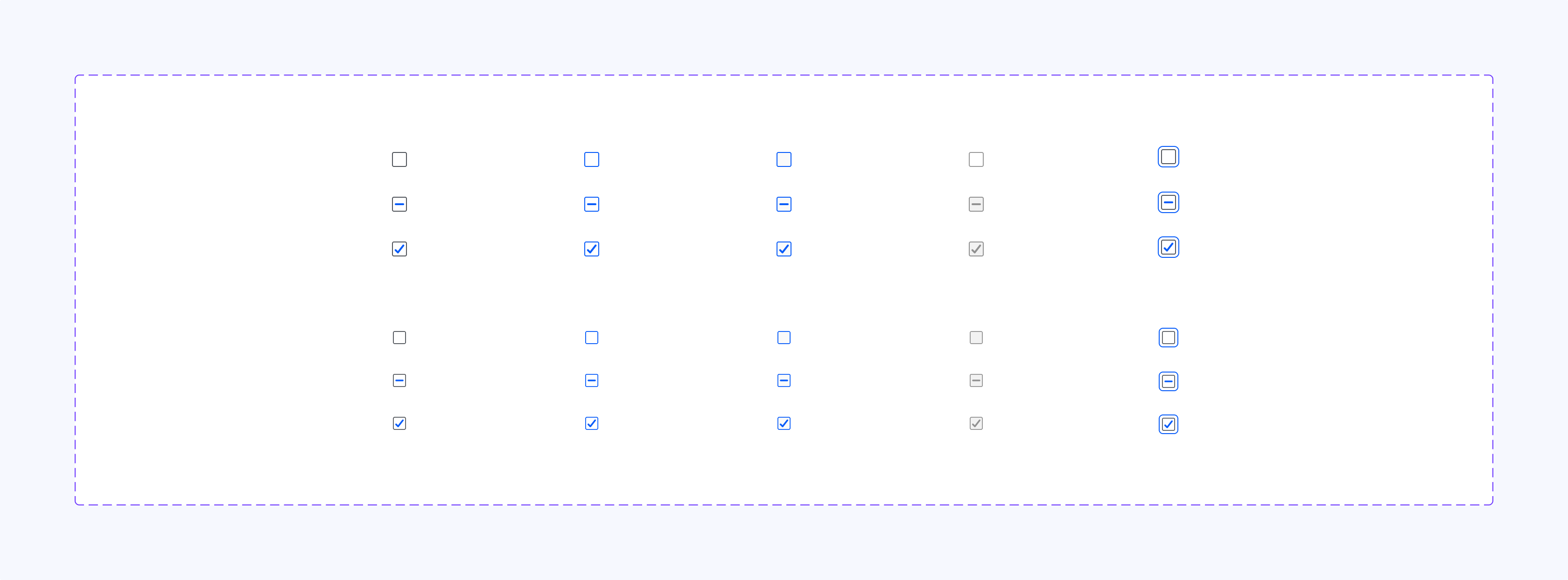
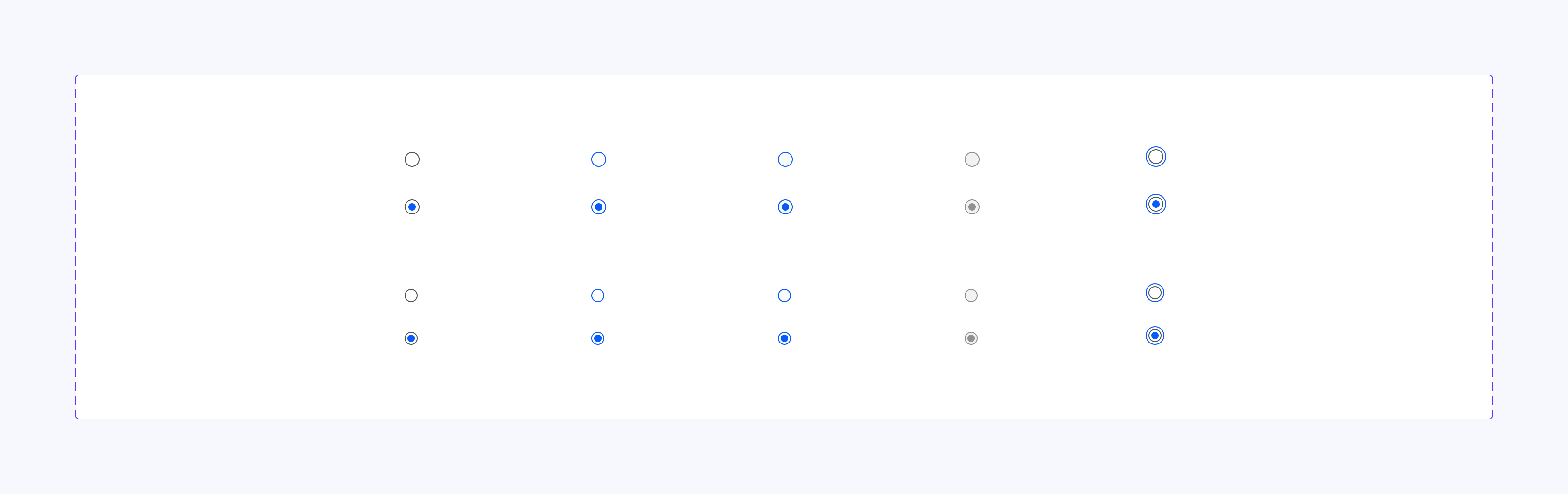
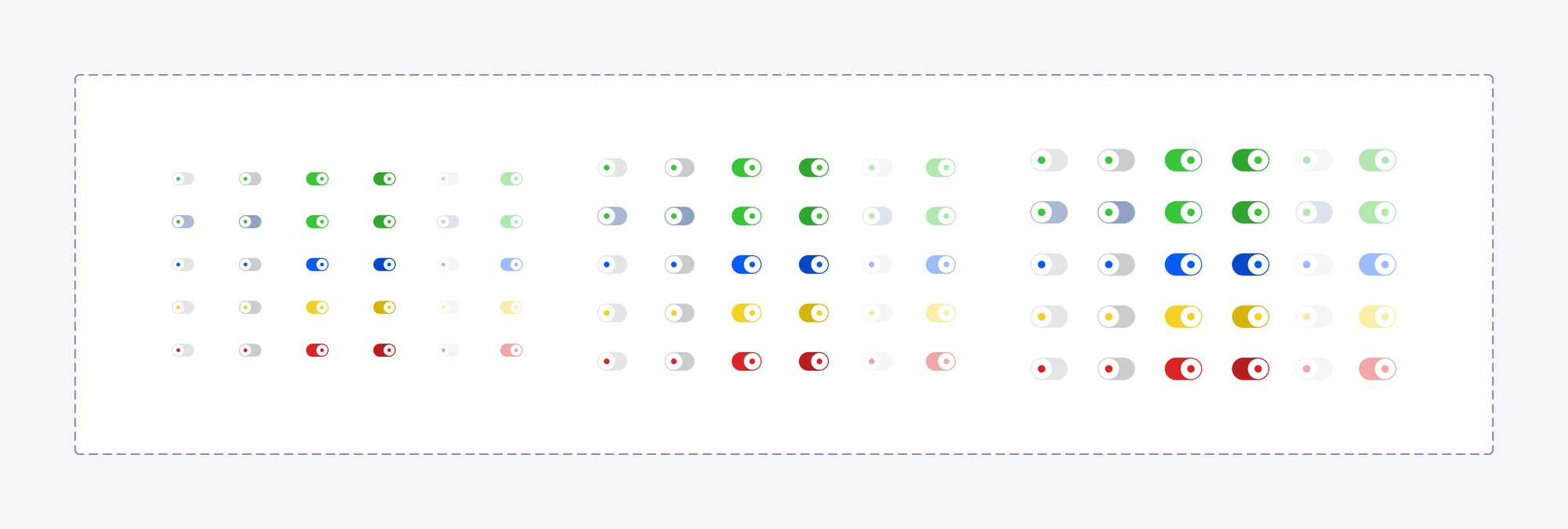
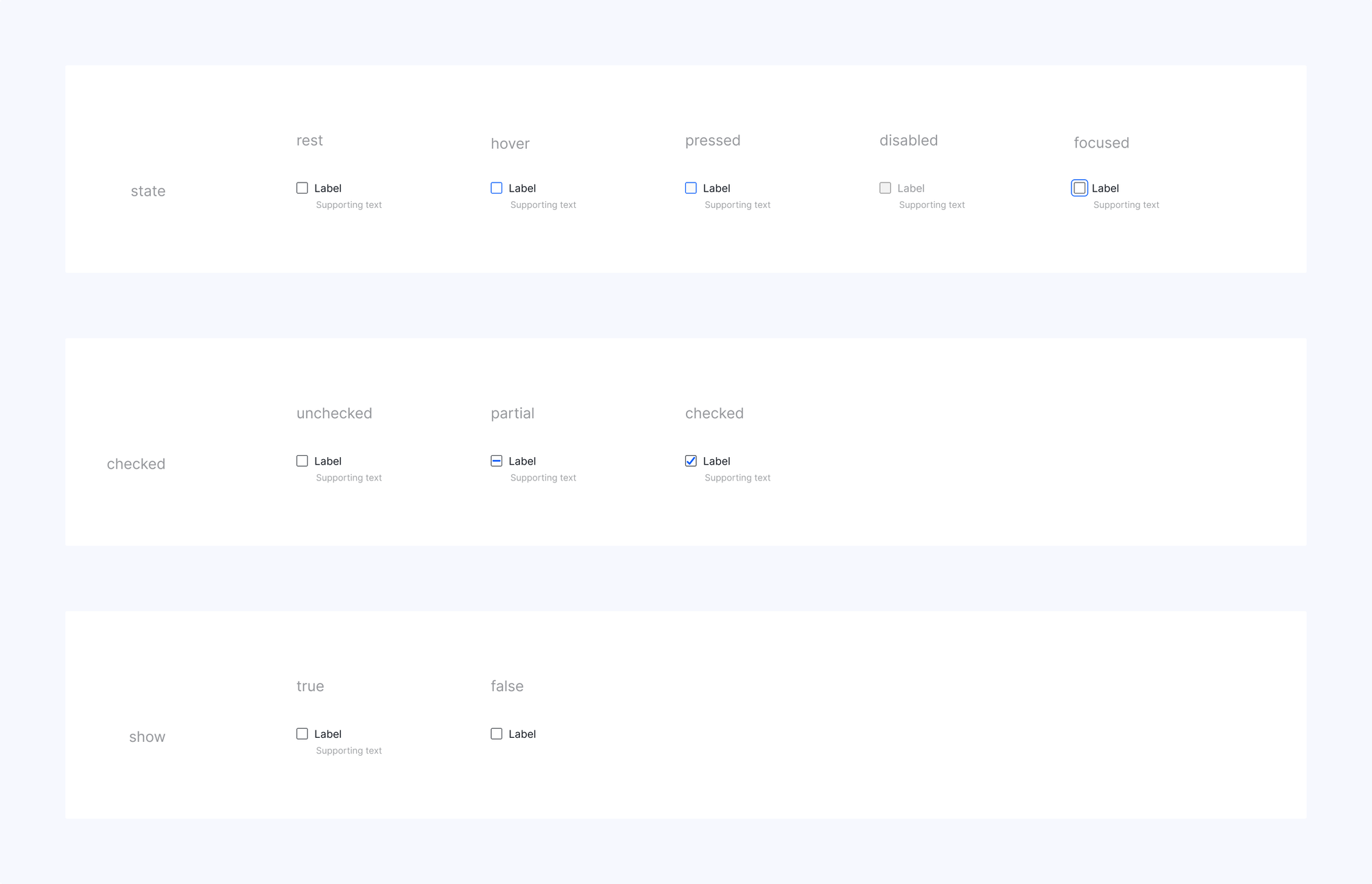
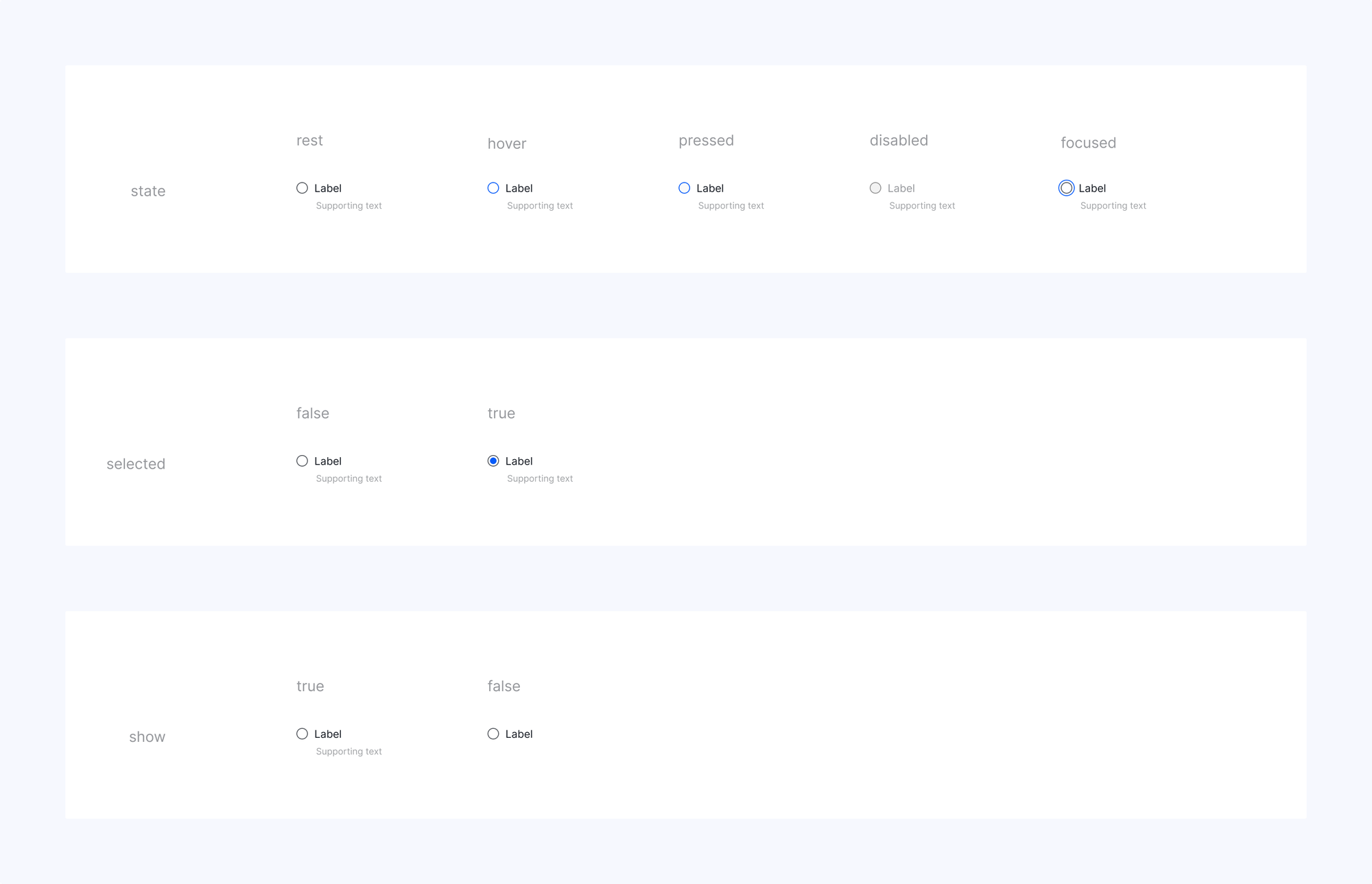
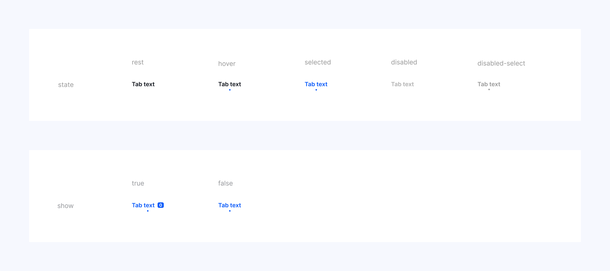
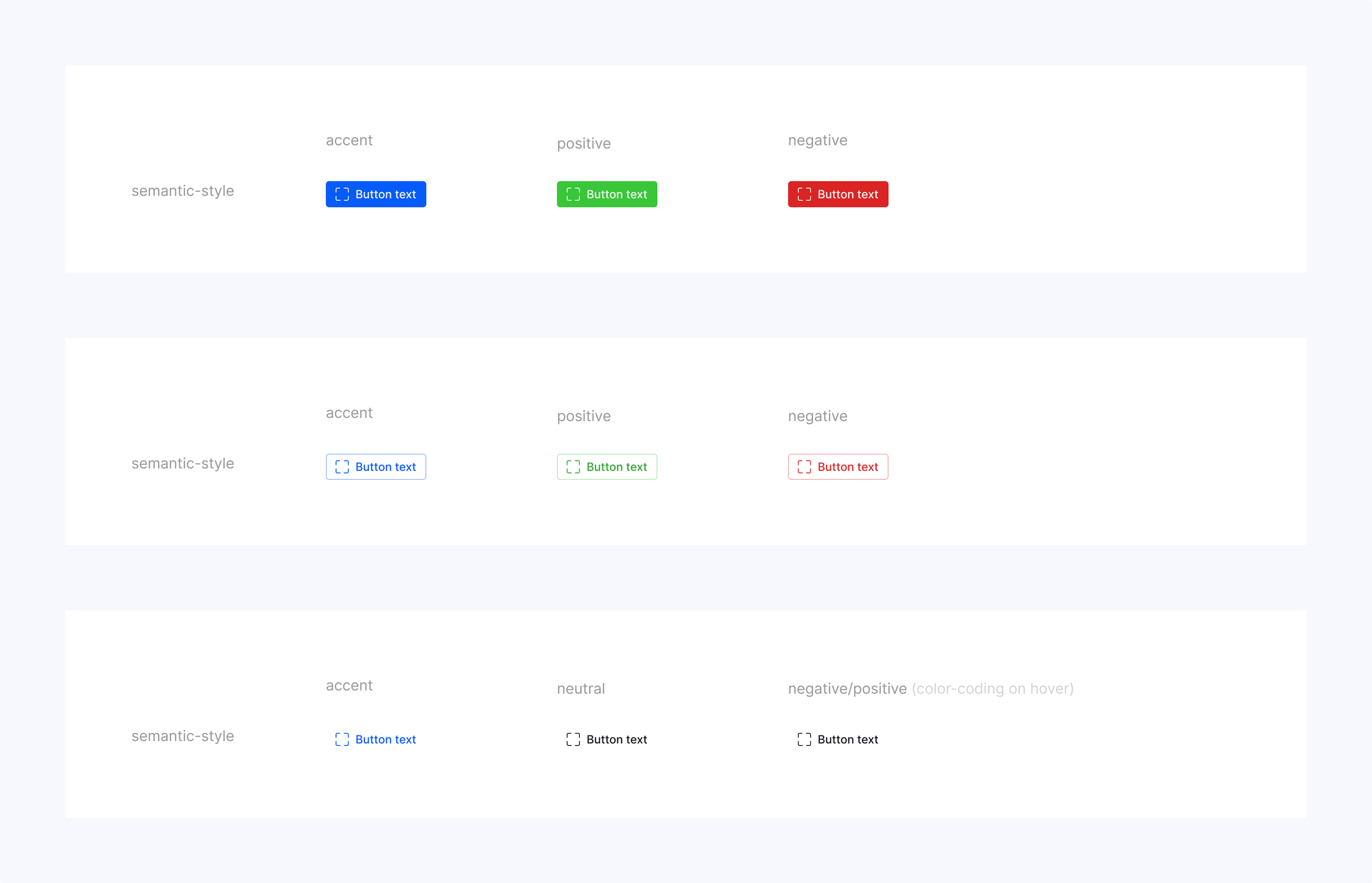
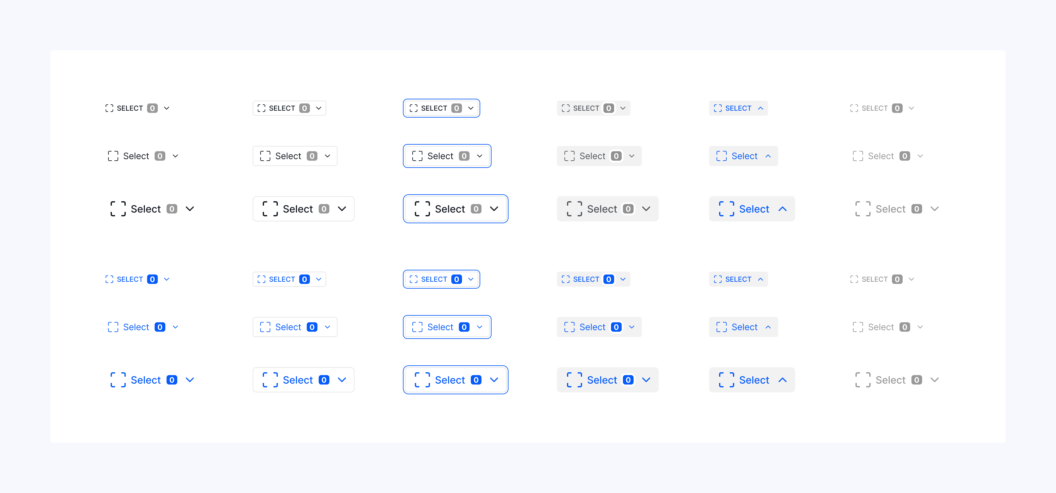
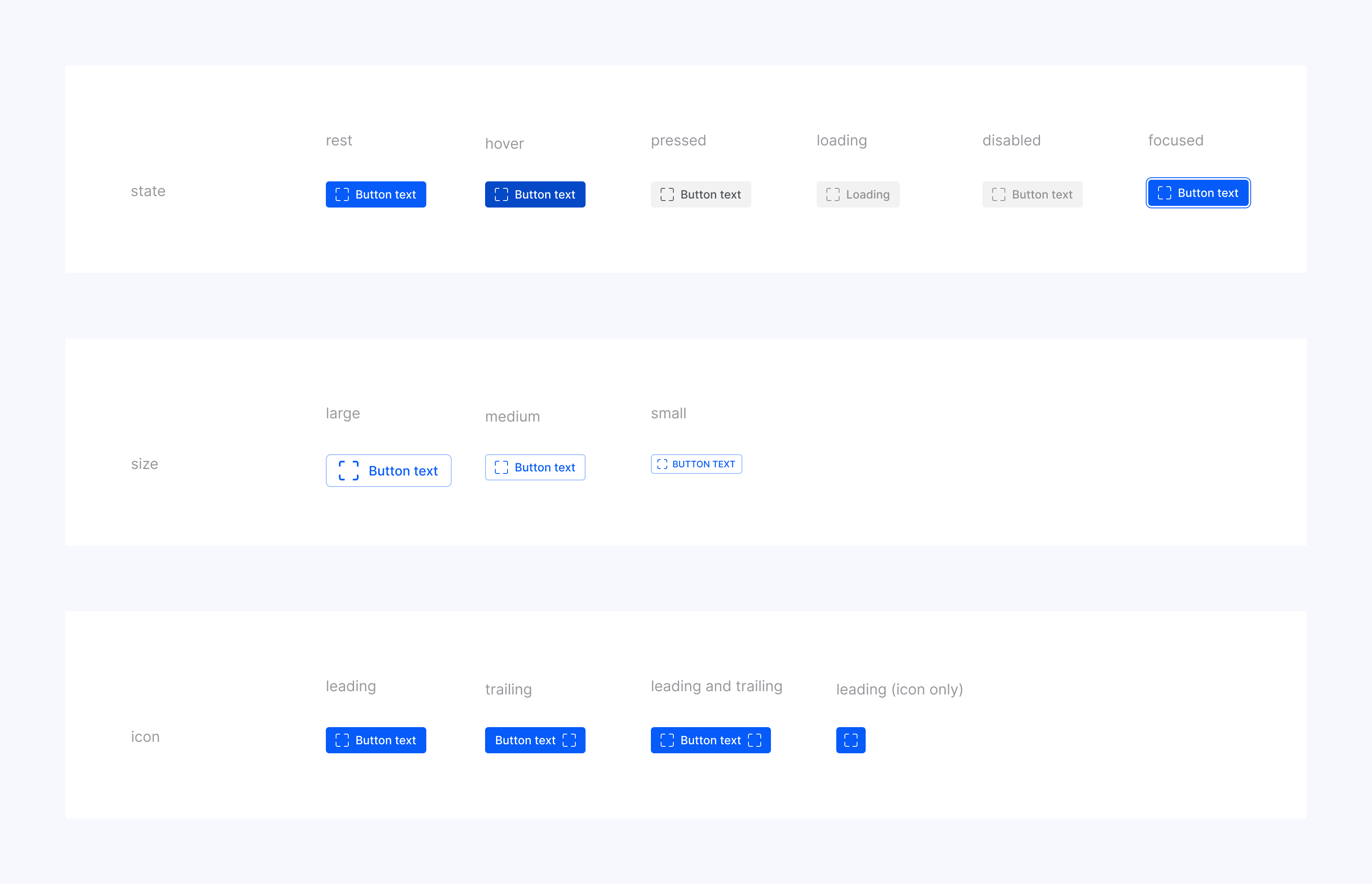
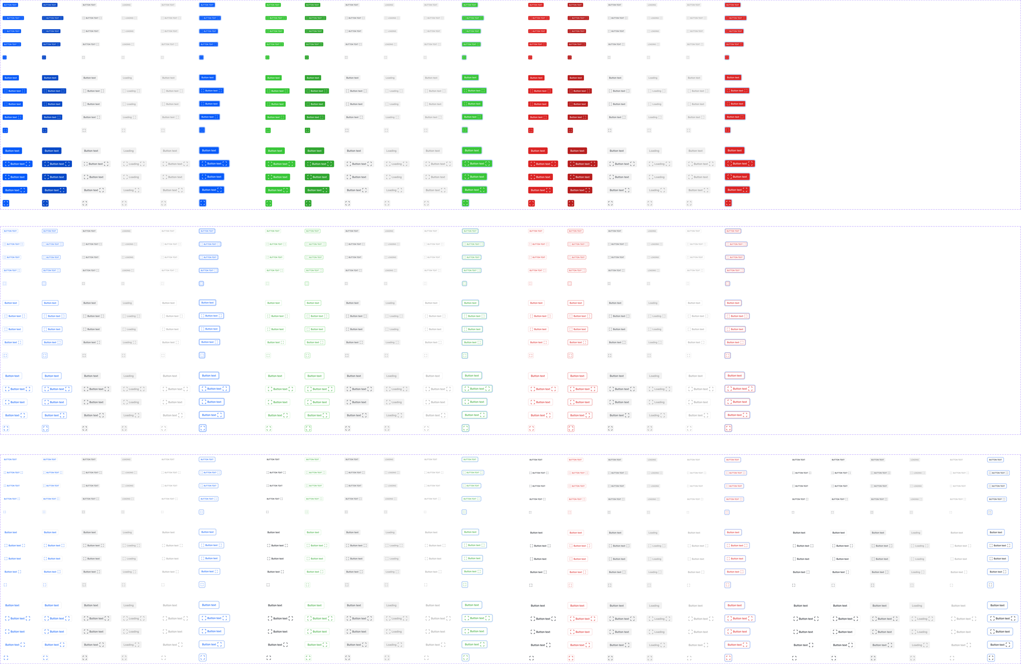
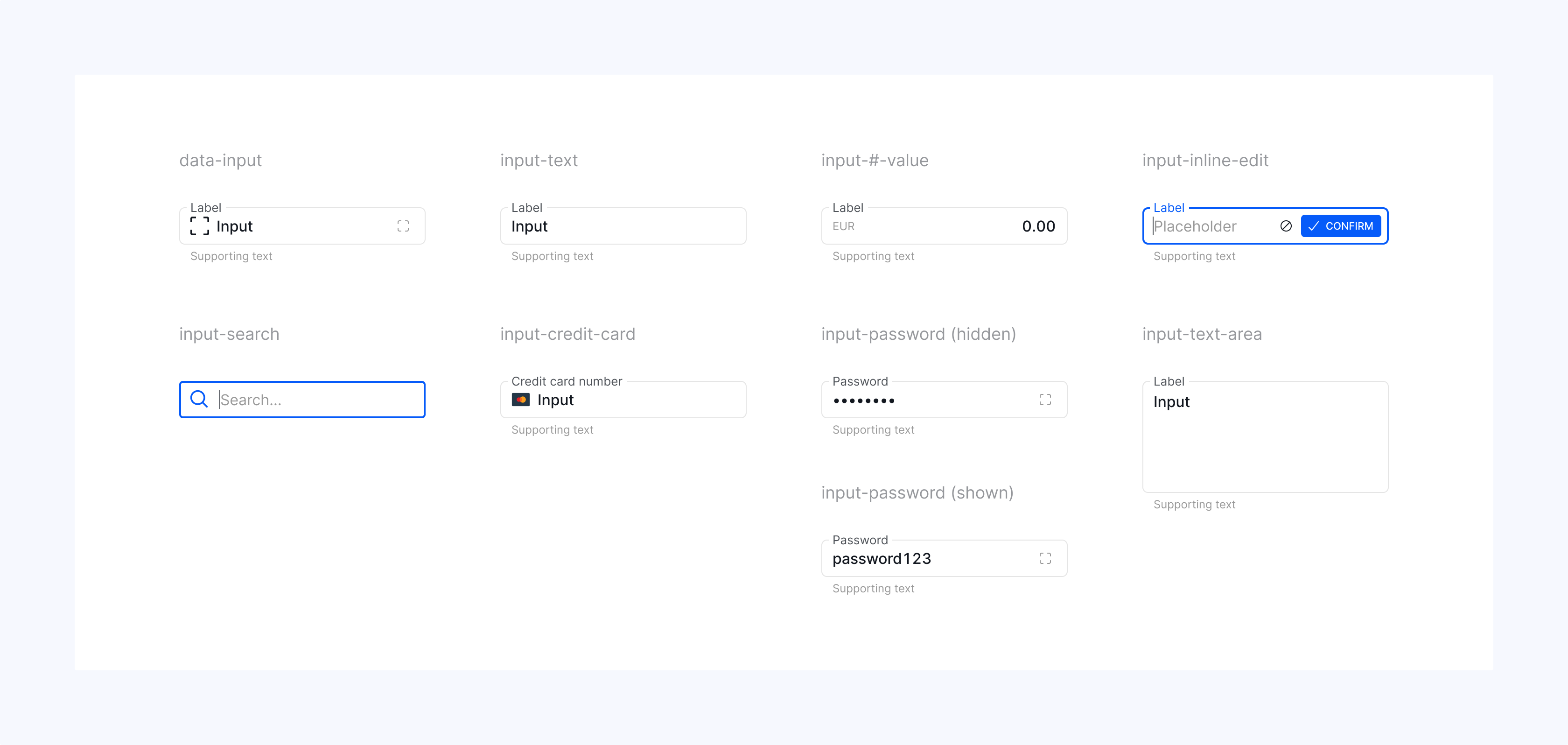
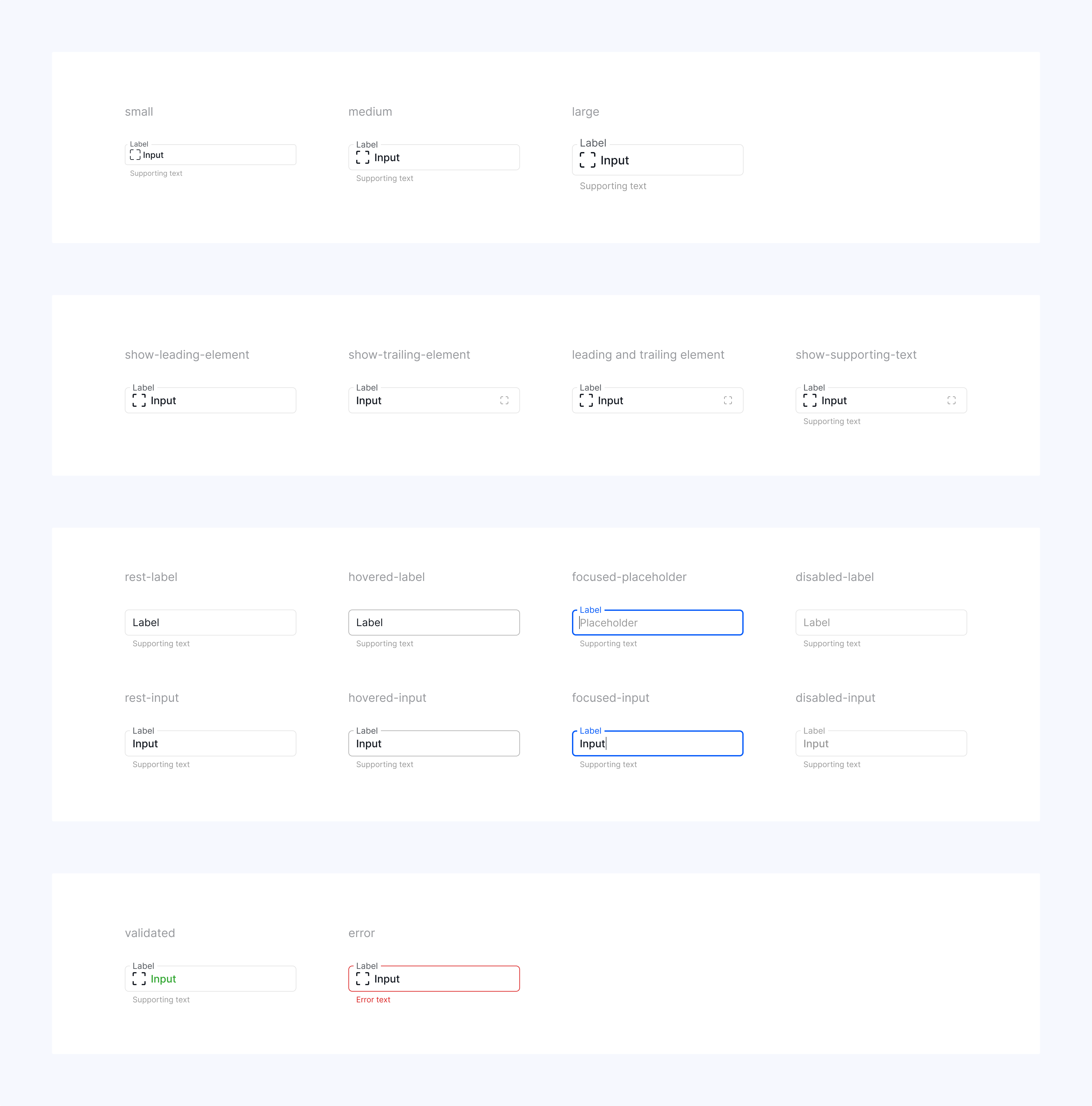
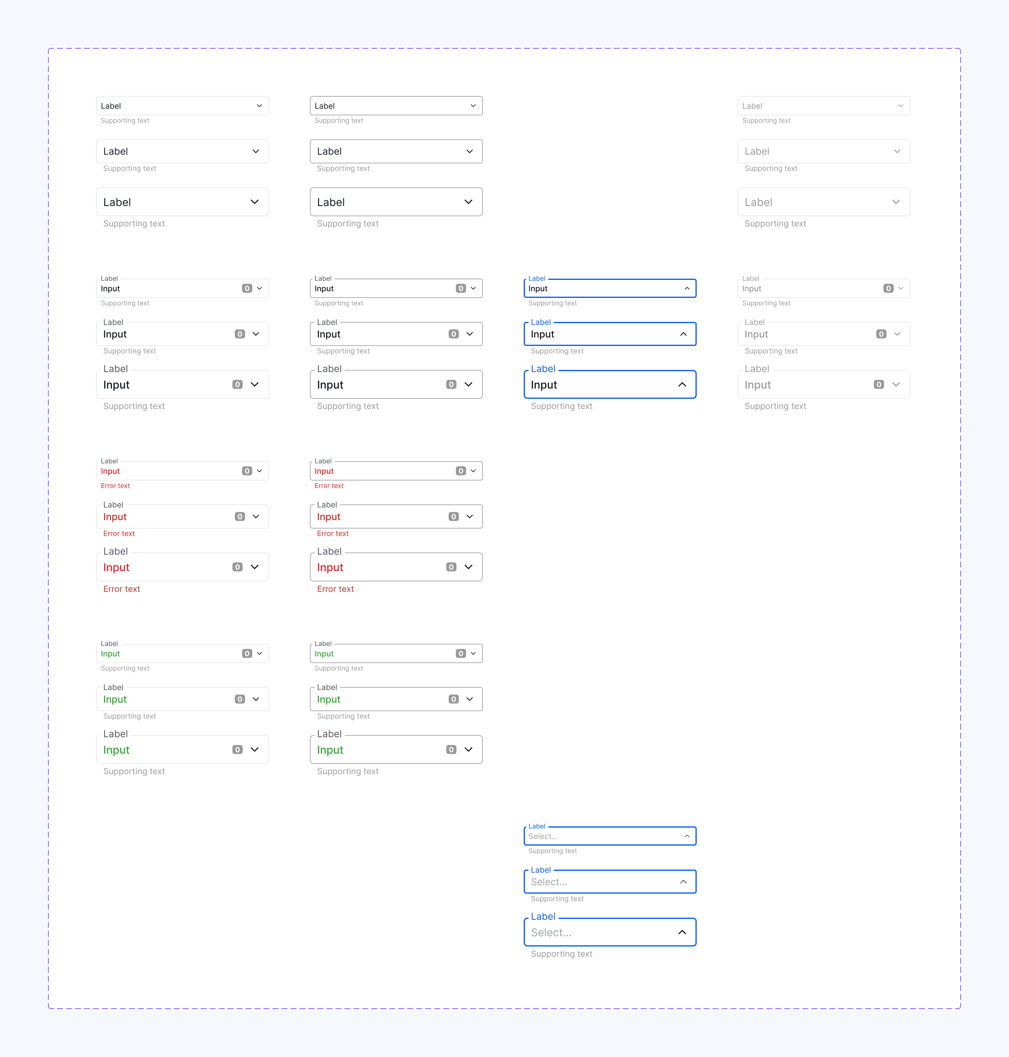
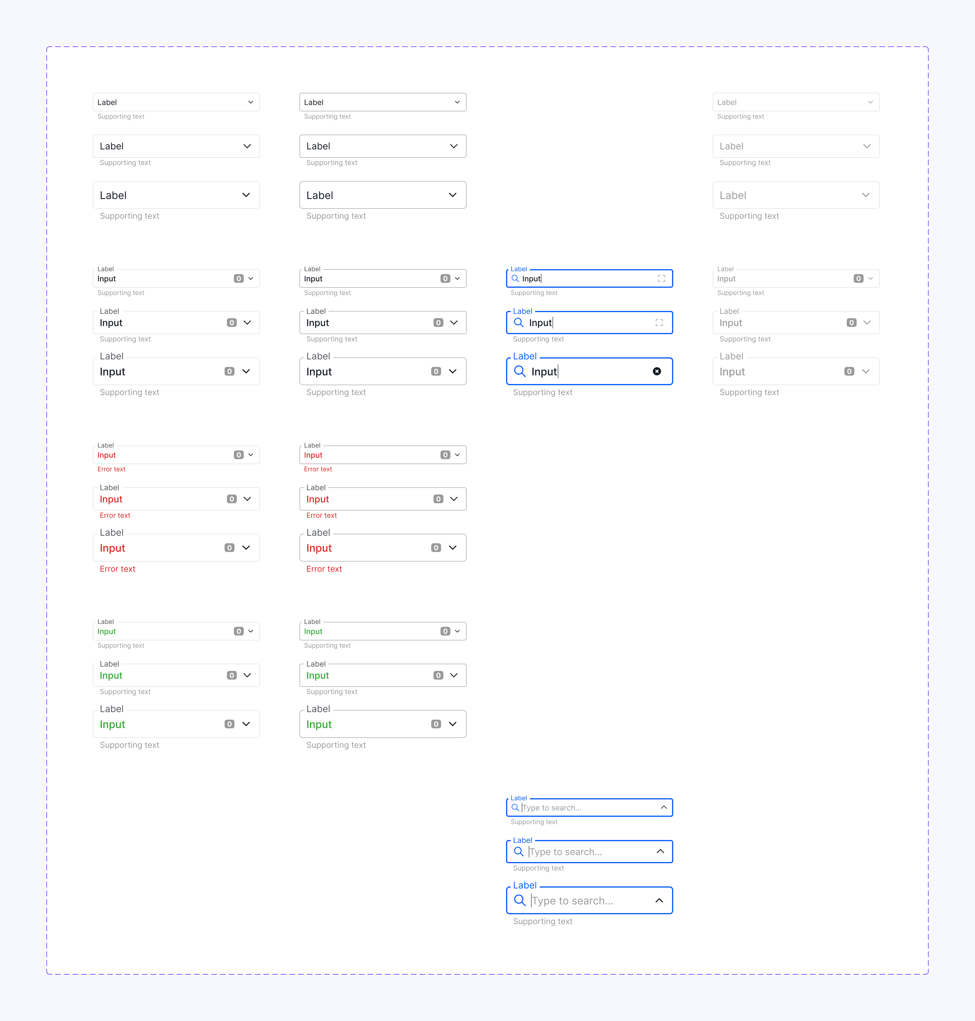
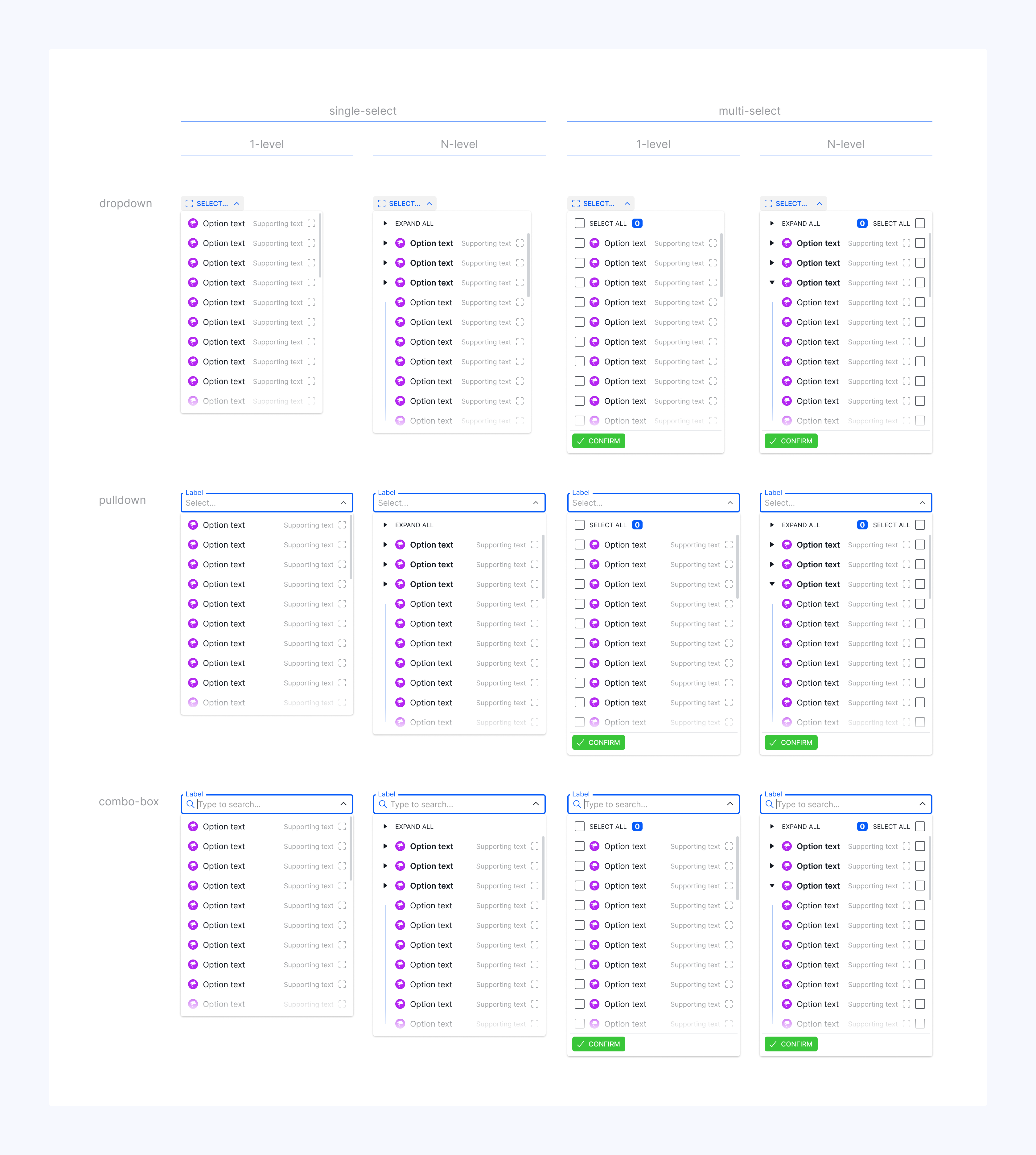
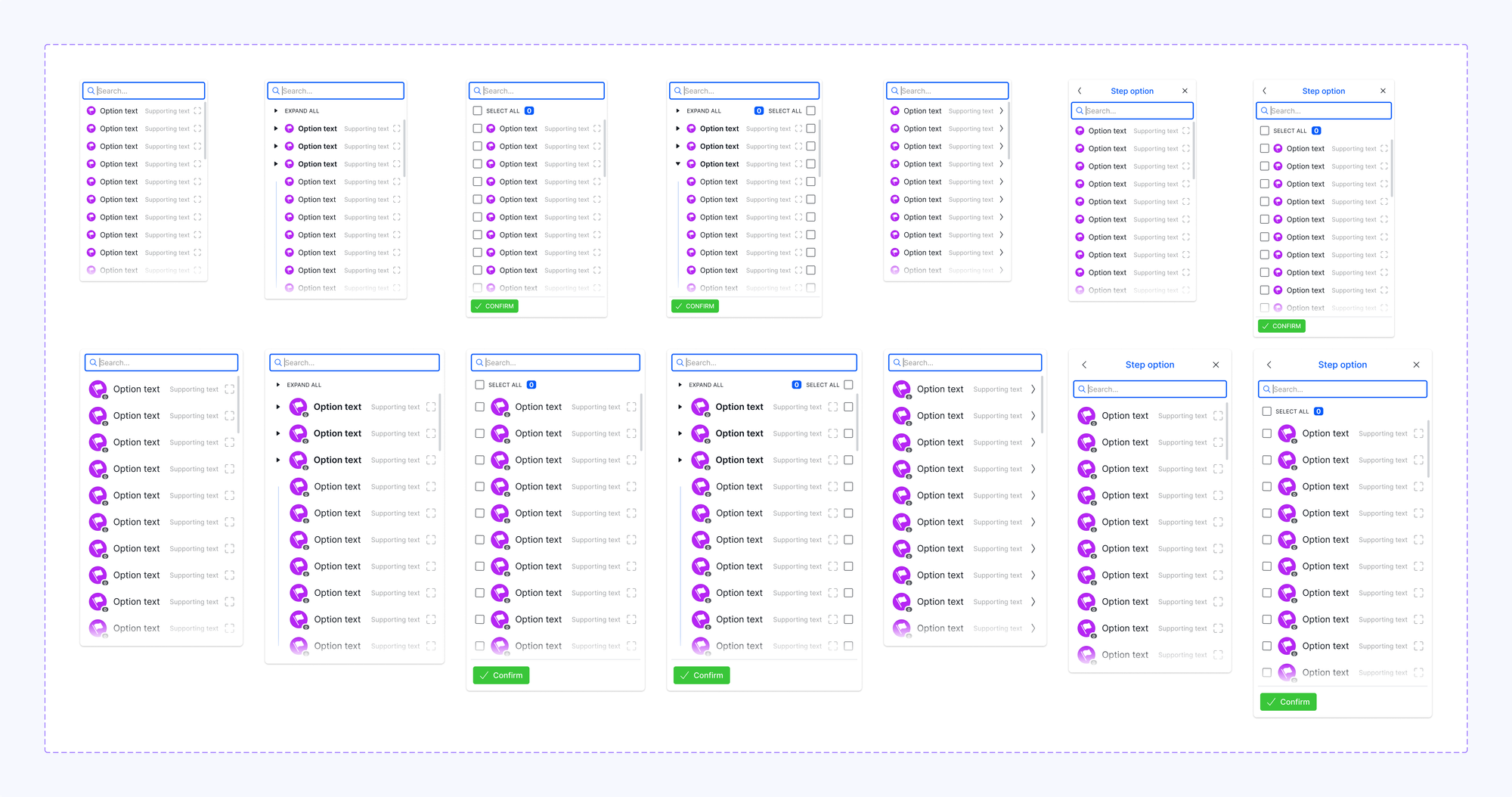
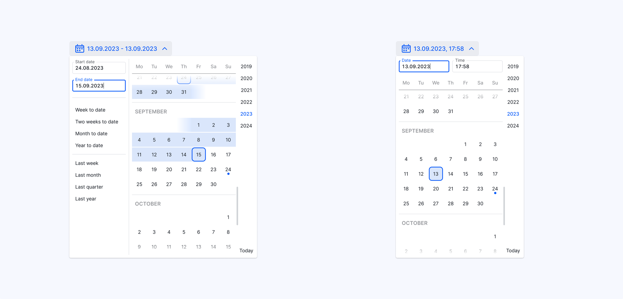
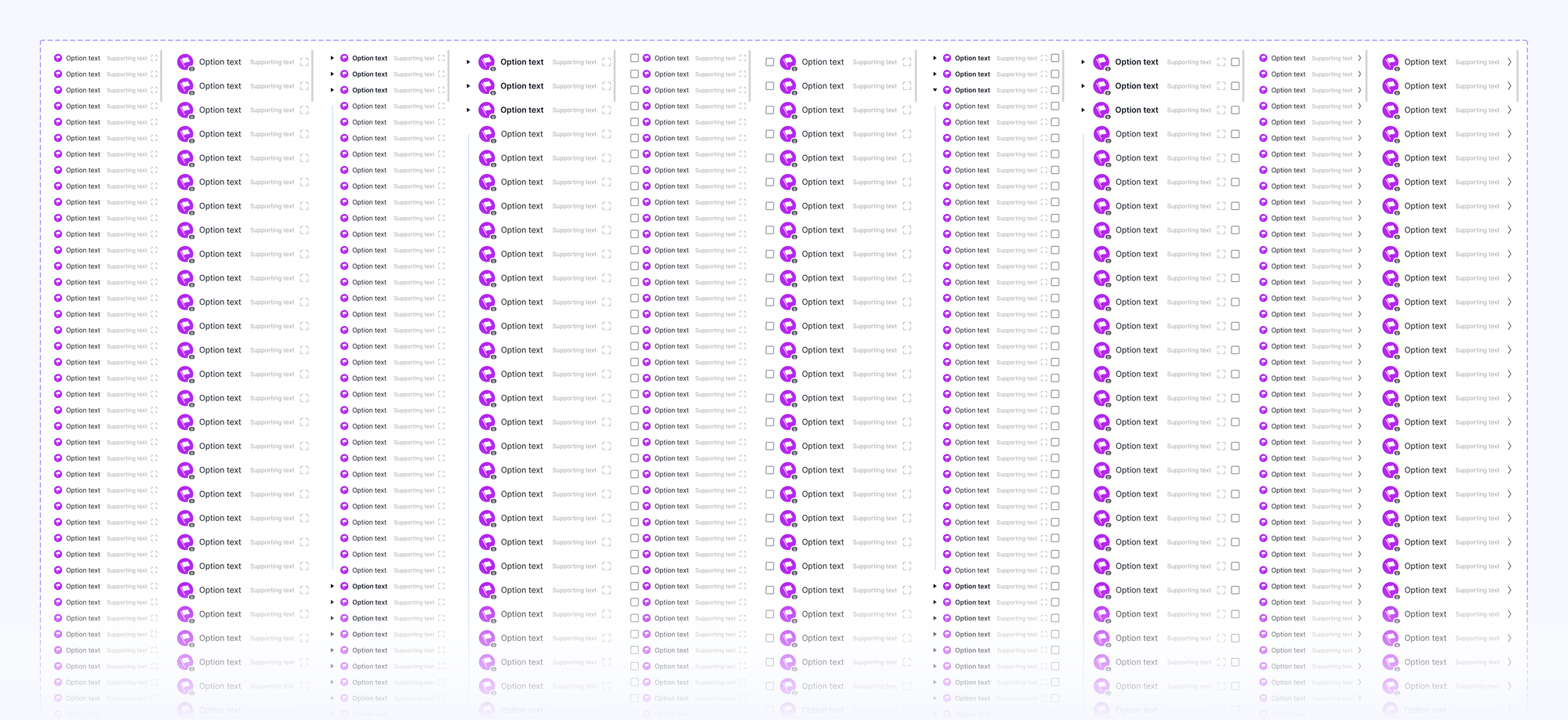
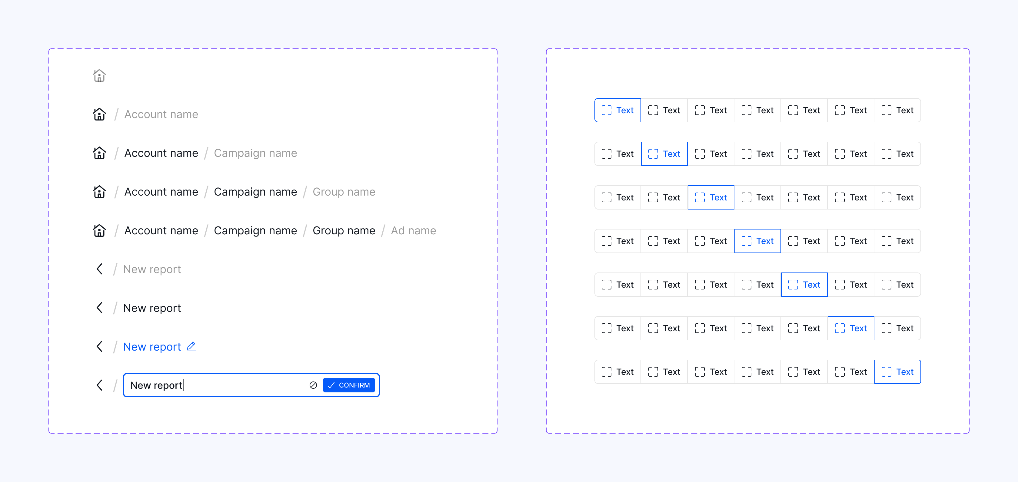
Design system
After creating a v1 of Wise.blue Figma components library, the engineering team consolidated their code implementation using Storybook and updated product instances. To consolidate UX with other in-house software development projects, the library was later promoted to Aleph global level, re-aligned to match Aleph brand guidelines, and upgraded with scope and implementation improvements to a full-fledged enterprise-grade design system with a user manual.
Credits
VP Product Management: M. Pangerc
Eng. manager: S. Križanič, D. Arh
PMM: A. Johnson
Architecture: T. Todorovski, A. Primc
UX+UI: S. Rotter, A. Gjorsheska
PM: B. Belovinov, S. Kukičar, G. Romavh
Scrum: A. Naskovska, K. Velichkovska, U. Simčič
Eng. lead: Ž. Klemenčič, A. Sušnik
FE: N. Ilievski, S. Selimoski, V. Todorovski, E. Poljšak, R. Aminov, A. Fajfar
BE: Z. Čičak, E. Šestić Vejzagić, A. Šupuk, D. Tominec, A. Alič, S. Buljević
QA: V. Kalachevski, H. Genas, A. Alyssa Leden
Data science: J. Hladnik