Videobolt
Overview
Company: Videobolt
Timeframe: 2021–2022 (6 days/month)
Role: Product Design Consultant
Background
Videobolt enables people without technical or creative skills to produce marketing videos of high-end production quality. It’s a library of 2,800+ premium After Effects templates that can be customized and branded into a finished video file by filling out a web form.
A year after its seed round, growth had slowed, revenue was unpredictable, and the team was unsure which roadmap projects would move the business, which left the path to Series A unclear.
Ownership
I devised the product strategy, directed its redesign, and consulted the company throughout the pivot in a hands-on advisory role.
Show individual contributions
- Designed the brand refresh
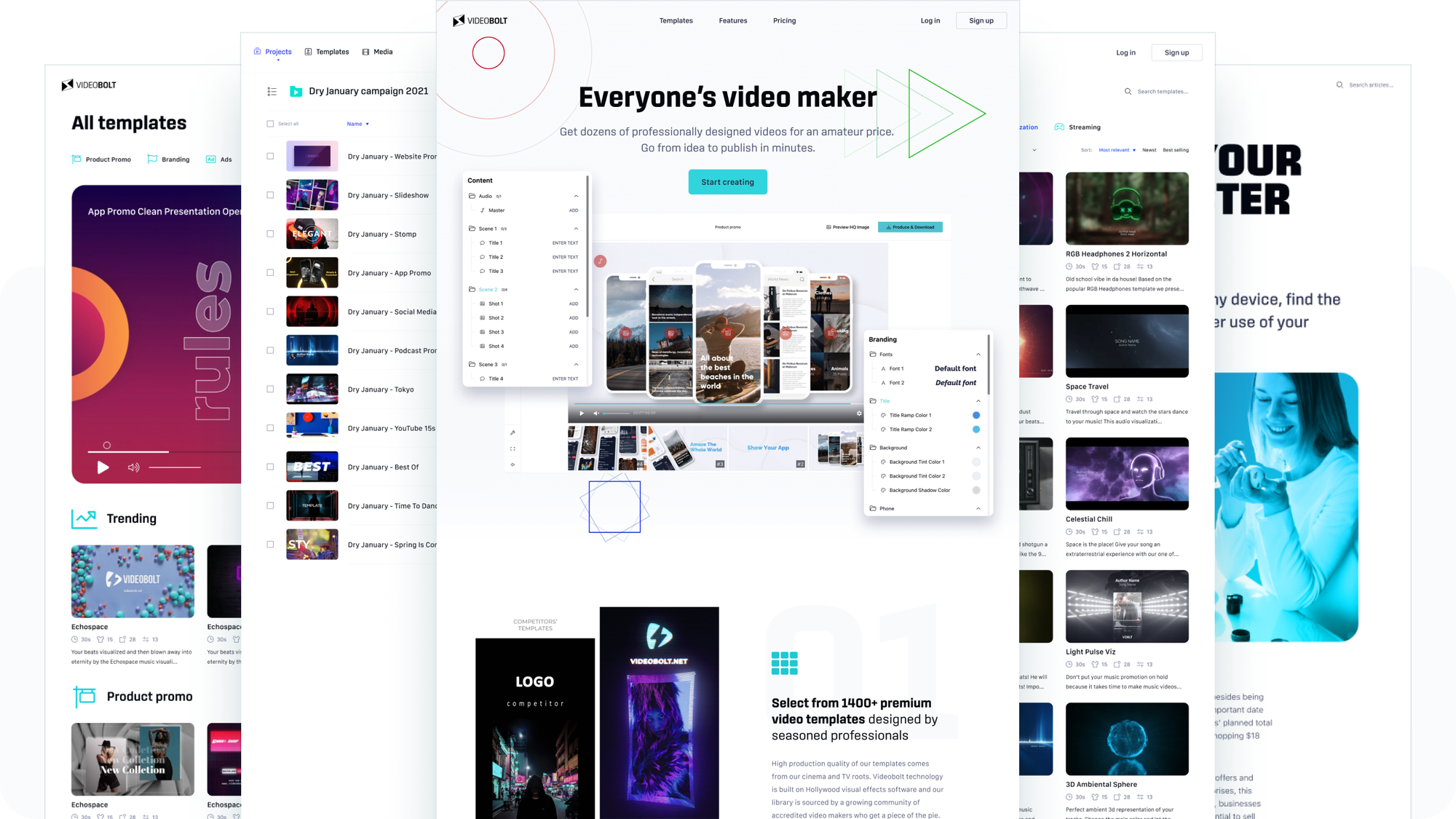
- Redesigned the landing pages, marketplace, and user dashboard
- Designed the next-generation video editor concept
- Audited the product across acquisition, retention, and usability
- Carried out SEO keyword analysis, competitor analysis, and customer segmentation research
I also advised the executive team on product positioning, value proposition, and growth strategies.
Results
| KPI | Change |
|---|---|
| Avg. MoM revenue growth rate | 5.04% → 9.95% |
| Sign-up conversion | +86% best, +11% lowest across landing pages |
| Subscription conversion | +79% on the best-performing flow |
| Organic clicks | +276% |
| Avg. SERP position | +33% (improved) |
| Bounce rate | −83% |
“Natan guided us in identifying and prioritizing issues and helped us set a strategy. We also appreciate the hands-on work he did to redefine our brand image and improve core product functionalities. The project resulted in our organic traffic almost tripling over the period of six months, and we doubled our average month-over-month growth compared to last year.”
— Ugljesa Stojanovic, CTO & Co-founder
Highlights
Brand refresh
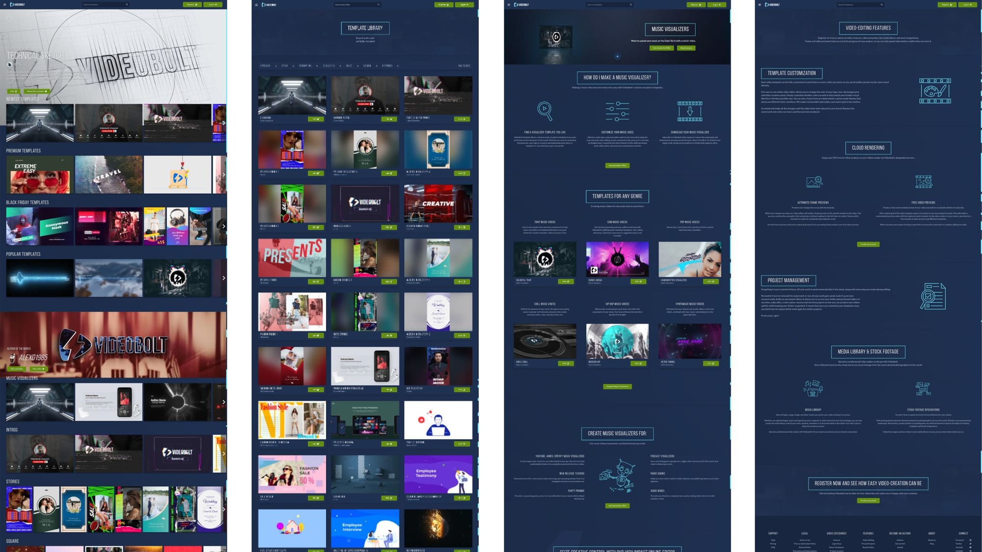
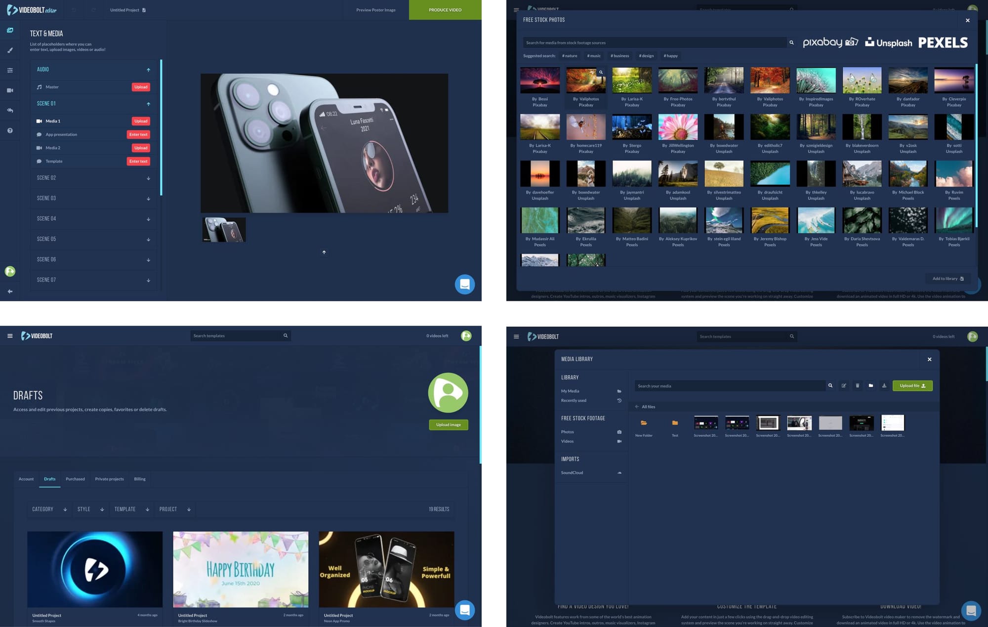
The original design was entirely in dark mode, which hindered readability and, in turn, conversion. The first impression felt outdated, perhaps even untrustworthy. And since the templates are the heart and soul of Videobolt, their visual richness demanded a consistently neutral stage: the redesign had to put them at center while getting everything else out of the way.
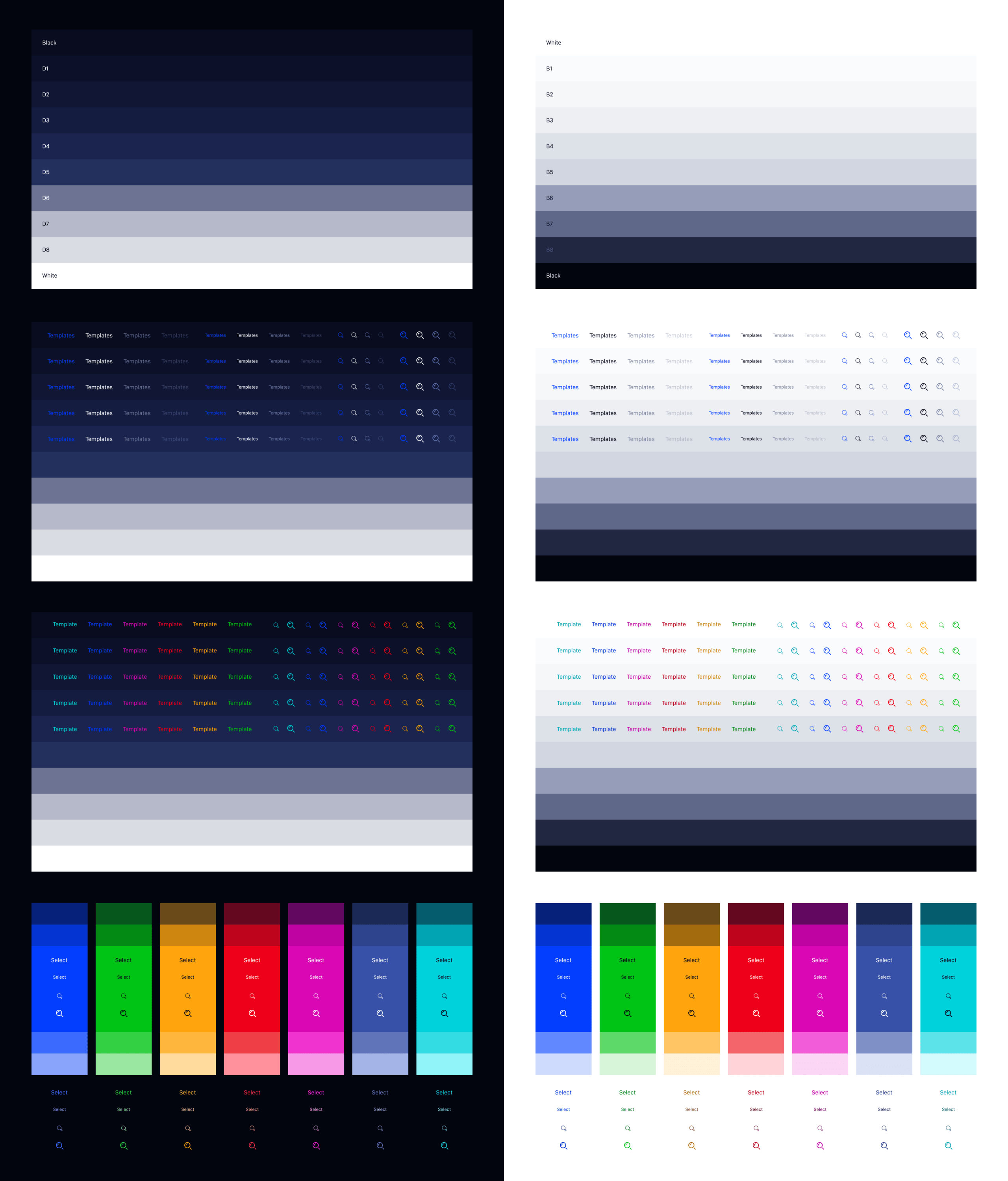
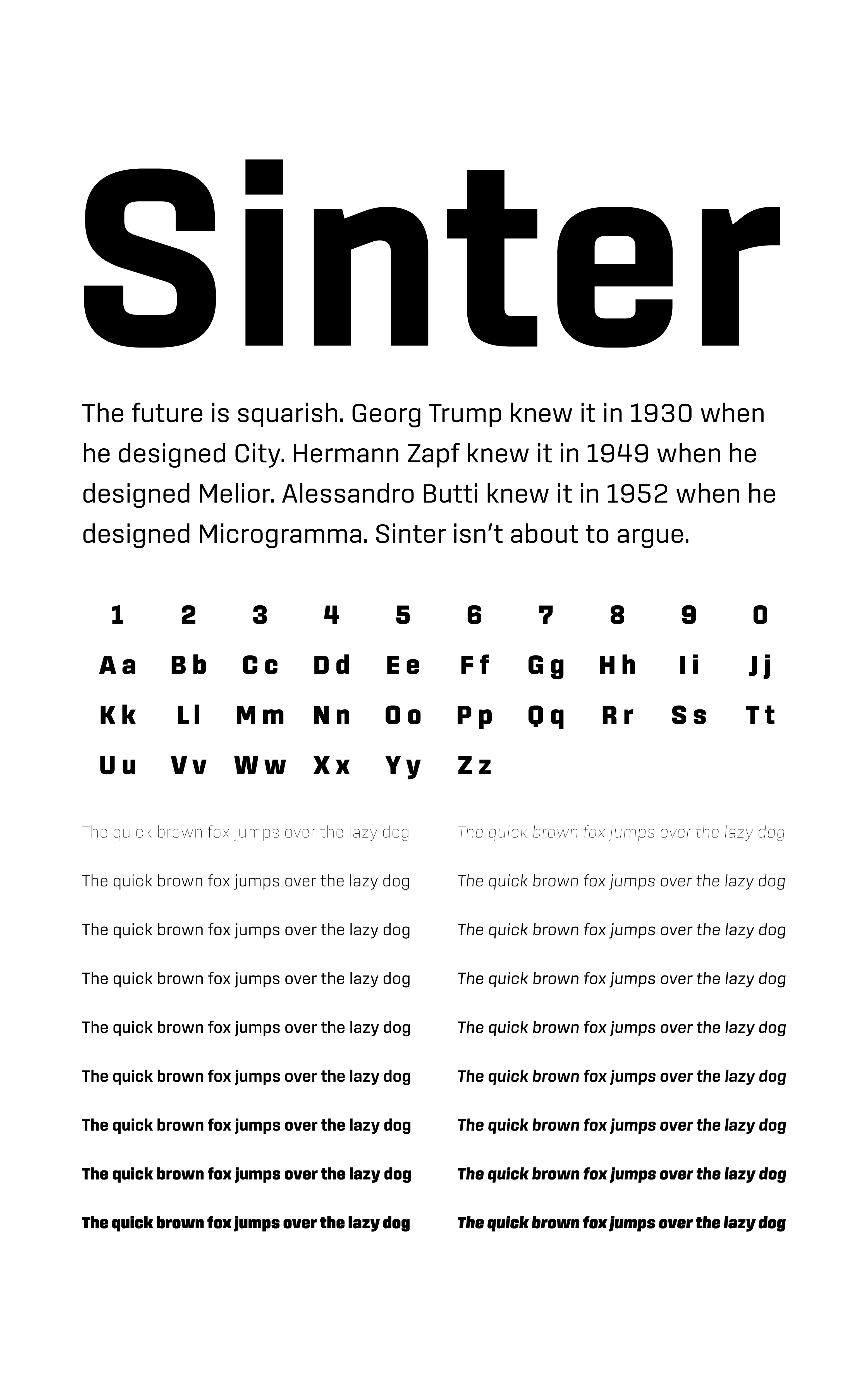
The new vivid color scheme was mixed for a neon look and optimized for high contrast in both dark and light mode with a single set of values. Sinter was chosen as the new brand font for its balance between a strong hi-tech character at large sizes and highly functional qualities suited to long-form reading and UI design.
Video editor app
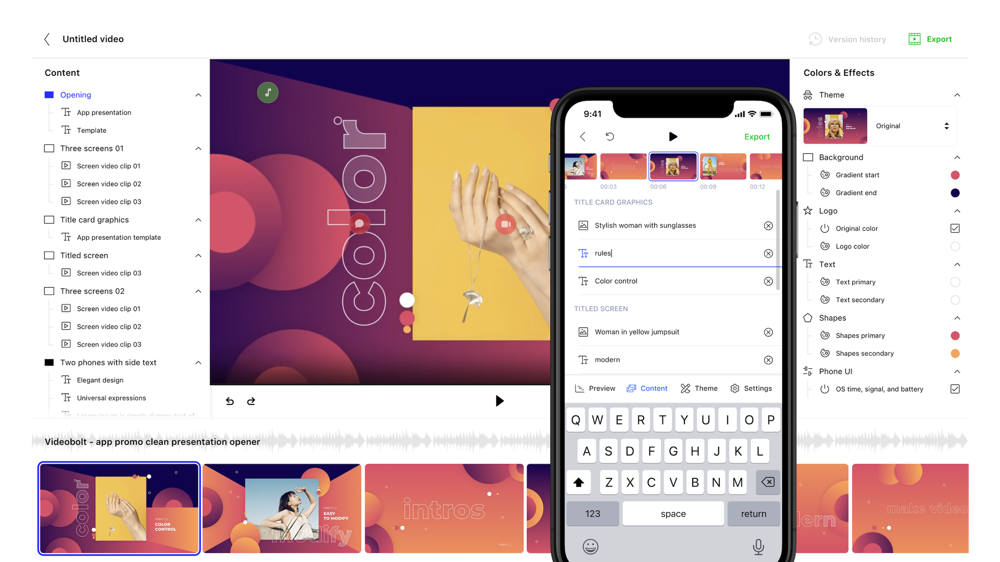
The redesign aimed to improve intuitiveness with a more familiar layout. The existing sidebar with multiple tabs was split into two side panels, keeping all functionality visible at all times. This would improve feature discoverability, require fewer clicks per action, use large screens to their full extent, and symmetrically center the creative canvas.
Even though the app doesn’t rely on a classic video editing timeline, a thumbnail strip was introduced for easier navigation between scenes and a clearer link to their customization controls.
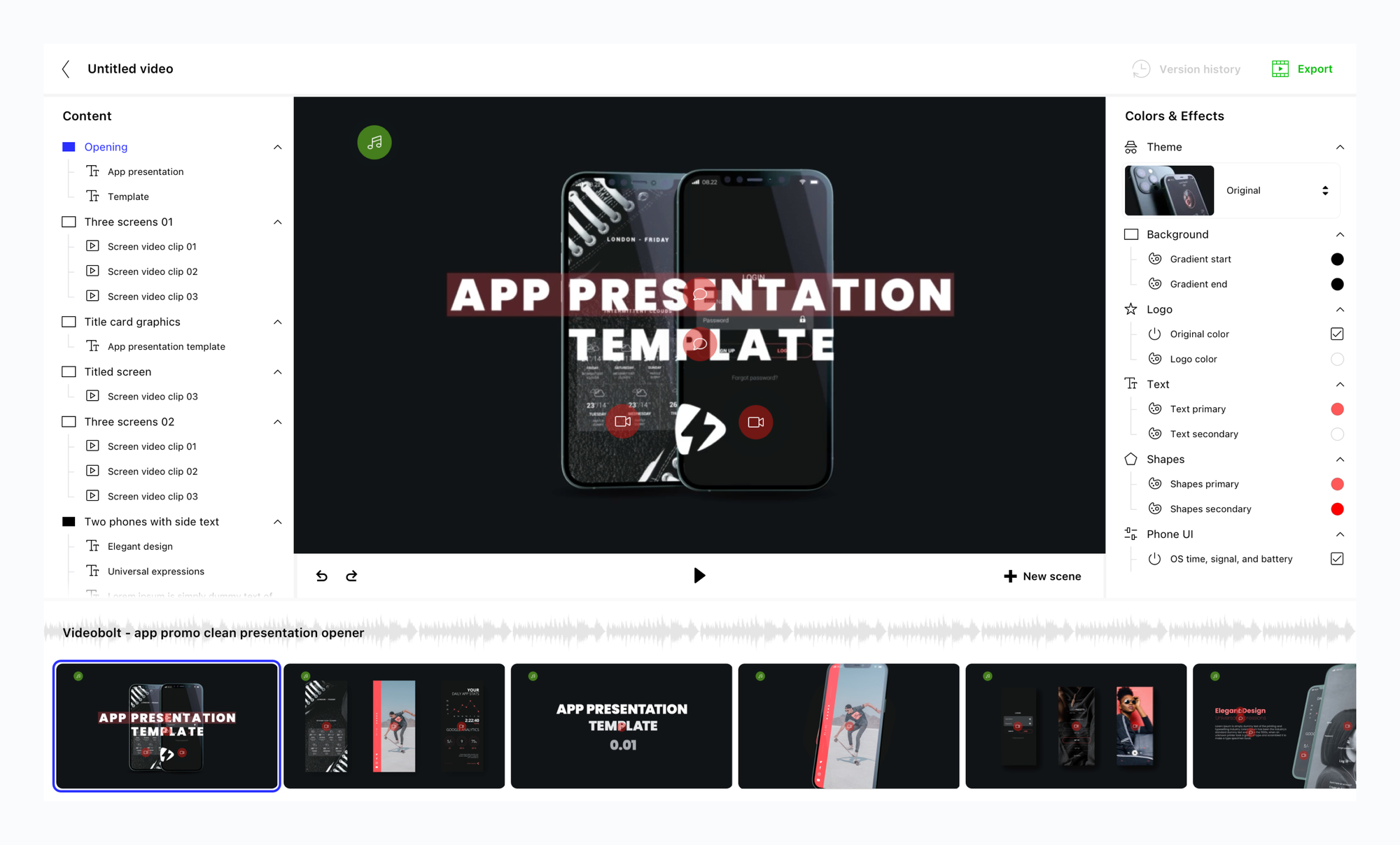
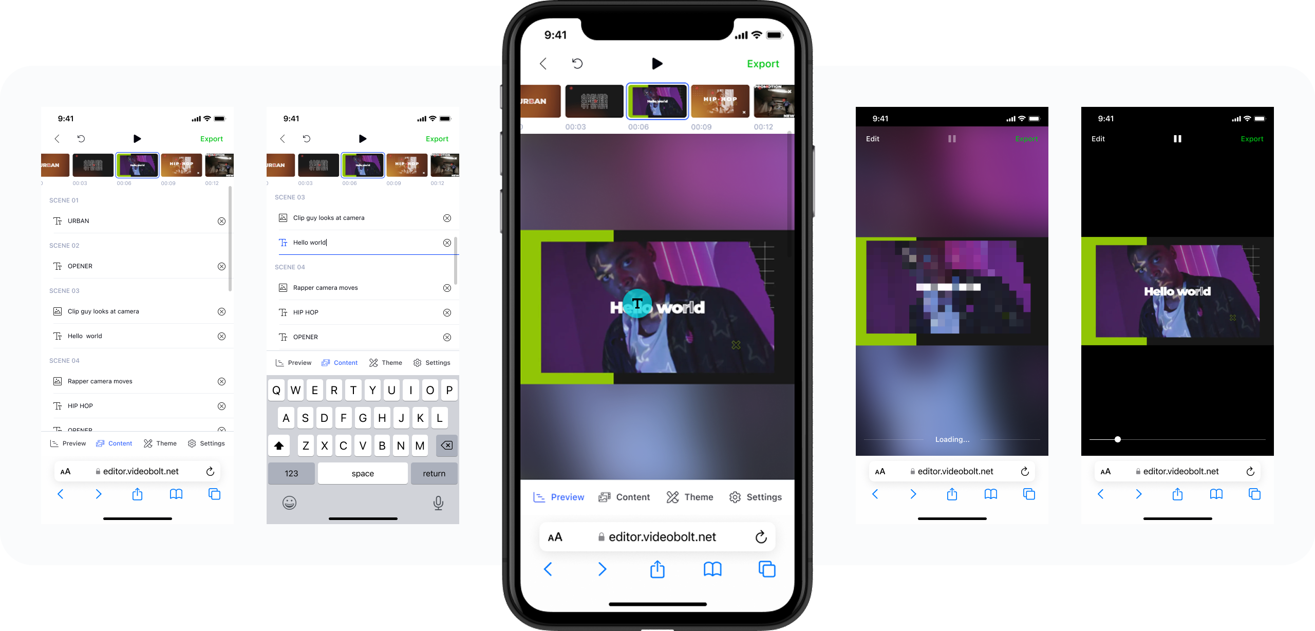
Most importantly, the design transformed the desktop-only app into a responsive progressive web app (PWA) optimized for tablets and smartphones.
Dashboard
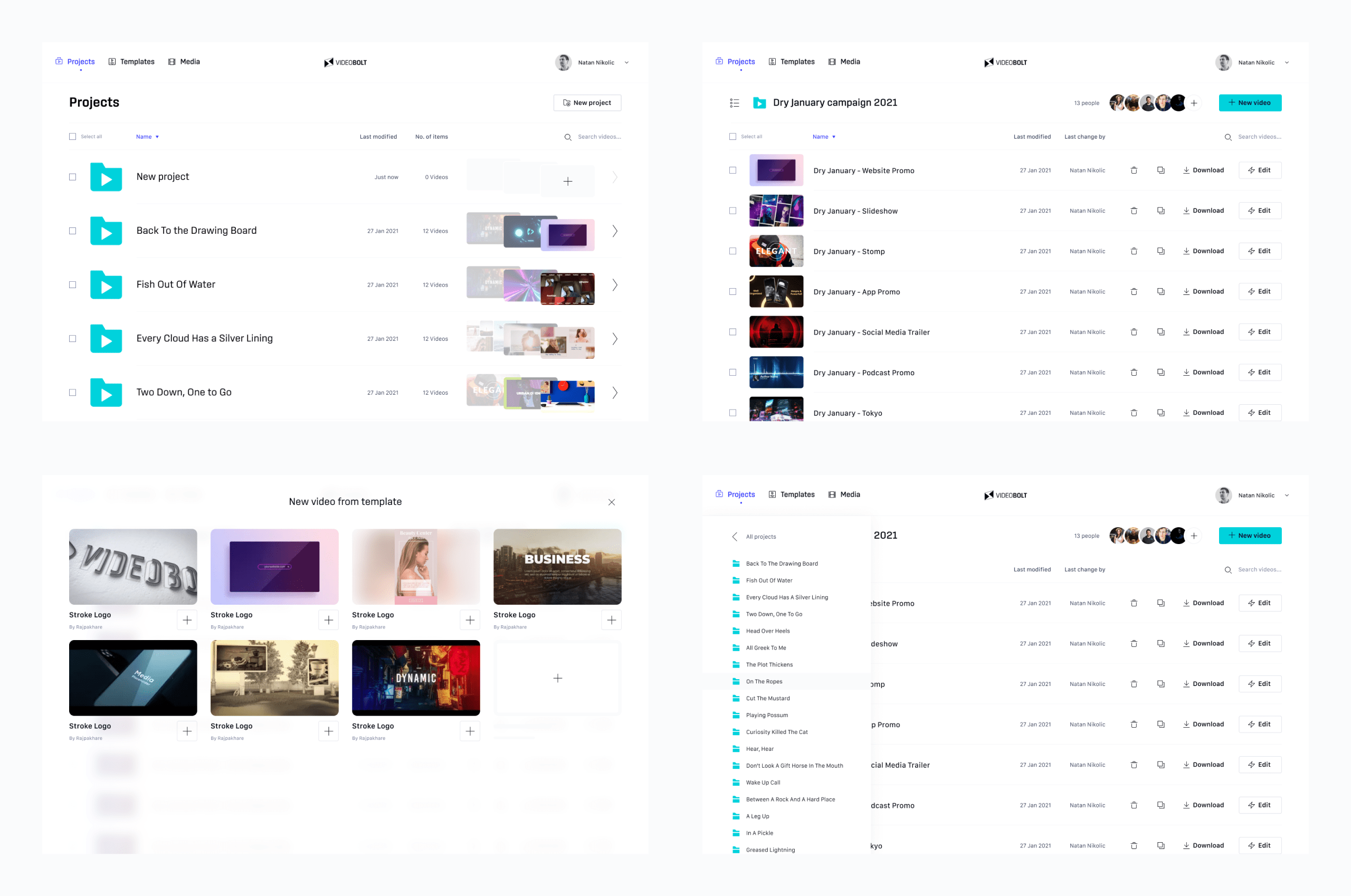
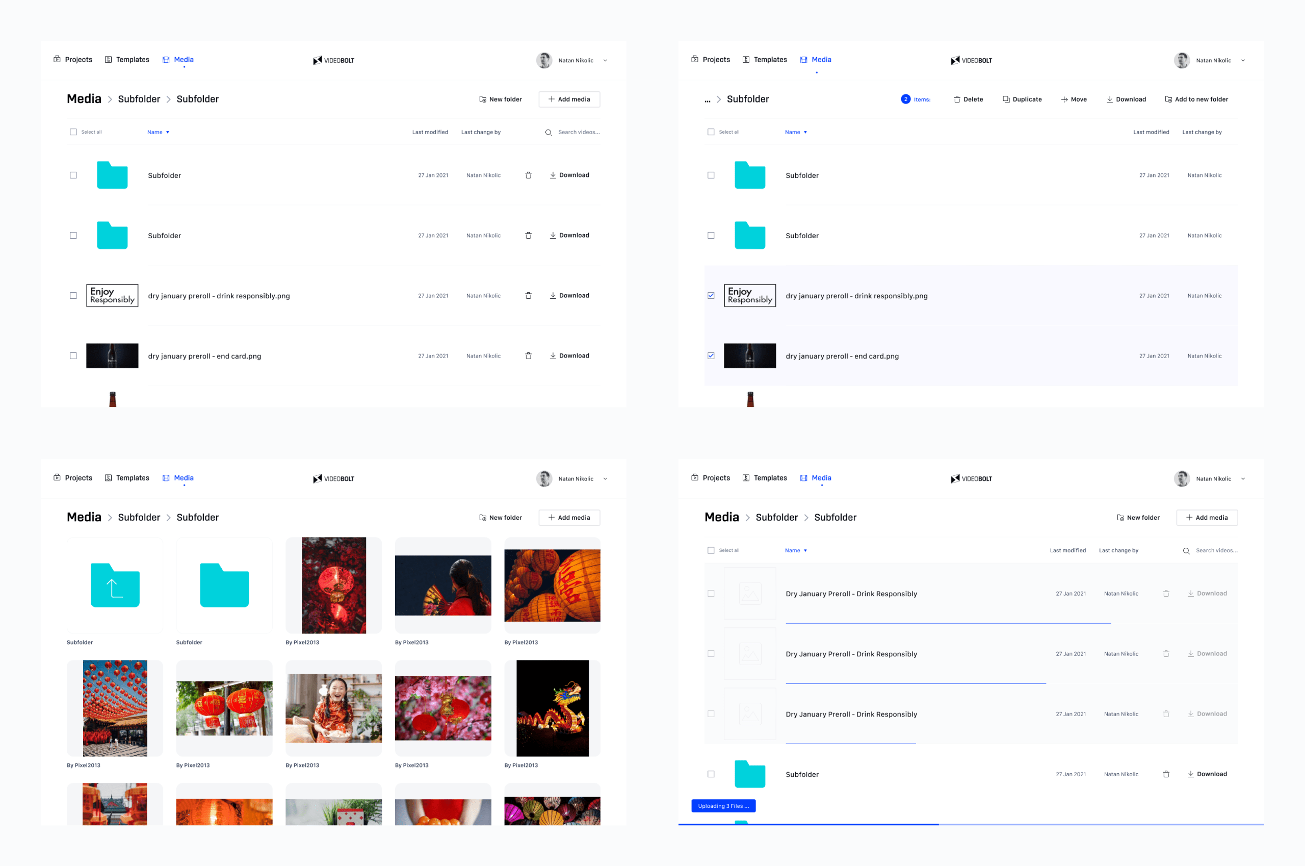
Increasing video production volume per user required removing as many points of friction as possible. We redesigned the dashboard as a web file explorer with batch operations and a new project wizard featuring previously used templates.
Templates marketplace
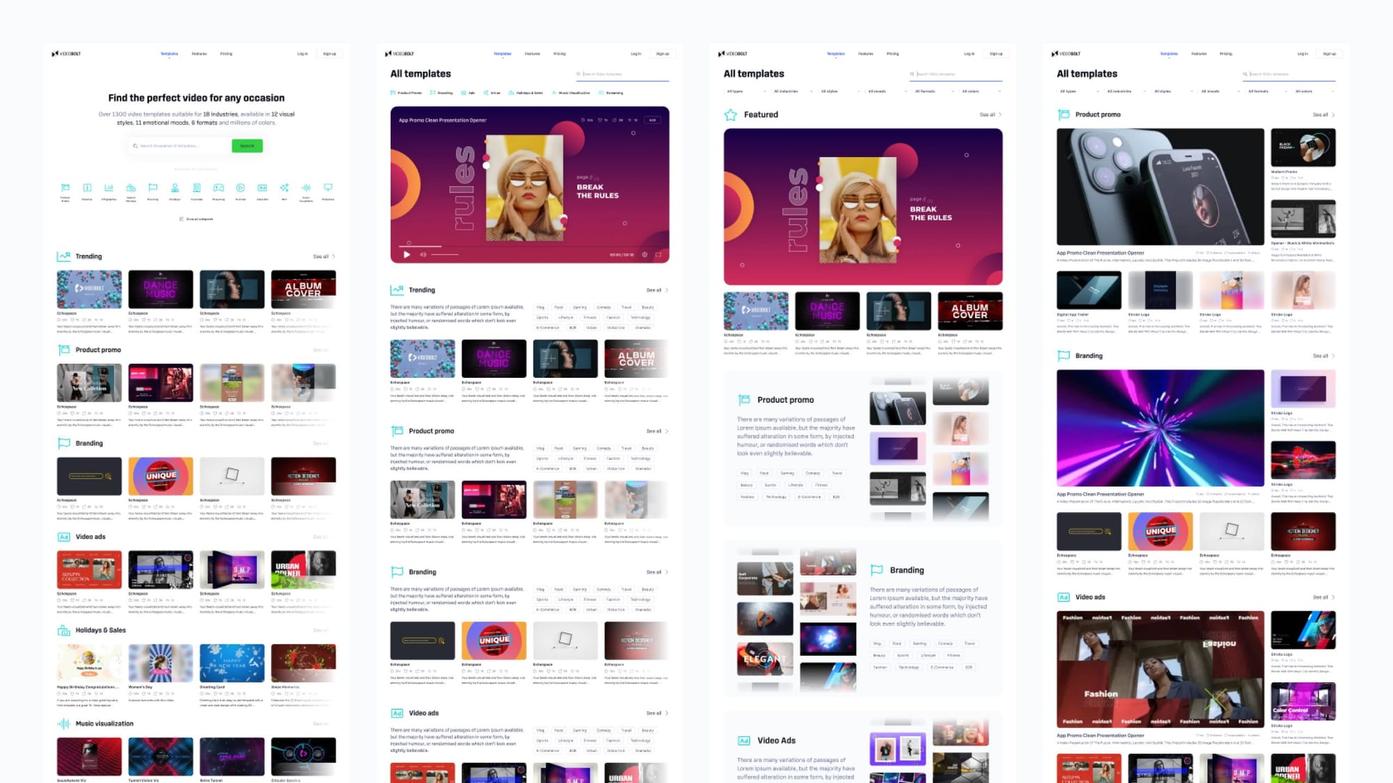
In addition to redesigning the typology of template categories, we experimented with layout concepts ranging from stock photo libraries to app stores. The aim was a solution that works both for those who know exactly what they’re looking for and those who arrive at a choice by exploring and shortlisting.
Marketing website
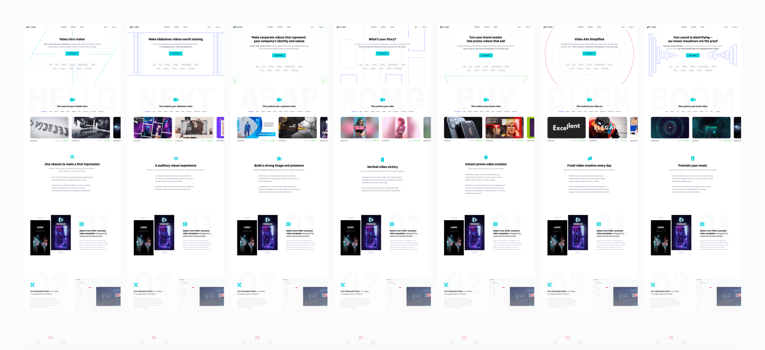
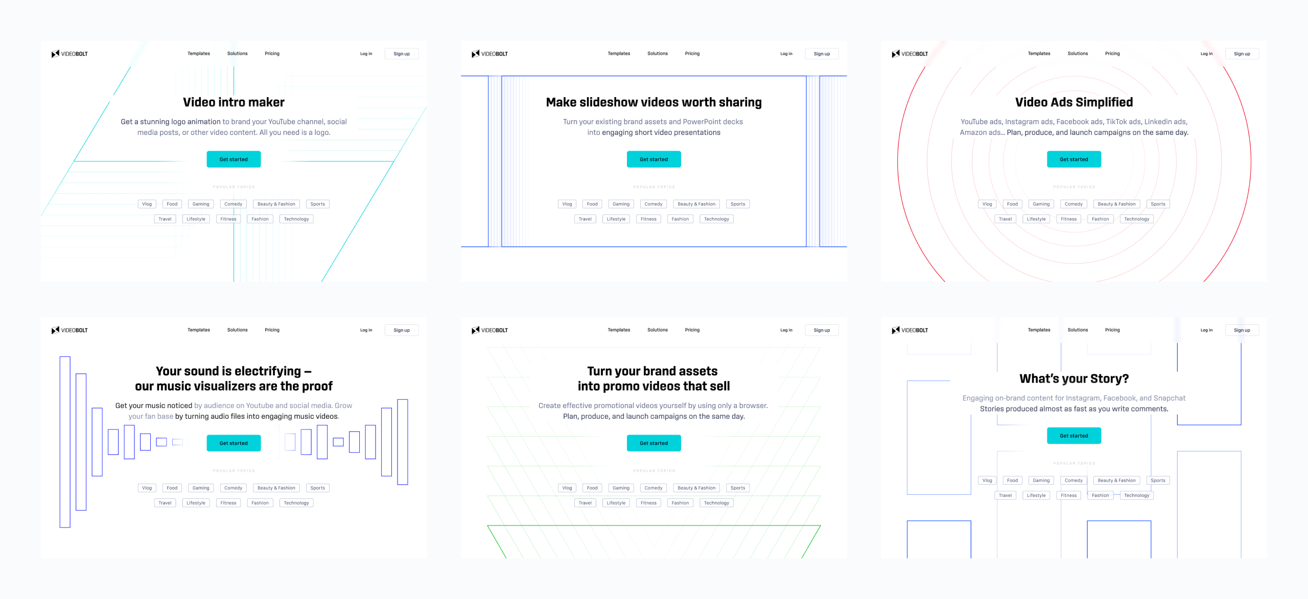
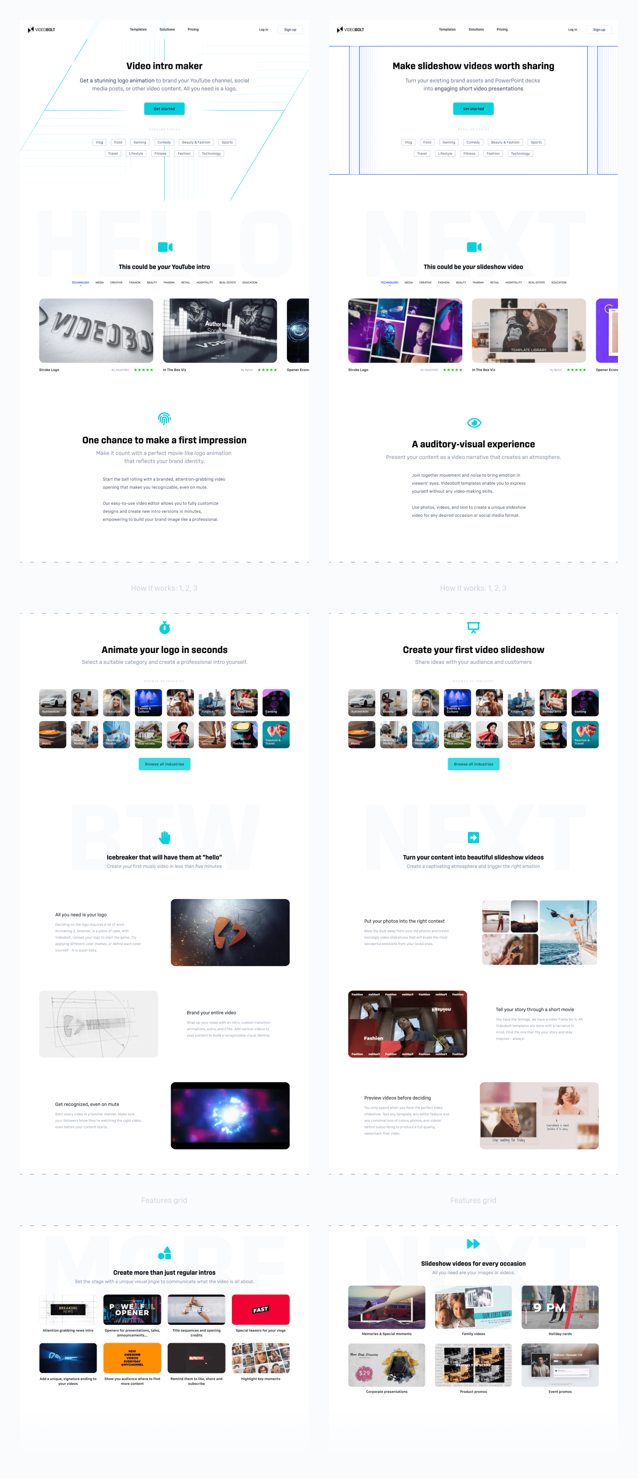
For landing pages we built a template that follows structural and copywriting best practices. The core value proposition sections are static. Others, like the intro and template gallery, are tailored to the use case.
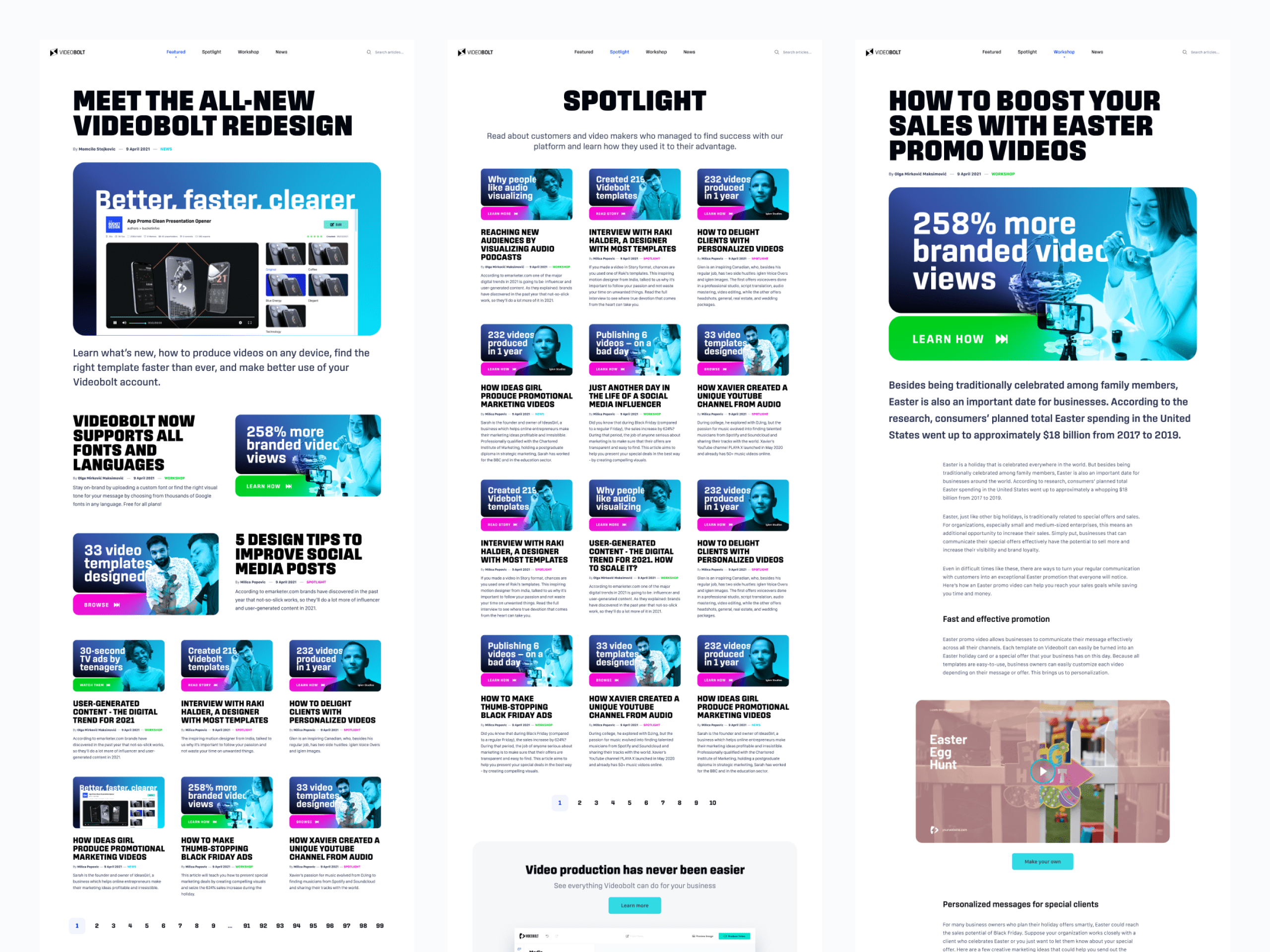
The blog was designed around the hero section, which doubles as an OpenGraph link preview image. The brand gradient blending with monochrome photography serves to standardize each post. The big text hook and a break-the-frame effect catch attention to stop doomscrolling. Together, they achieve brand recognition through repetition.