
TransferWise
Context
Company: TransferWise (now Wise)
Timeframe: 2011–2012
Role: UX+UI Designer (freelance)
Founders Kristo Käärmann and Taavet Hinrikus invented what TechCrunch called the “Skype of currency exchange.” At the time, the company operated an MVP with a few thousand users and a handful of supported currencies. The signal for market demand was strong, but the website suffered from high bounce rates, low conversion, and low repeated transfers.
As the first designer to work with the company, I singlehandedly redesigned the core product and the marketing website. I also advised founders on user experience and product marketing.
Results
- Performance: Significant lift in conversion rate, repeated transfers, and LTV (reported but undisclosed)
- Legacy: Core architecture and solutions still in use today
- Impact: Helped secure Series A funding; the company went on to achieve unicorn status
Web analytics and user research revealed that the greatest obstacle was trust. Despite the company’s no-brainer value proposition, its radically new P2P model, no formal bank status, and a plethora of online scams contributed to users’ risk aversion.
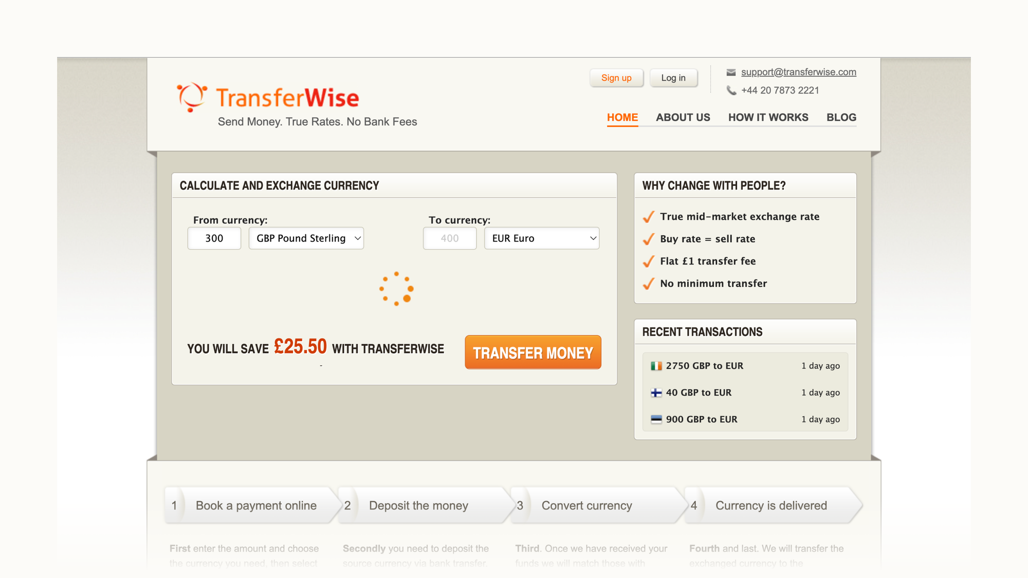
Redesign served as a soft-rebrand experiment to align the new website’s visual language with consumers’ expectations of financial institutions.
The hero section featured a background map showing live transactions to instil trust in addition to the Facebook widget and TechCrunch endorsement. I collaborated with the copywriter on articulating the value proposition and how-it-works pitch.
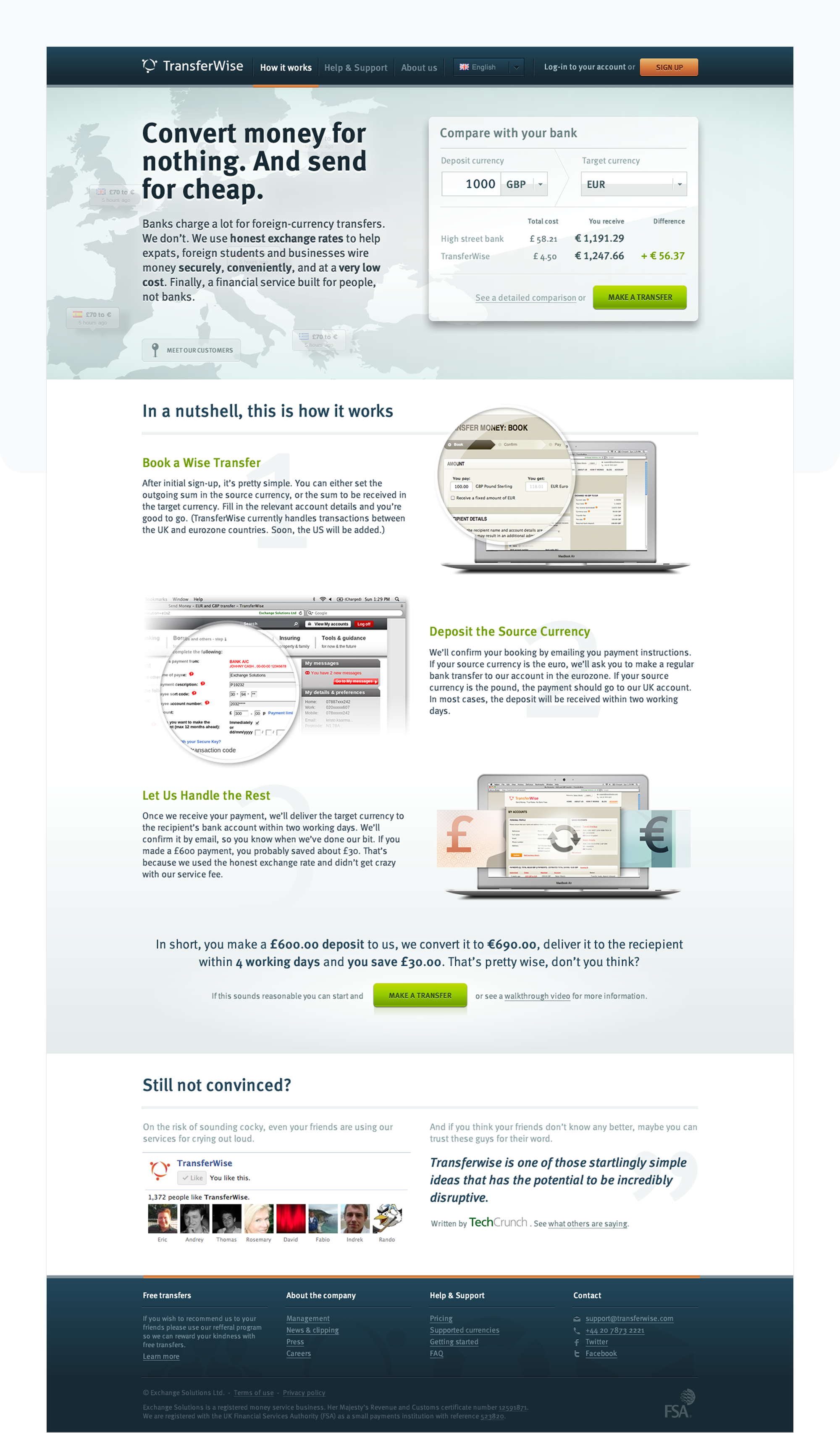
I advocated for transparency and accessible language as the cornerstone brand values to position the company as a trustworthy alternative to banks, which obscure their subpar business terms with complicated verbiage and small print.
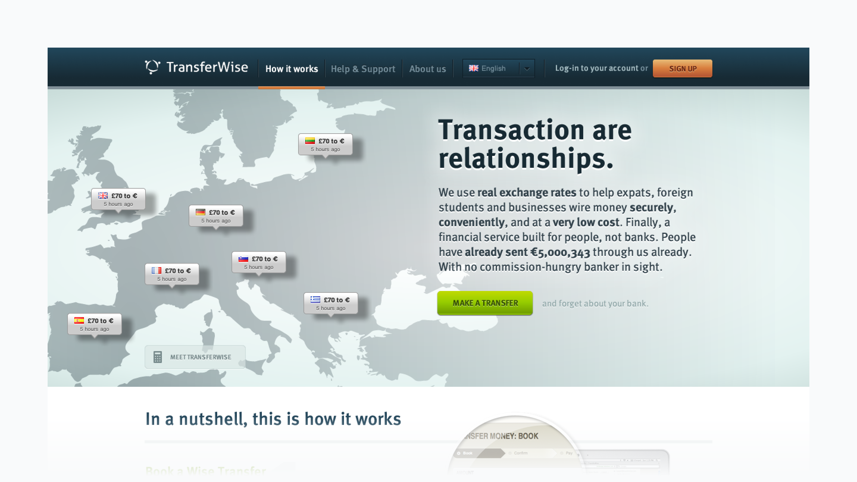
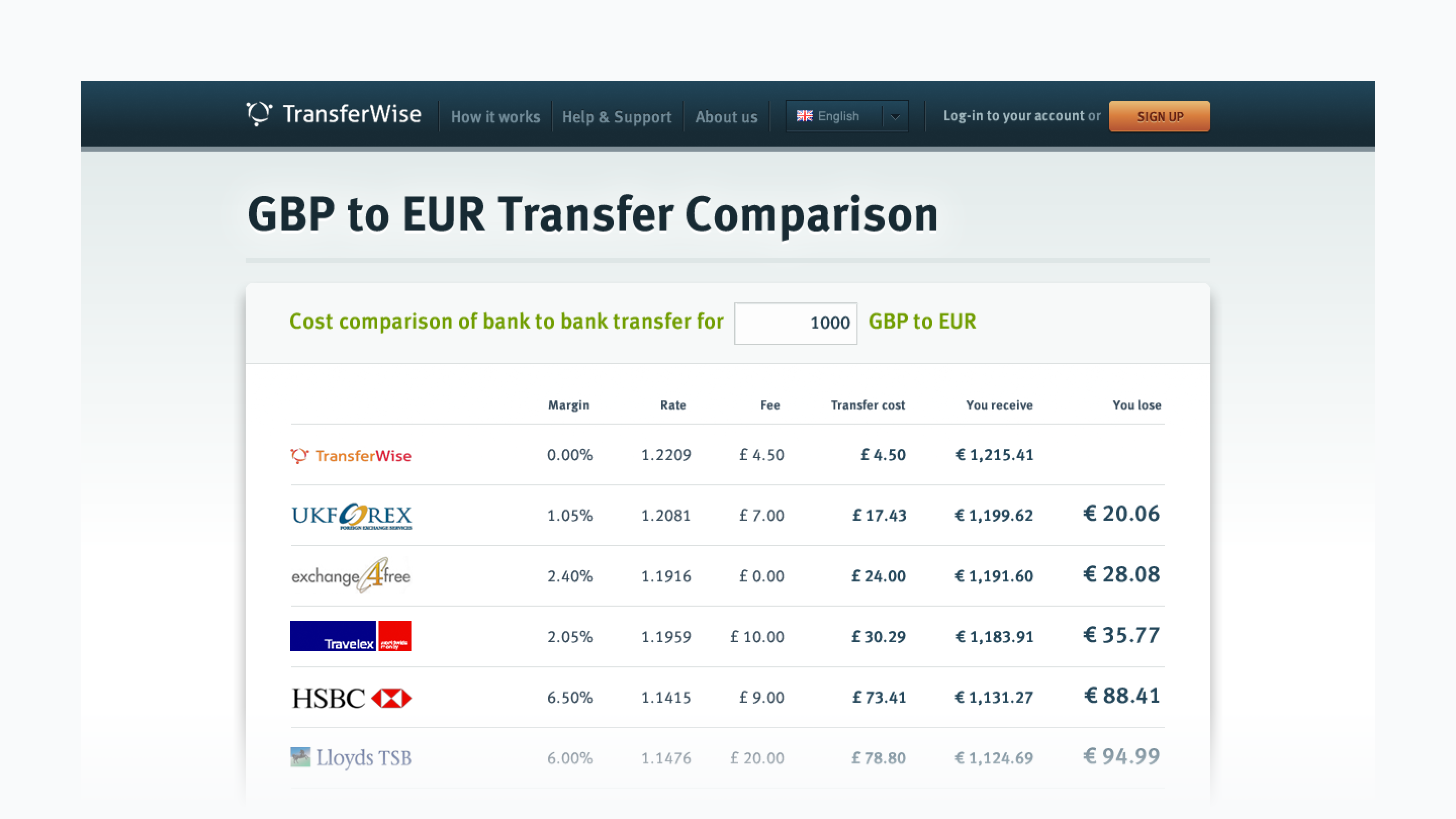
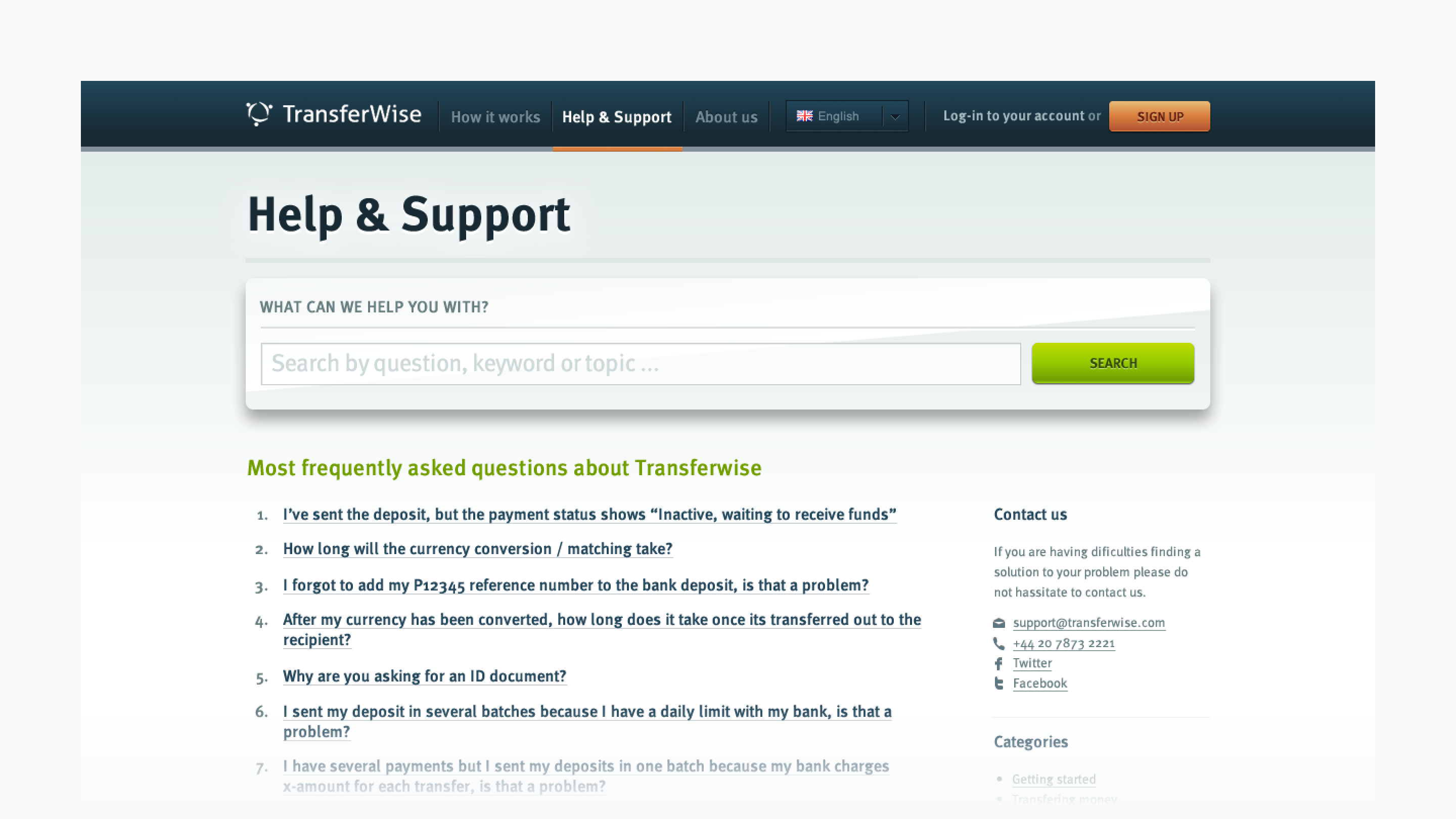

1. Live transactions map; 2. Cost comparison SEO landing page template; 3. Support section; 4. Corporate blog article
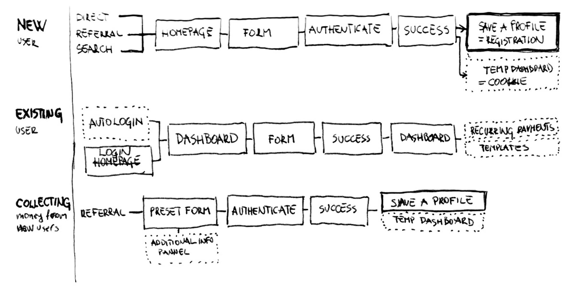
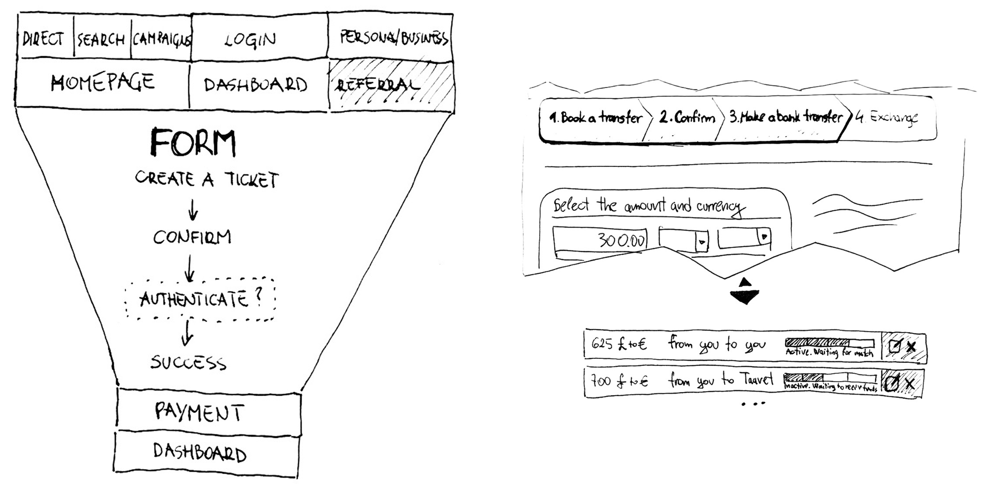
The redesign improved the conversion rate by reducing the number of required fields, aligning transfer flow steps with users’ mental model, and implementing other UX best practices.
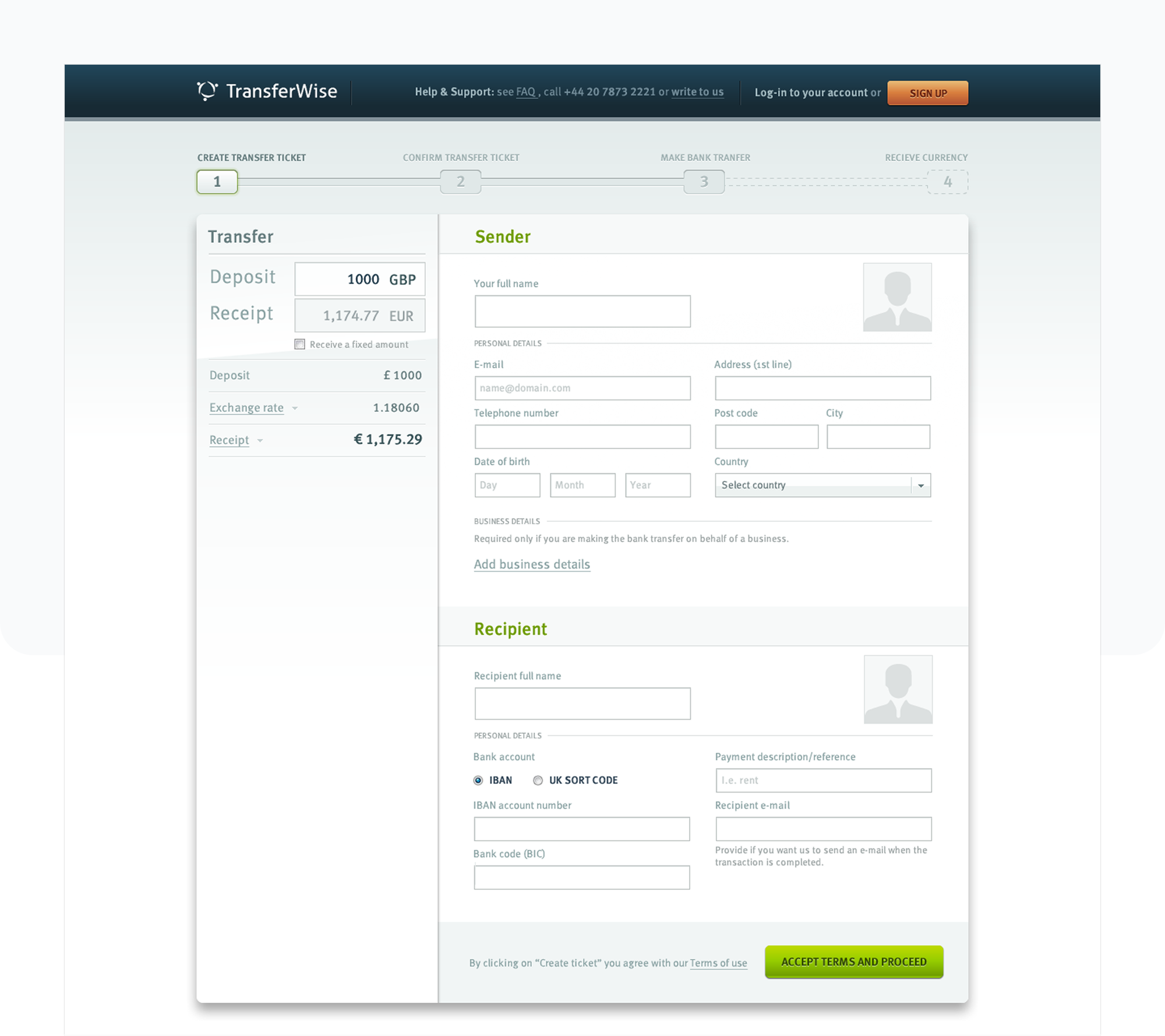
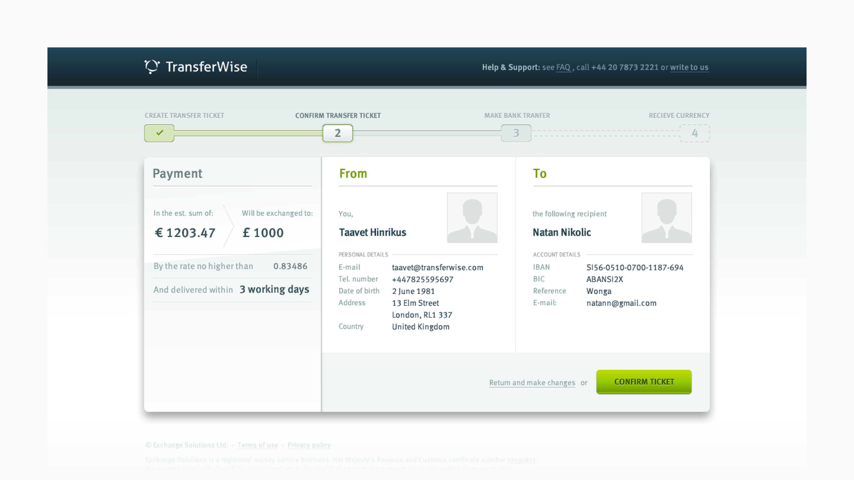
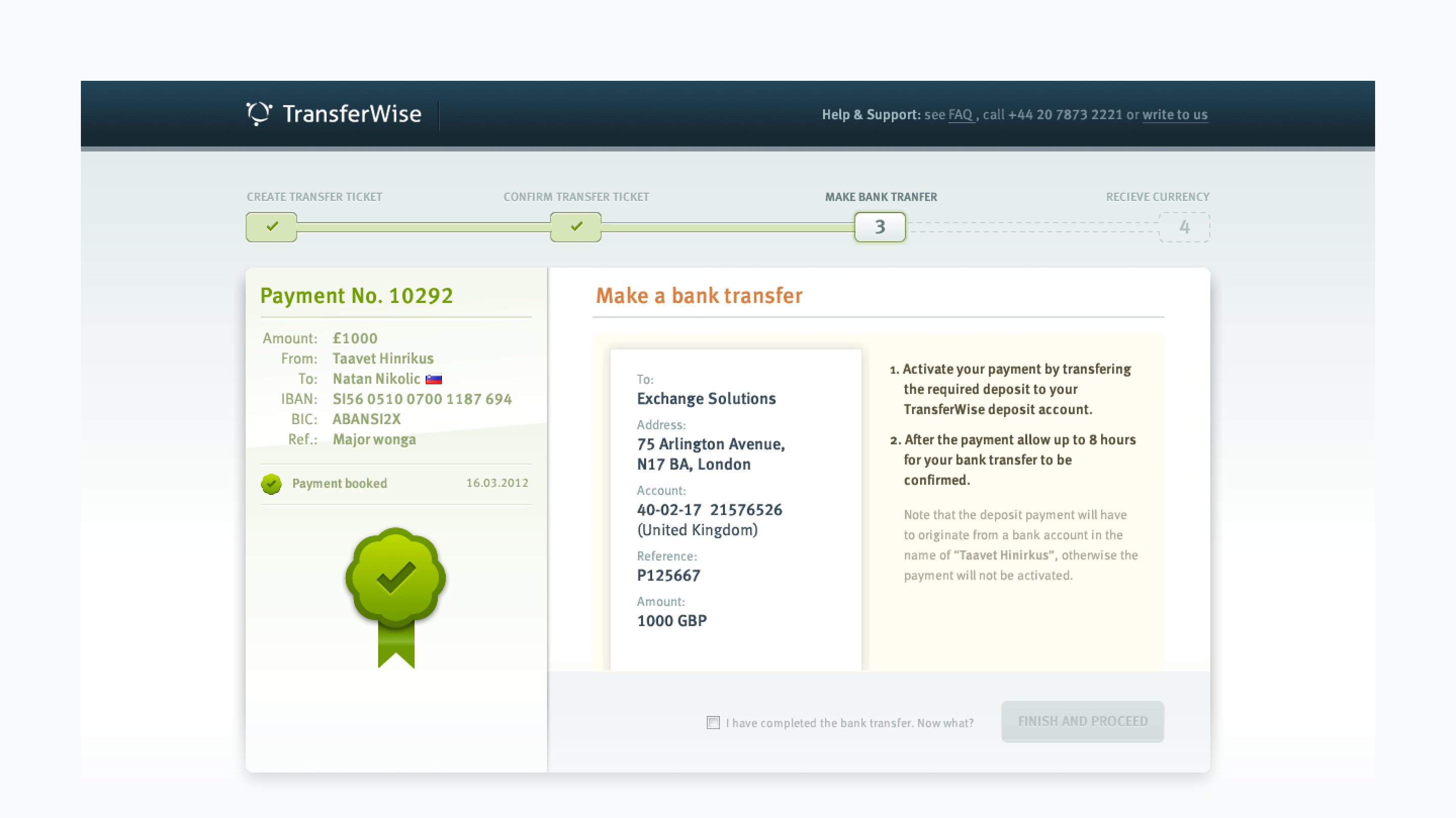
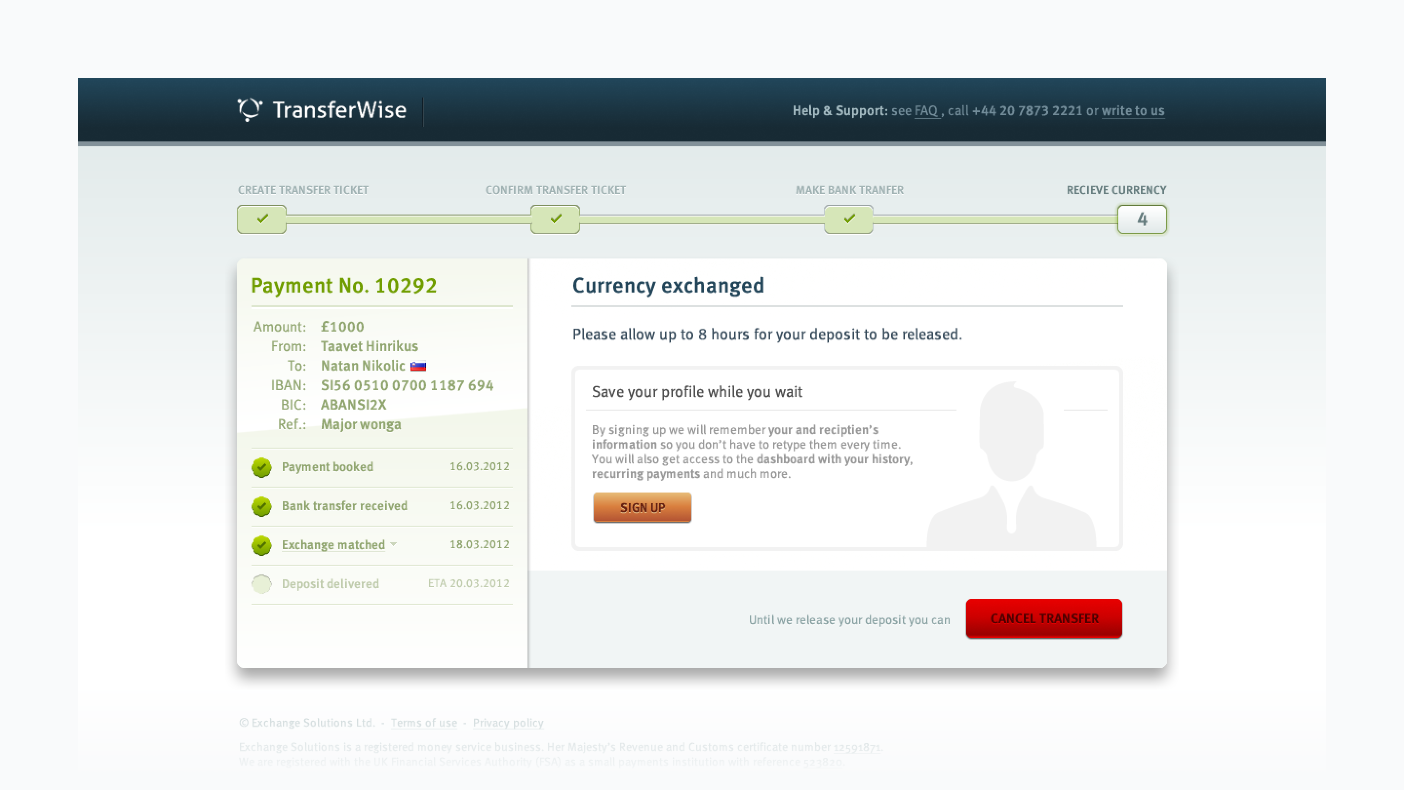
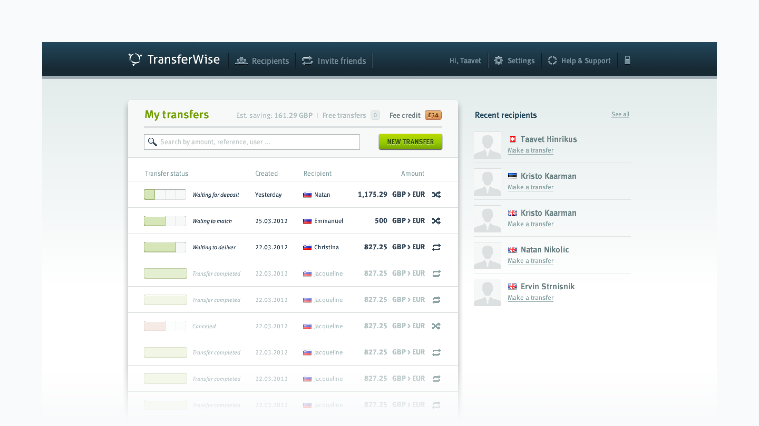
1. Review and confirm step; 2. Payment call-to-action step; 3. Confirmation screen; 4. Account dashboard with payments history
Credits
Copywriting: Villu A.
Engineering: Bogdan D. & Alexander L. @ DefaultValue