
Seoul Beauty Club
Overview
Company: Seoul Beauty Club
Timeframe: May–Jun 2026
Role: Product Design Consultant
Note: Published with client’s consent.
Background
Seoul Beauty Club is a box subscription startup that guides members to healthier skin by identifying their needs and prescribing tailored skincare routines. Its Korean American founder saw the Western market flooded with K-beauty gimmicks and the potential to disrupt it by unlocking access to thousands of premium products and the traditional approach to skincare that Koreans actually use.
After raising a pre-seed round, the company began in-depth improvements to the MVP, including aligning the product with its new brand visual identity.
Results
Undisclosed.
Ownership
As the sole designer on the team, I worked directly with the founders on identifying and implementing the highest-leverage improvements for boosting growth.
Show individual contributions
- Optimized the sign-up flow for conversion
- Improved the box configurator shopping UX+UI
- Optimized the post-purchase UX for stickiness and retention
- Improved the IA and navigation
- Consolidated UI patterns for the web and iOS app
- Aligned the website and the app with the new visual identity
- Ran a dogfooding product audit and wrote a UX research report on the points of friction it diagnosed
- Analyzed customer survey data and wrote a report identifying consumer attitudes and opportunities
- Researched visual language conventions in the cosmetics industry, produced a typology report, and set the art direction for ads
The role also included advising the founders on product strategy, positioning, and value proposition.
Highlights
Sign-up conversion optimization
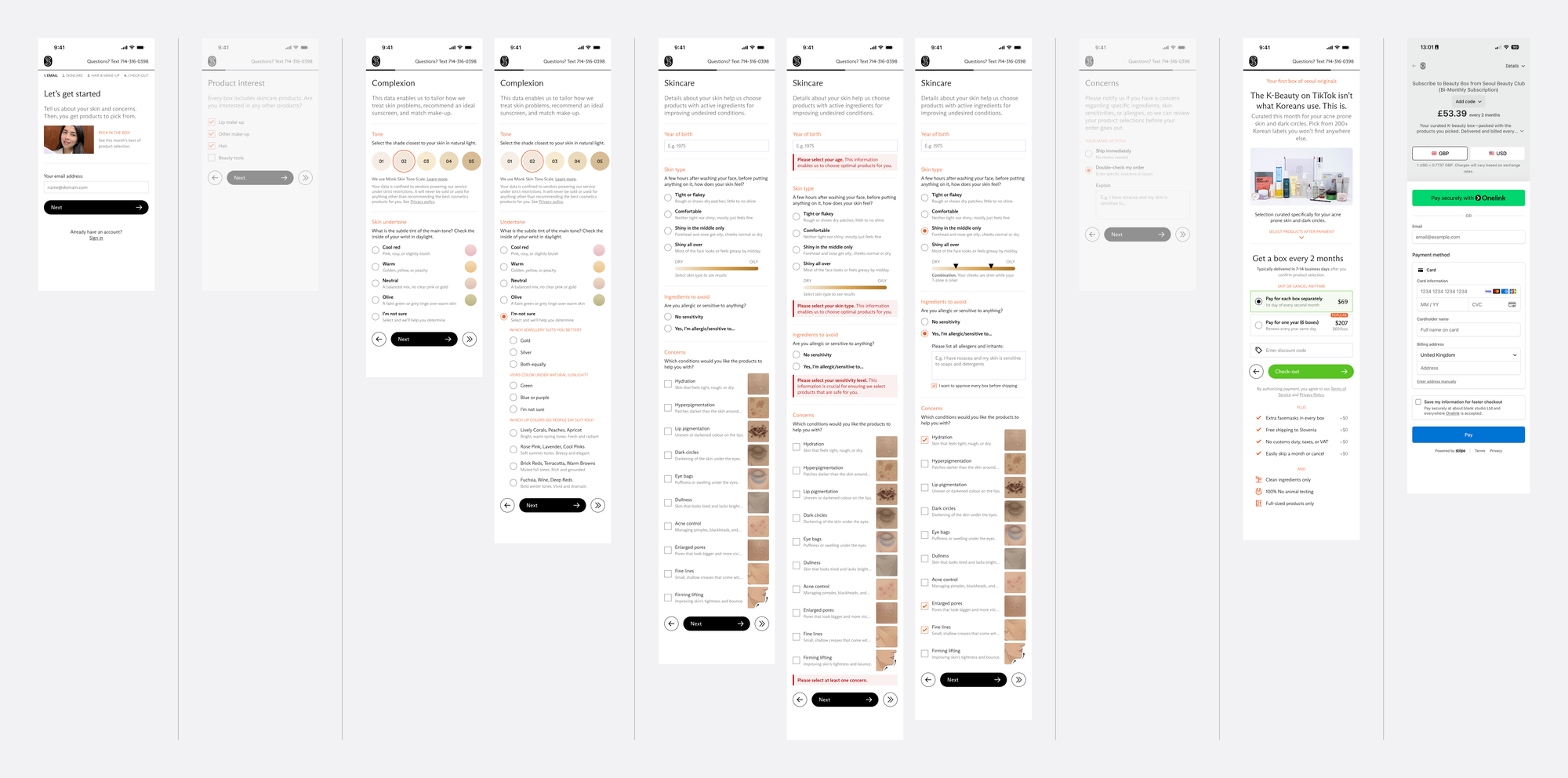
Refactoring the sign-up flow reduced seven steps to five. The skin survey was moved to the second step to match users’ expectations set by the call-to-action on entry landing page. Form logic and micro-interactions were simplified to reduce effort and improve completion rate.
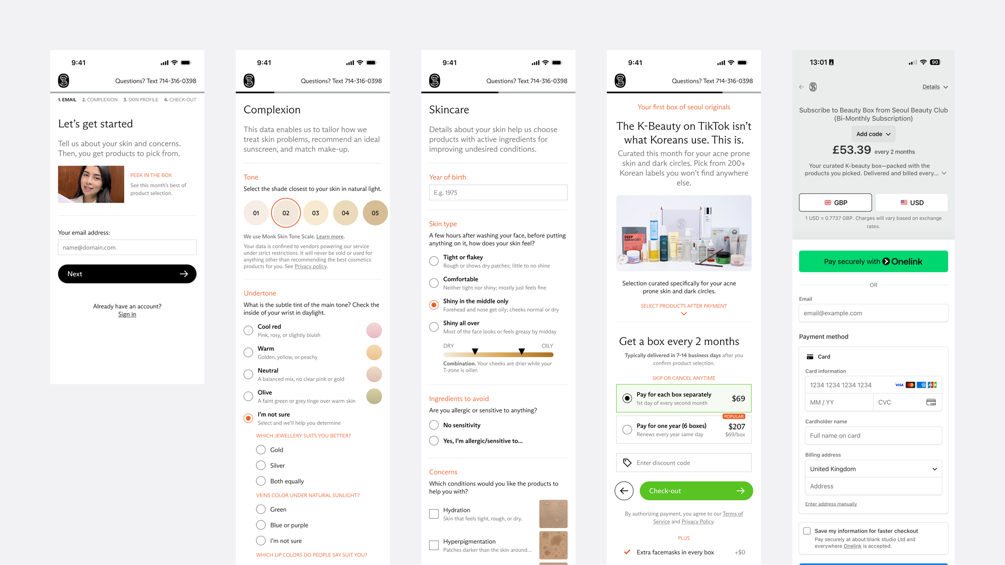
Since the product’s efficacy relies on the quality of collected data, it was crucial to make self-reporting as reliable as possible.
To make selectable options clearer, all instructions were rewritten in a more accessible language and visualized.
The original “skin type” form used the conventional dermatological model that conflates oiliness, sensitivity, and acne into one multiple-choice question that’s too confusing for an average consumer. Reframing the survey question allowed the form to be refactored into a single-choice field that anyone can answer by feeling and looking in the mirror.
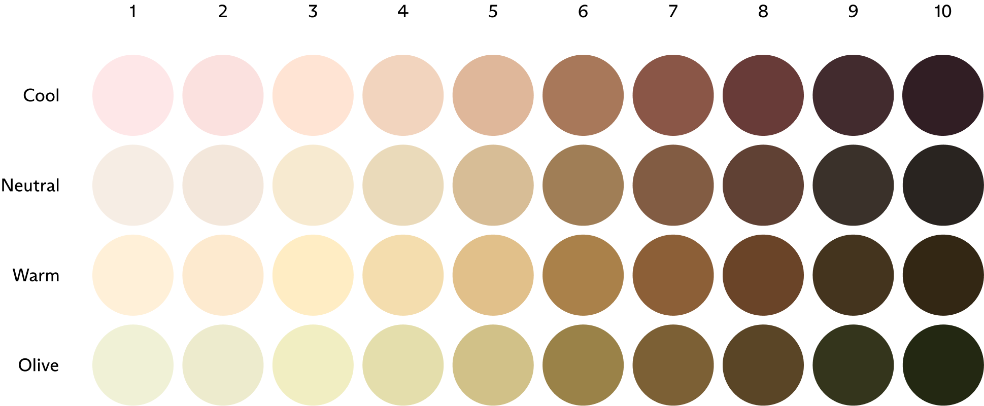
Identifying your skin undertone was made easier by extending the open-source Monk Skin Tone Scale with cosmetic industry-standard cool, warm, neutral, and olive undertones to visualize answers based on a 40-shade matrix.
Box configurator optimization
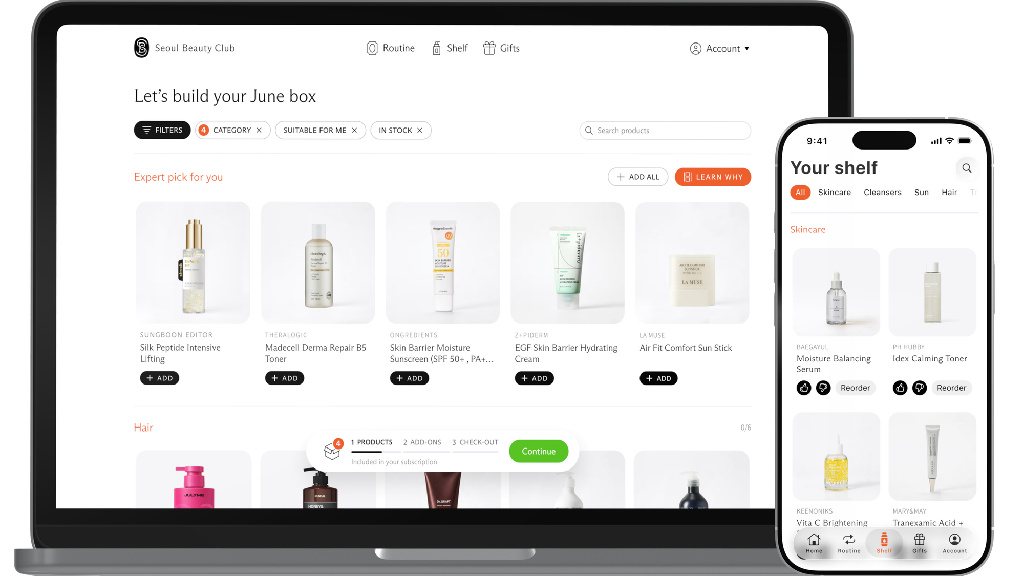
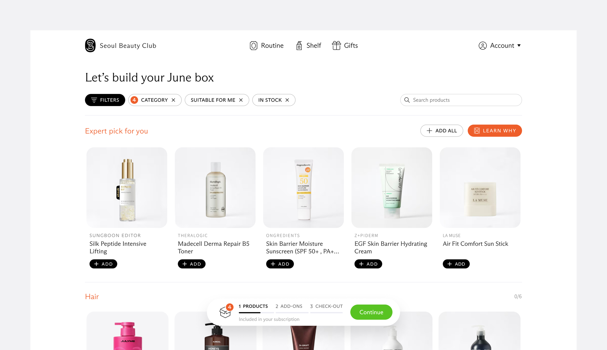
New users are eager to see products, so completing the payment now lands on the full product list. The original interstitial step presenting recommendations was folded into the first section of the list, with the rationale details available on demand. This change eliminates confusion about the number of available products and turns potential frustration into instant gratification.
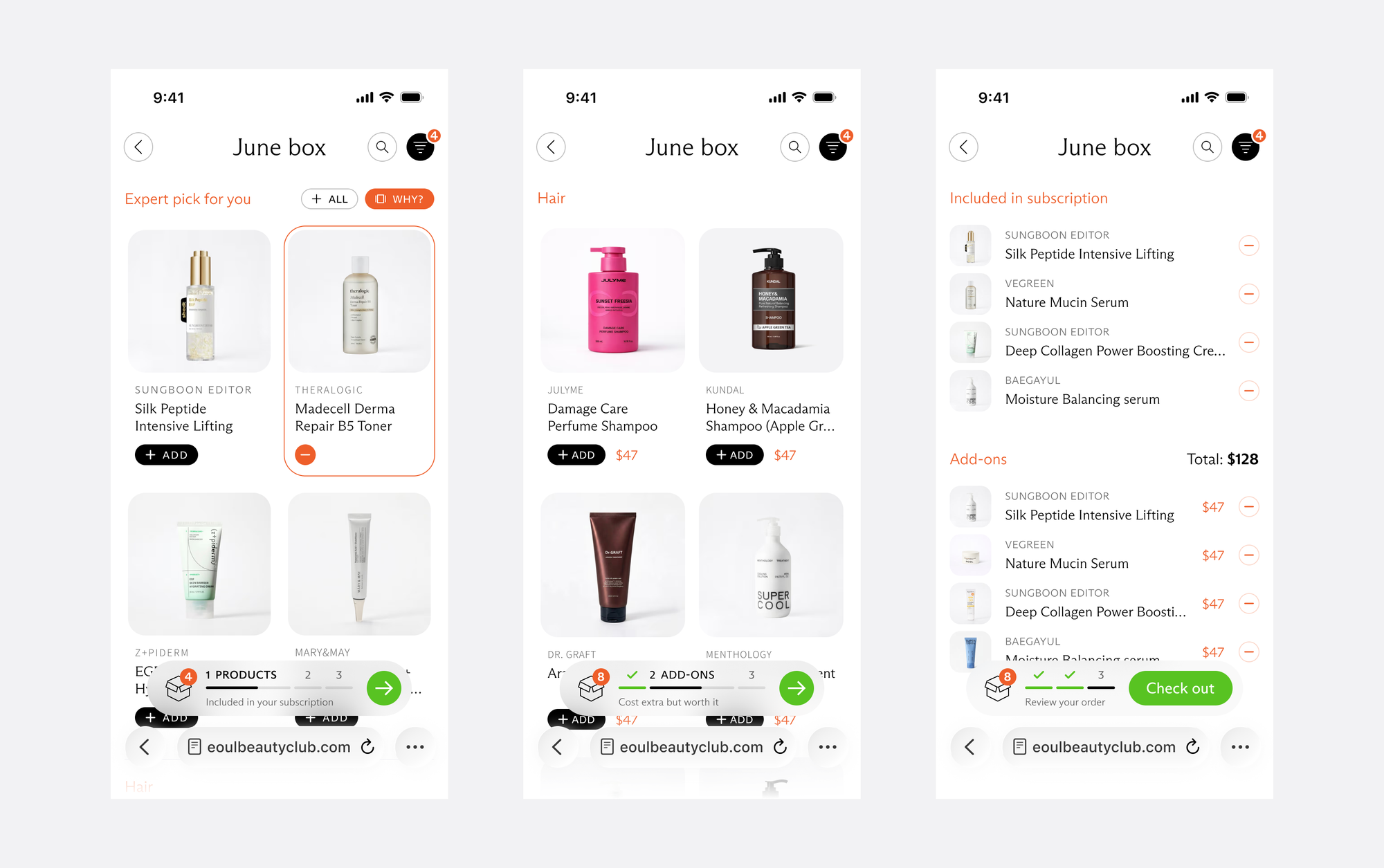
An icon-only “add” button was often overlooked, which hurt sales and drove support queries. Positioning it outside the product thumbnail and adding a label improved mission-critical clarity and intuitiveness.
The original sidebar column on desktop was converted into a floating shopping basket progress bar to fit more products into the viewport and unify UX across all device types. Filters and search were added to make long lists more manageable and enable regular customers to find specific items.
Improving product stickiness and retention
The home page for logged-in users was redesigned for repeated use as a dashboard focused on the core product experience.
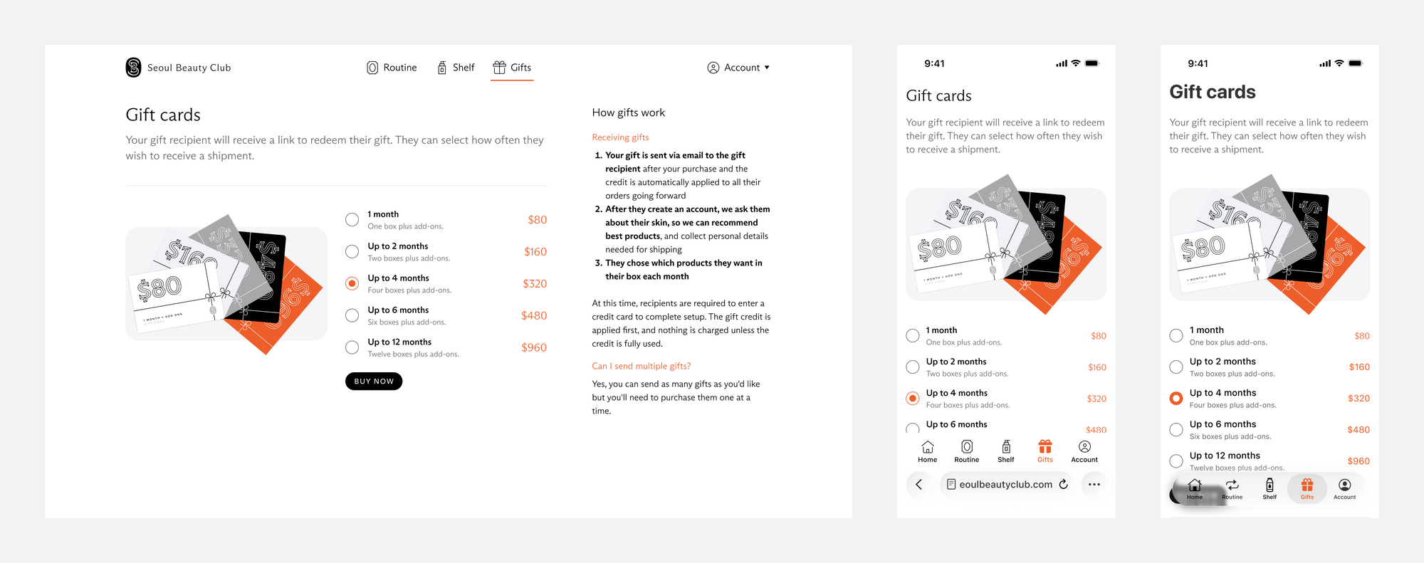
The customer's personal information and billing details moved under the user profile section as per convention. Their place went to call-out cards for the next box drop teaser, Slack community, referral program, and gifts.
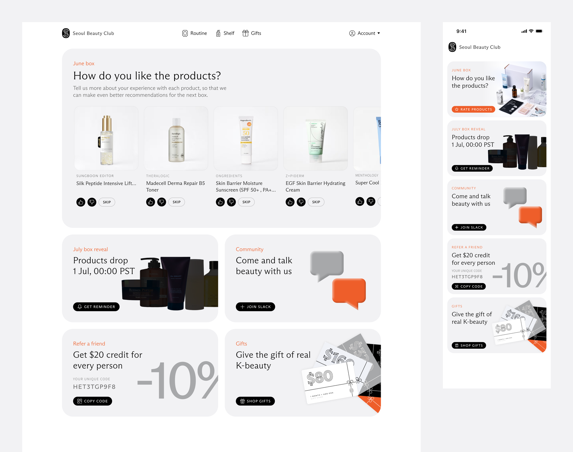
The hero section displays parcel tracking information after the purchase and encourages feedback about products once they’re delivered to improve the recommendation engine’s efficacy. This crucial post-purchase functionality was added to all product lists throughout the app for fail-safe discoverability.
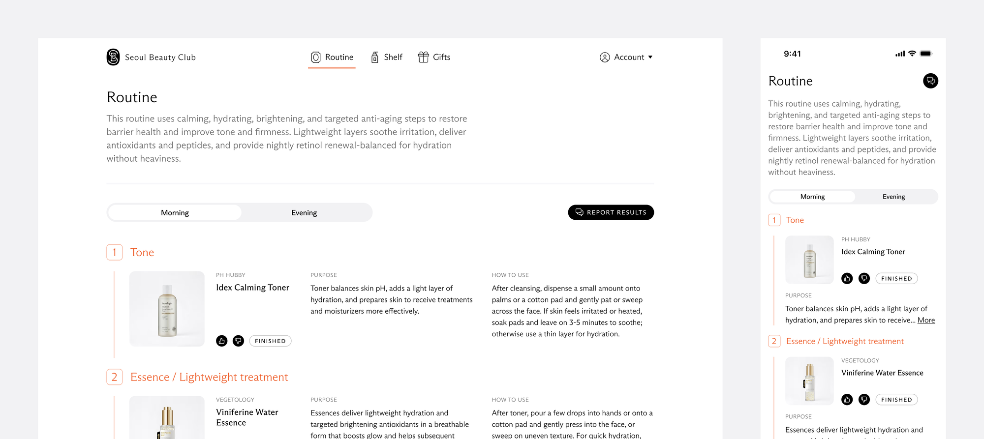
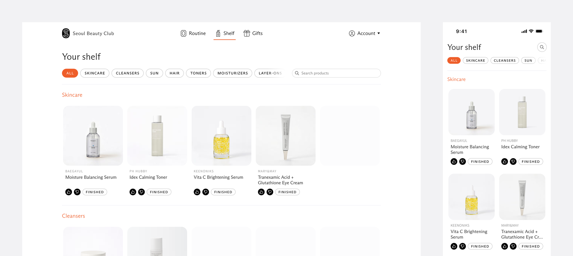
UX+UI patterns consolidation
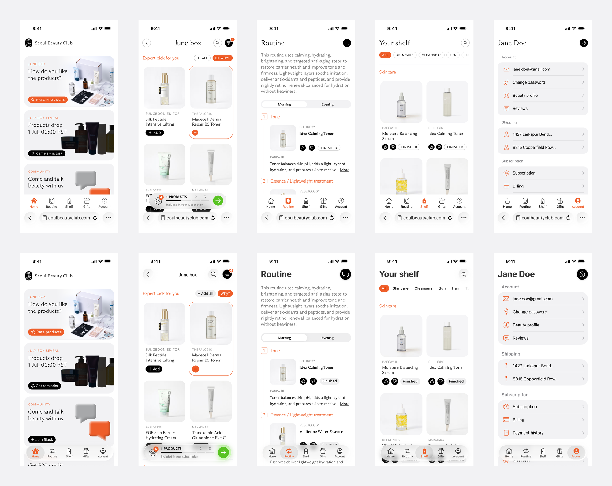
With an iOS native app in the backlog, it was prudent to future-proof the redesign by aligning the UX of the responsive web app with Apple HIG.
Each section was explored with multiple interaction pattern variants to find a unified solution that works equally well in all contexts.
Visual language was harmonized by bringing the web closer to the Liquid Glass and by branding the iOS app with ABC Arizona Flare typeface and brand color scheme. Native components use platform styles, San Francisco font, and system icons, so the app stays coherent with its environment.
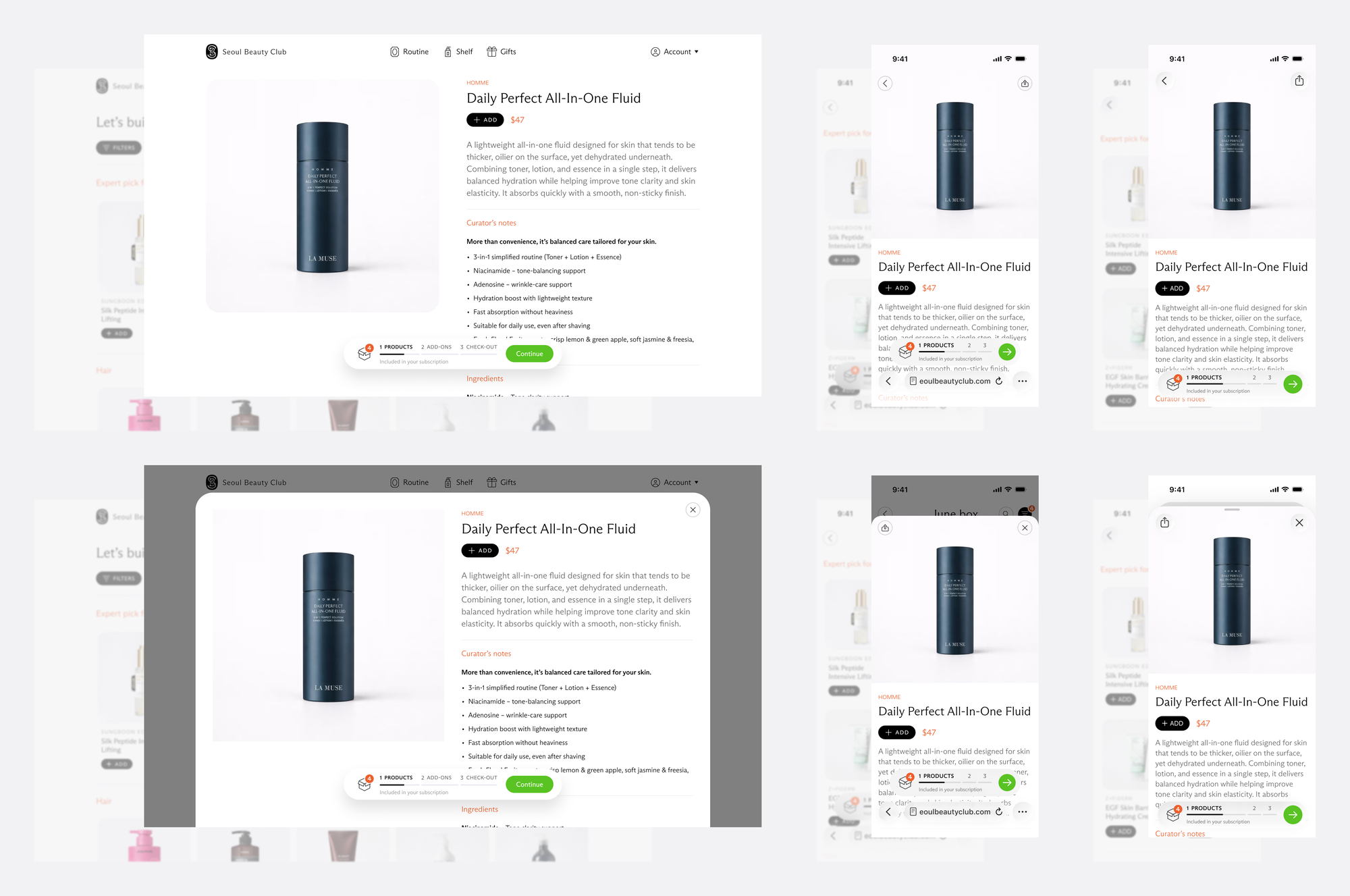
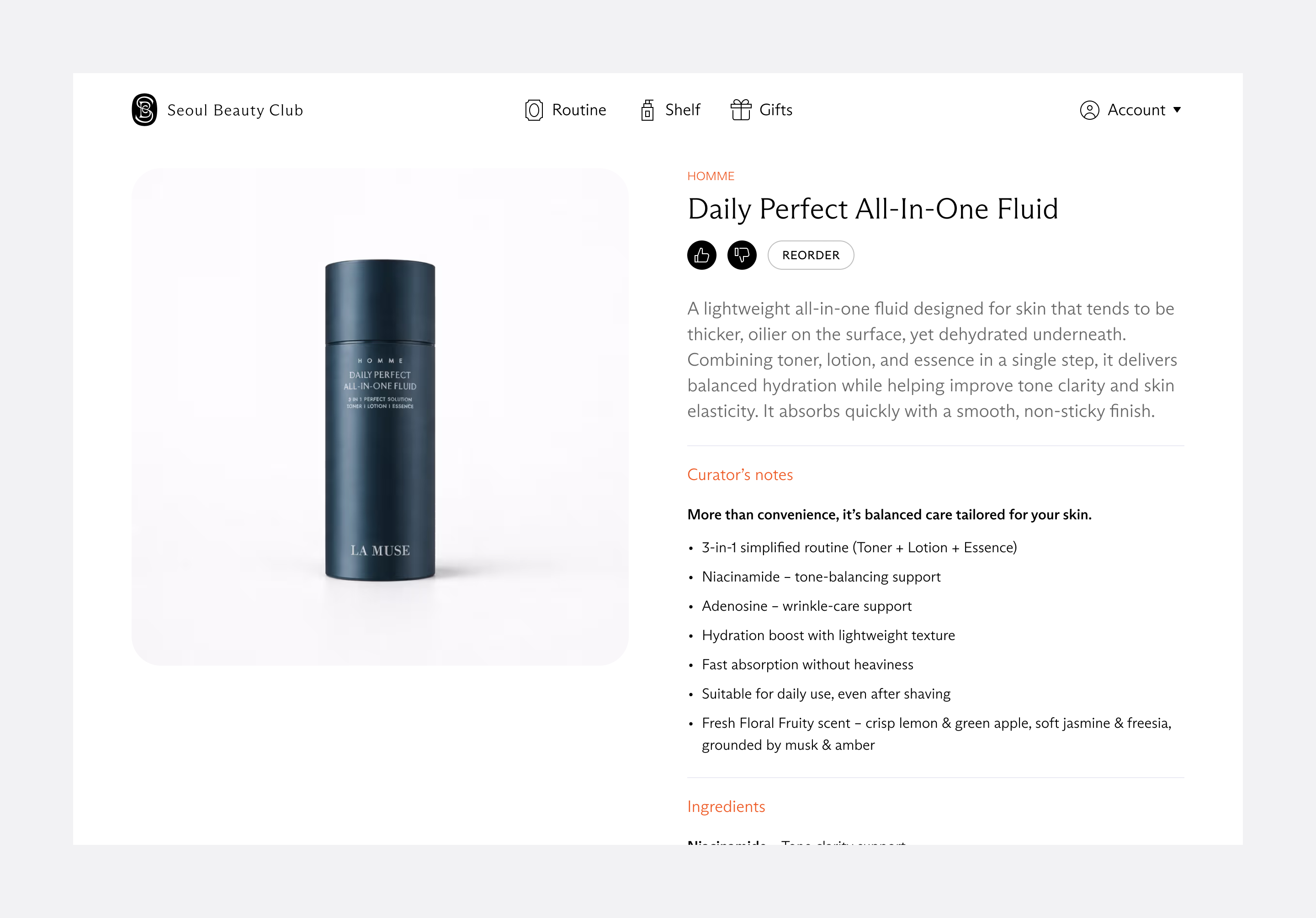
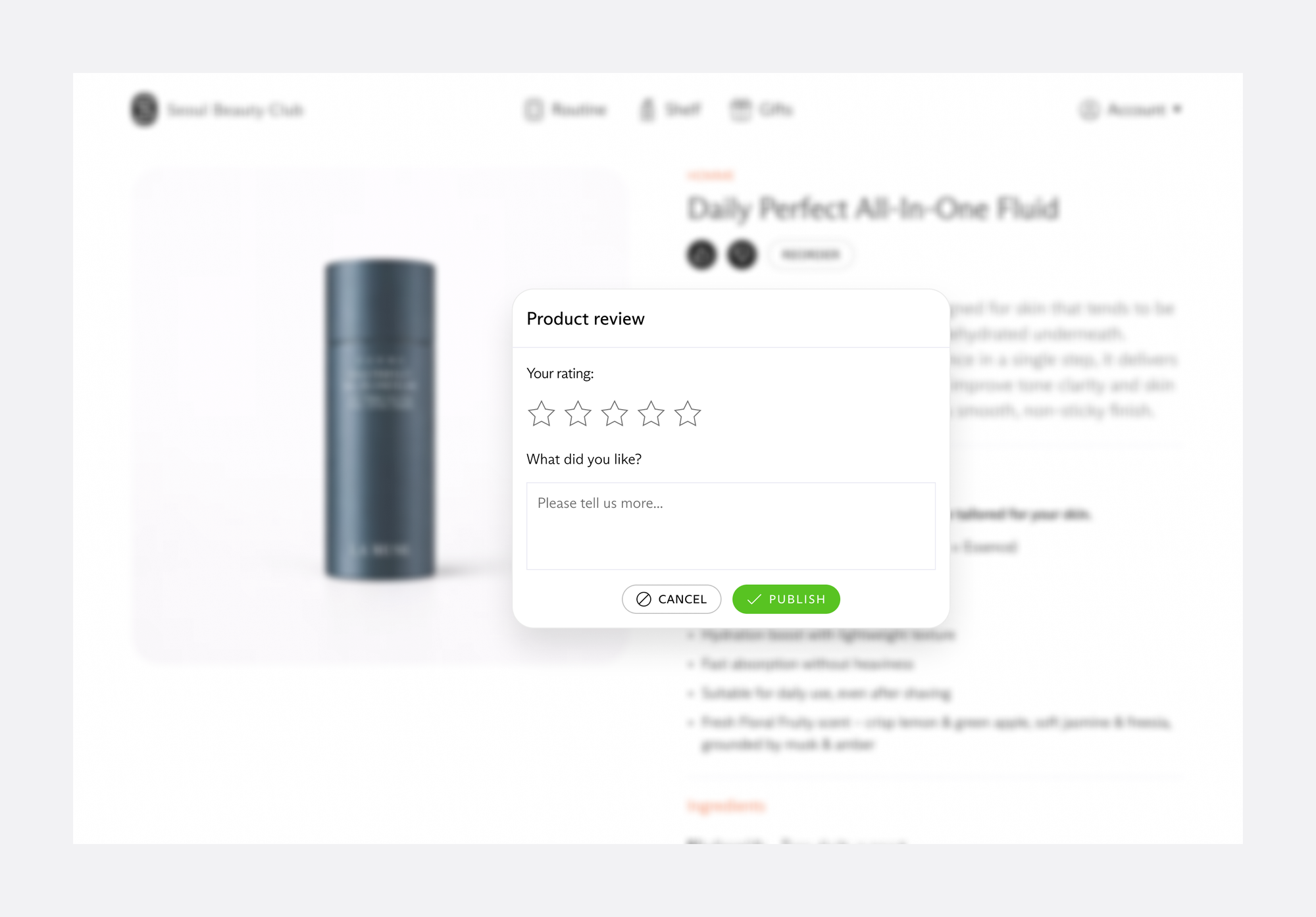
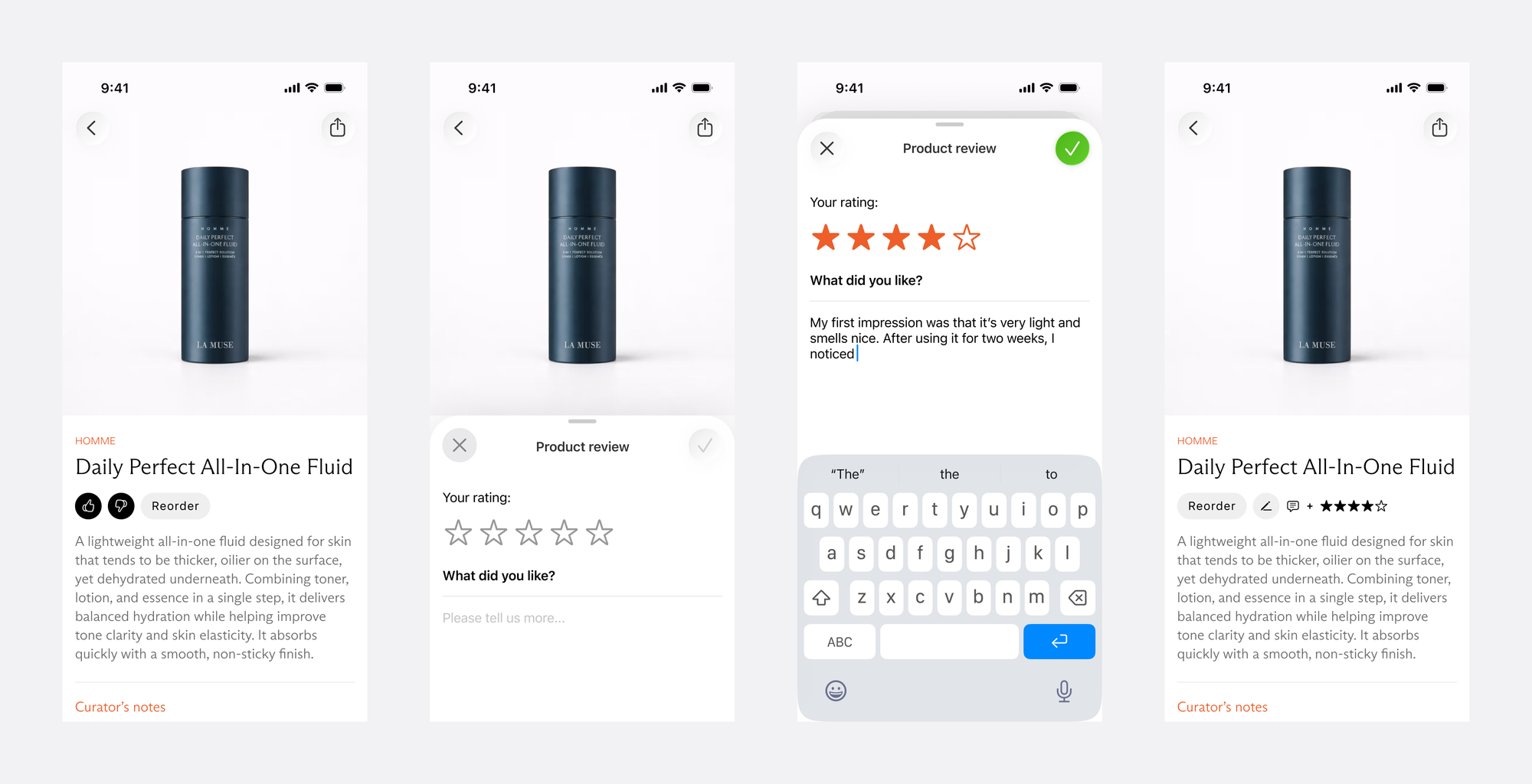
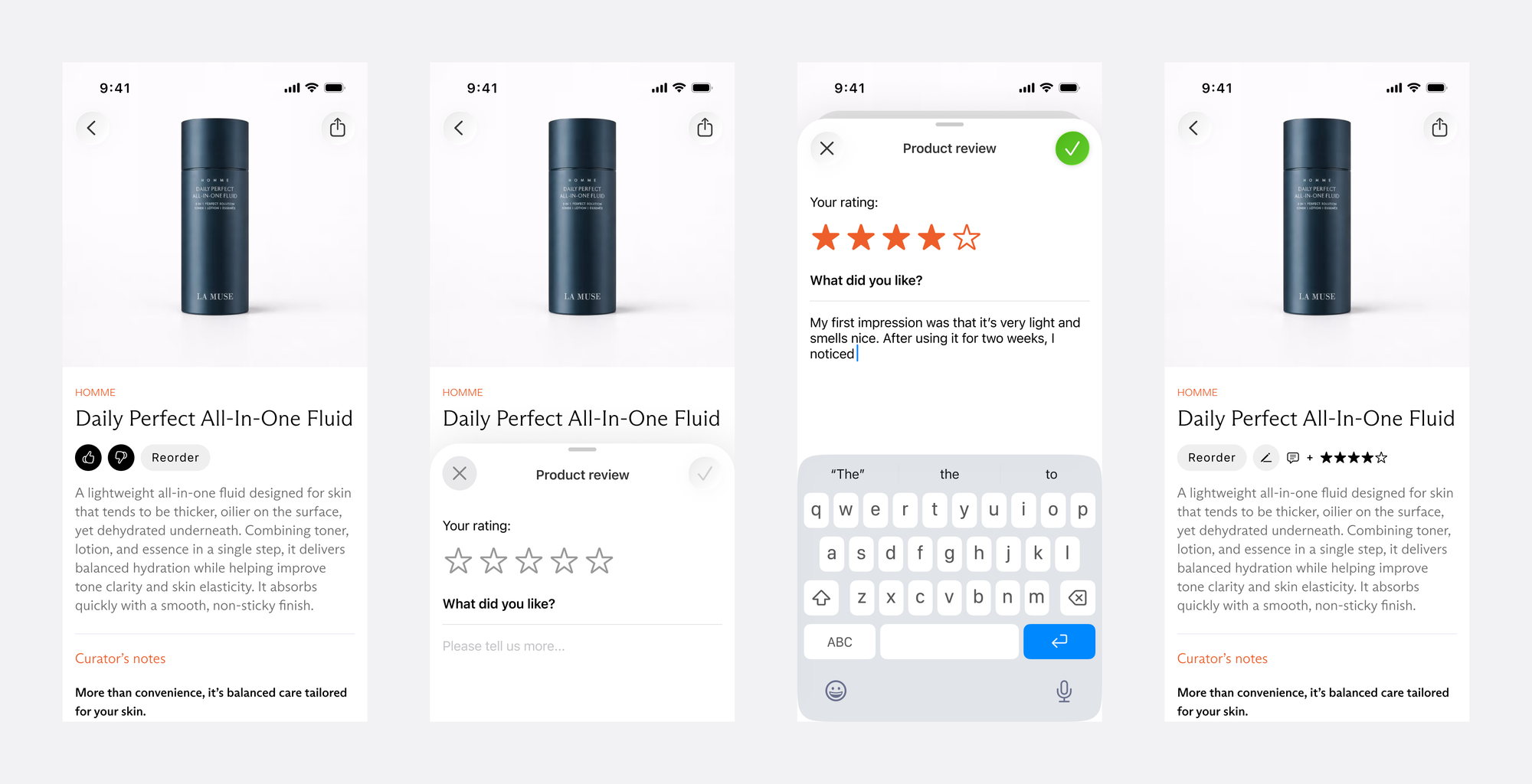
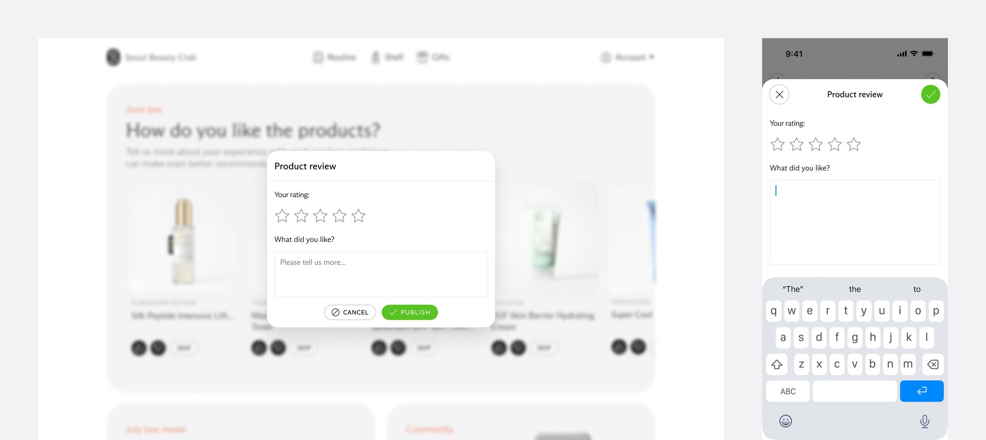
Product review UX was consolidated across all platforms with a modal overlay UI pattern.
Credits
CEO: Leo P.
CTO: Sebastjan T.