
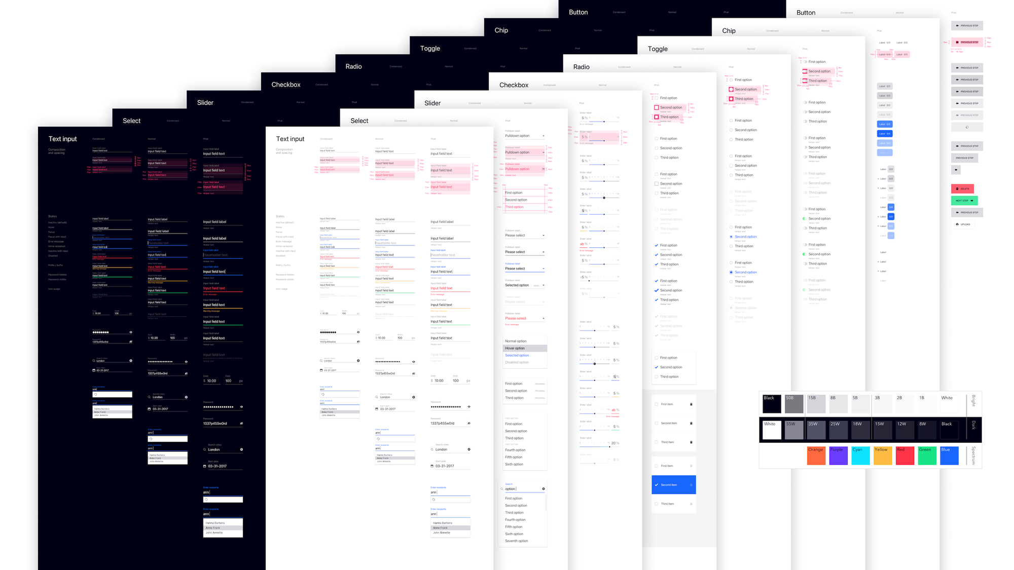
Celtra Design System
Overview
Company: Celtra
Timeframe: 2017–2018
Role: VP of Product
Background
With the company’s fast growth and an influx of new features, the platform quickly outgrew its original design. New features were being shipped with a mix of legacy components and new visual language experiments, across three parts of the platform built with different front-end technologies. Business priorities kept tooling projects off the roadmap until engineering got approval to improve technical debt by rewriting the platform’s core in Vue.js.
Results
- Consolidation: One component library and visual language across three diverging codebases
- Rollout: Shipped project by project with ongoing roadmap development, with platform overhaul completion after my tenure
Ownership
I initiated the project and was responsible for its implementation from conception to rollout in a hands-on player/coach role.
Show individual contributions
- Researched leading design systems and best practices
- Designed the stack and production workflow architecture
- Designed the foundation of the component library
The role also included partnering with the engineering leads on the Vue.js rewrite and the strategy for consolidating the platform’s visual language and user experience. Throughout the 18-month gradual rollout, I directed a team of three designers to establish the DesignOps function and worked closely with engineering leads and product teams to support adoption in active development projects.
Highlights
Stack research and architecture
Our objective was to achieve a lean production workflow, ensure long-term interoperability, and be rational with licensing costs.
The 2017 tooling landscape was mid-upheaval. We were bullish on Framer X’s vision of designing with live codebase components, but unfortunately, it was incompatible with our Vue.js stack. InVision’s Studio was fresh in beta, buggy, and its import of Sketch files was unreliable. Figma seemed promising; however, at the time it had limited features for managing component libraries, no desktop app, and requiring the entire team to learn a new tool would be a hard sell.
| Design | Version control | Prototyping and animation | Handover | Icons | Style guide |
|---|---|---|---|---|---|
| • Sketch • Framer X • Figma • InVision Studio • Adobe XD |
• InVision DSM • Abstract • Plant |
• Framer • Principle • Marvel • Flinto • Origami Studio • LottieFiles • Kite Composer |
• Sketch Cloud • Zeplin • InVision Inspect |
• Nucleo • Streamline • FontAwesome • Noun Project |
• VUEDS • Fractal • Catalog • Patternplate • Bit • zeroheight |

We decided on the combination of Sketch, Abstract, and Principle. It was a safe bet that wouldn’t require convincing the rest of the organization to change the stack, and it left the door open for migrating to Framer, InVision, or Figma in the future if necessary. Within Sketch, the Overrideit plugin alleviated the pain of finding components within dropdown menus, and a clever hack gave us auto-resizable button symbols (before the native auto-layout features).
The longer-term ambition was a system relying on code as the single source of truth, with Airbnb’s React Sketch.app generating Sketch components and VUEDS generating the documentation.
Luminosity and contrast
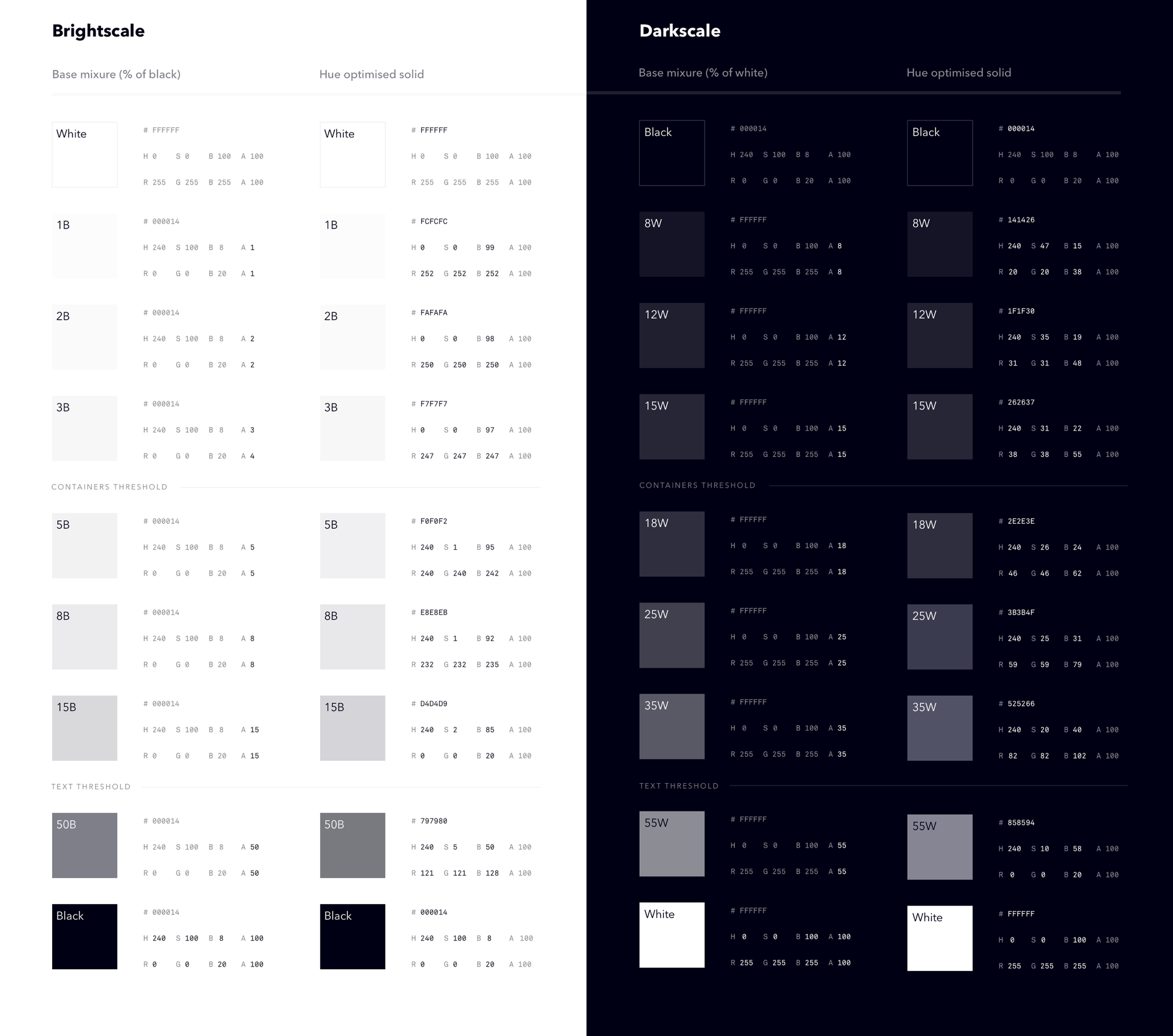
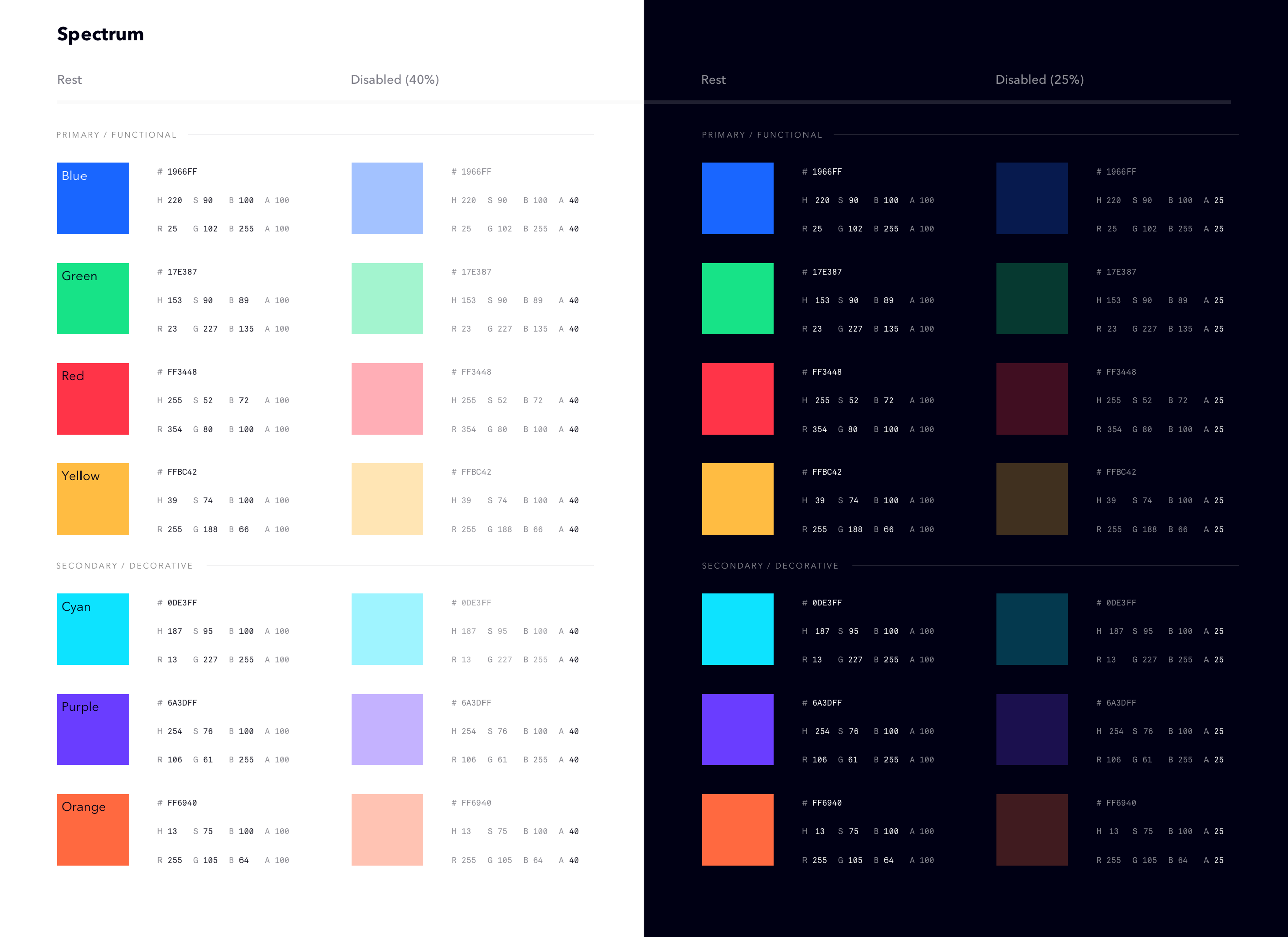
The biggest initial challenge was finding consensus on the optimum between aesthetics, functional requirements, and simplicity.
Grayscale and semantic colors used for text had to pass the WCAG AAA requirement, while for decorative colors and background shades, the AA rating was sufficient. It took several months of incremental progress and stress-testing with more than 10 shades of blue to fine-tune the values.
Type system
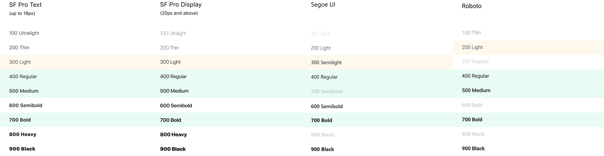
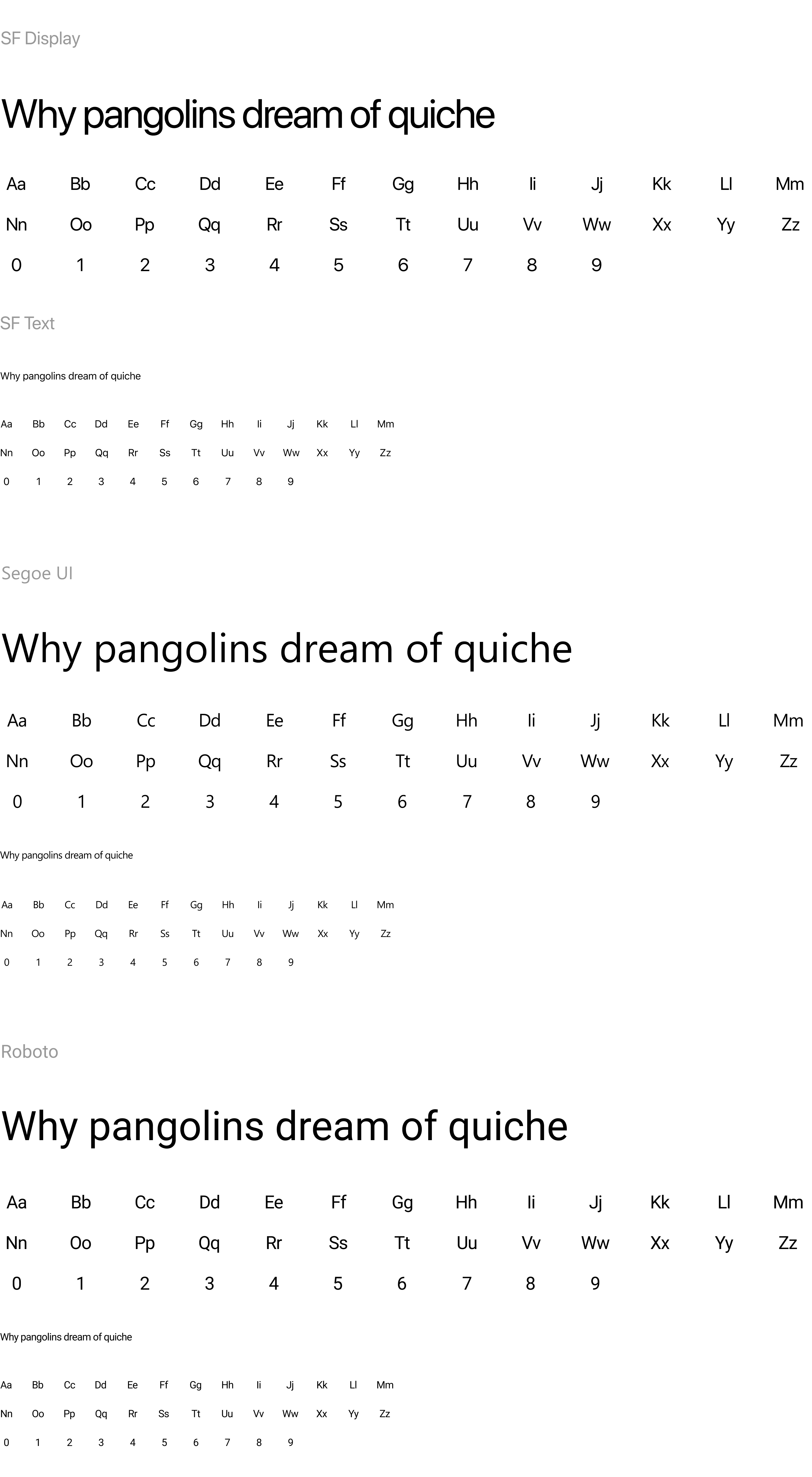
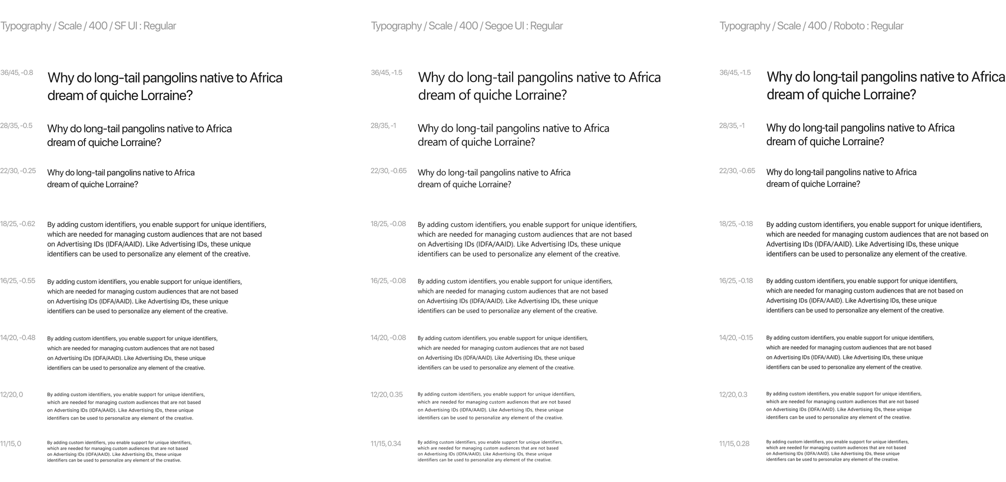
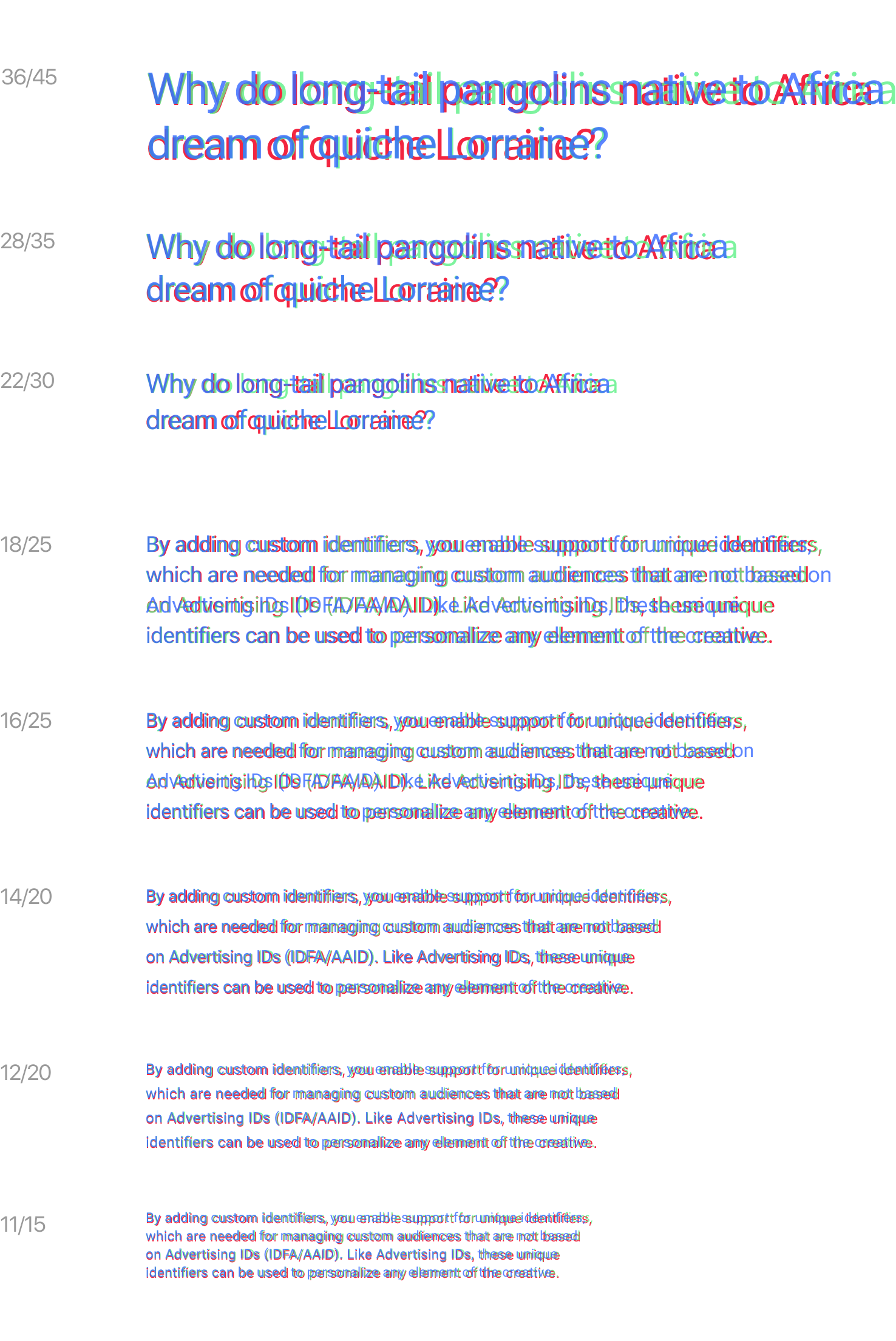
To support our customers globally, we required the UTF-8 charset. A custom webfont in at least three font weights would translate to a significant payload. Using the OS’s native type family was an obvious choice to get premium typography and full accessibility while staying within the performance budget.
Scale
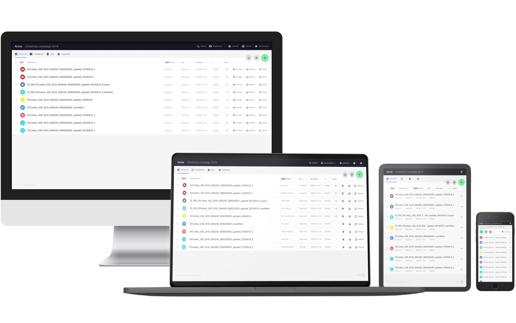
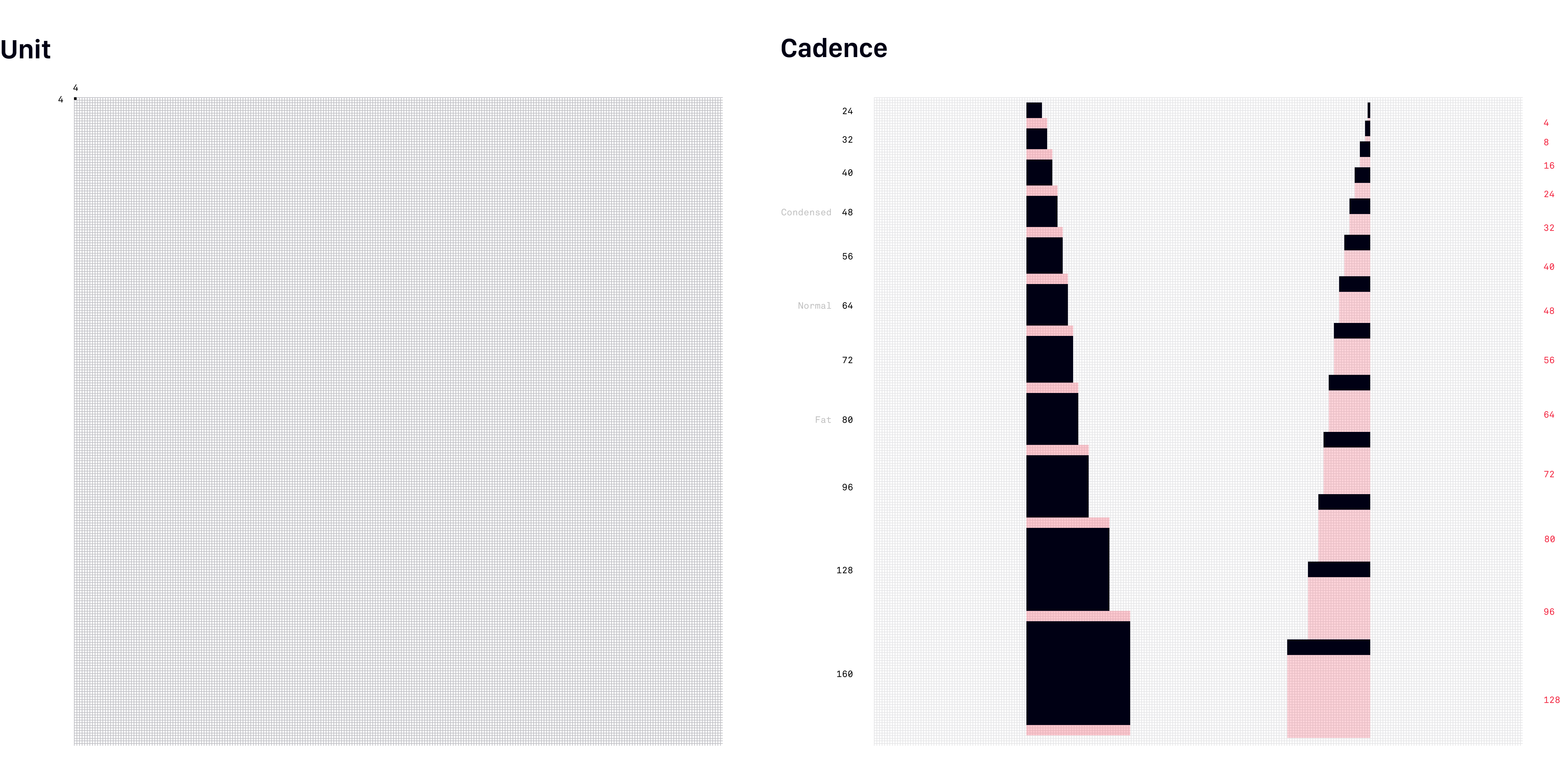
To achieve clear visual hierarchy and optimize the user experience for the entire spectrum of devices (from 27" external displays to smartphones), we would need every UI element in three sizes: condensed, normal, and fat.
Iconography

Components
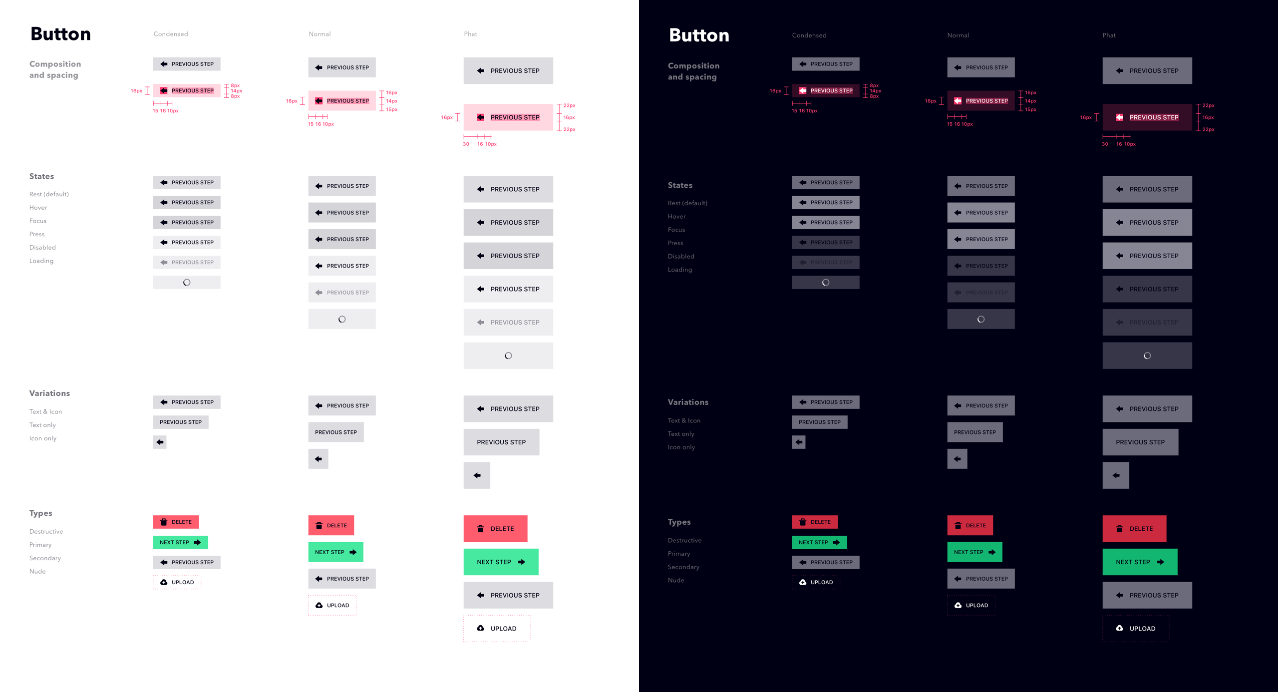
We chose underline form elements style to reduce the number of nested rectangles and borders, which make the UI harder to comprehend due to visual noise. As a B2B product with technically savvy users, we could afford the clarity trade-off associated with this style on the component level to make the whole clearer.
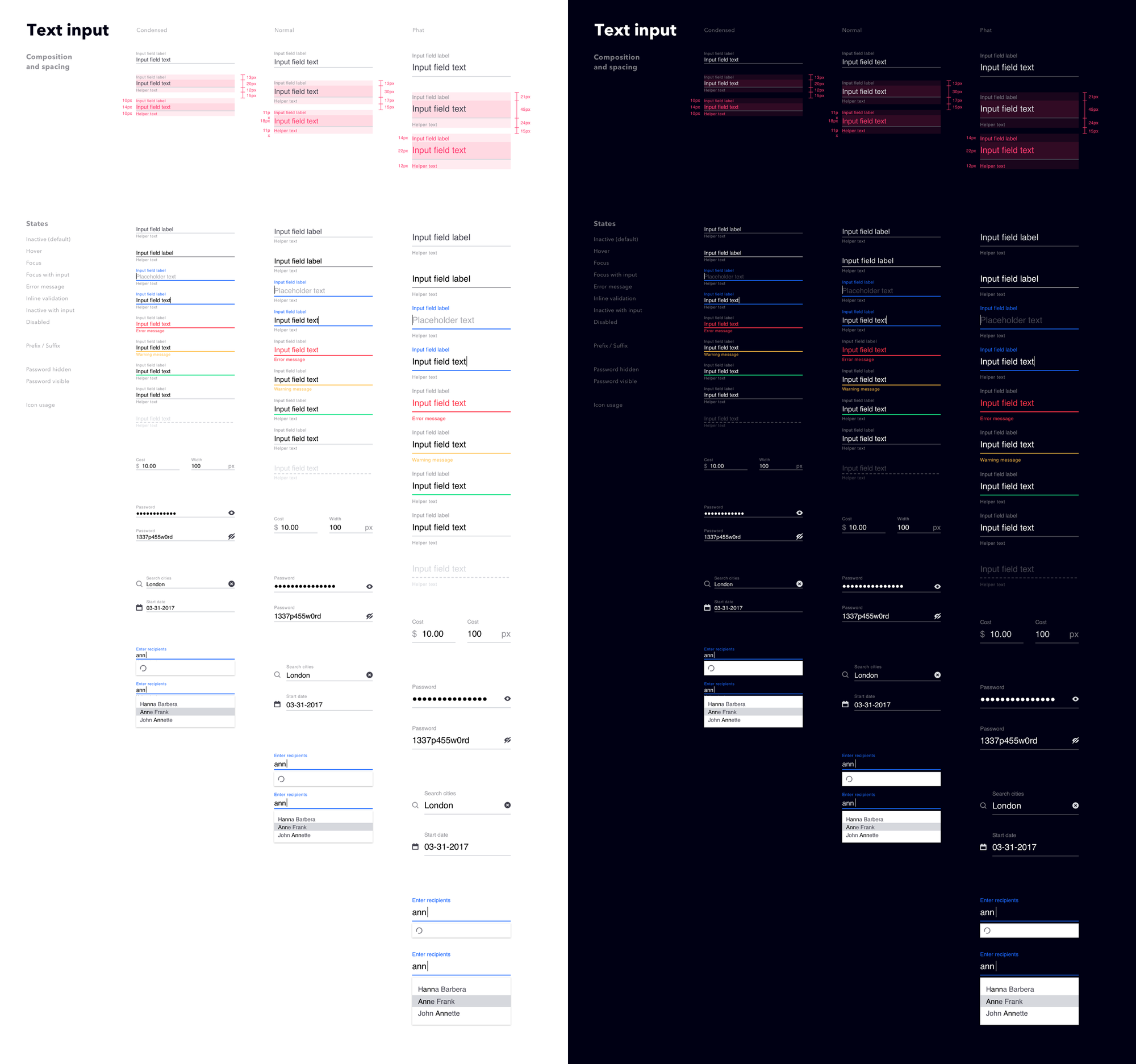
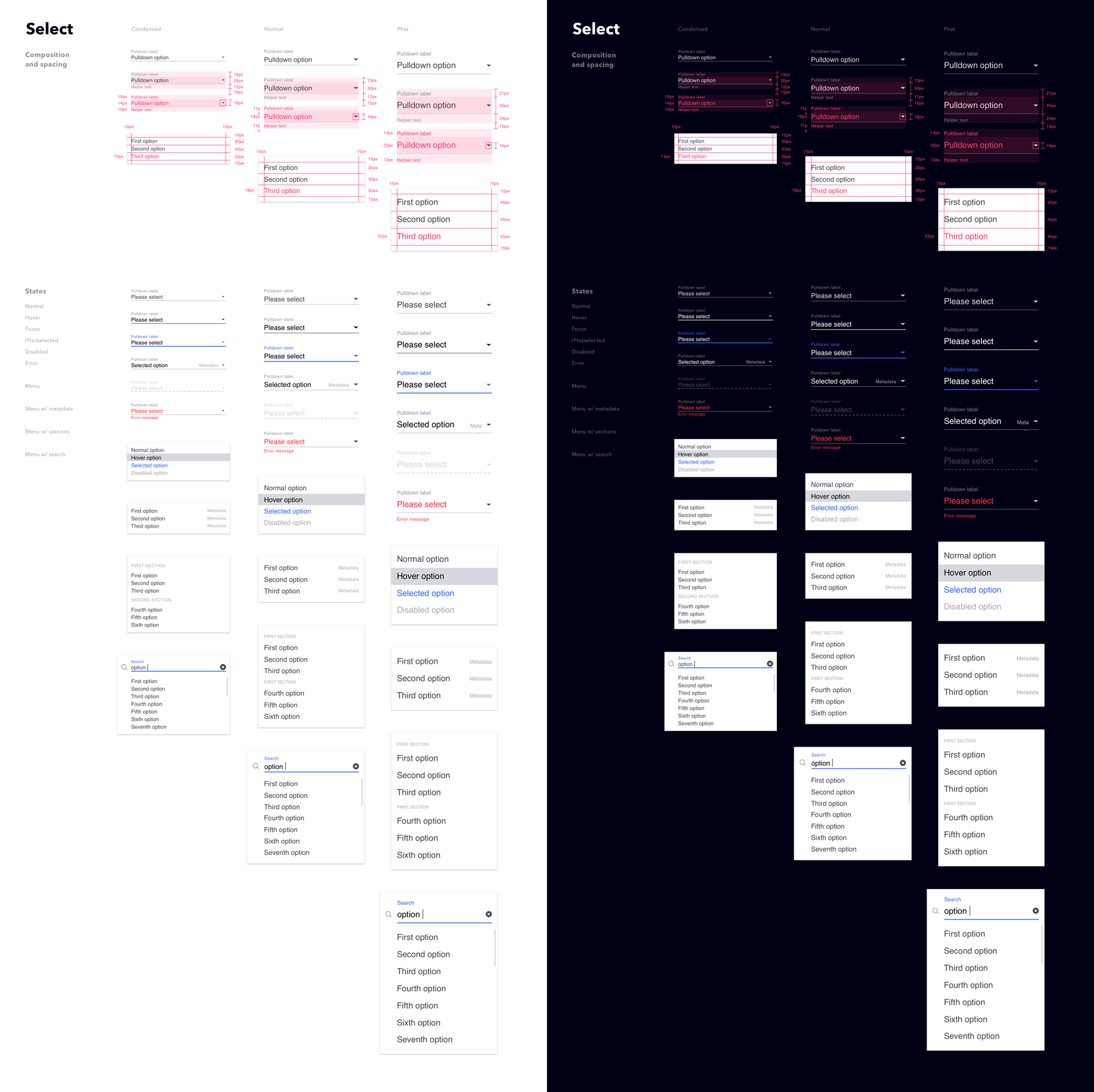
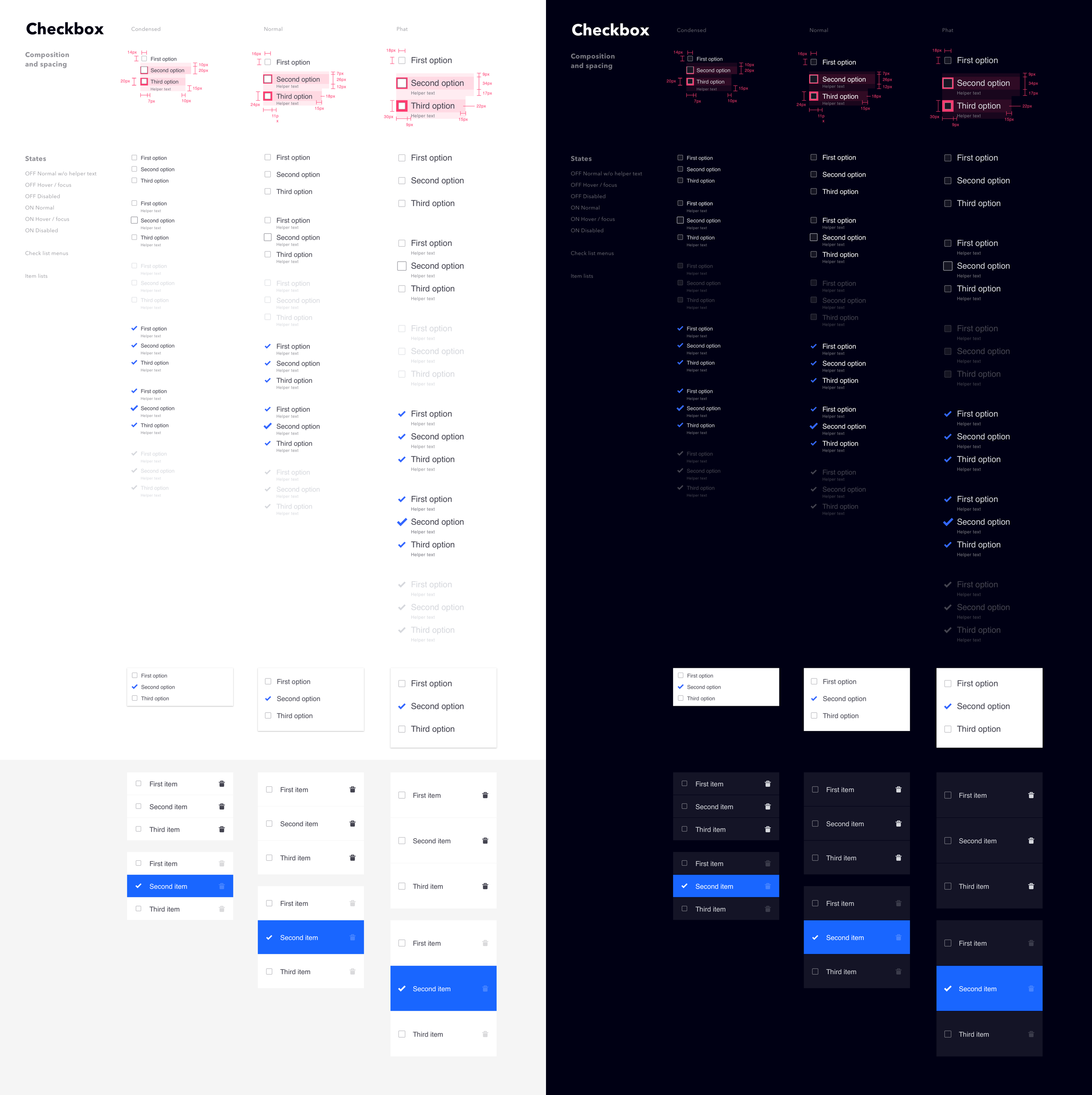
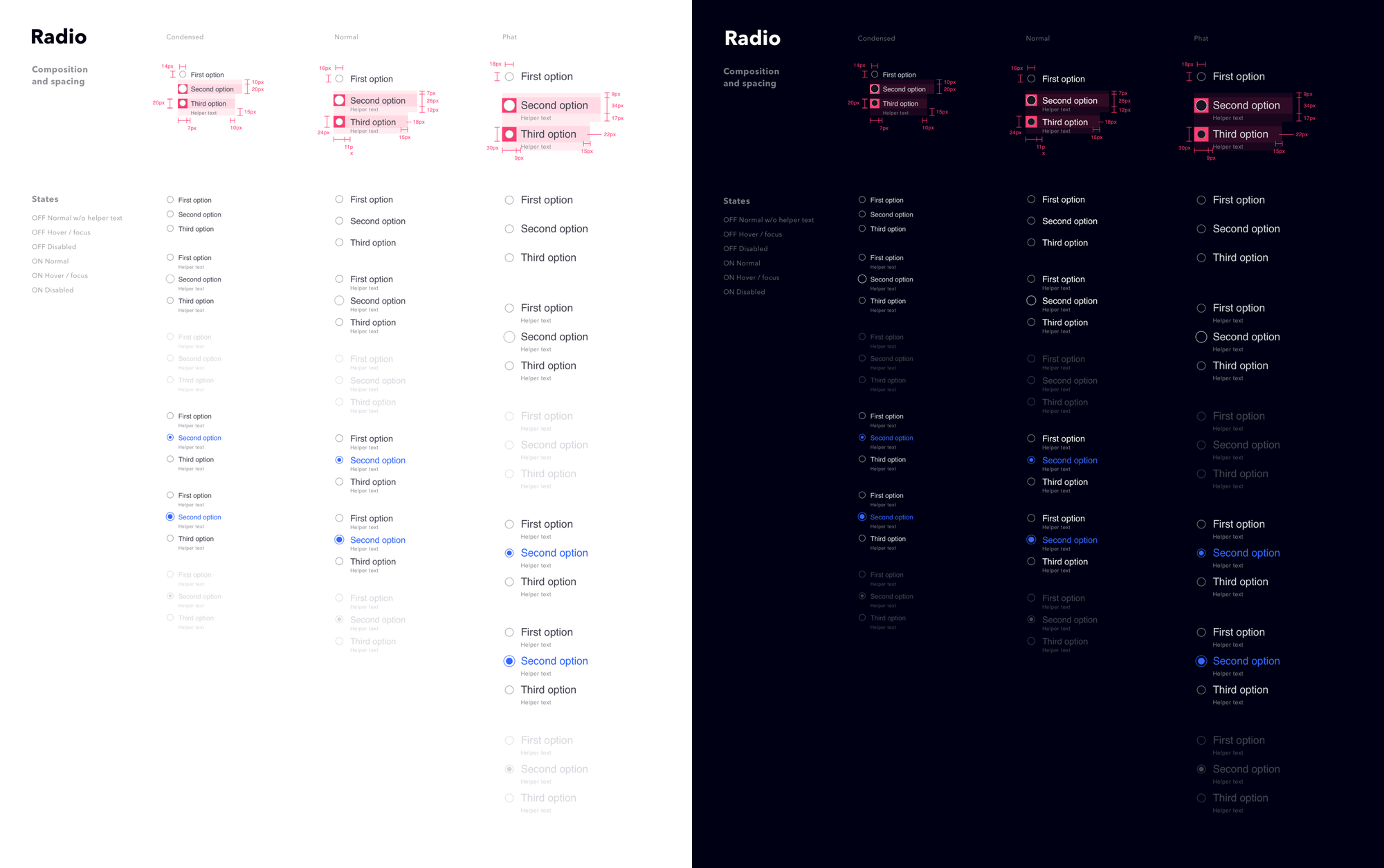
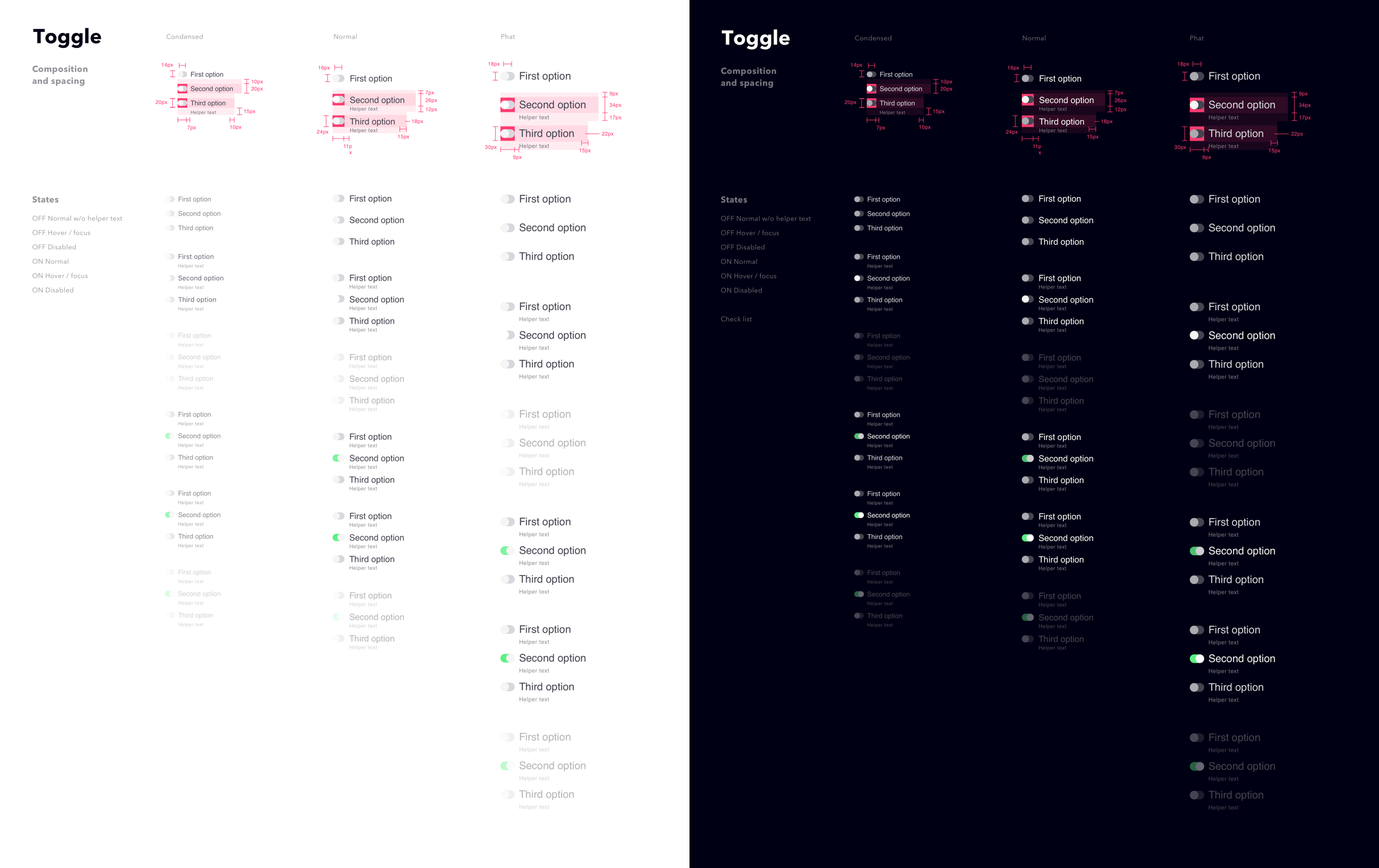
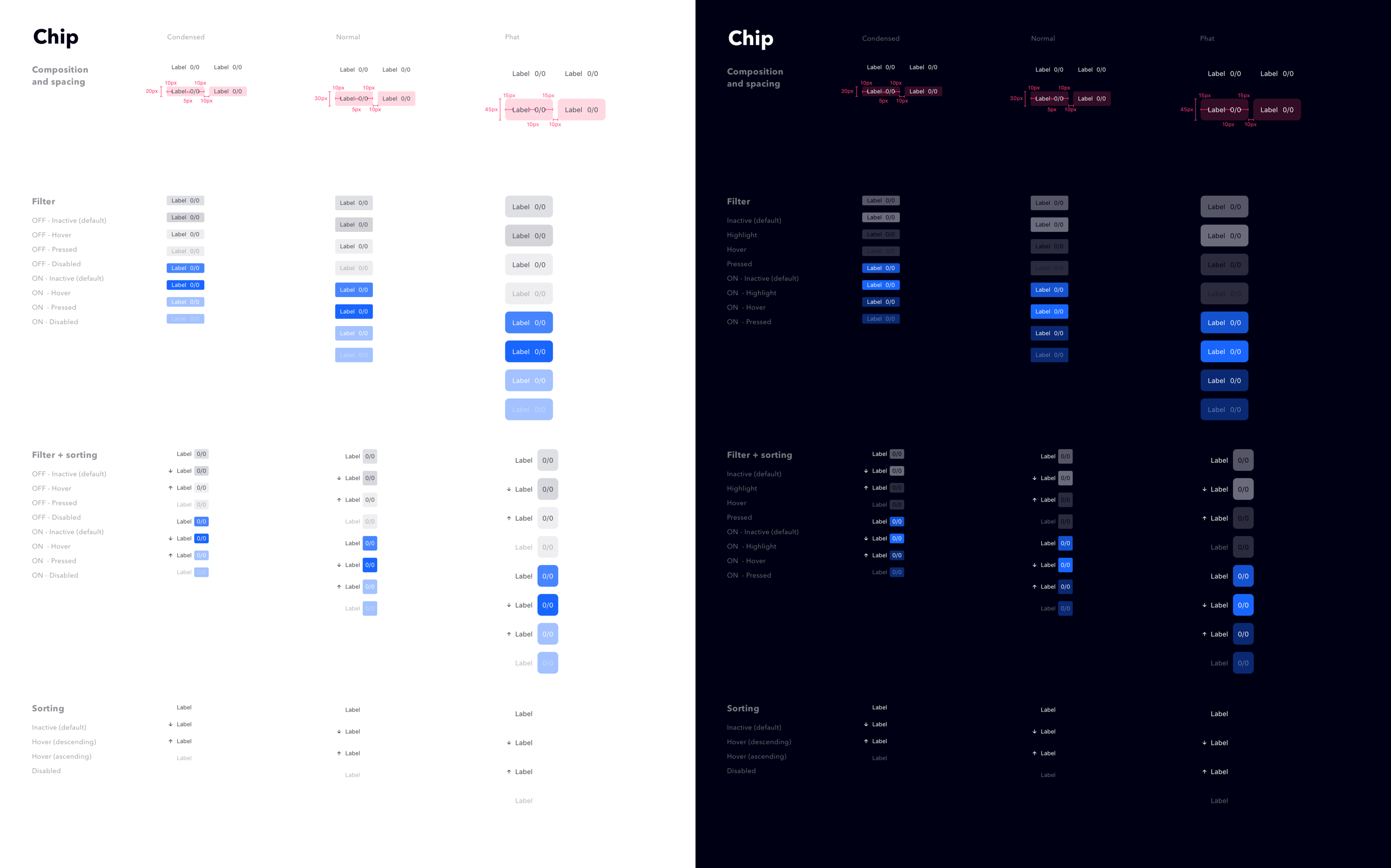
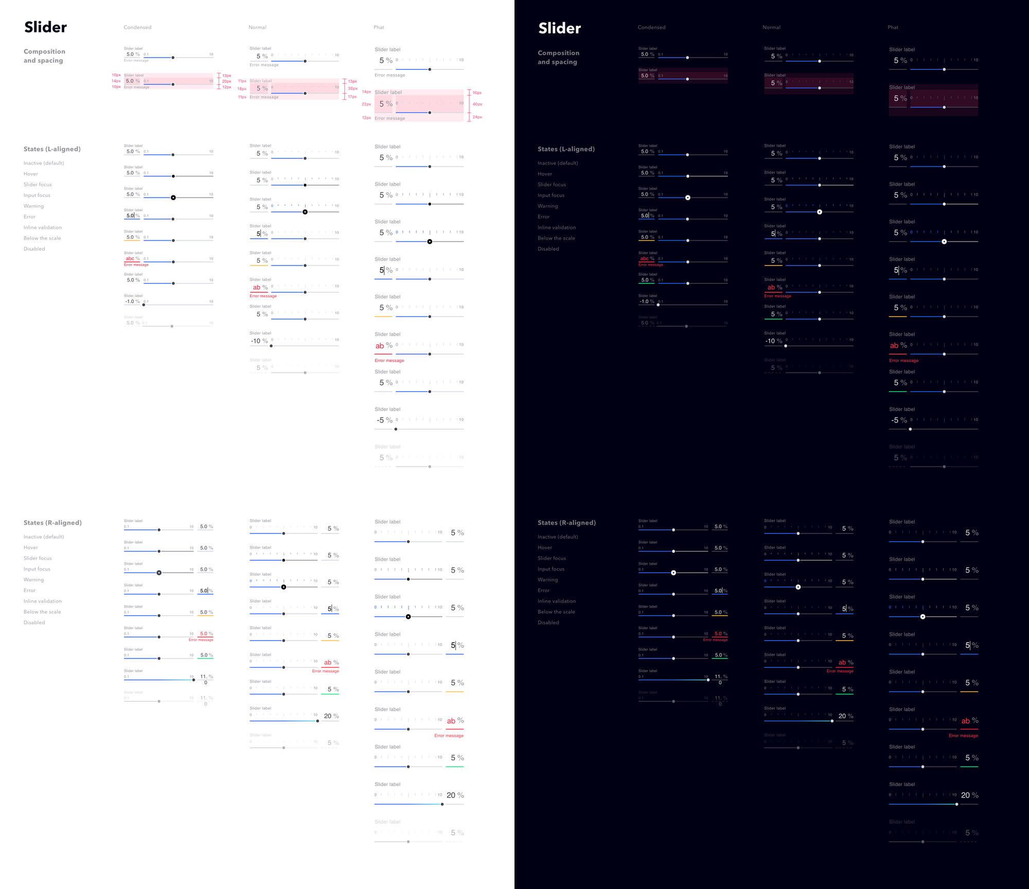
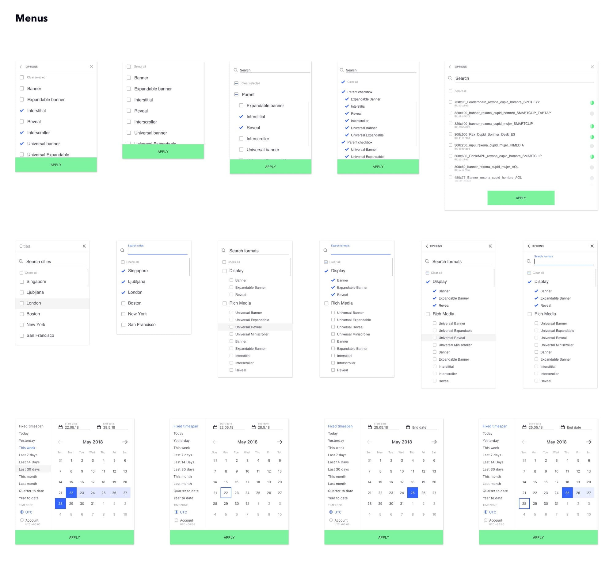
Data-driven design
We often run into dilemmas where accommodating a wide range of edge case scenarios would require big trade-offs. By analyzing live data (e.g., quantity of list items, length of titles, time ranges, frequencies, etc.), we were able to optimize UI decisions for realistic value ranges.
Implementation and rollout strategy
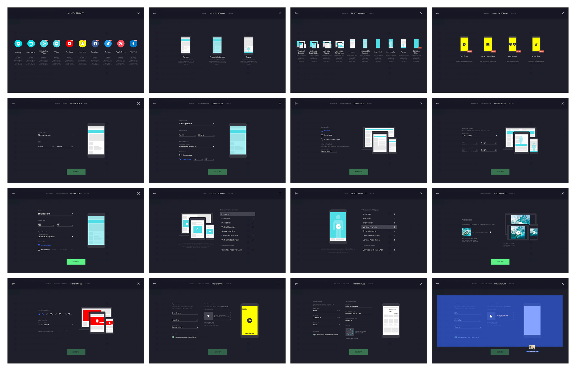
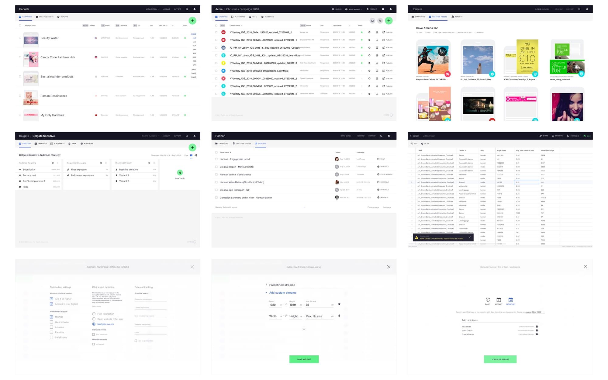
The operational constraint of developing a design system while simultaneously using it in production was incredibly challenging but proved extremely effective. It expedited our learning about the platform’s intricacies, enabled us to stress-test elements before rolling out the entire system, and prevented us from creating design fiction.
Within the next year and a half, we meticulously directed all roadmap projects to ensure all ongoing projects were using the correct components and were aligned with the platform redesign big picture. The rollout continued past my tenure.
Credits
Design: A. Venta, A. R. Urankar, G. Furcolo
Engineering: U. Pirnat, M. Tribušon